It’s been almost one month exactly since we got possession of the Heights House and things are going really well! And fast! I thought I should do a check in now because soon enough, it will be completely unrecognizable. The first thing we did after a complete demo was make sure everything got a good cleaning. Trust me when I tell you it needed it. Then we got to work on some slight layout changes…well, slight may be the wrong word…Here’s what we’ve done so far:
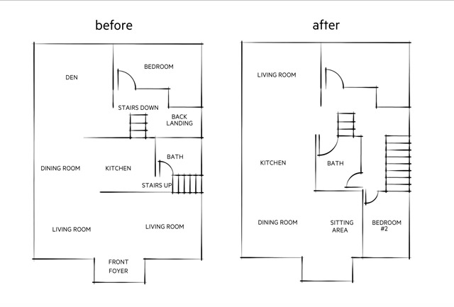
The Stairs: One thing we all hated about the house was how narrow the staircase was leading up to the second floor. Dave came up with a solution to this by changing their location: they’ll run alongside the house, rather than jutting out into the middle of it. Then that allowed us to open up the tiny bathroom on the main floor and get a better sized vanity and tub! Yay for more useable space!! I know it’s hard to visualize now but this is going to be a much better bathroom layout!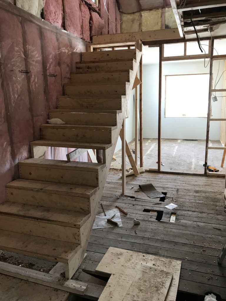
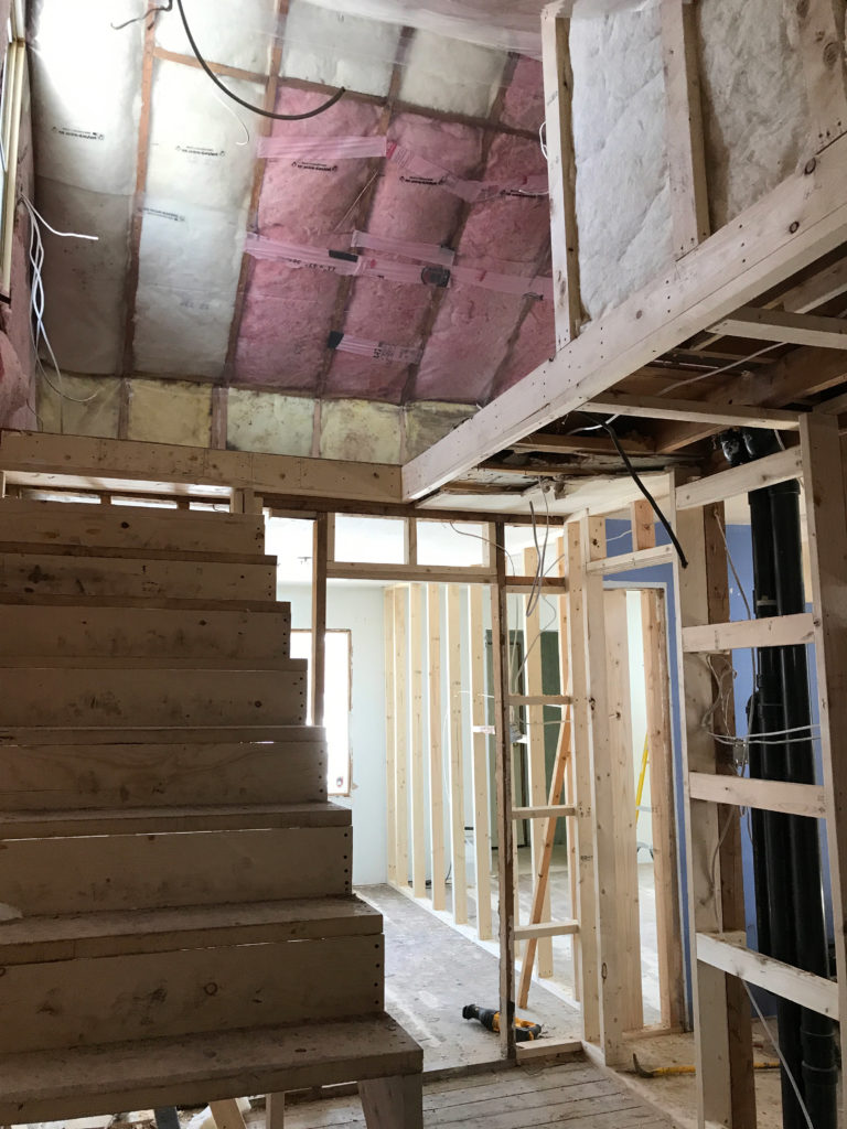
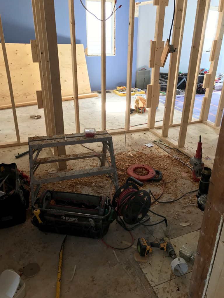
(A mess yes, but this is the new bathroom location)
New Bedroom: Then, since this house had too many “living” areas, we decided to close in one space to get another bedroom. We all thought this was a smart decision – more bedrooms is never a bad thing! Jack is showing off the new framing here…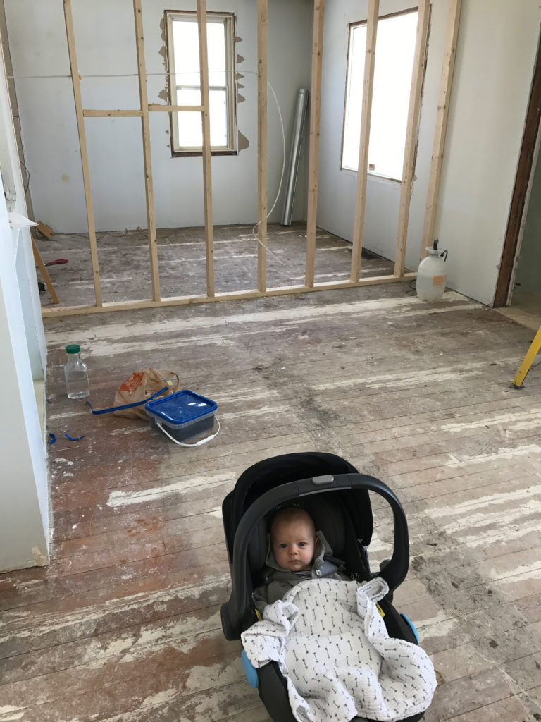
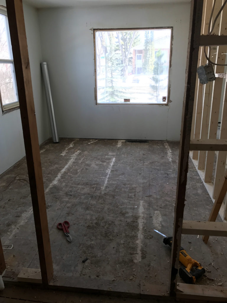
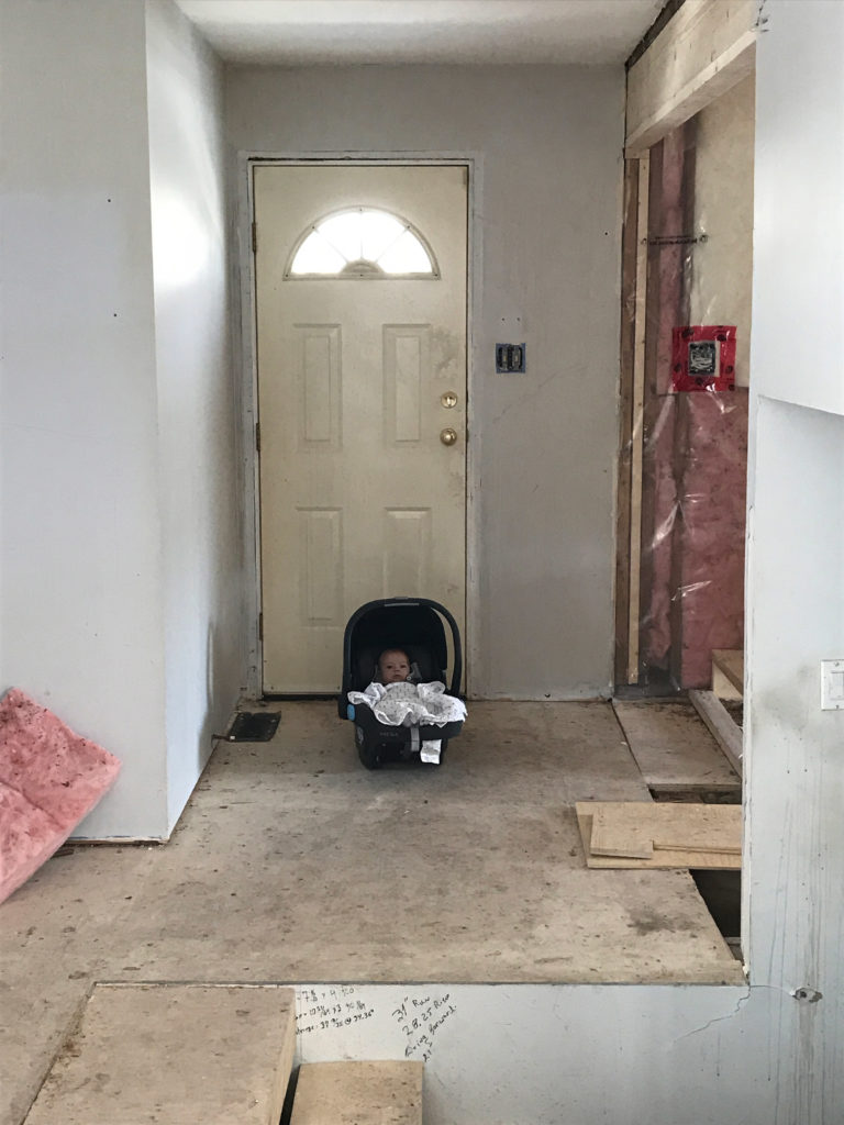
The Kitchen: Its layout has also changed. We designed the space to be a galley style, where you walk through to the living room at the back. Even though the kitchen isn’t enormous, I think this will flow SO much better! Then the dining space can be at the front of the house, with a small sitting area when you walk through the front door.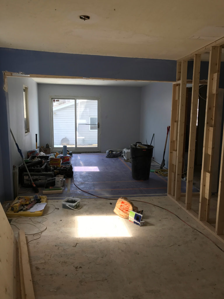
So now that I think about it, this layout has gotten a pretty big overhaul. And we said we weren’t going to go crazy on this house lol. Oh, well!!
Here’s the layout of the main floor before and after to give you a better idea where everything falls: