It is one of my favourite blogging days!! The day I get to reveal the before and after of yet another house flip. And this may just be the best one yet. No, I take that back. It IS the best one yet. From day 1, we knew there was something special about the Grand Glenora. It had a killer location, good bones and a LOT of potential. But it was in dire need of our help. So, we got to work completely revitalizing the layout (almost nothing is in the same place) and spent the better part of the winter turning this house upside down. The result is pretty outstanding if I do say so myself…here we go!!
| Exterior Before |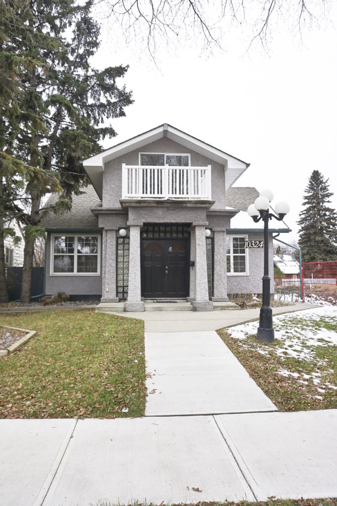
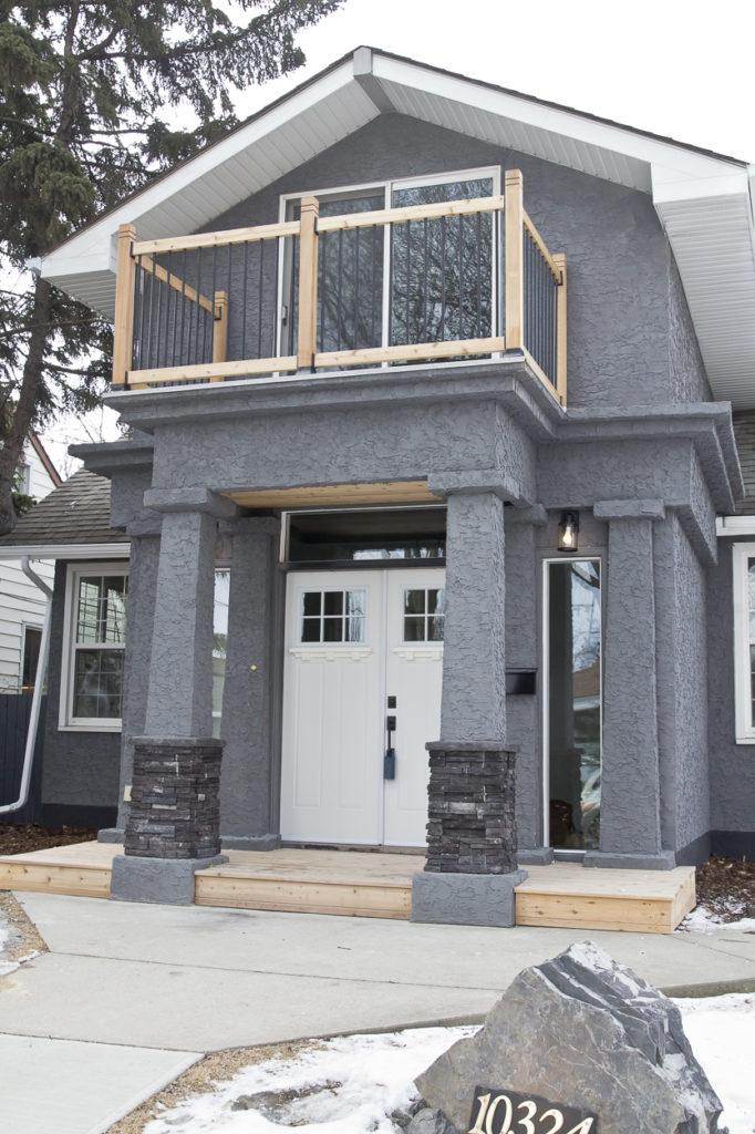
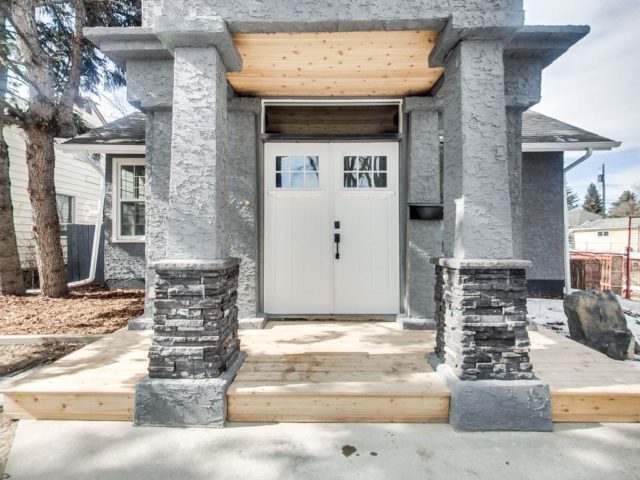
The biggest issue we had with the exterior was that it looked quite purple. The columns and dark door made it feel really dated, so a facelift was in order. We got gorgeous new doors, windows and lighting for the entry and clad both the step and overhang in cedar. The upstairs balcony railing was also replaced and Dave did a lovely little stone feature out front where the old lamppost used to be. Small changes made a big impact and I think it will be even more beautiful once that snow melts.
| Exterior After |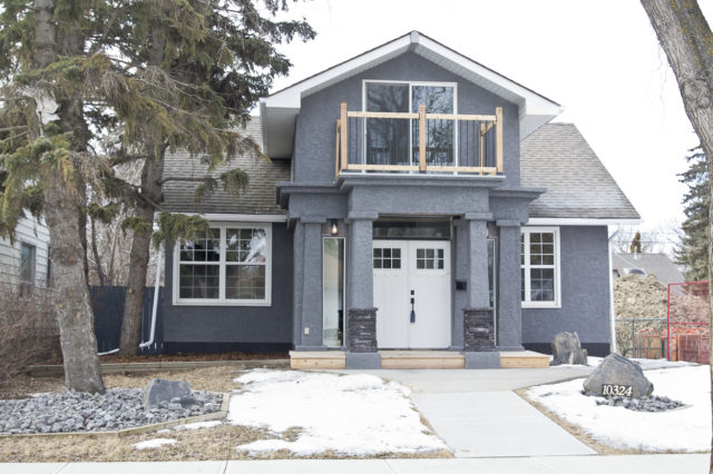
| Foyer Before |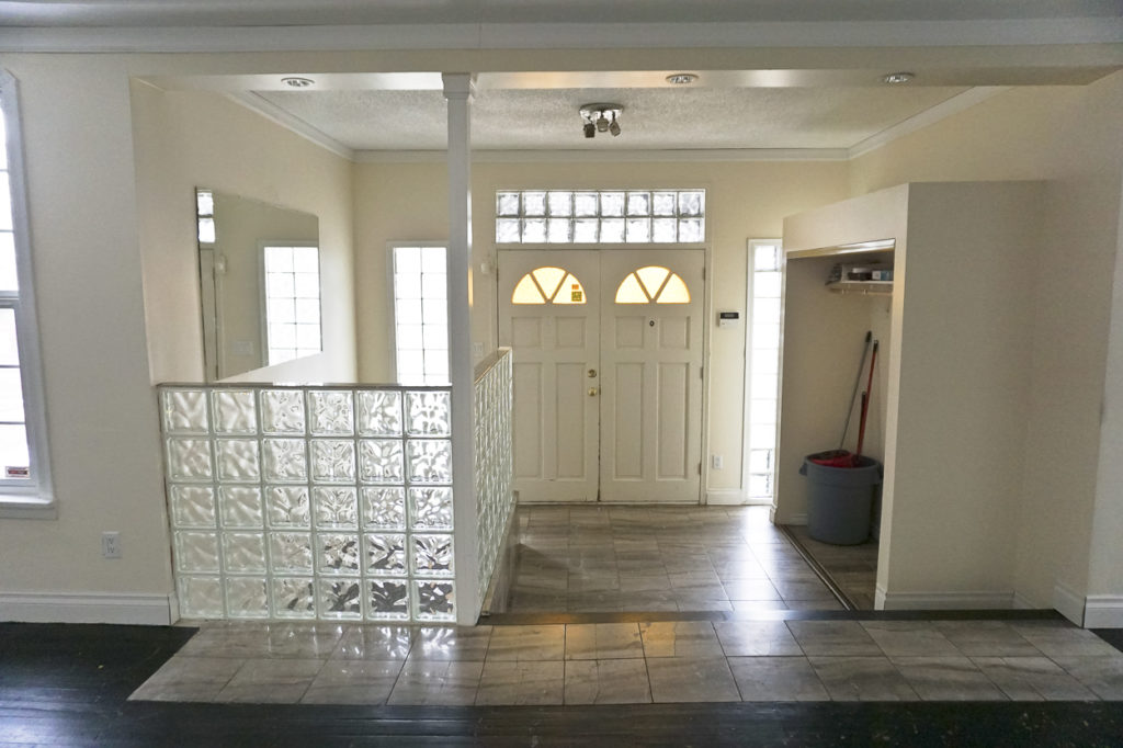
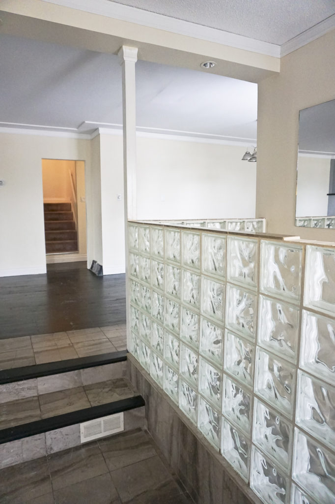
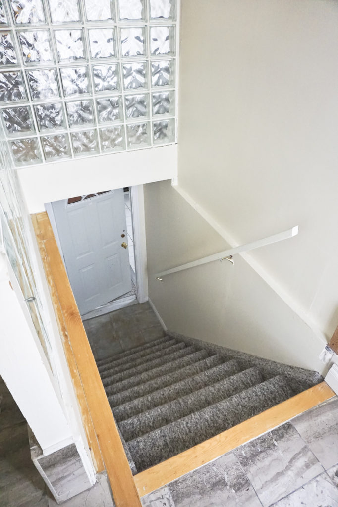
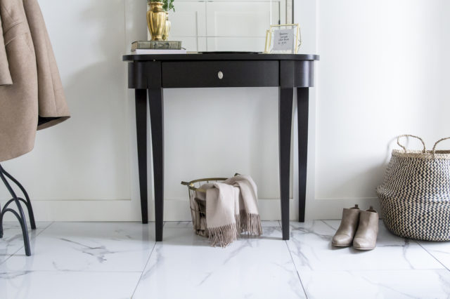
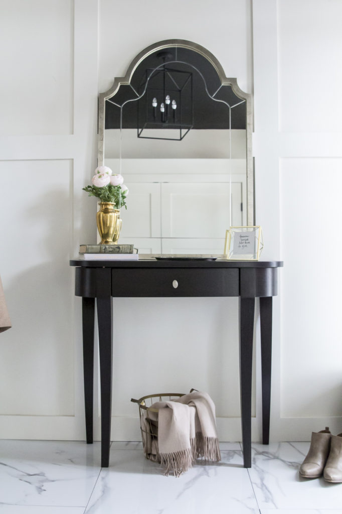
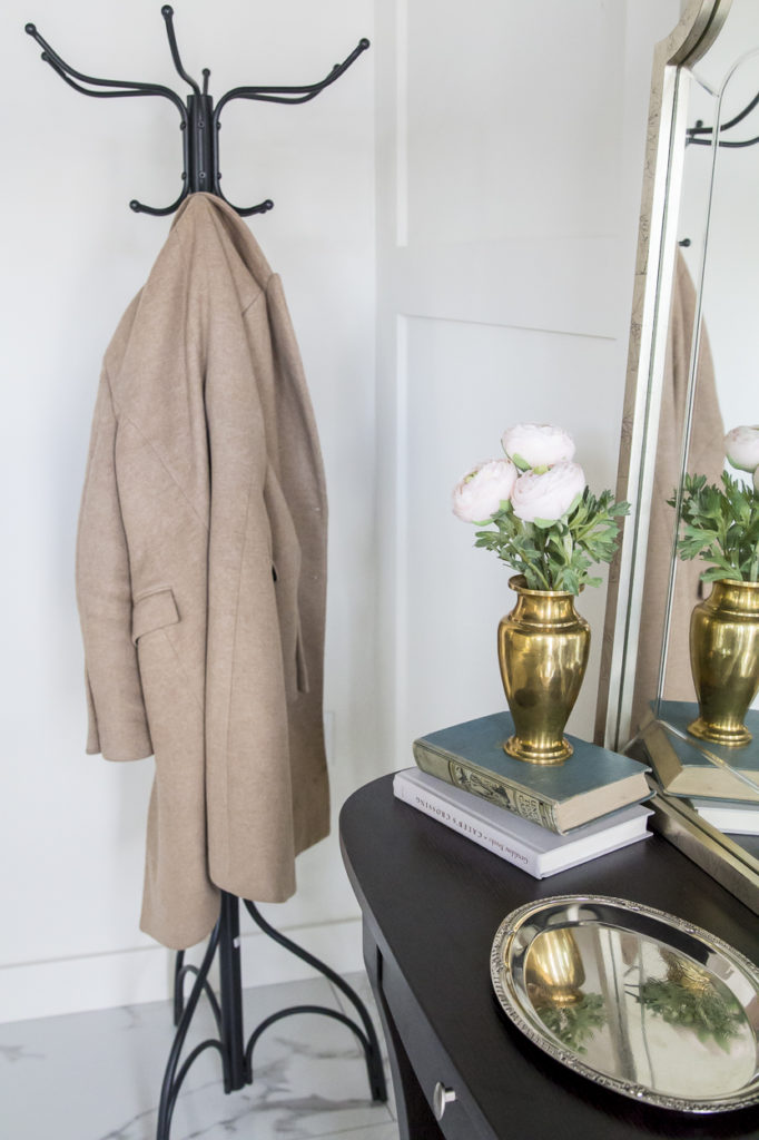
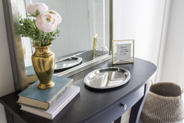
The first major change in this space was ditching the second set of stairs into the basement and all the glass block that surrounded them. Once we sealed that off, we were left with this massive front entry! I really wanted it to make an impact, so we painted the ceiling a jet black, covered one wall in trim and found a lantern style chandelier to draw the eye up. The oversized tile was a bit of a splurge but when it looks that pretty, how can you not!?
| Foyer After |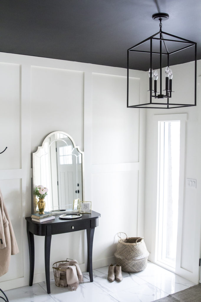
| Living Room Before |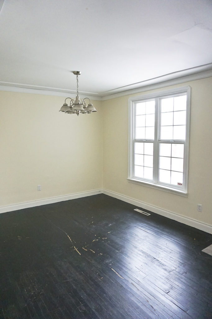
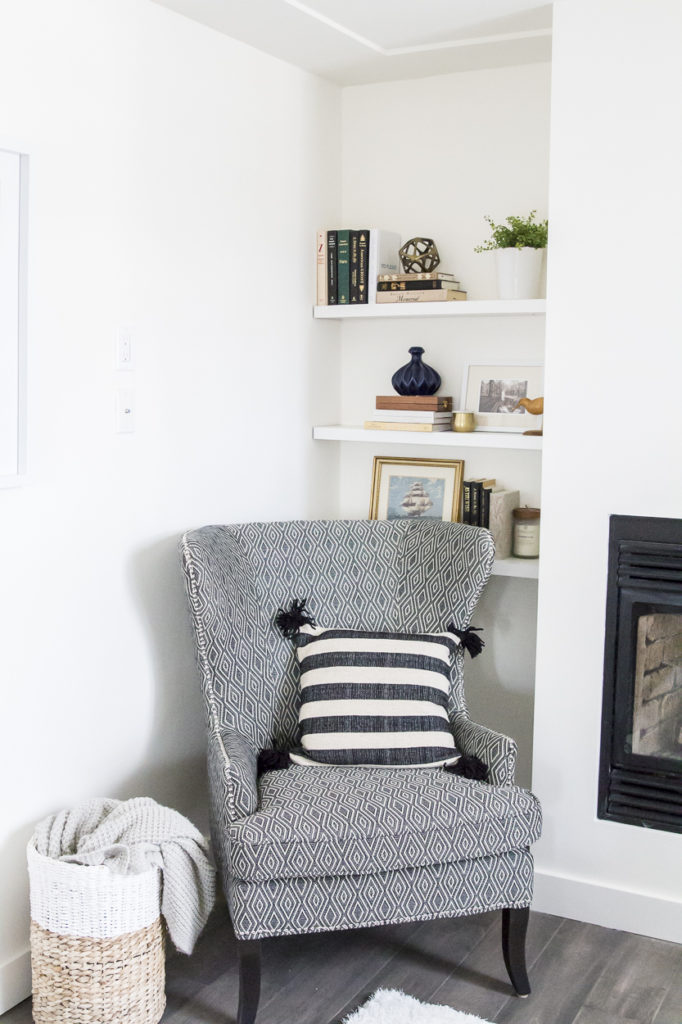
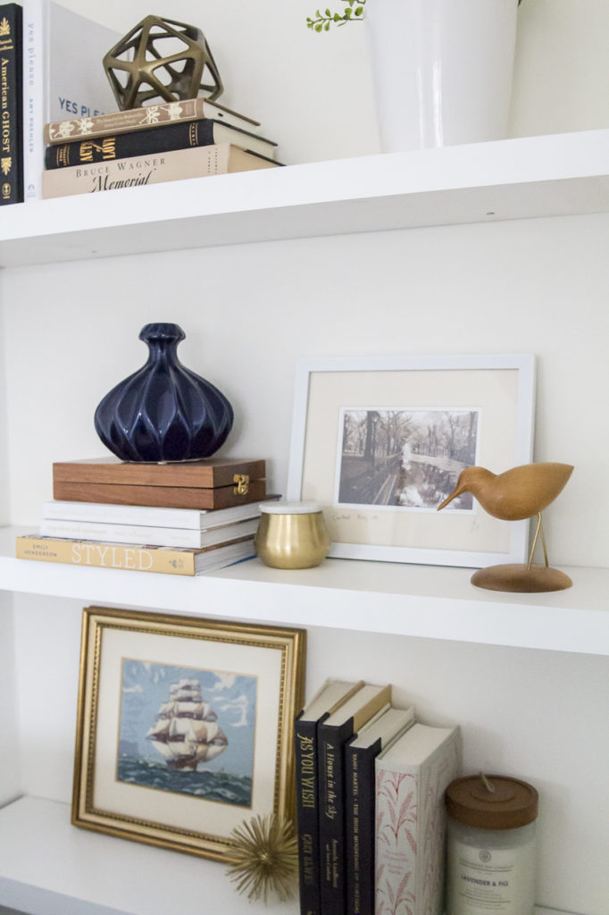
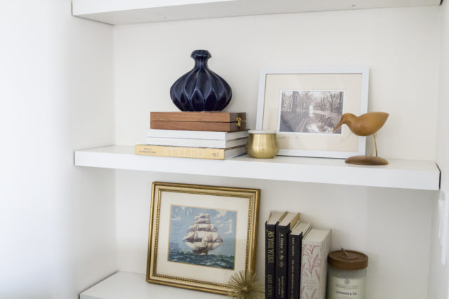
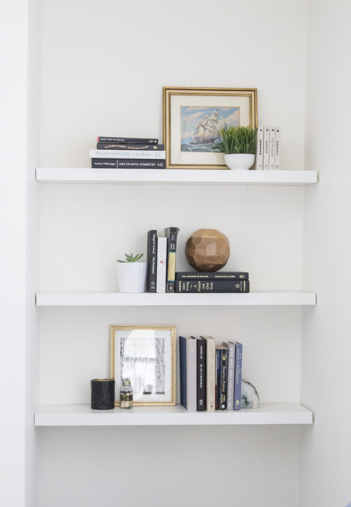
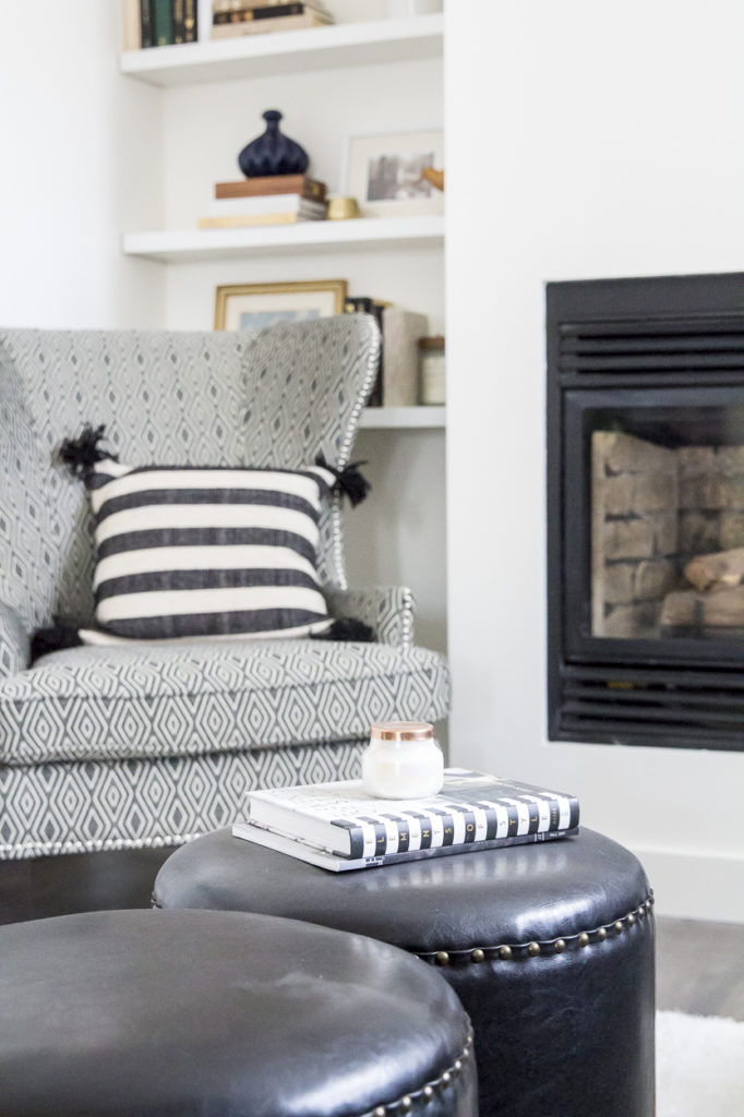
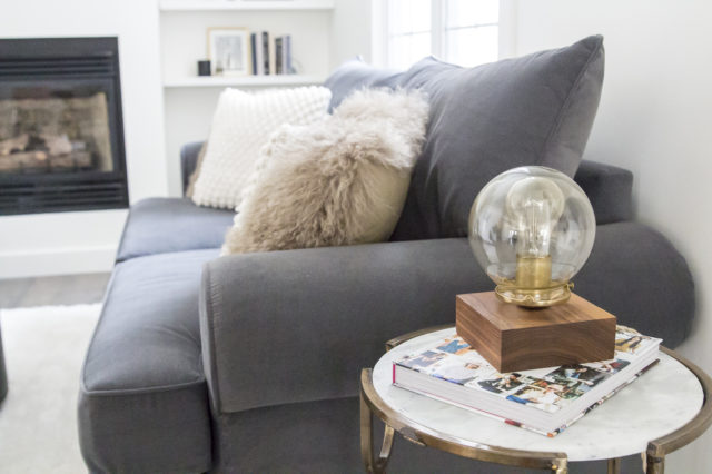
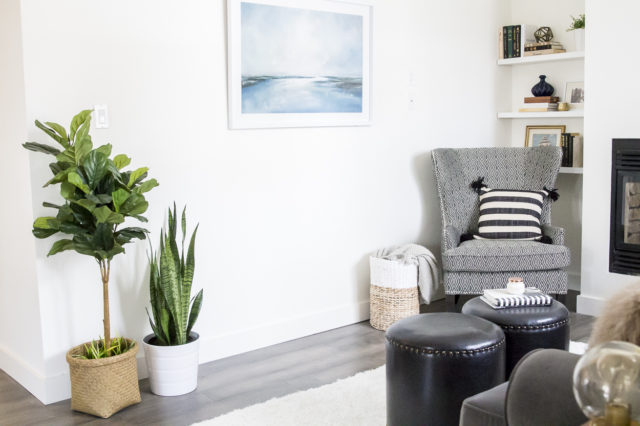
You may have noticed in the before post that the living room used to be to the left of the front entry. Once we revamped the layout, the living room felt awkward in that location, especially with a big fireplace to take into account. So we took the fireplace and relocated it to the opposite wall, creating a cozy living room area where the dining room once was. I wanted it to be clean and simple, so I decided to forgo tile on the facade, which gives it a somewhat Scandinavian feel. My favourite part, of course, is the open shelving since it’s here where you can inject some personality and life!
| Living Room After | 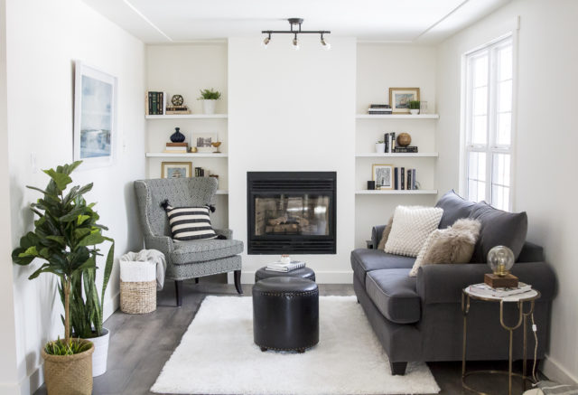
| Dining Room Before |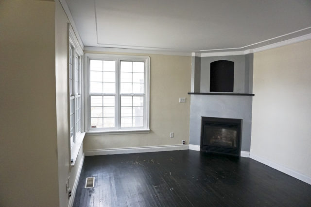
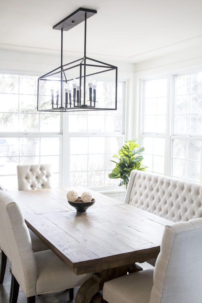
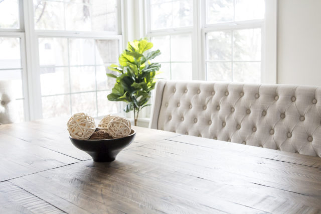
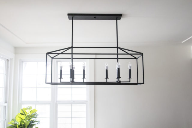
With the fireplace gone, the windows steal the show in this dining space, letting in so much beautiful light. I wanted the chandelier to tie into the front entry, so I chose one from the same line. It was important that it be big enough in scale to fill the space, yet open and airy so as not to impact sight lines. I think it works so well, especially in the matte black finish.
| Dining Room After |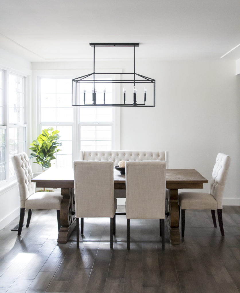
| Kitchen Before |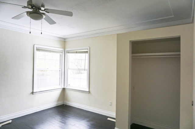
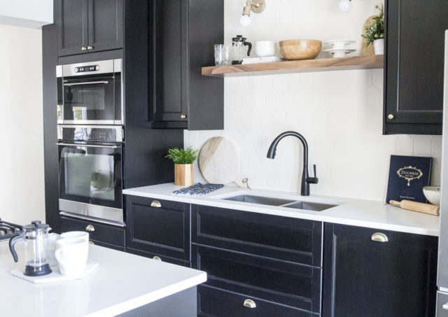
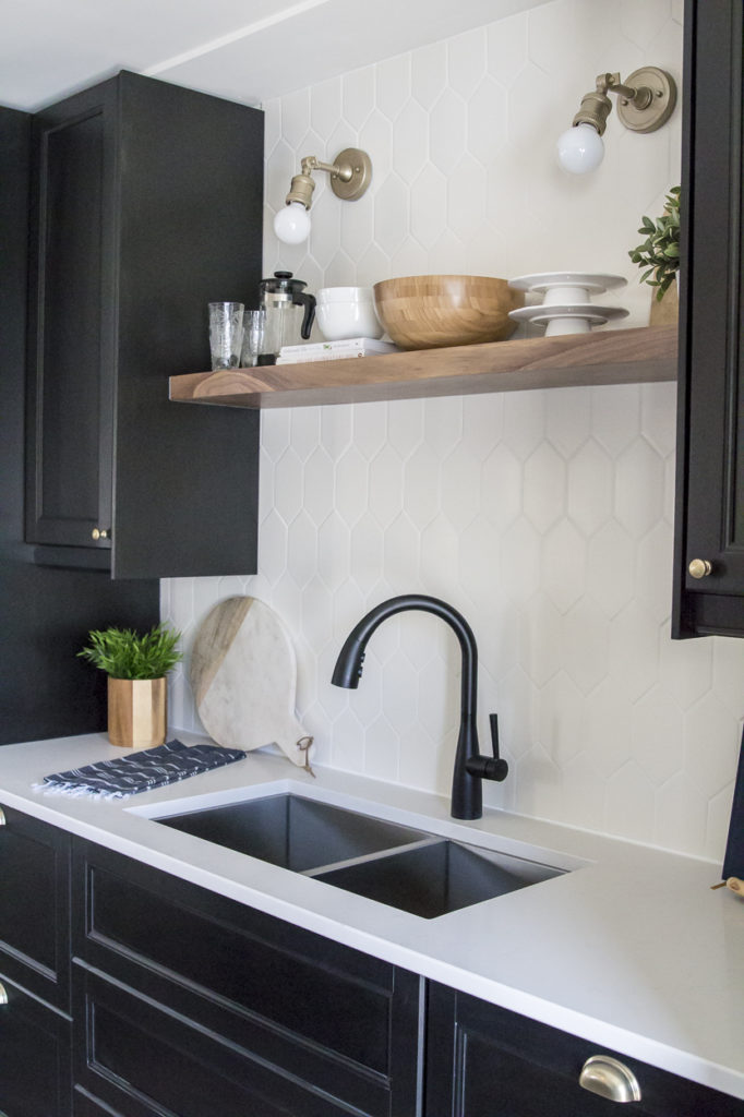
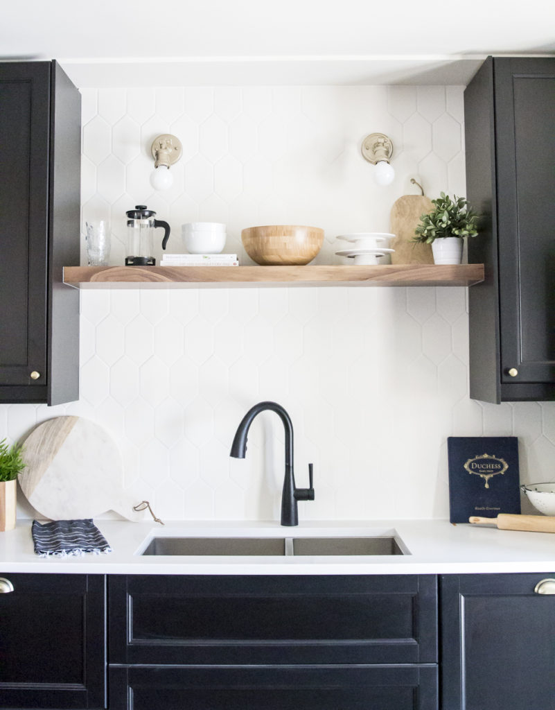
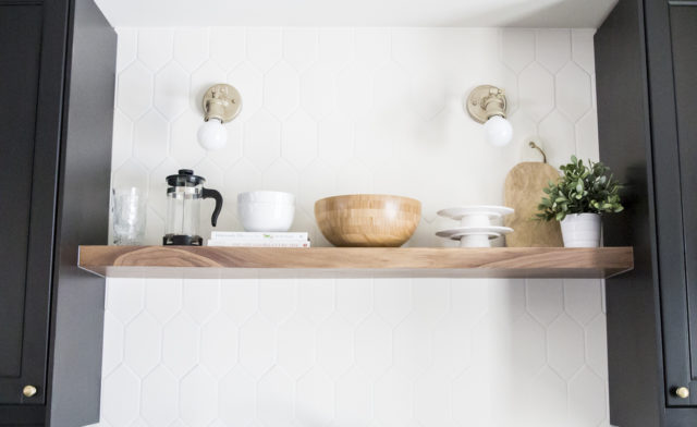
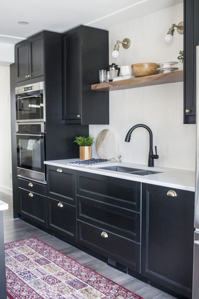
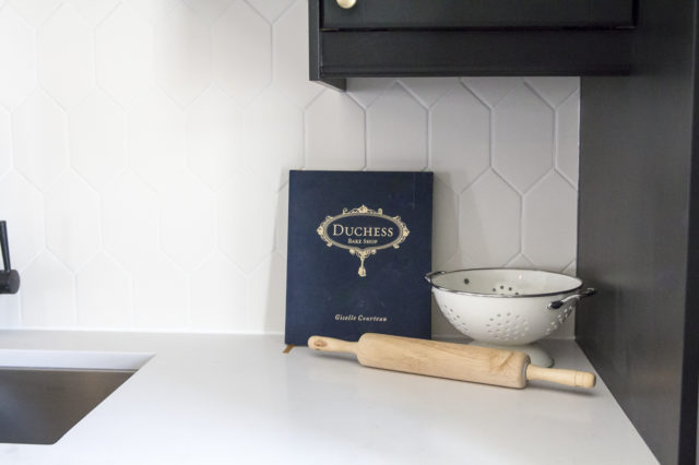
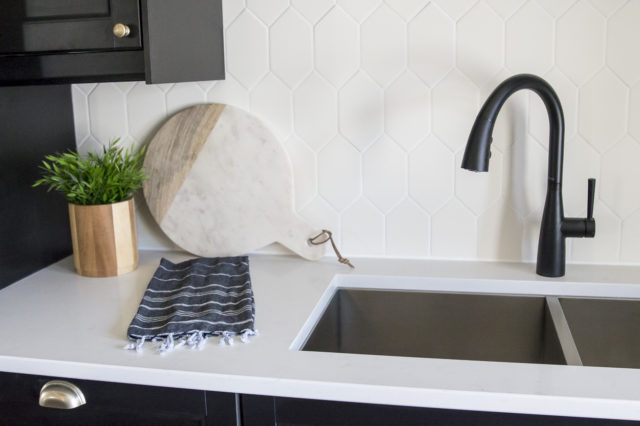
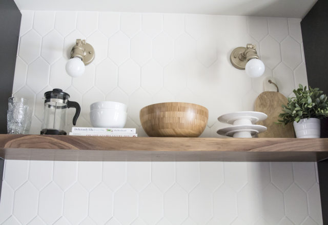
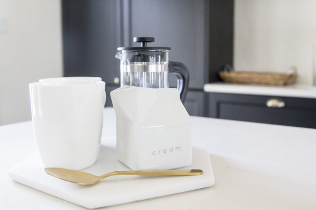
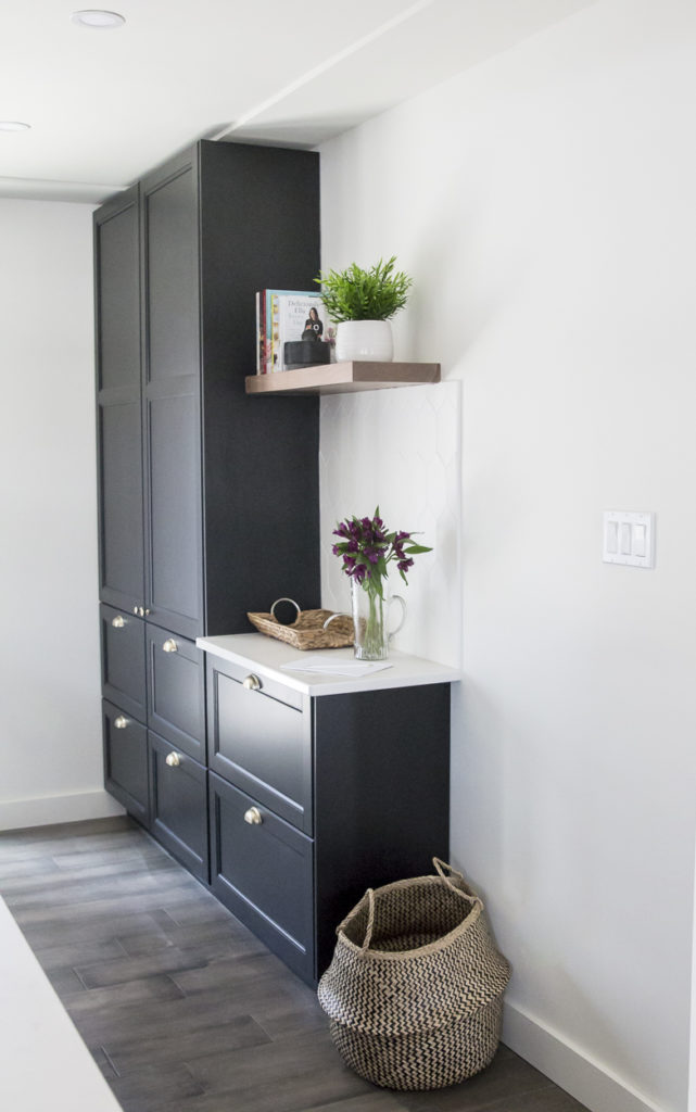
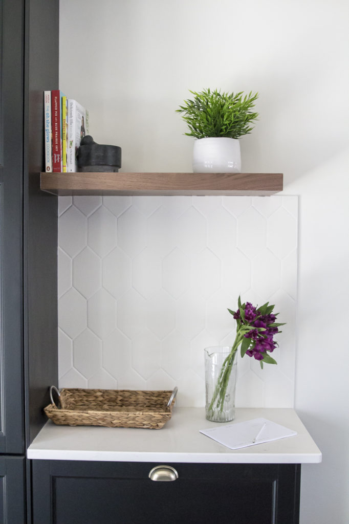
The biggest transformation by far was the relocation of the kitchen. You may remember from my previous posts that we took out the wall separating the existing living room from a bedroom, replacing it with a giant beam. This allowed us to create that open concept kitchen/dining space. The new kitchen is pretty dreamy and really functional. Since there was so much natural light coming in, I went dark on this one with black cabinets. Then we added quartz countertops, a fun geometric backsplash, walnut shelving and brass accents. This may be my favourite combo we’ve done yet!
| Kitchen After |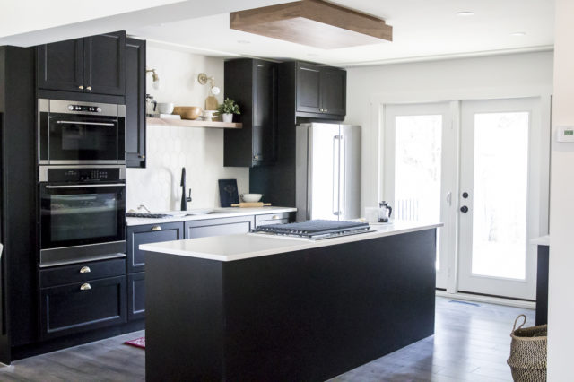
| Main Bath Before |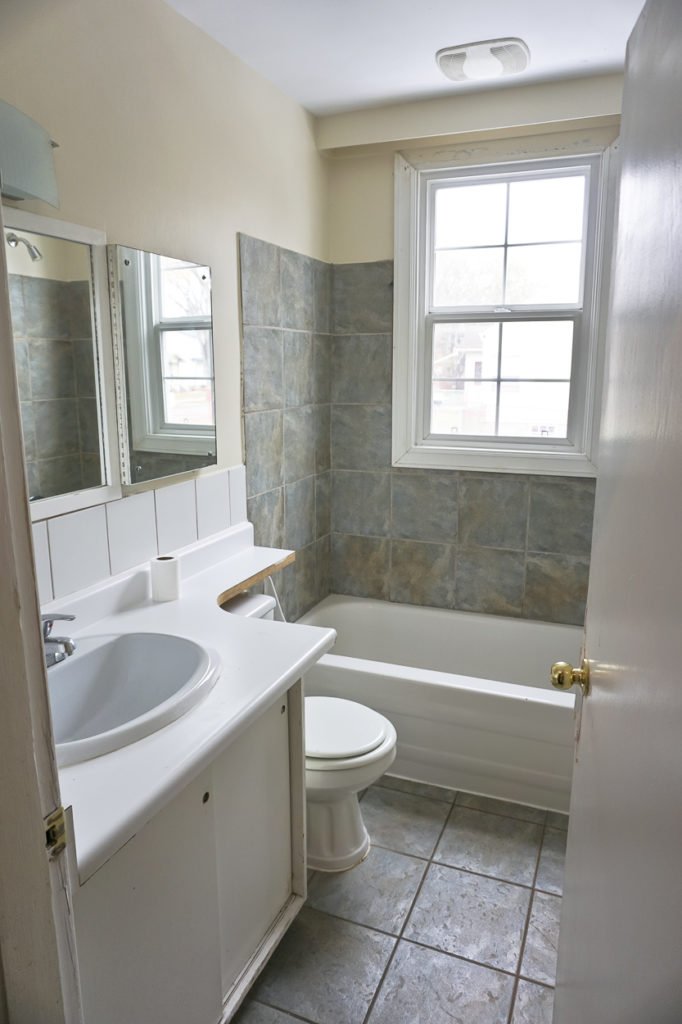
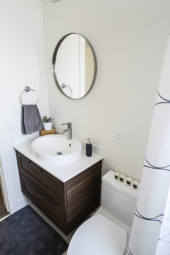
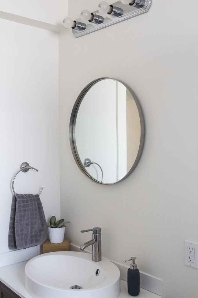
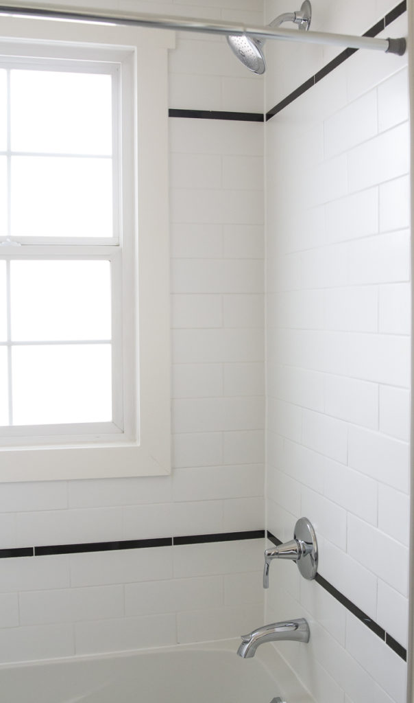
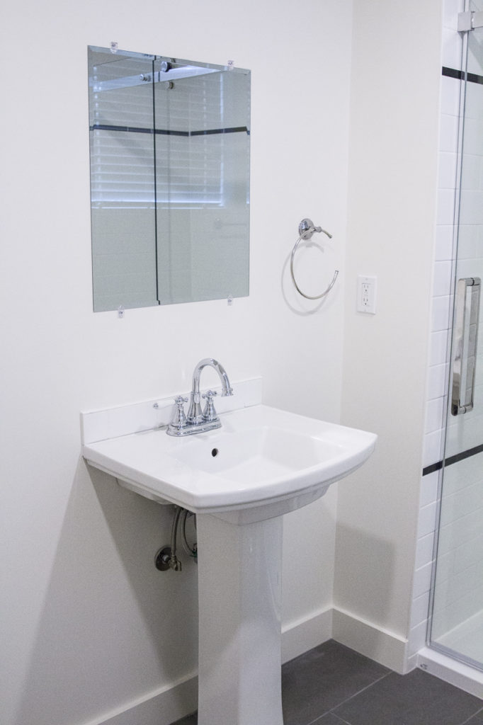
Before, this bathroom was drab and dated. We completely gutted it and ended up with a space that brings in elements from the kitchen – white tile, a touch of black detail in the shower and a warm wood vanity.
| Main Bath After |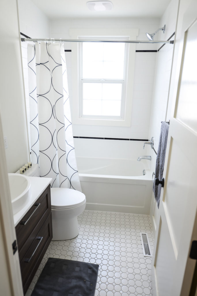
| Kitchen Area Before |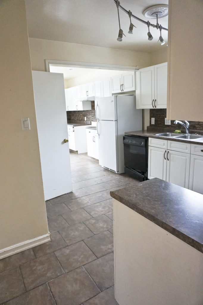
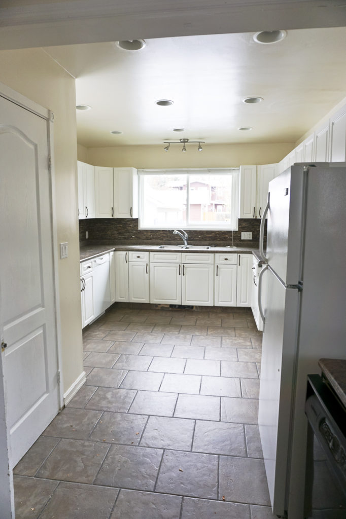
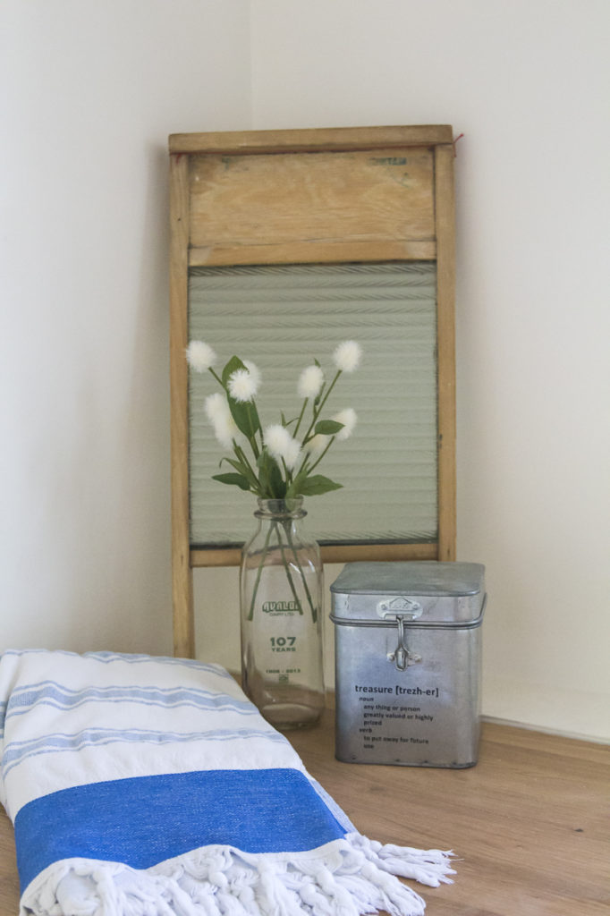
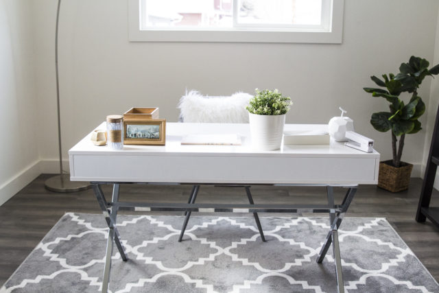
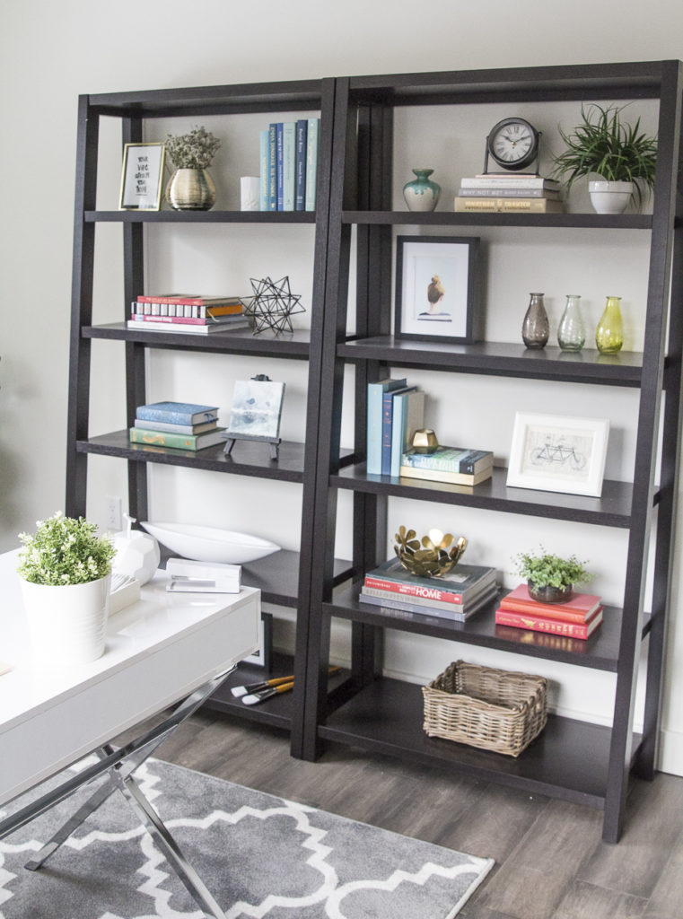
What was once the duel kitchens is now two new spaces: a laundry/mud room and a large bedroom, which we staged as an office.
| Laundry/Mud Room |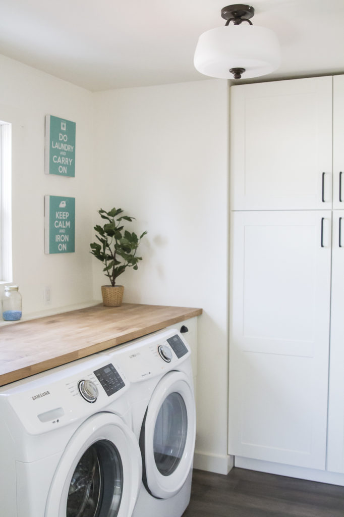
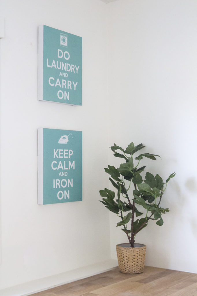
| Office |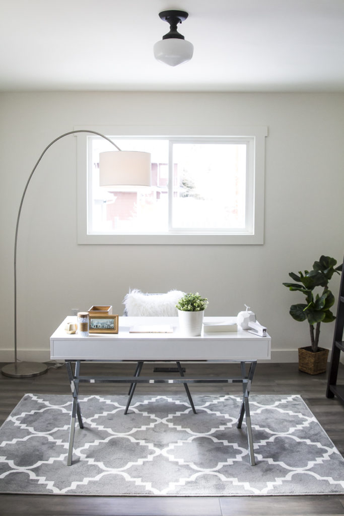
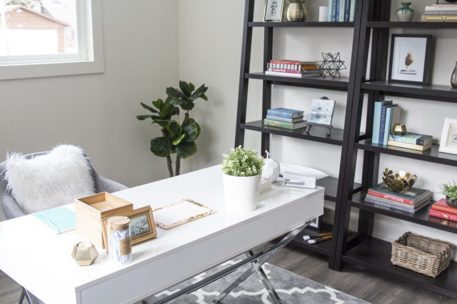
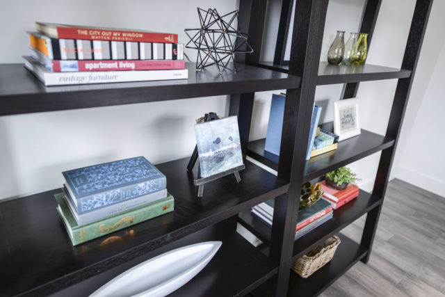
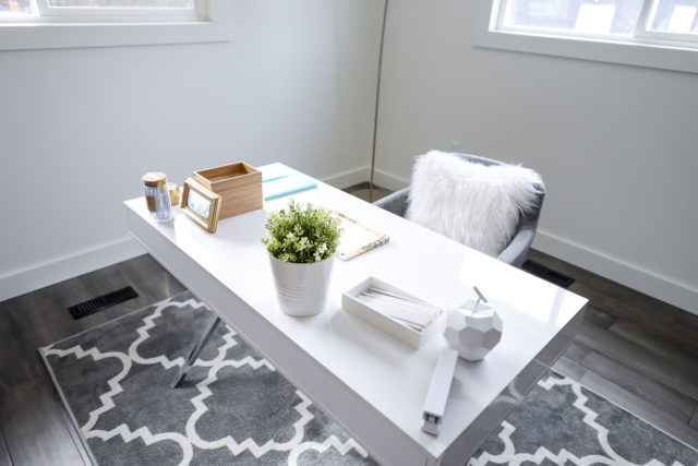
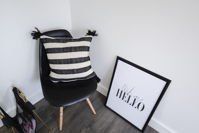
| Basement Before |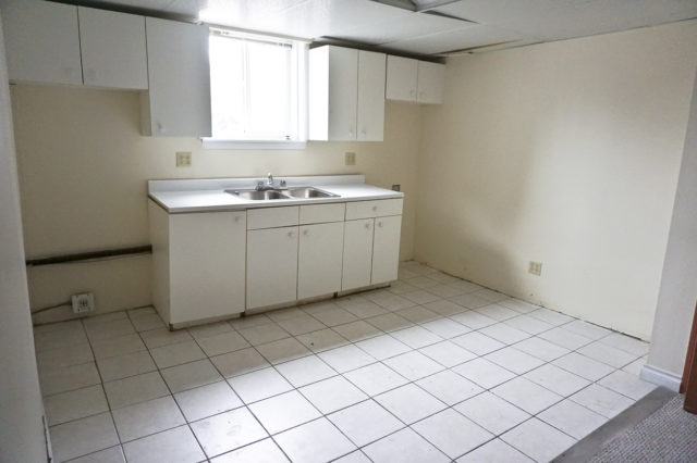
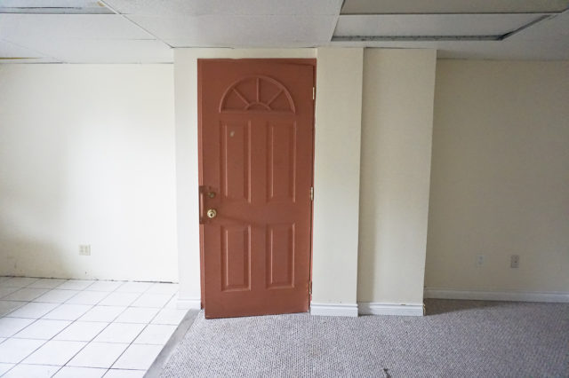
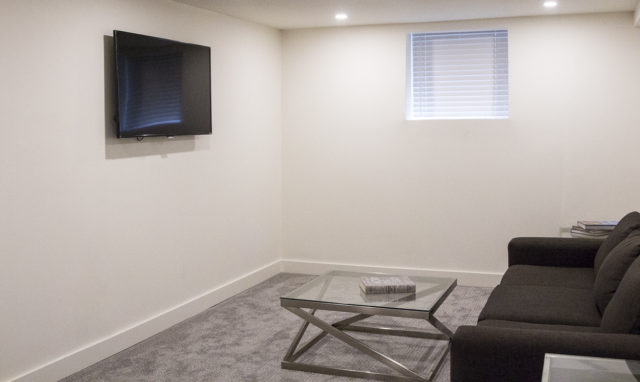
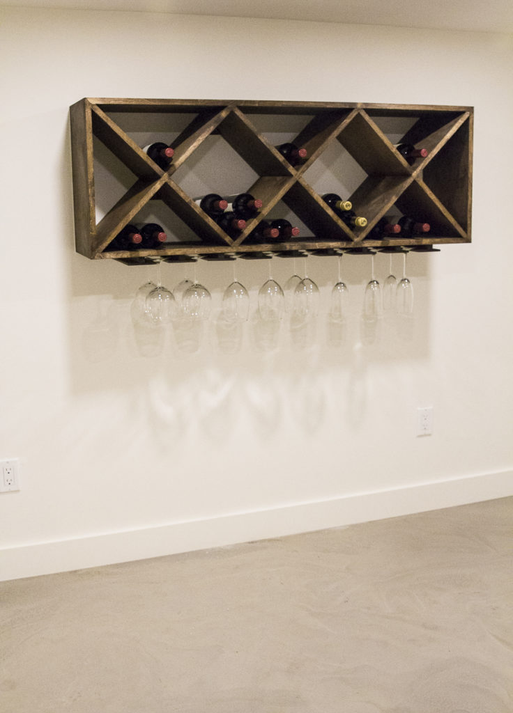
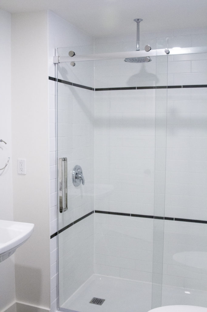
The basement was less than desirable at the start. It was dark and dingy, with a beat up looking kitchenette on one side. Yet again, we changed the layout considerably, adding a large bathroom, an airy living space and a fun wet bar. I’d definitely hang out here now.
| Basement After |
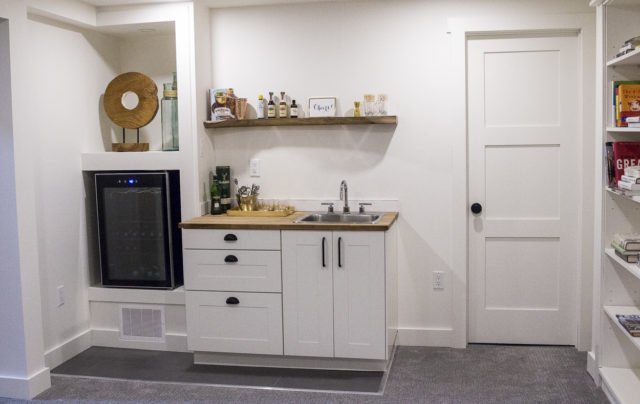
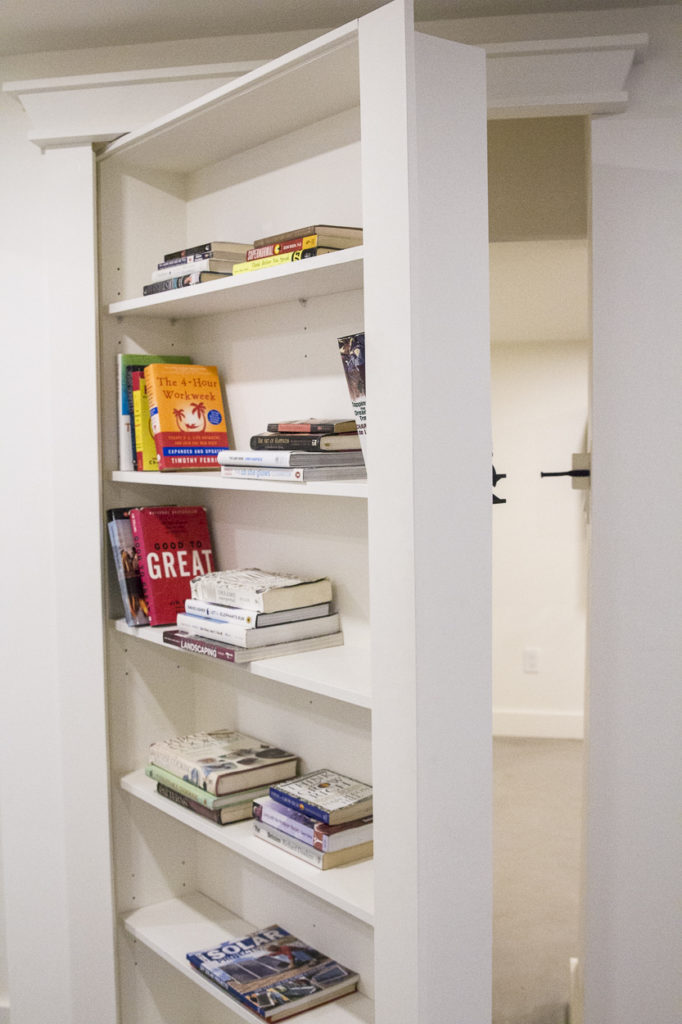
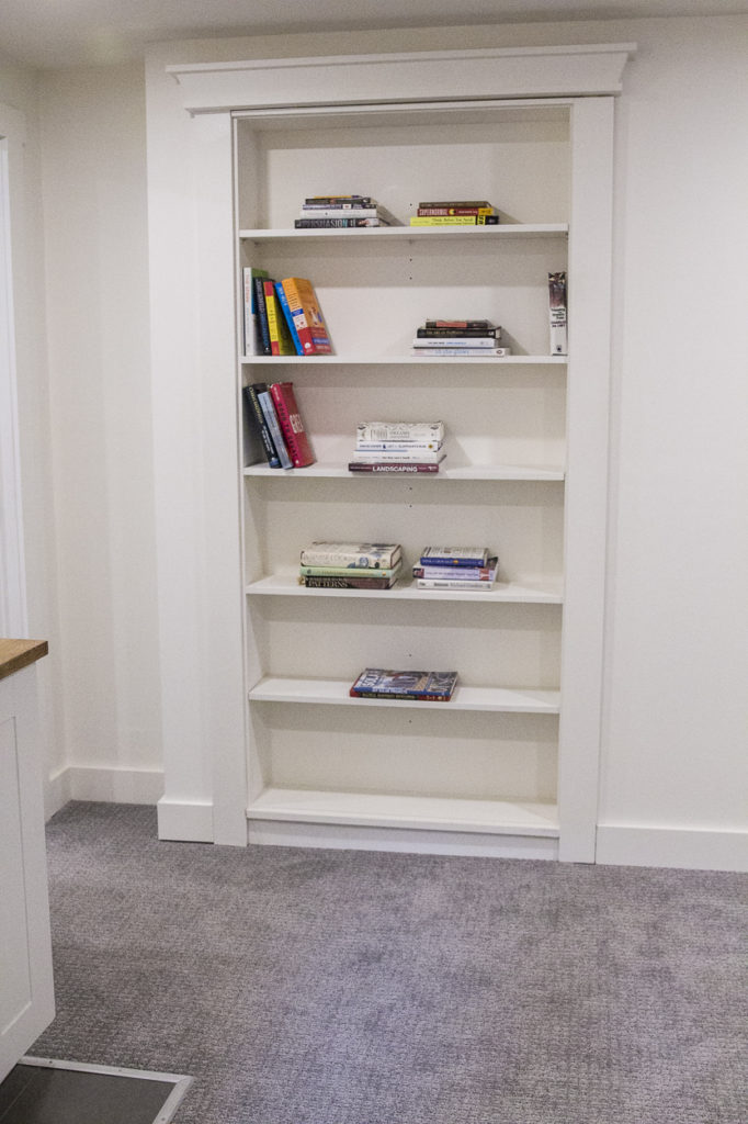 We also added a little surprise behind this massive bookcase – the brain child of Dave and one of our awesome workers. If you locate the correct book, it swings open to reveal a small hideaway, perfect for storing all those bottles of wine 😉
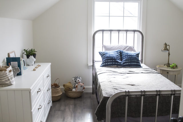
| Upstairs Bedroom – Kids Space! |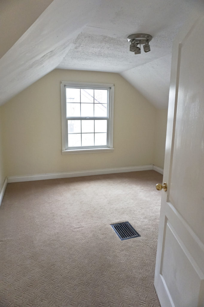
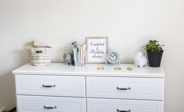
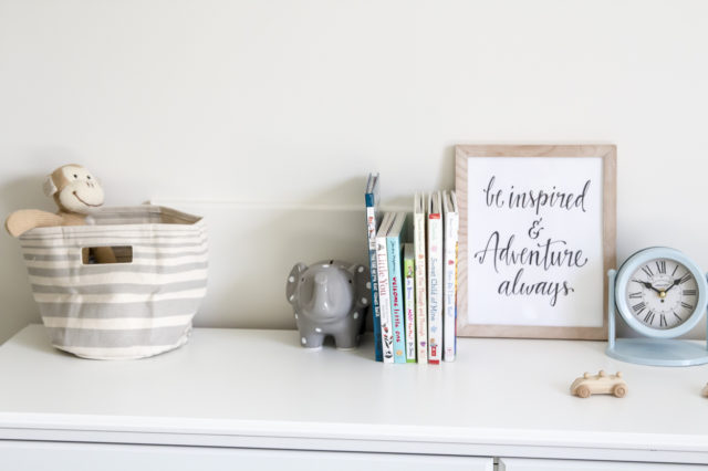
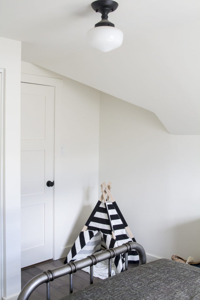
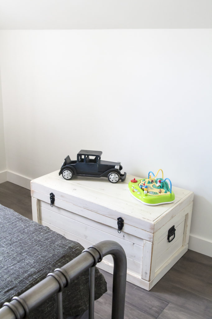
The upstairs of the Grand Glenora had 3 bedrooms that all saw some change. This one in particular transformed into a pretty great kids space!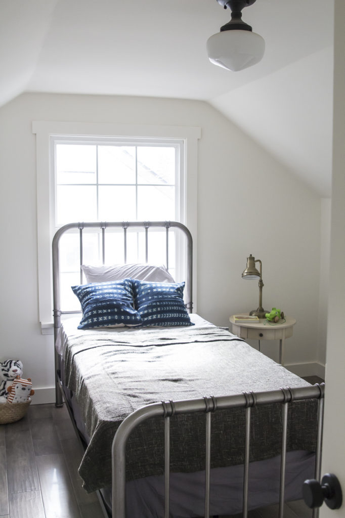

| Master Bedroom Before |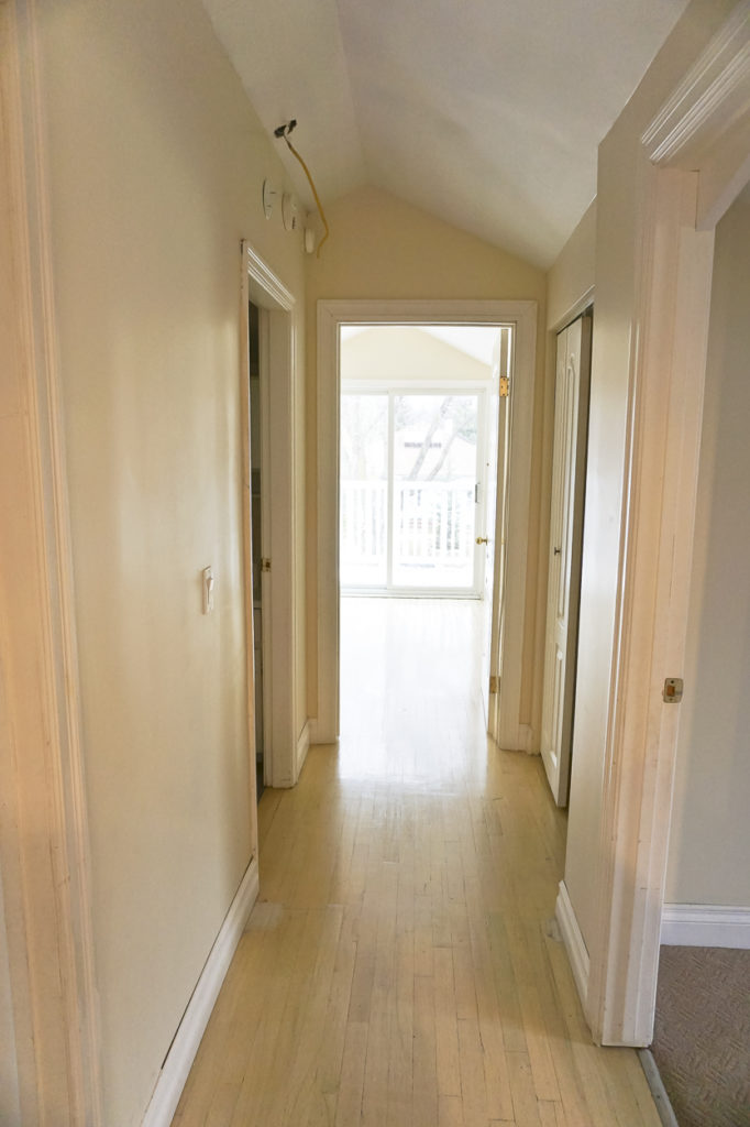
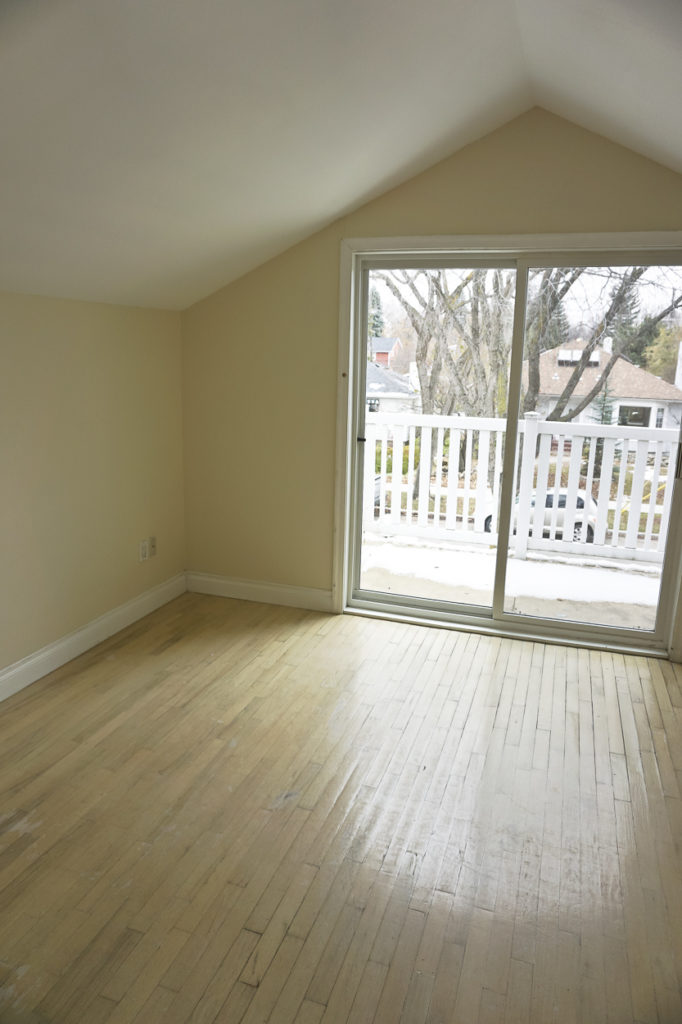
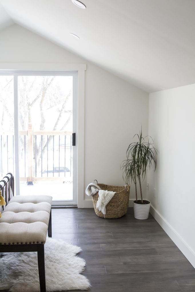
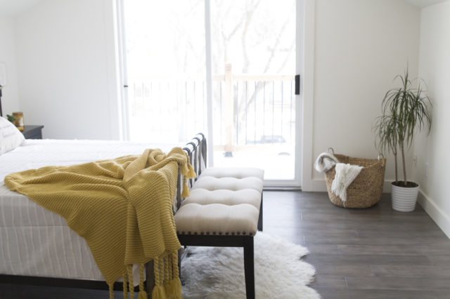
The master bedroom had a few things going for it from the start: decent square footage, a gorgeous roof line and a sweet balcony. All we did was change the location of the closet so it flowed a little better, leaving us the perfect spot for a reading nook. New hardwood floors, a coat of white paint and some killer staging and this is one dreamy bedroom. I’m usually not one for colour but the pop of mustard yellow works so well in this space, reminding me that spring is on its way!
| Master Bedroom After |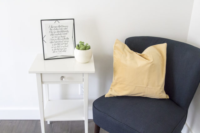
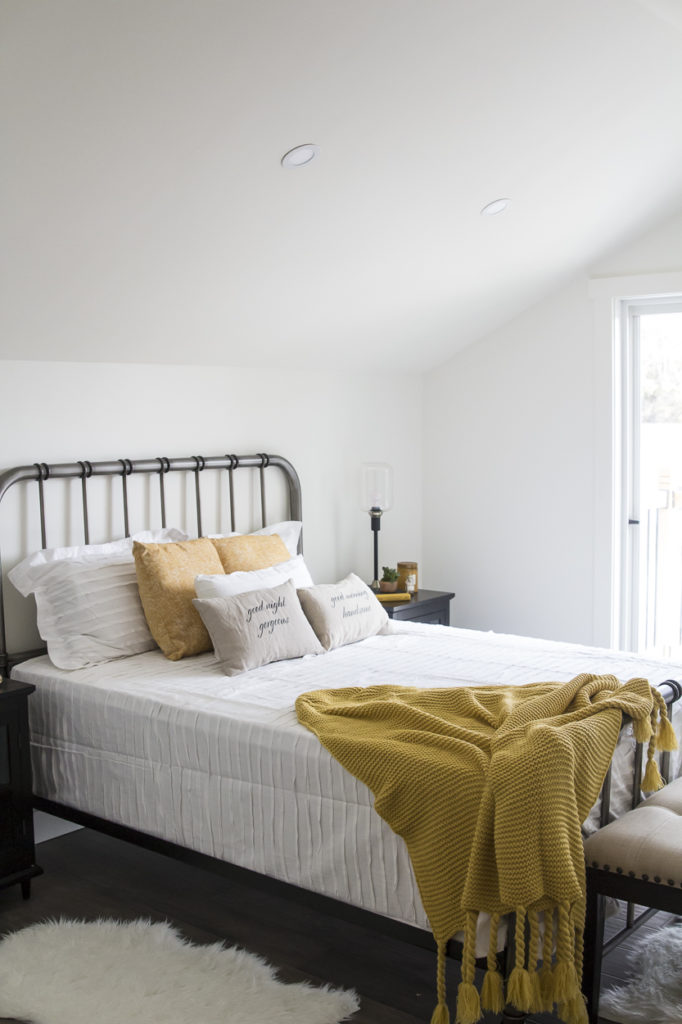
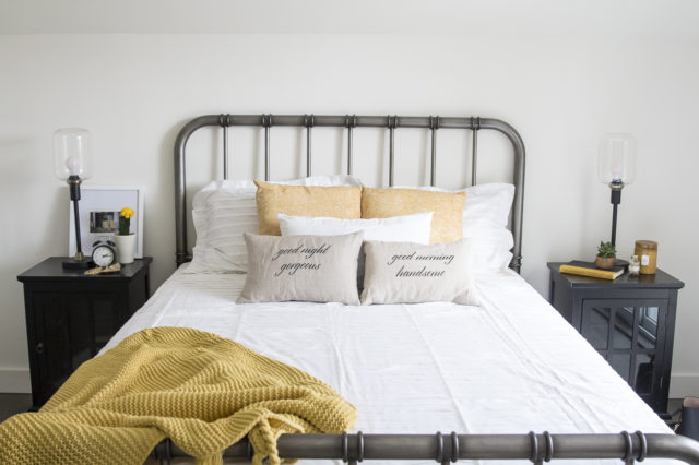
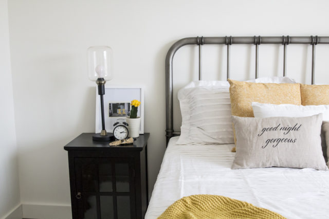
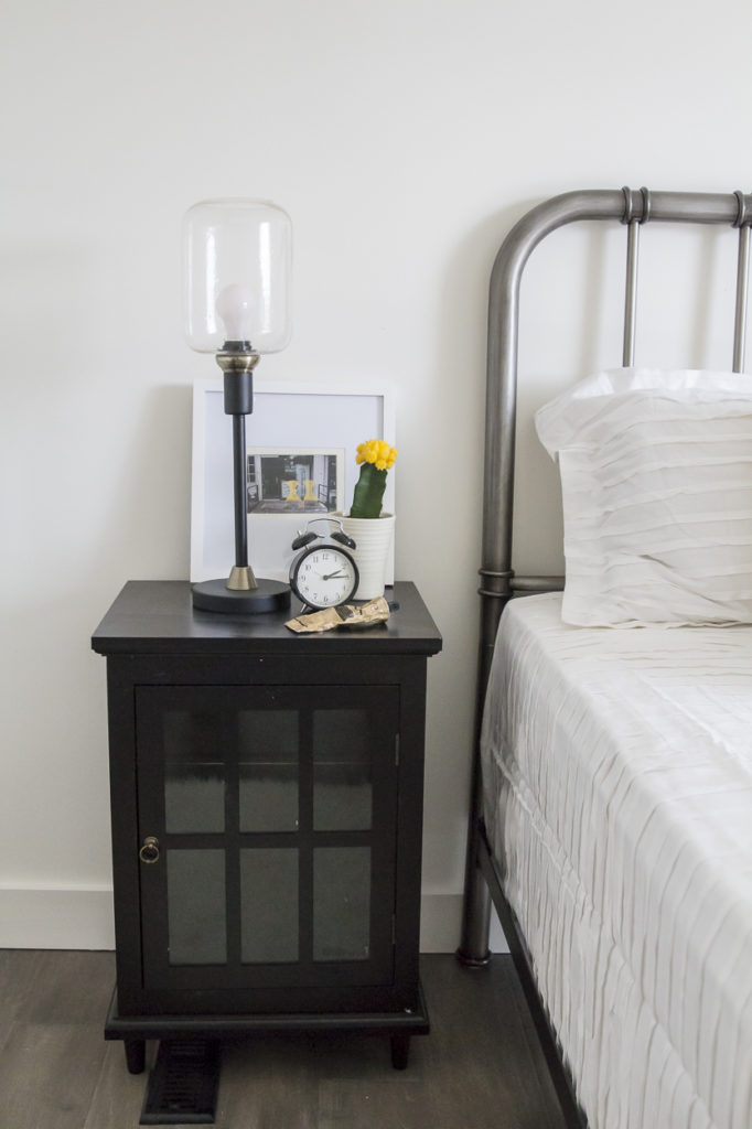
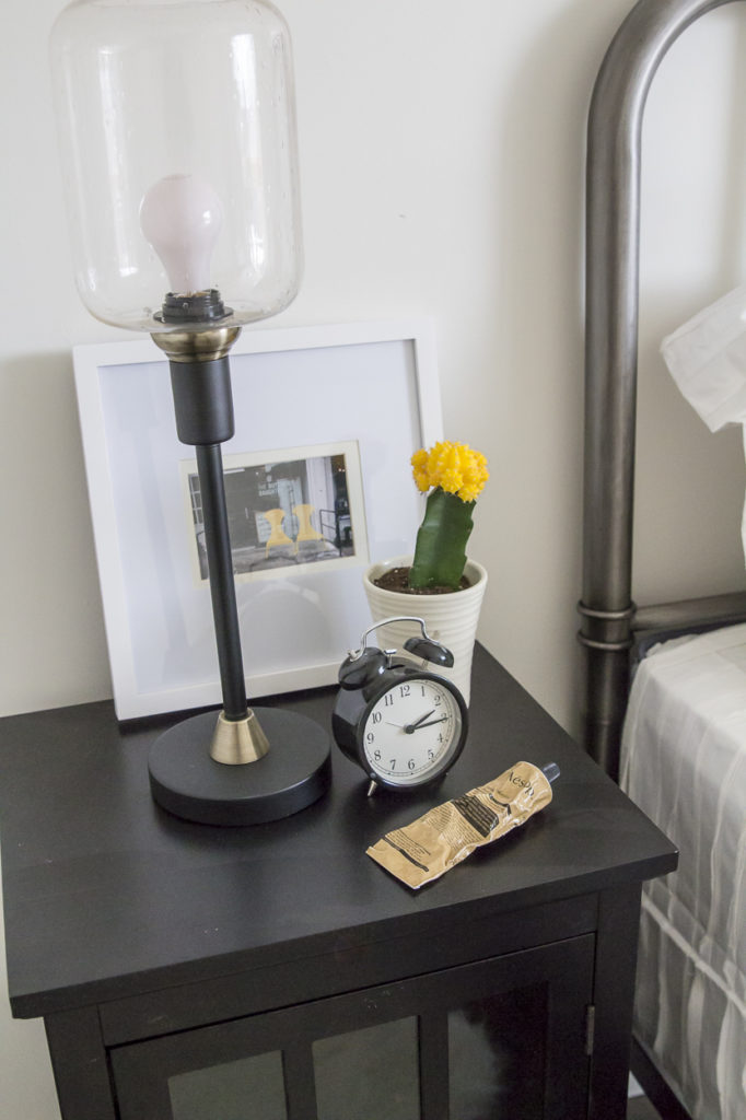
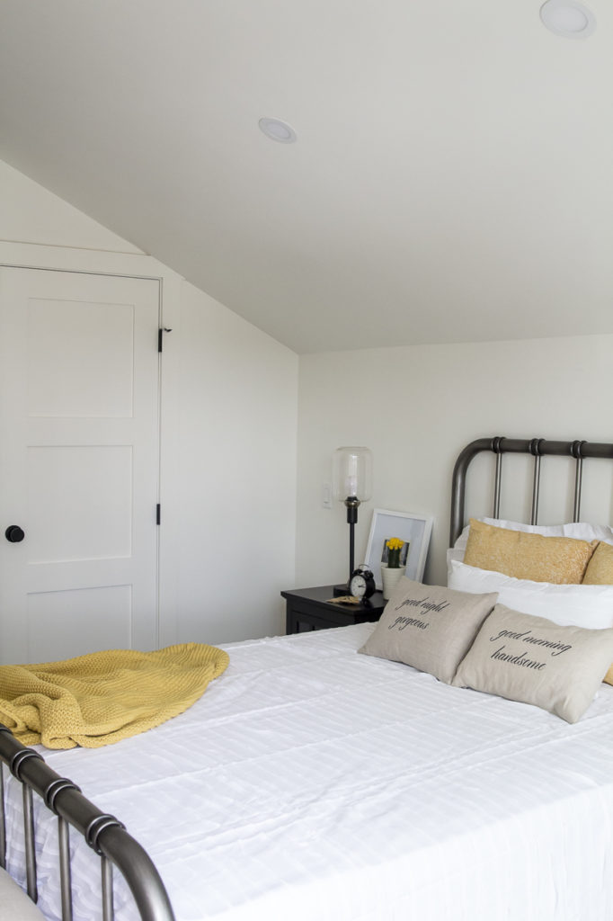
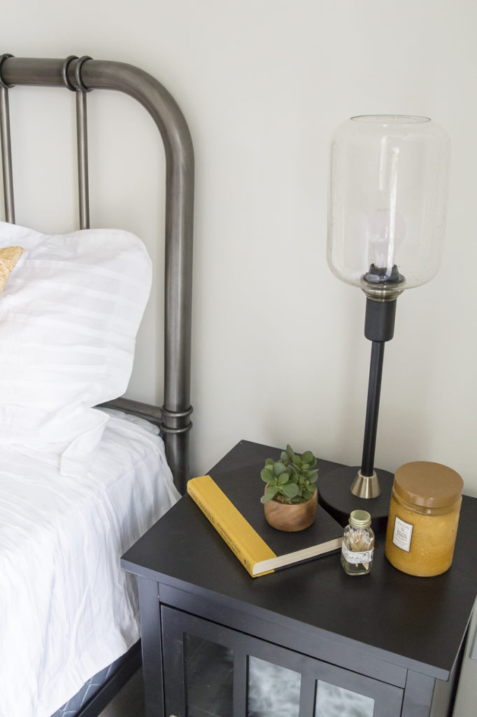
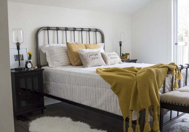
| Master Bathroom Before |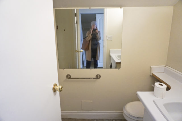
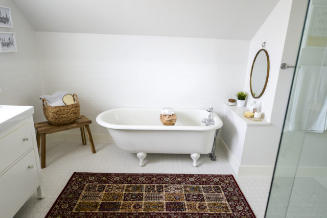
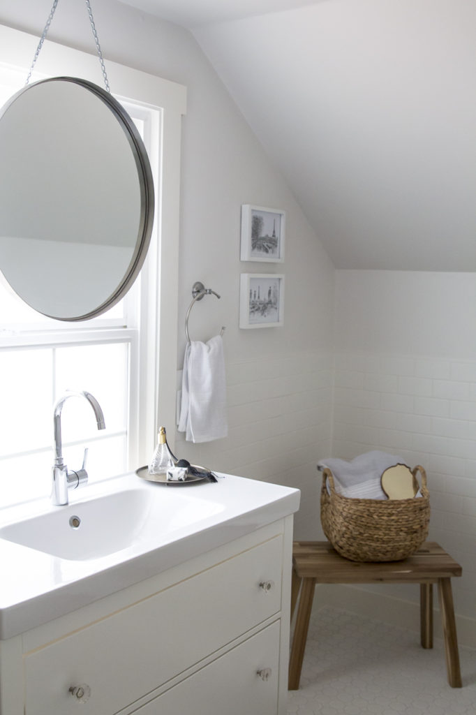
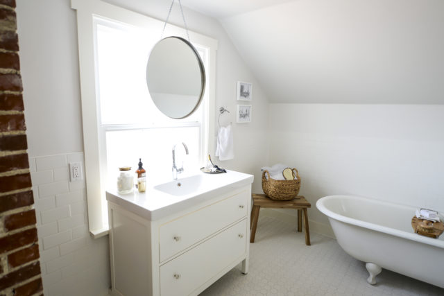
Master bathroom may not be the best name to use to describe this space. It was such a small, dark room that smelled so horrible, I can’t even imagine someone using it in its condition (I barely walked in). We decided to gut it completely (goodbye gnarly smell!) and allocate the space to the master closet. Then we turned the third bedroom into a large, no massive (!!), master bathroom. Planning this layout was tricky with the angled roof lines, but after putting all our heads together, we think it came out pretty perfect.
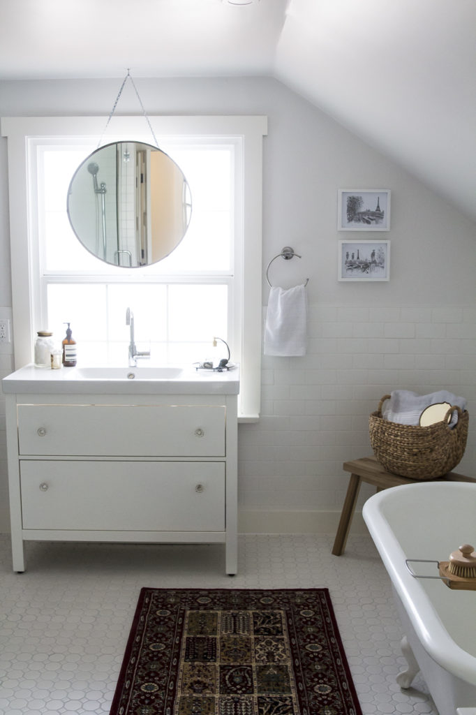
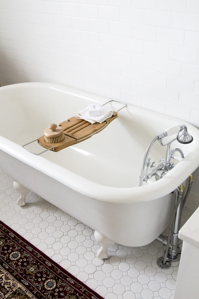
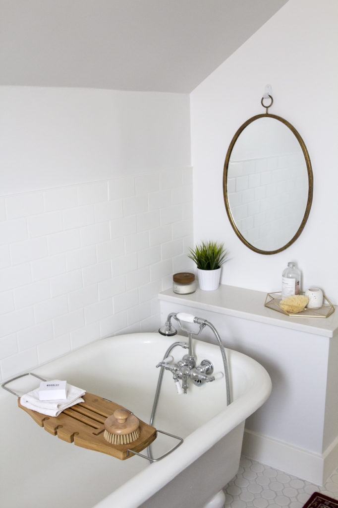
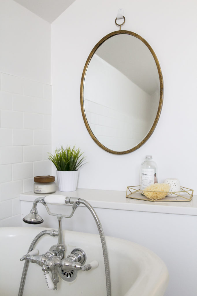
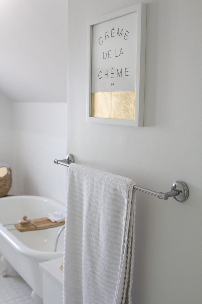
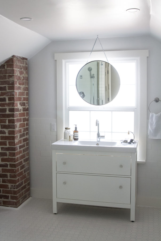
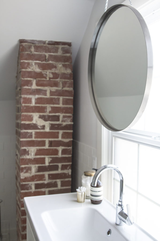
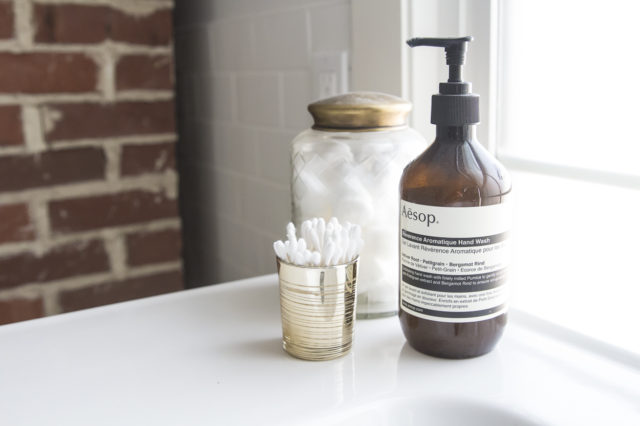
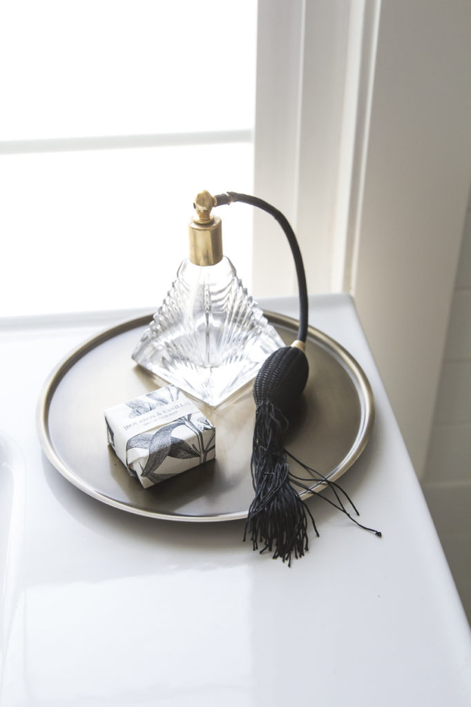
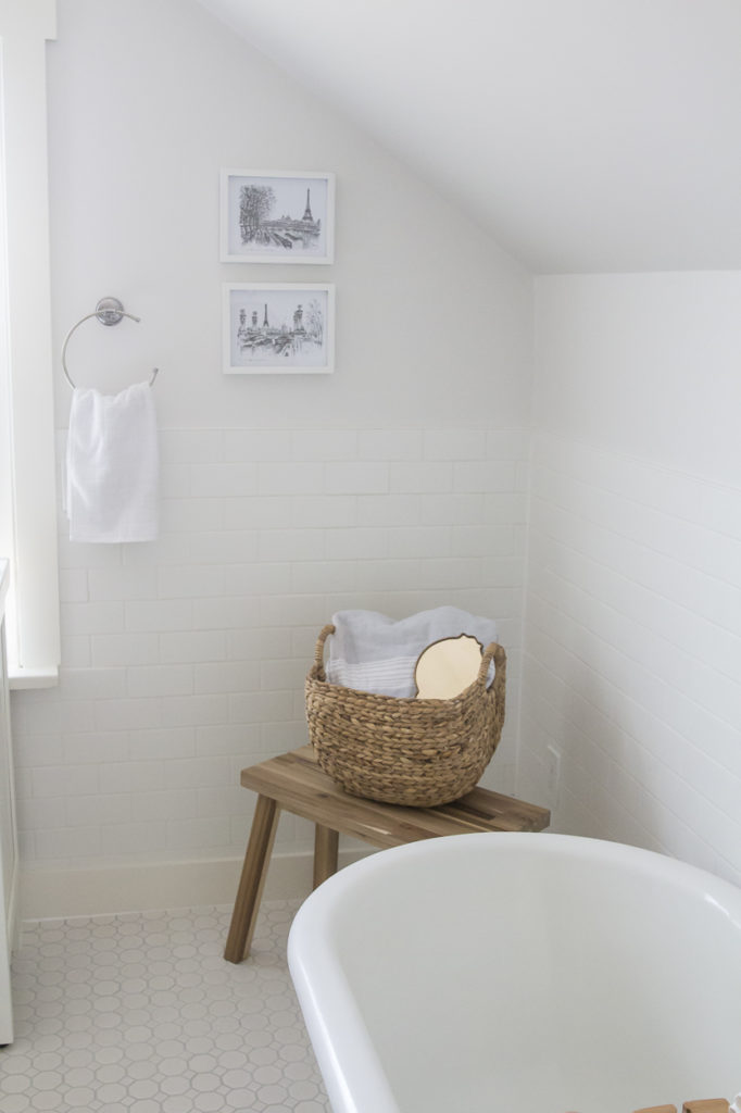
The bathroom is light and bright with loads of white subway tile. I wanted it to have a traditional feel so we went with the smaller hexagon tile on the floor, a repurposed vintage clawfoot tub and clean vanity. Exposing the brick chimney was my favourite addition since it brings in that old charm and a bit of texture. And can you believe the size of this shower too?!
| Master Bath After |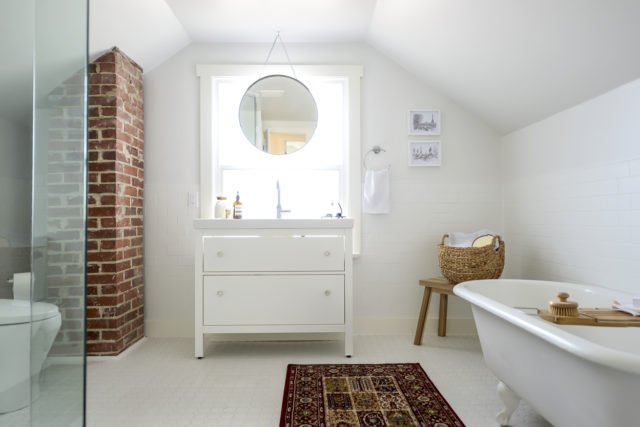
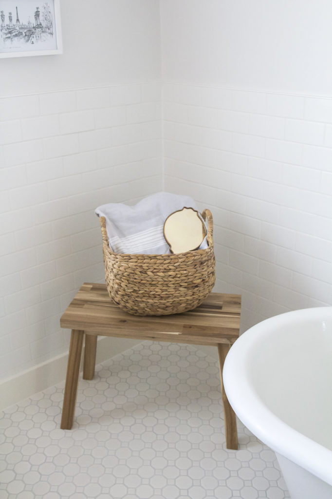
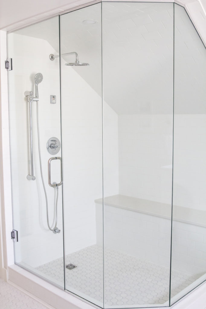
And that concludes my before and after tour of the Grand Glenora. It’s a bit bittersweet since we all love this property so much. From the beginning it was a labour of love and amazing collaboration between our whole Revive Developments team, which included our friend Dave of Plaid Contracting. And, there is no way I could have staged this home (with a newborn PS) without the help of my dear friend and partner in crime, Diana from 204 Park. She teamed up with me to finish this house and it really goes to show that two heads are better than one…especially when that head is attached to Diana’s body 🙂 You’ll be seeing more of the Grand Glenora over on her site shortly – she is going to be talking about the importance in staging a home and how we went about staging Glenora together.
In the near future, Diana and I will be sharing a new project we’ve been working on together that’s REALLY exciting. So stay tuned to see what we are cooking up (it’s good – trust me!!).
Thanks again for sharing in yet another flip! Let me know what you think in the comments below!! XO
Missed the previous posts?! Check out Grand Glenora’s transformation process here, here, here, and here
WOW!!!! It’s absolutely stunning!! Beautiful work!
Thank you so much!
It looks amazing!! What a great job you guys did! So proud of you! XO
Thank you my dear! XO
the transformation is just amazing!!!
Thanks Janna!
So pretty 🙂
Thank you! 🙂
What a beautiful home! You guys did such an amazing job! I wish I could buy it 🙂
I know, me too lol!
It looks like an entirely different home, well done! I especially love that light fixture in the dining room.
Thanks Sarah! Yeah it pretty much is an entirely different home!
Hey Kristina! This property is absolutely stunning. I love it! What height are the ceilings on the main floor?
Thank you so much! I’ll have to ask my husband…I think they are 8 foot though.
Thanks Kristina! I was thinking they looked like they were 8′ but the entry ceiling looked like it was maybe a bit higher. I absolutely love the design of this space! My husband and I are likely going to build within the next year or so and I’m finding so much design inspo on your blog. Love, love, love.
That’s so great to hear! I love that you can find some great inspiration here! Also, the foyer is sunken down so that’s probably why they look much higher 😉
Oh okay, that makes sense. So, in the kitchen and dining room they must be 8′! I also love the dining room and foyer fixtures! Where did you get those from?! If you don’t mind me asking!
Kristina, this looks awesome, wondering if you could share where the kitchen backsplash is from? Exactly what we are looking for and running into some issues! Thanks!
Thank you so much! We sourced it locally at River City Tile. It’s just a white porcelain tile…in an elongated hexagon I guess!