Last week, I posted my plan for the nursery, which was super exciting for me! Today, I wanted to continue on that topic and discuss my ideas for creating a nursery gallery wall. A lot of people have tackled gorgeous gallery walls in their spaces and my plan isn’t necessarily unique from the hundreds of Pinterest photos already in existence. But I do have some ideas, as well as some tips for making sure it’s warm, personal, and balanced instead of feeling too cluttered or mismatched like some gallery walls do. Not to mention, some tips for keeping it safe for baby.
Safety First: Most people tend to place their gallery wall above the change table/dresser. As soon as that baby gets a little more mobile, they are sure to reach the frames above. So, it’s obviously important that everything is not only hung properly but reinforced to the wall so no little fingers or feet can knock a hard object off. Or better yet, think of placing softer objects on the lower half of the wall. I am planning to place some of baby’s hats here so he can pull them off and play with them if needed.
Textures Are Important: This isn’t a regular gallery wall after all. The hats are just one example of how you can add a little softness or whimsy into the grouping. Think also a fabric pennant, a woven animal head or a wood banner to add some variety in texture.
Go 3D: A nursery gallery wall is the perfect place to have a bit of fun AND add some dimension, like adding those faux animal heads for instance. I love a grouping that has some unsuspecting element and strays from the typical frame next to another frame. And it adds more interest for the baby – something for him to focus on while that bum’s being changed 🙂
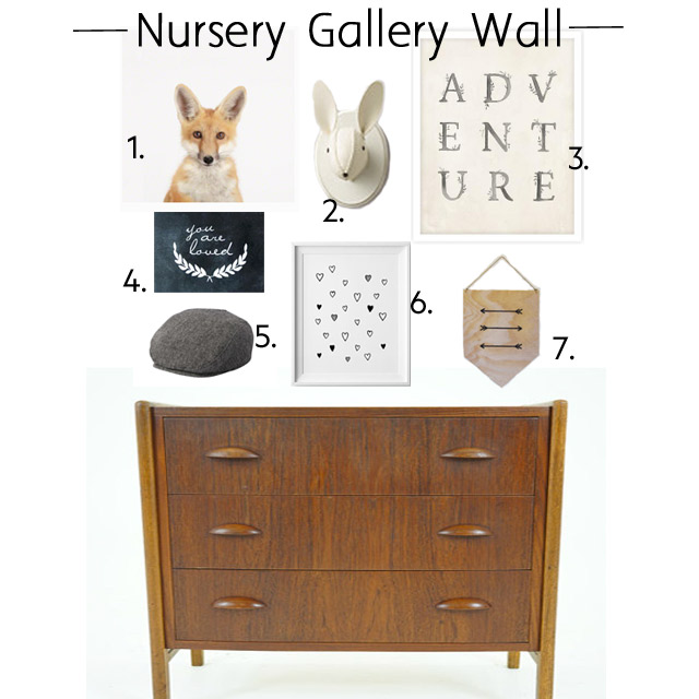
Create Balance: Just like a normal gallery wall, nothing is worse than having too many colours or patterns that fight for attention. You want to achieve a nice harmony, so try to choose 1-2 dominant colours and then have them balanced throughout the gallery with neutrals. Maybe a black frame is balanced by another piece of art that has black in it…if your animal head is white, then you have one white frame as well…there’s a wood banner and some brown in one of the hats on the wall…etc. Check out my example here:

1 // 2 // 3 // 4 // 5 // 6 // 7 // Dresser
Since my dresser is teak, I have it balanced with a wood arrow banner and more than likely I’d make one of the frames a soft wood as well. My fox print pulls in some of the orange tones and then I’ve got some lovely creams and whites in my wool animal head and prints. The You Are Loved sign is actually a decal, which adds a different depth and some variety in terms of shape too. A little bit of black grounds the gallery wall. And, of course, I have a soft hat or two ready to add to the grouping, right above the change table.
Comments are closed.