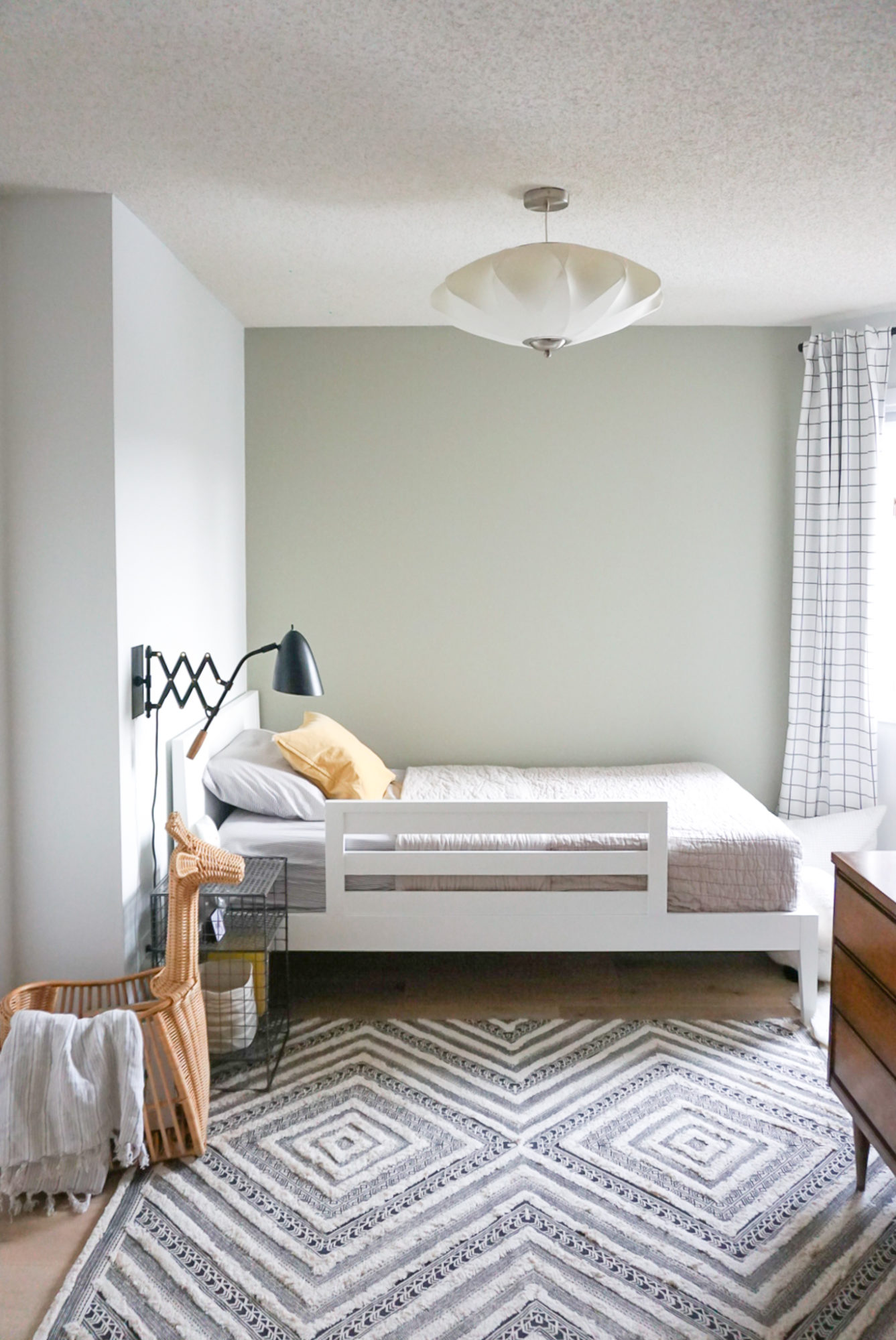
One of the ways I have tried to maintain some normalcy and generate some positivity during this crazy time is to focus on our home and decor projects. They may not be earth shattering before and after reveals, but just adding in a few small, fun projects has been good for this restless, creative spirit of mine. And my focus, even before we got shut in, was always to breathe some new life into Jack’s big kid bedroom.
I loved designing his nursery over 3 years ago (see that original post here). It was my first crack at a space for a little one and it brought me so much joy. Then it slowly shifted as we transitioned him out of the crib (which moved over into his sister’s bedroom) and into a big bed. Not much changed in the room besides the bed and it was never quite right for the space. The mattress didn’t quite fit the weirdly sized frame and we were constantly fighting with a removable bed rail that slipped around. It wasn’t ideal. Here’s the state the room was in only a few short weeks ago…
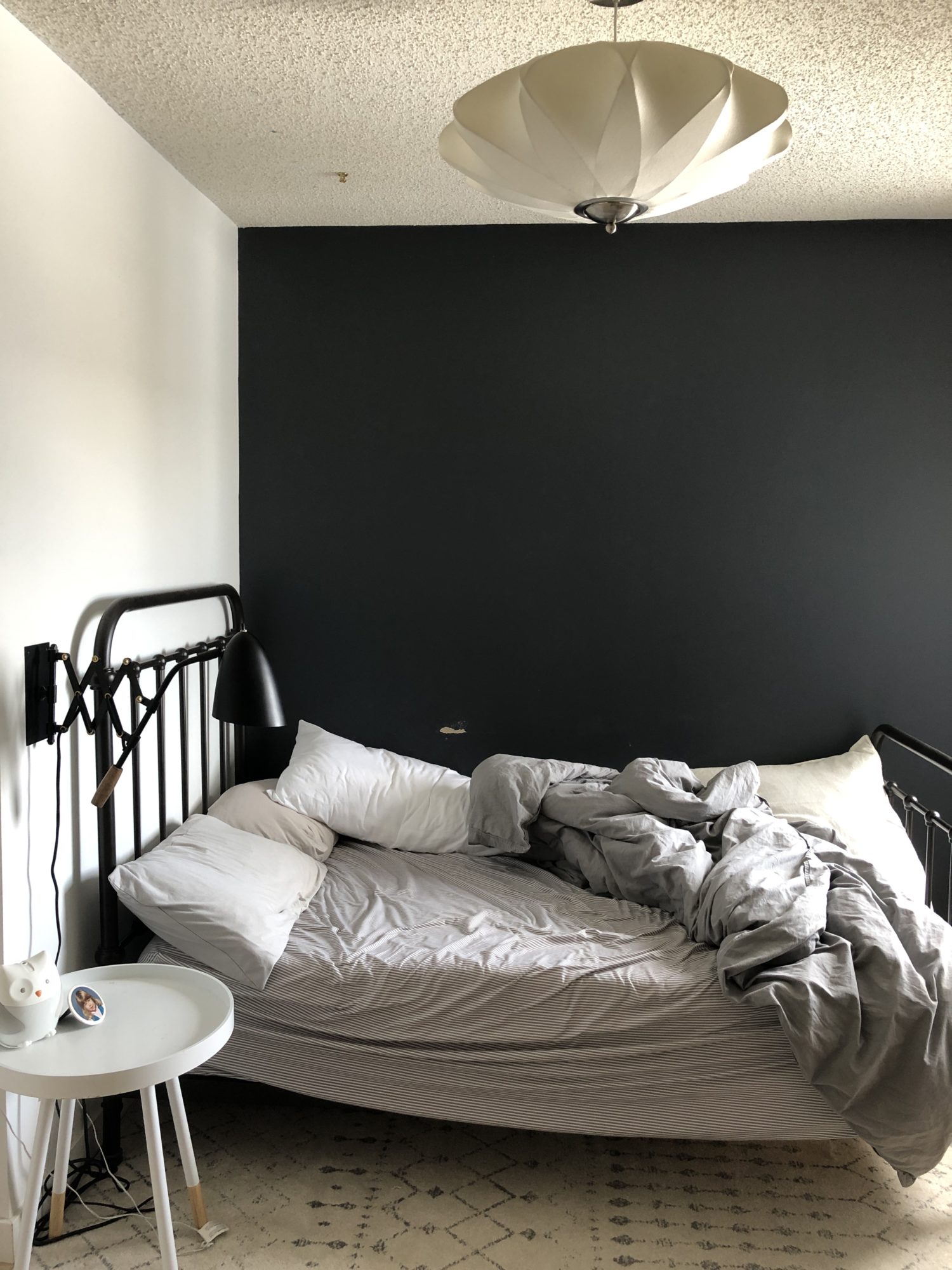
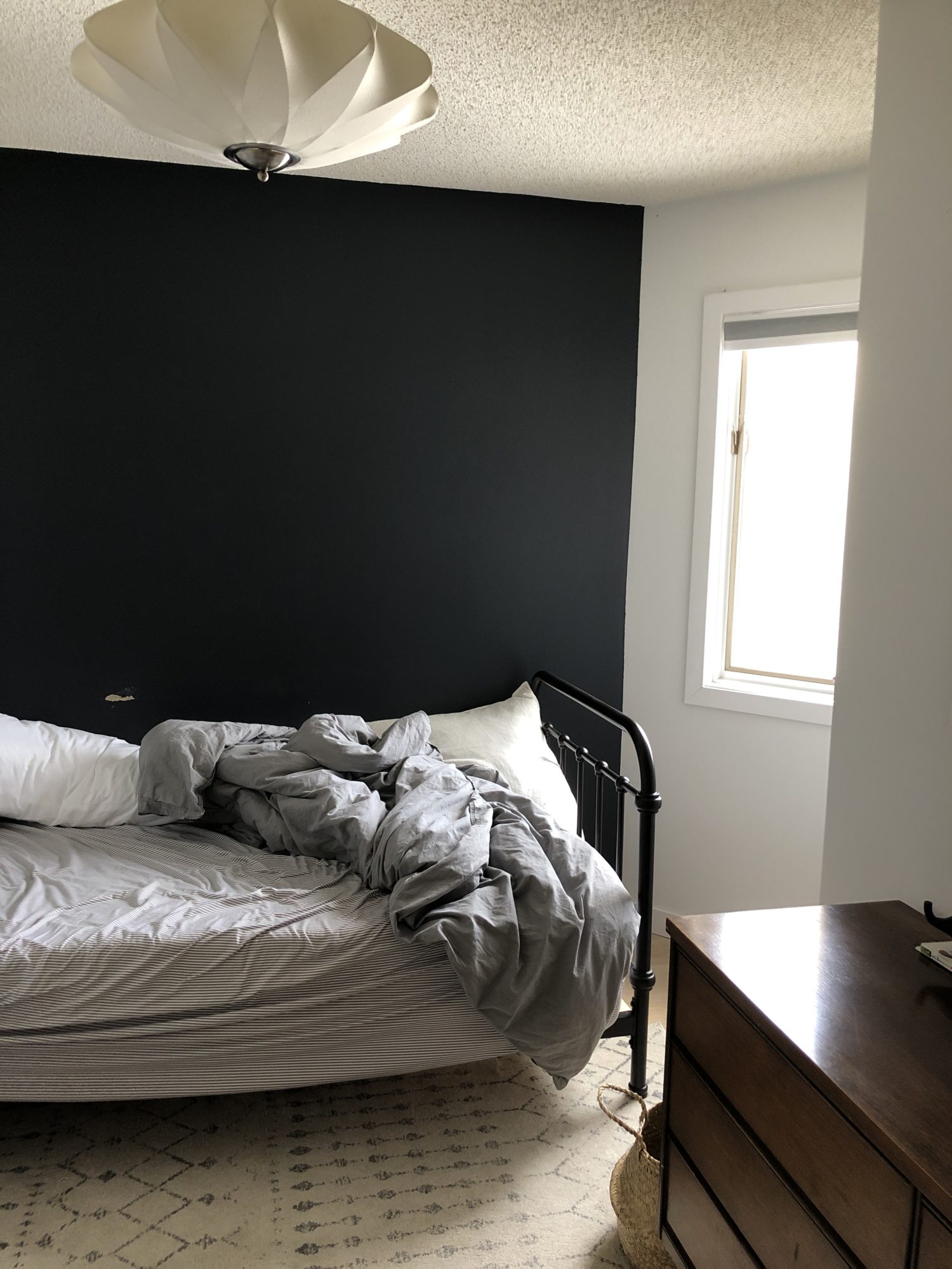
Nothing wrong with the room, besides the paint damage of course, but if you’re anything like me, then you can see why I’d be itching for some change. While I still love the original wall colour, first and foremost, I wanted to lighten the space up. New paint and some added drapery to soften the window would make a big difference.
I also wanted to make use of the awkward size and dimensions of the room a bit better. It might be hard to tell, but we can’t even get a double bed in this room…and the angled wall makes it a bit tricky to do much over by the window. With our current metal frame and round side table – things just weren’t the best fit or scale for the space. We needed a new plan.
Enter my lovely friends at Crate and Kids who agreed to help me find some perfect pieces. I can’t tell you how excited this made me, after patiently waiting for this line to come to Canada and drooling over some gorgeous kids furniture and decor. Want to see what we created together for Jack?? His new and improved big kid bedroom?
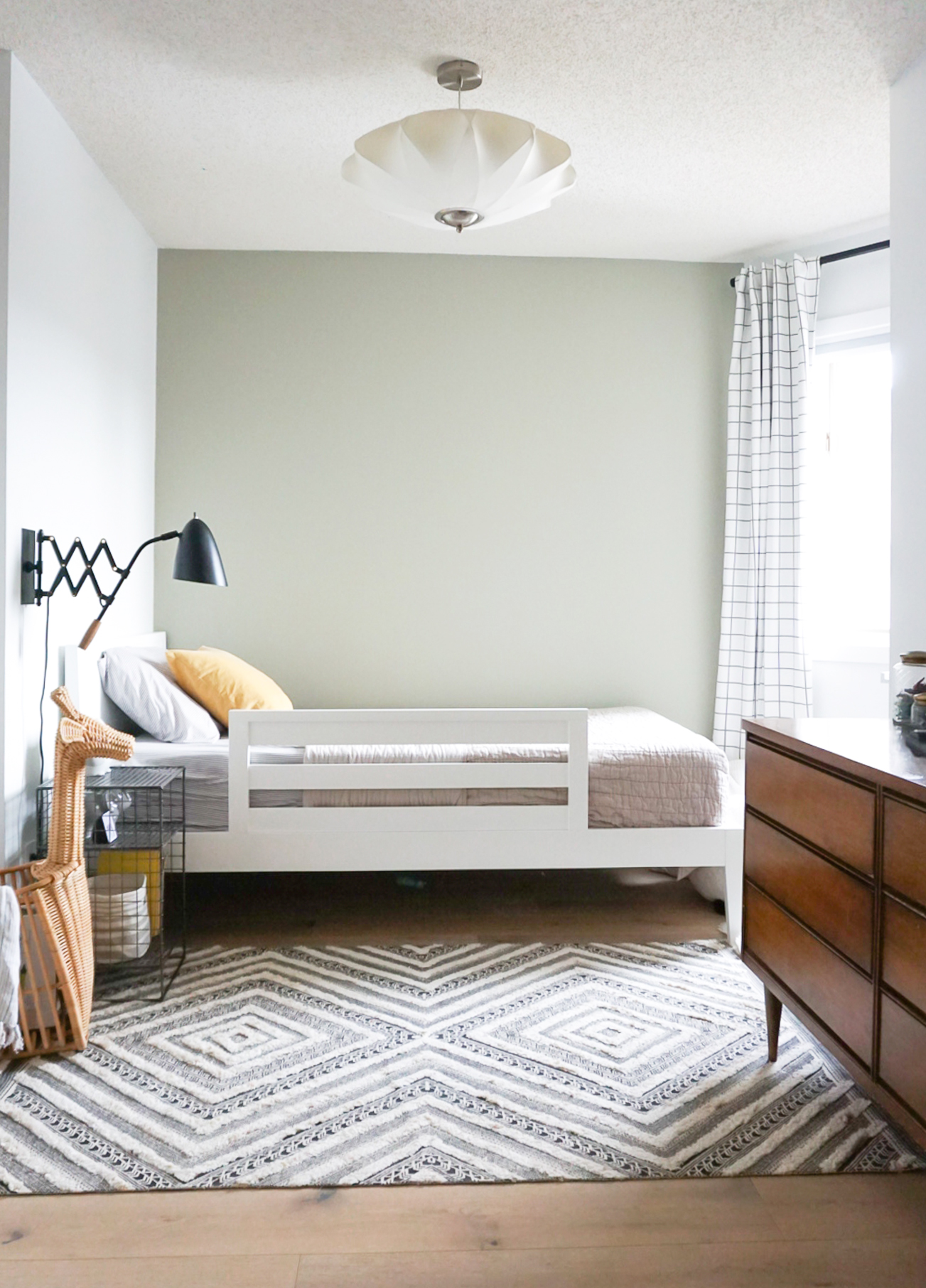
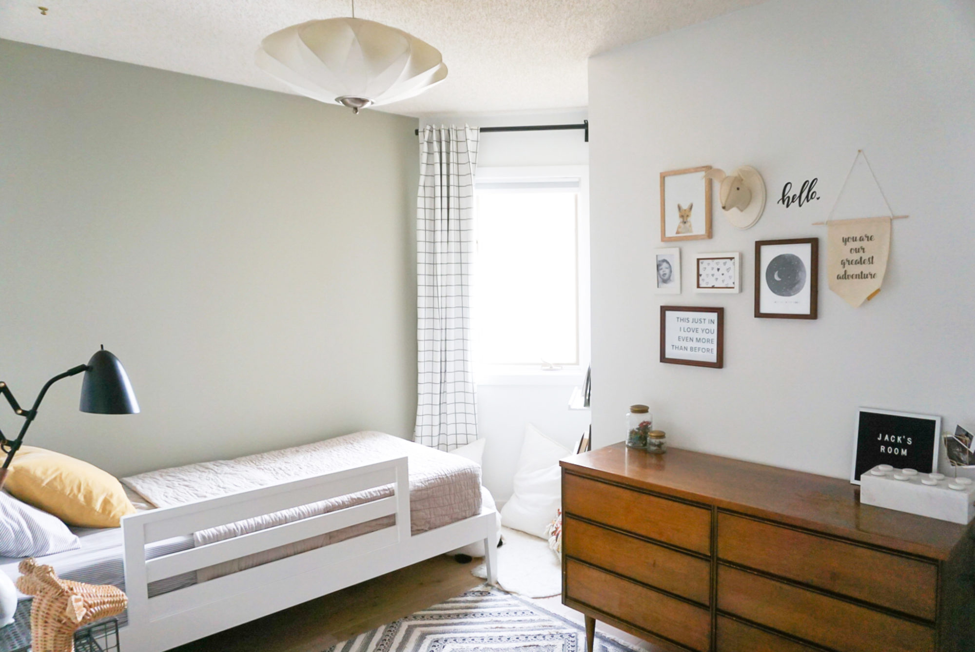
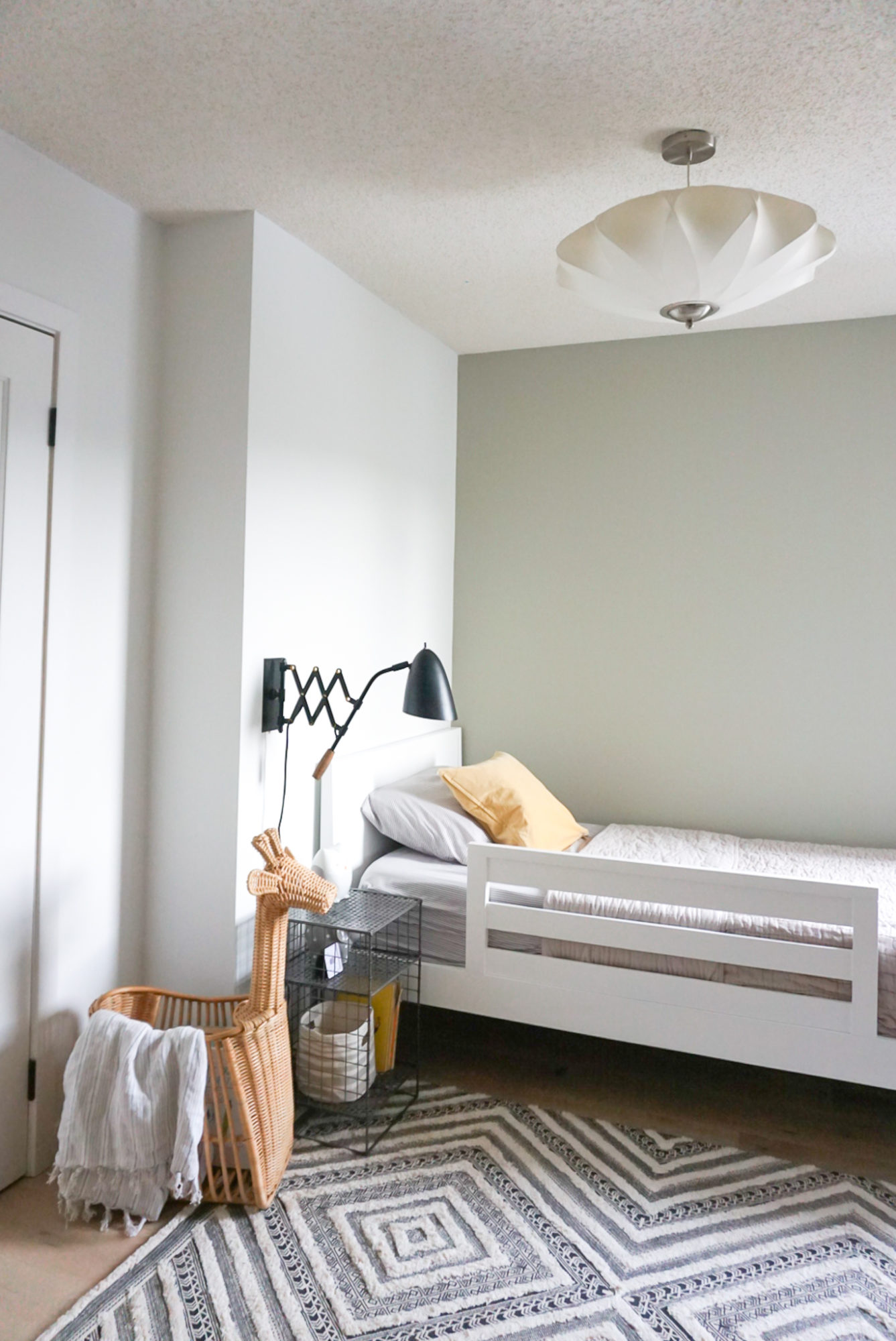
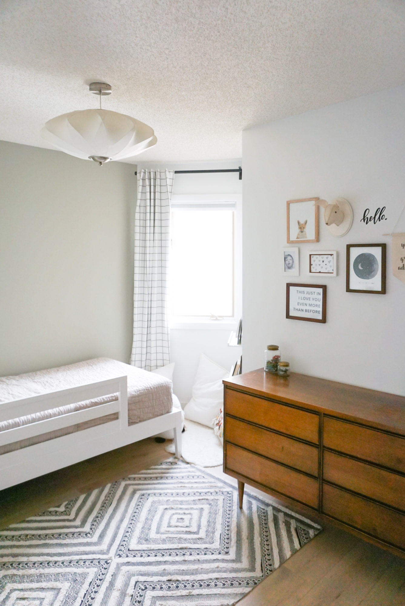
Changing this wall was step one and I’m so happy with the colour I chose. Originally, I selected Sage Wisdom by Benjamin Moore but I ended up switching to Horizon Gray instead…it was a much softer, subdued green. At certain times of the day, it moves a bit more into the grey world but it always has this beautiful green undertone. I love it so much.
The new white bed frame contrasts nicely with the wall…but in a simple, understated way. I would have loved to go with one of Crate and Kids wood bed frame options, but I opted for a classic white instead. I didn’t want it to compete with my vintage dresser or the other wood accessories in the room. Plus, I was so excited to see that this particular frame had an attachable bed rail. No more fighting with the old fabric one! And it can easily unscrew once he grows out of it. We also picked this linen grey quilt which is so soft and cozy!
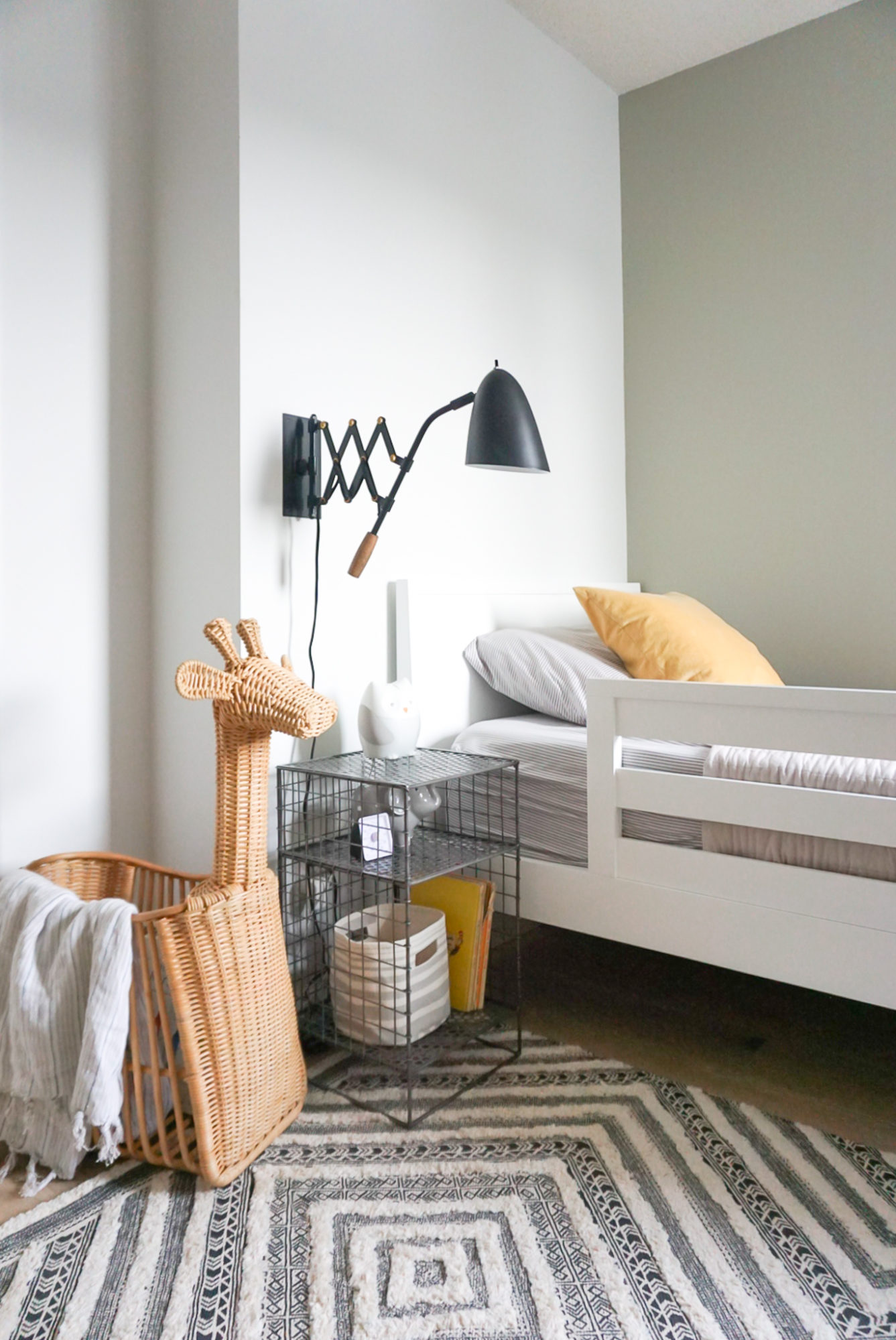
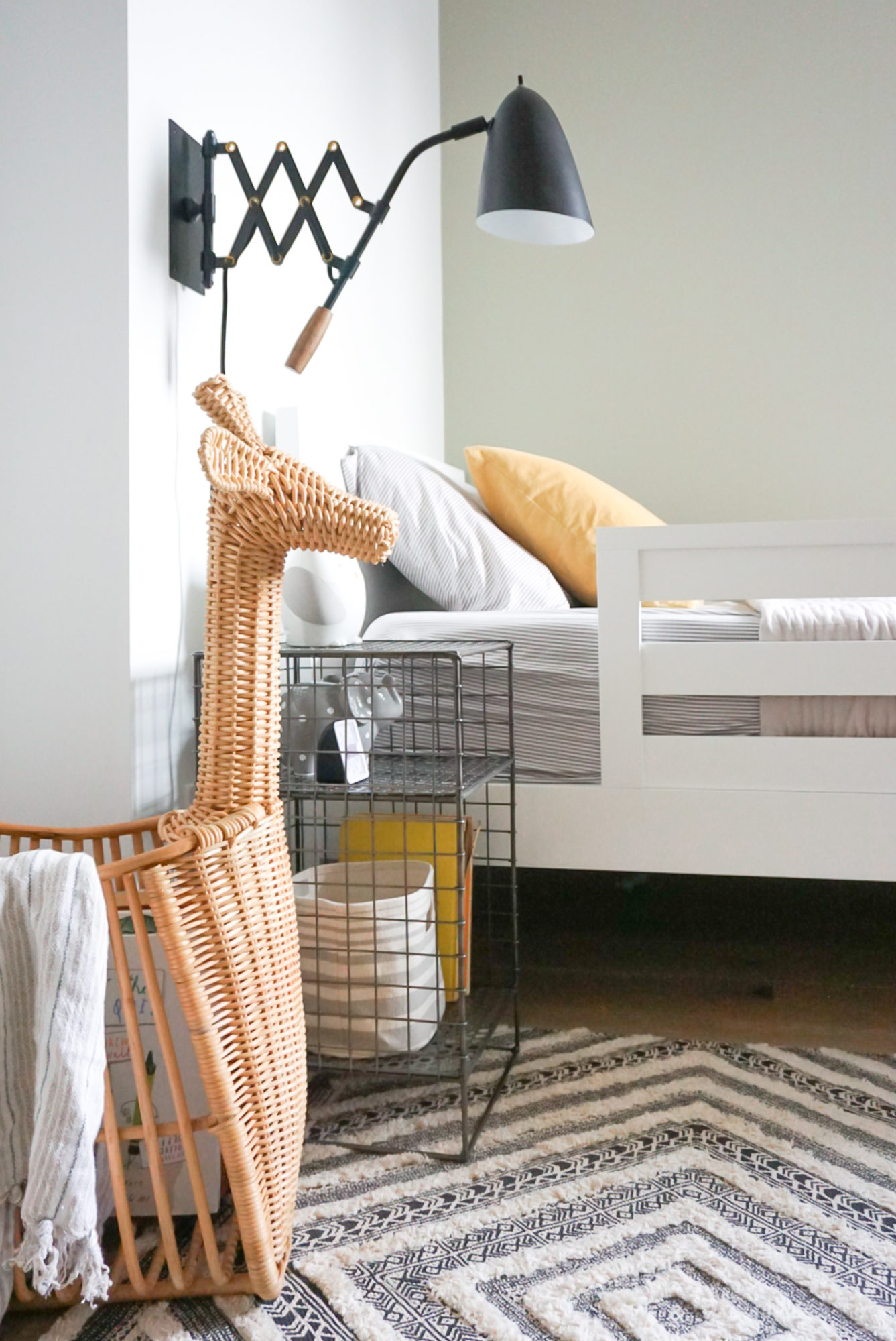
Beside the bed, I chose a new end table. This square shape fits the wall SO much better and I love the added storage that the wire shelves provide. Nestled under our matte black wall sconce, it really adds the right vibe to this boy’s bedroom. PS – we had this wall sconce before and I love it so much more now that it pops on our green wall.
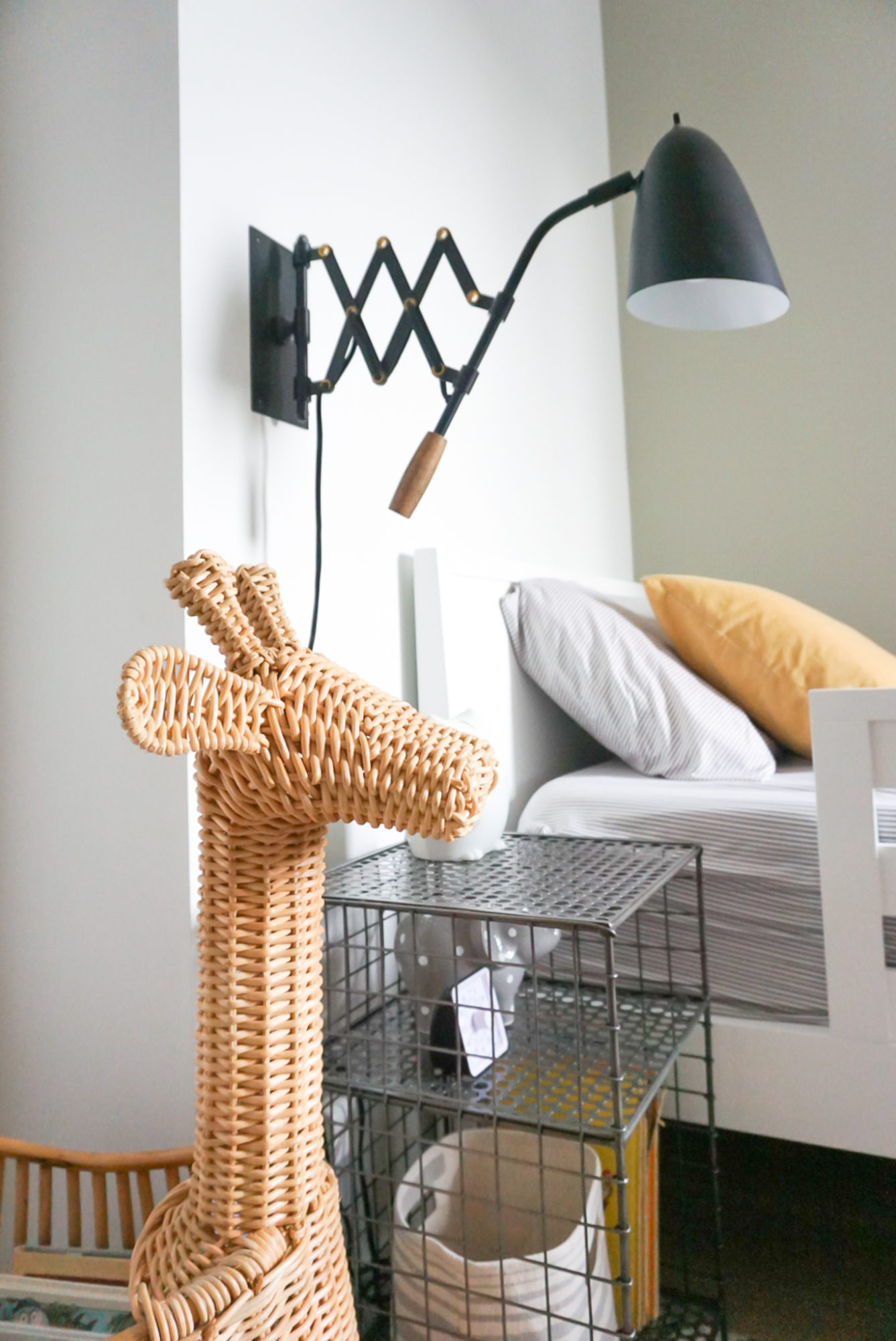
And how can you not LOVE this giraffe basket?! It was one of the first things I knew I had to get for Jack. After visiting the San Diego Zoo this year, he has developed an even deeper infatuation for animals, so I knew he’d love it. We can store books, toys, blankets…whatever we want really!
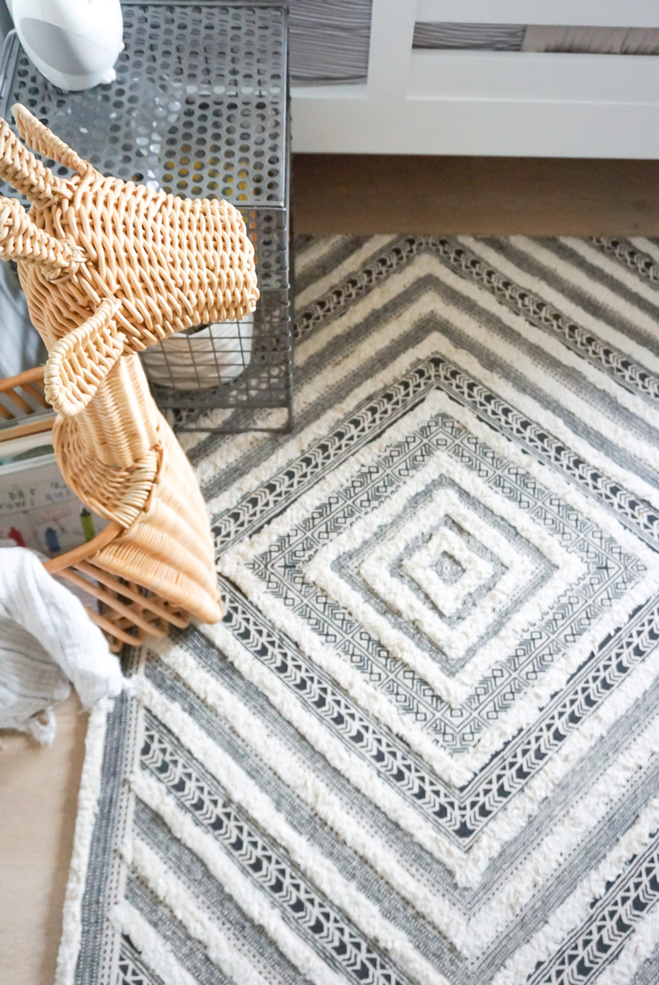
After humming and hawing for awhile, adding some texture and pattern with the diamond rug was the right choice. This particular option has just the right amount of detail and interest, and funny enough Jack likes to play with his cars on it too, using the lines as roads!
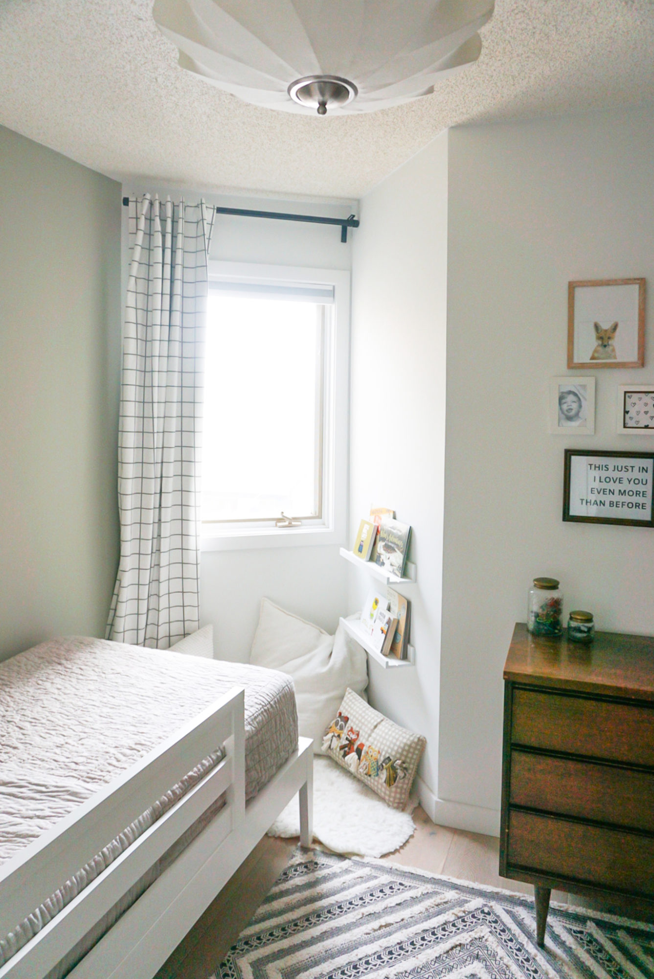
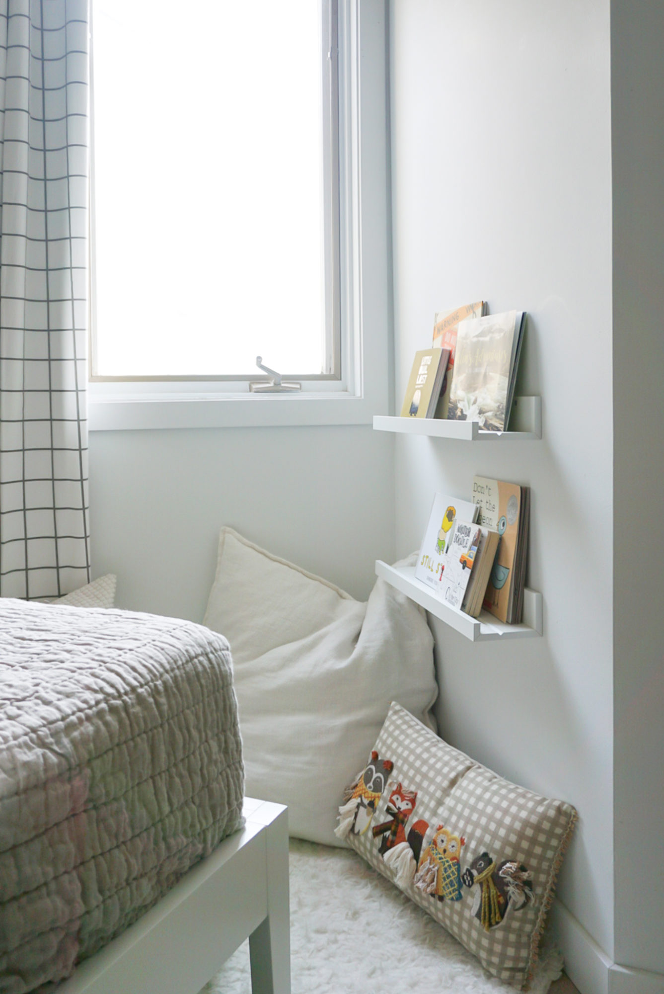
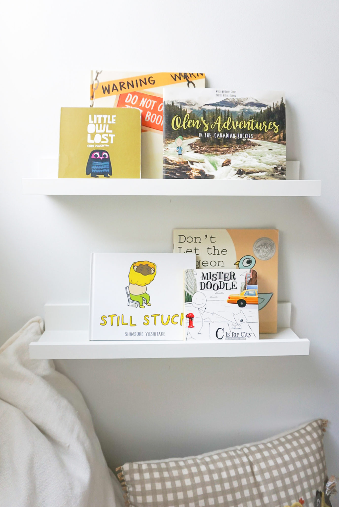
Getting a drapery panel up absolutely changed this corner for me and had me wondering why I hadn’t done this years ago. I love the grid pattern of this blackout option. It’s classic but fun at the same time. Plus, it softens up what I now dub ‘Jack’s reading corner.’ I had Ryan relocate Jack’s book ledges so now he can actually reach them and nestled a few pillows and faux fur rug in the corner. It may not be the biggest area, but at least it now has a function, and it’s so much cozier!
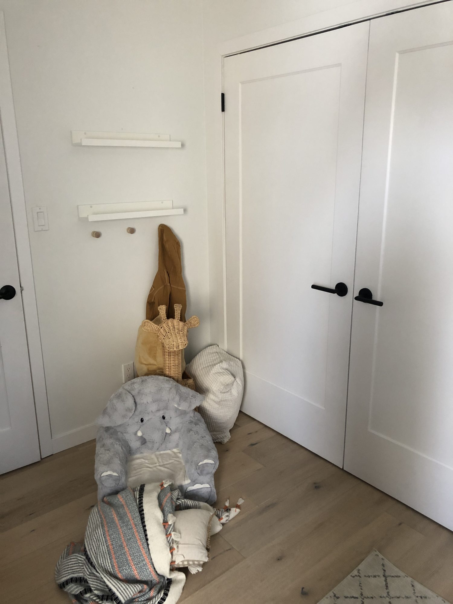
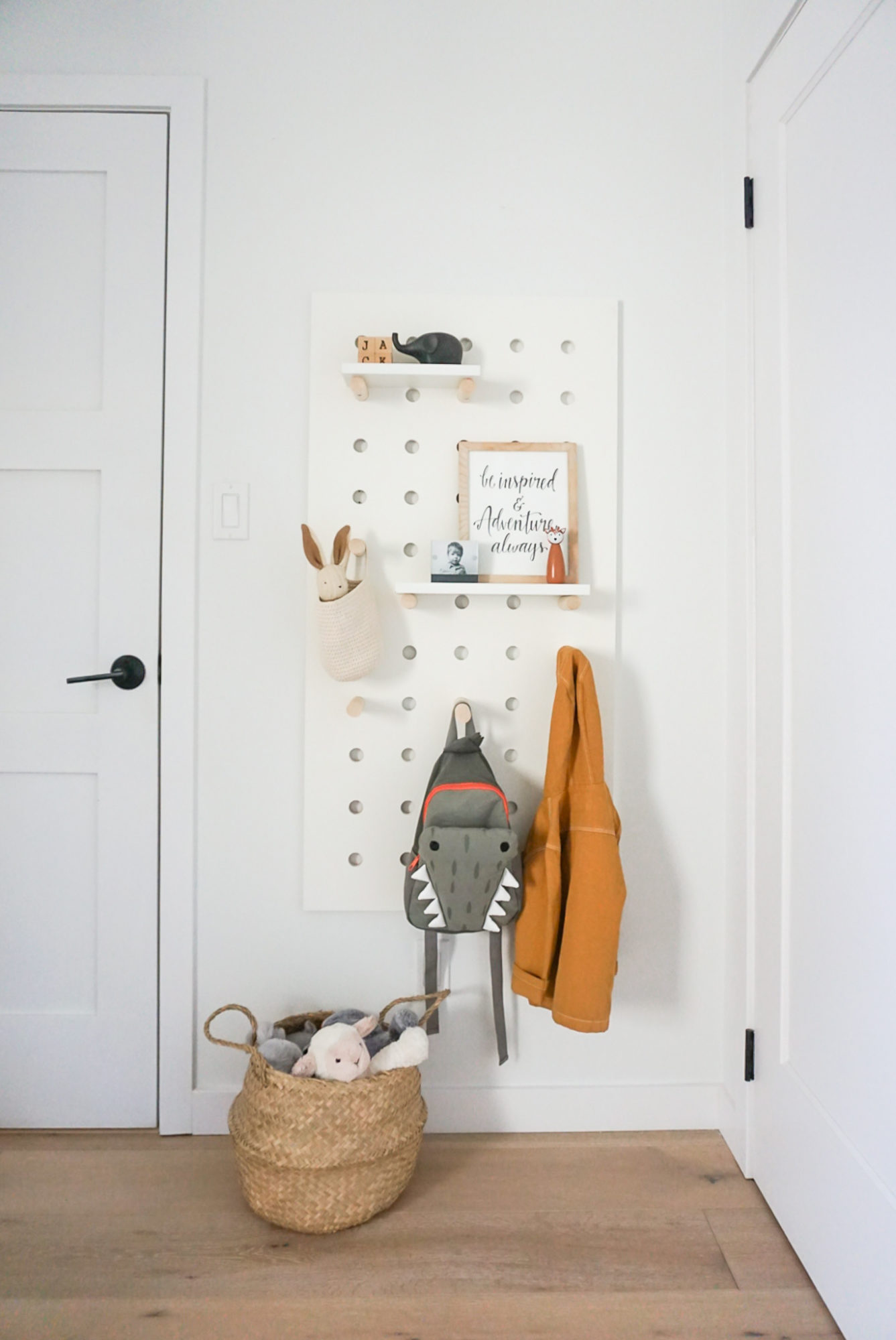
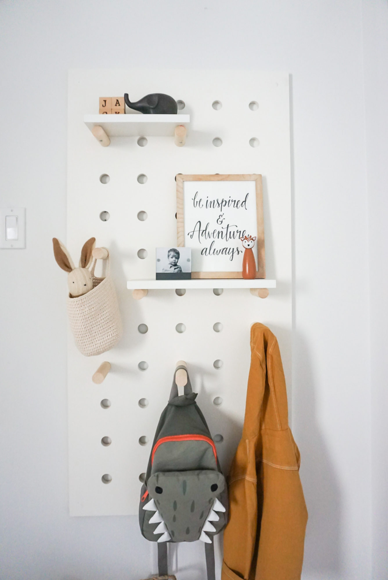
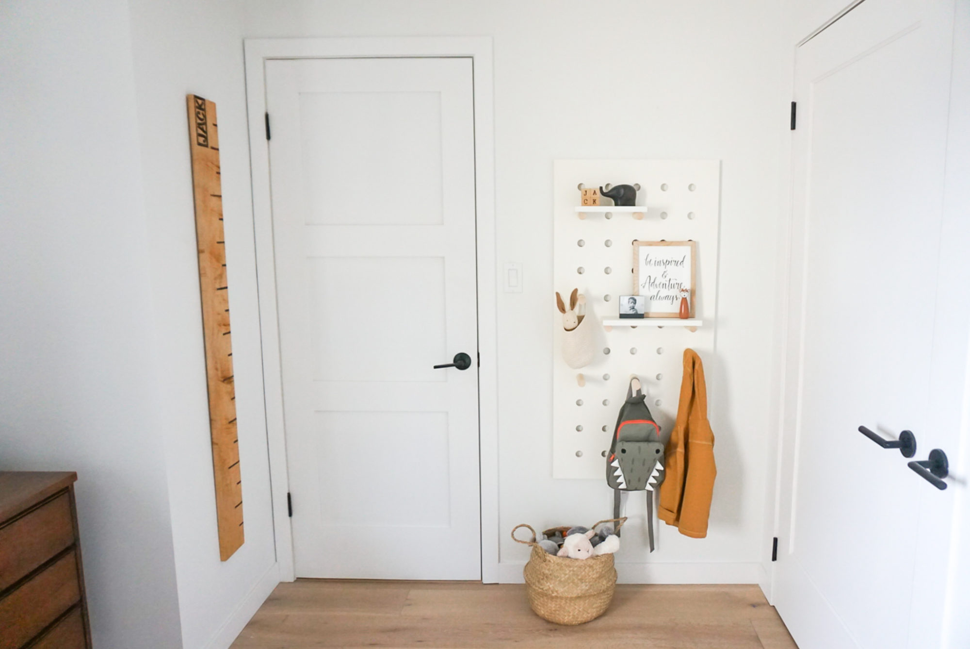
On the opposite wall, Ryan and I created a fun pegboard wall for Jack using some leftover materials we had on hand. We can move the dowels around to change things up and Jack now has a spot to hang his jacket, towels, backpack etc. Plus, I love that I still have two small shelves here to display some treasures. I’m sure this will be constantly rotating, but that’s the whole point, right?!
With these small changes, Jack’s big boy bedroom feels so fresh and inviting. I love being in here with him, whether we’re snuggling in bed or reading in his nook. He’s been proudly showing it off on Facetime with family or friends, so I know it’s a hit for him too. What do you think of the new space?
