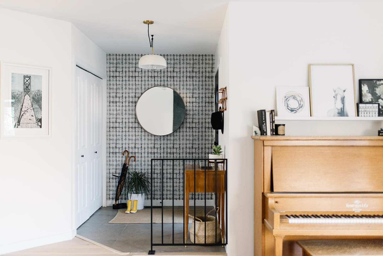
It wasn’t very long ago that I shared our front entry refresh over on Lowes.ca, but I thought it would be great to dive back in on my own blog and show off all the photos! If you never saw what the space looked like before, take a peek back at this post (where I also shared the design plan). Ok, hopefully you are back and ready to experience all that is the new front entry! Shall we?!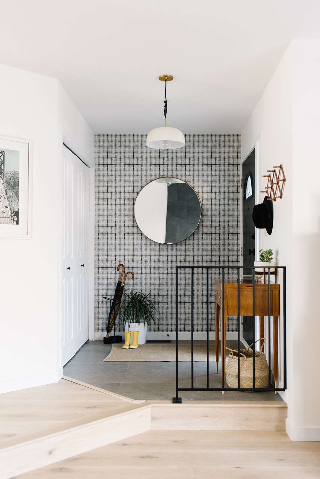
First thing’s first, Ryan and I replaced the original tile about a year ago to a nice square porcelain tile that had an almost concrete look. We painted the walls Simply White by Benjamin Moore and then basically left it…we lived with it in this half finished state for a long time! And there was nothing wrong with it, but I always wanted it to be more!
When I came across Milton and King’s wallpaper – specifically their Shibori line – I knew that’s what I wanted to do. A feature wall with this Earth Grey brick pattern would add some depth and character to the space.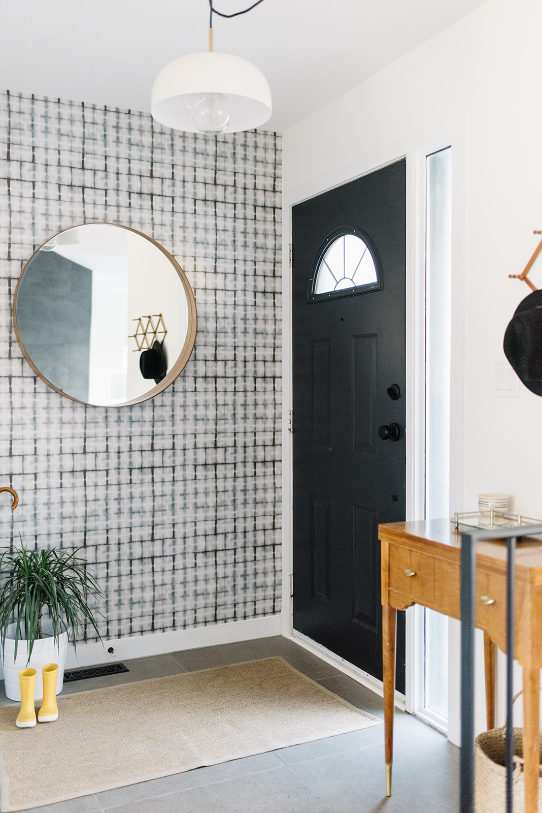
With the help of my detail oriented mom, we installed it with no issues! Milton and King’s instructions were so helpful and their paper was easy to work with. I know hands down that that one addition completely transformed the space, but let’s keep going!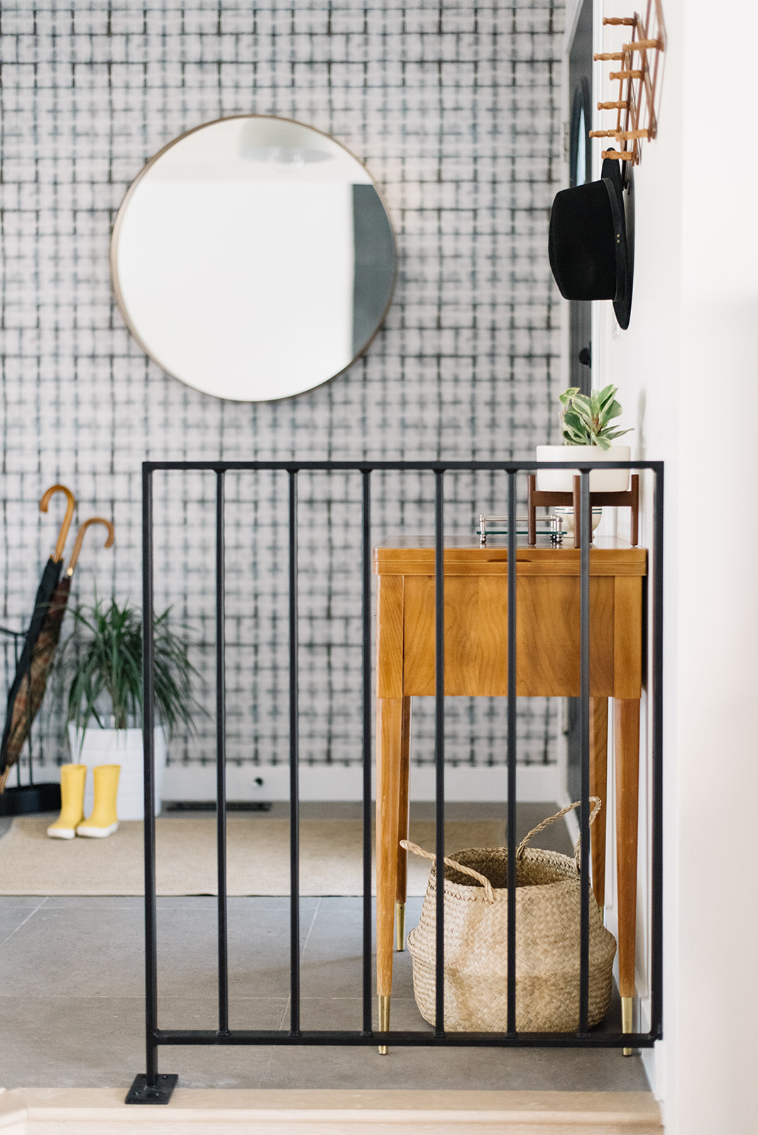
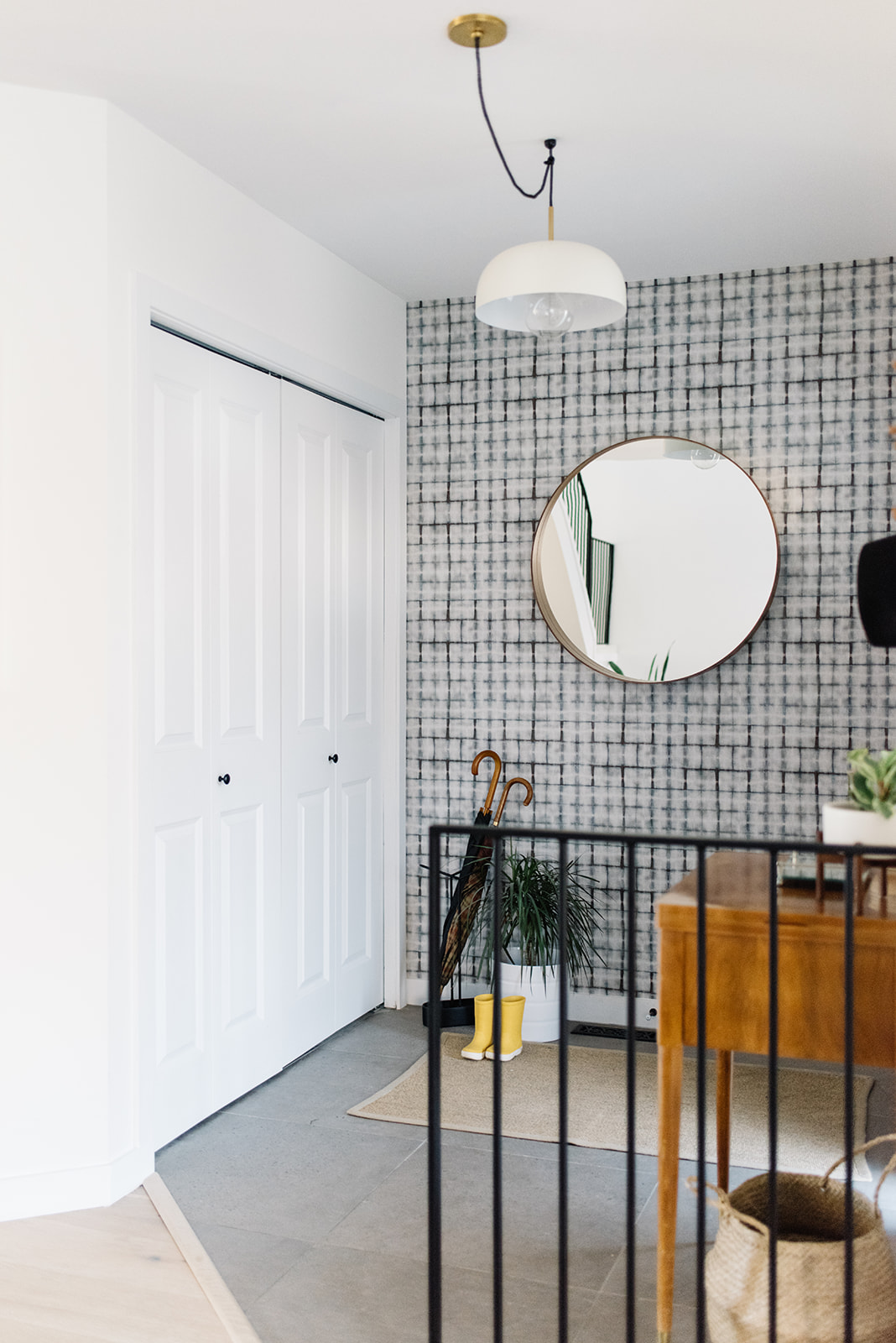
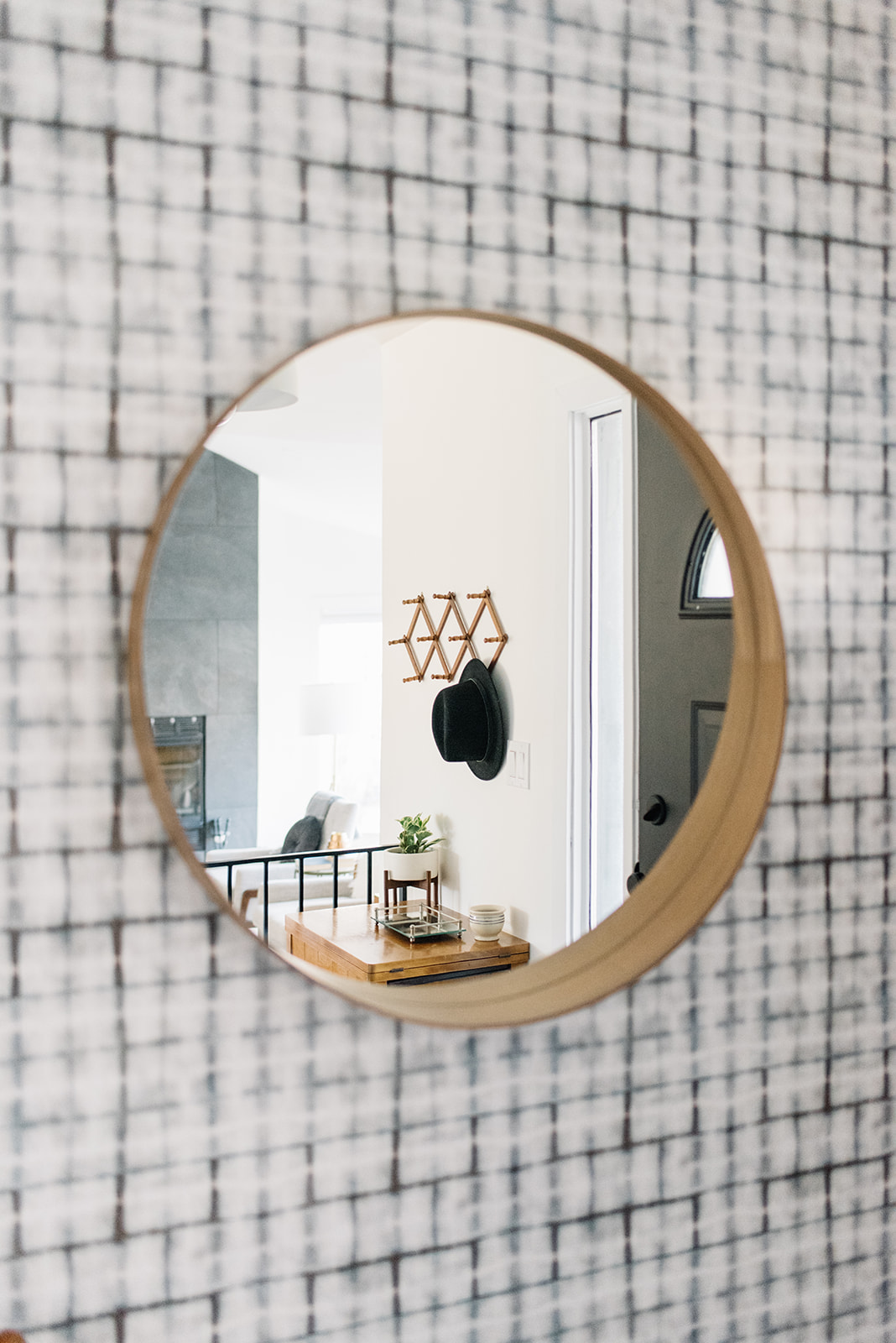
Before we gutted the front entry, there was an old railing here that matched the existing staircase. We took it out and then lived with nothing. Buuut, after careful consideration, we asked our friend Bruce (he owns Iron Elements Inc.) to come back and add a small railing, that just so happened to perfectly match the rest of our house.
Initially, I didn’t think we needed anything here (it’s just one step down into the living room) but I’m so glad we did. It helps define the space in the best way possible and I love how the dark metal contrasts with the soft wood of my Nana’s old sewing table (yes there’s a sewing machine in there…but it hasn’t worked in years, so it has become a great side table turned front entry table!). There’s nothing like mixing textures and ages (new versus old) to make a space come alive!
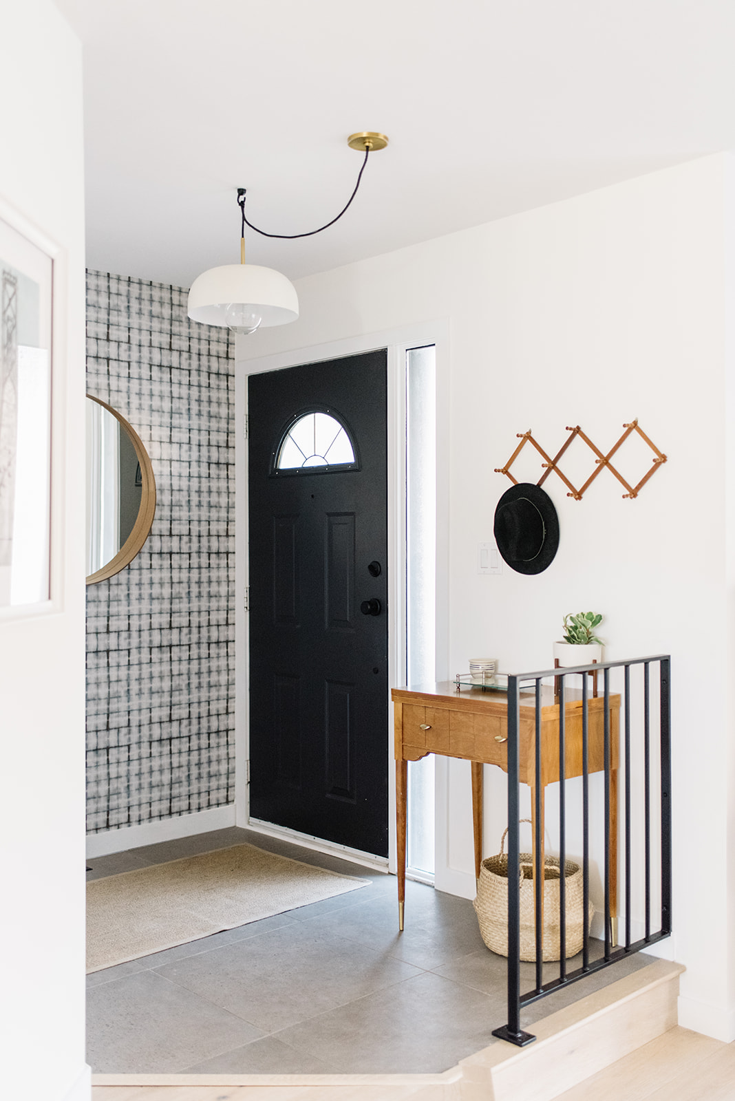
This view is particularly good because you can appreciate the new light fixture as well! I found this pendant from one of my favourite brands, Mitzi, which was a great option because the string allowed us to hang it centred in the room (we never changed the original electrical location unfortunately!). The mix of white, brass and black is lovely – giving a perfect preview of the rest of the house’s mix.
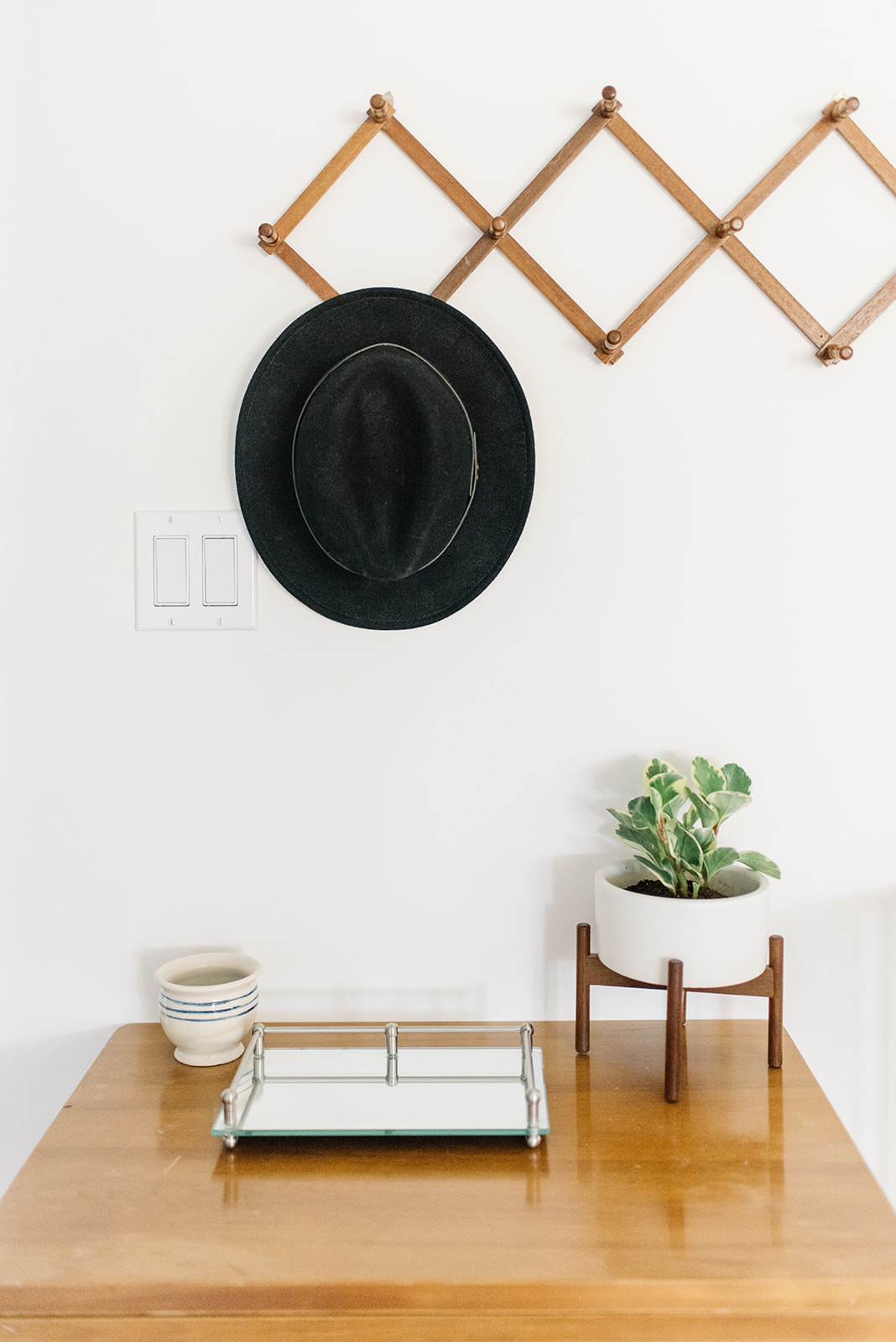
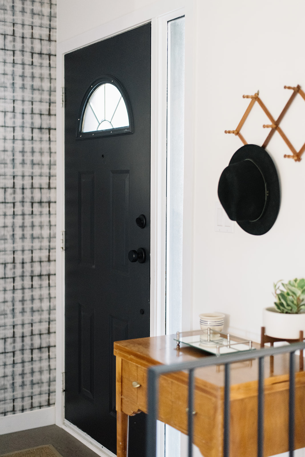
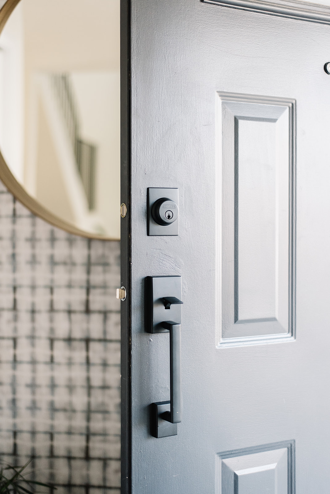
I should also mention that we repainted our front door, after getting sticker shock looking at new doors. We would have loved a completely new style, but it’s incredible what a little paint can do! We chose Sherwin Williams Tricorn Black and I fell in love with it – such a nice chalky shade, with just a hint of grey running through it. With a beauty of a black door, some new hardware was a must, so we chose a great matte black option to compliment the new paint colour.
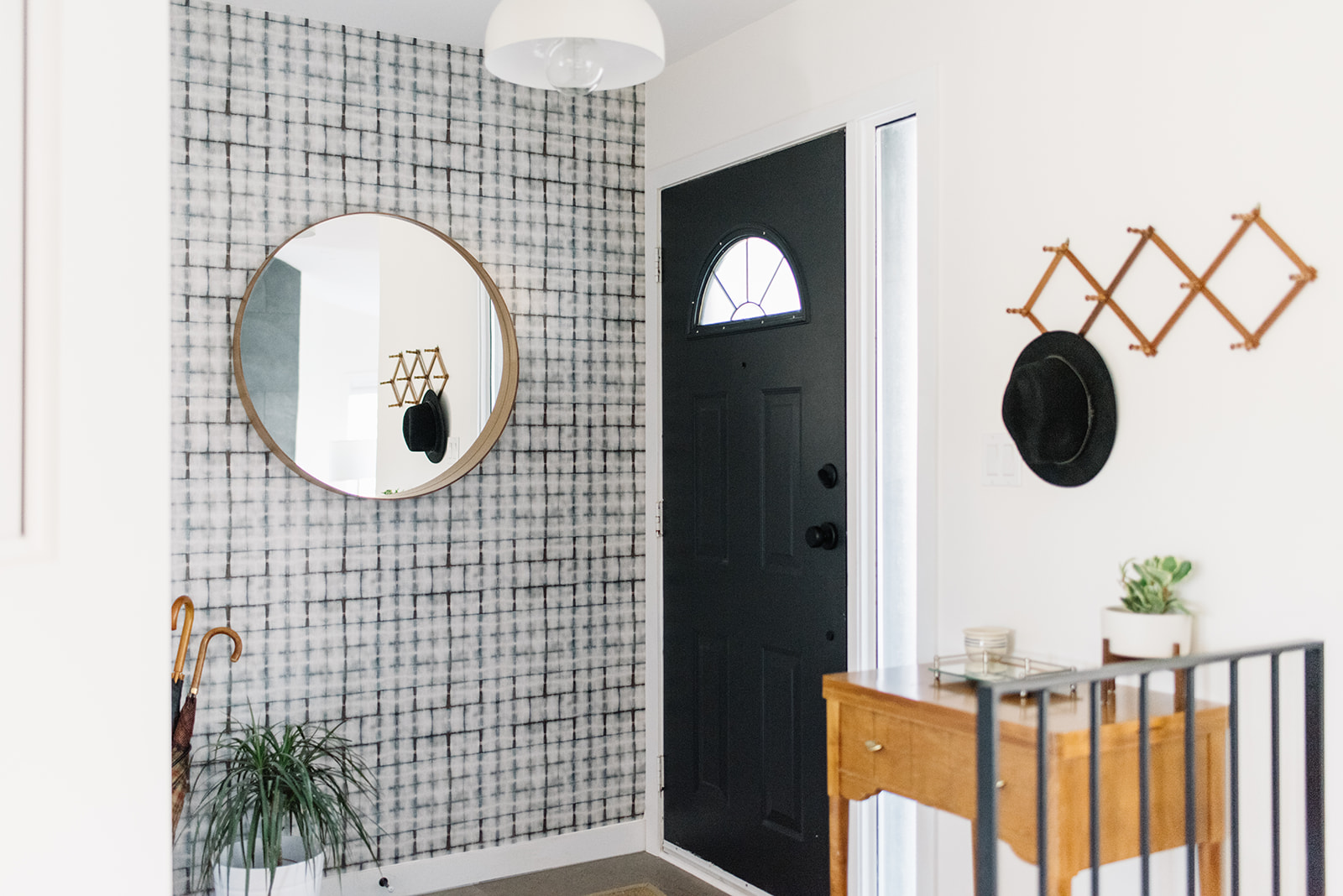
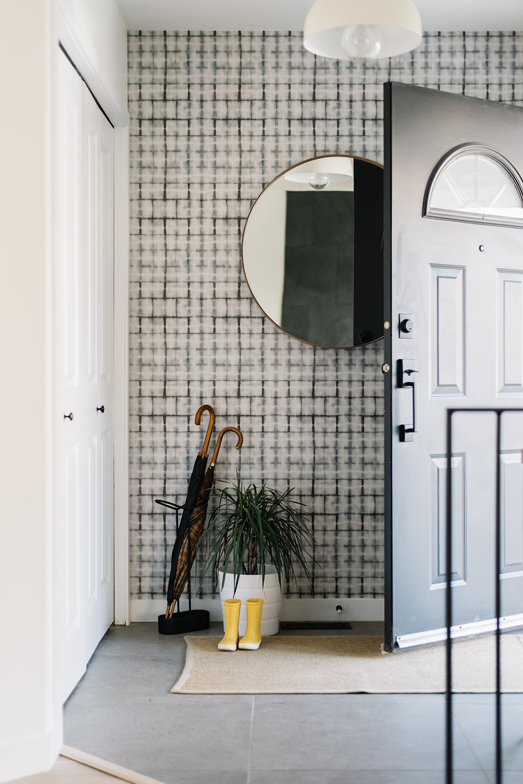
Check out some more of our front entry decor details…
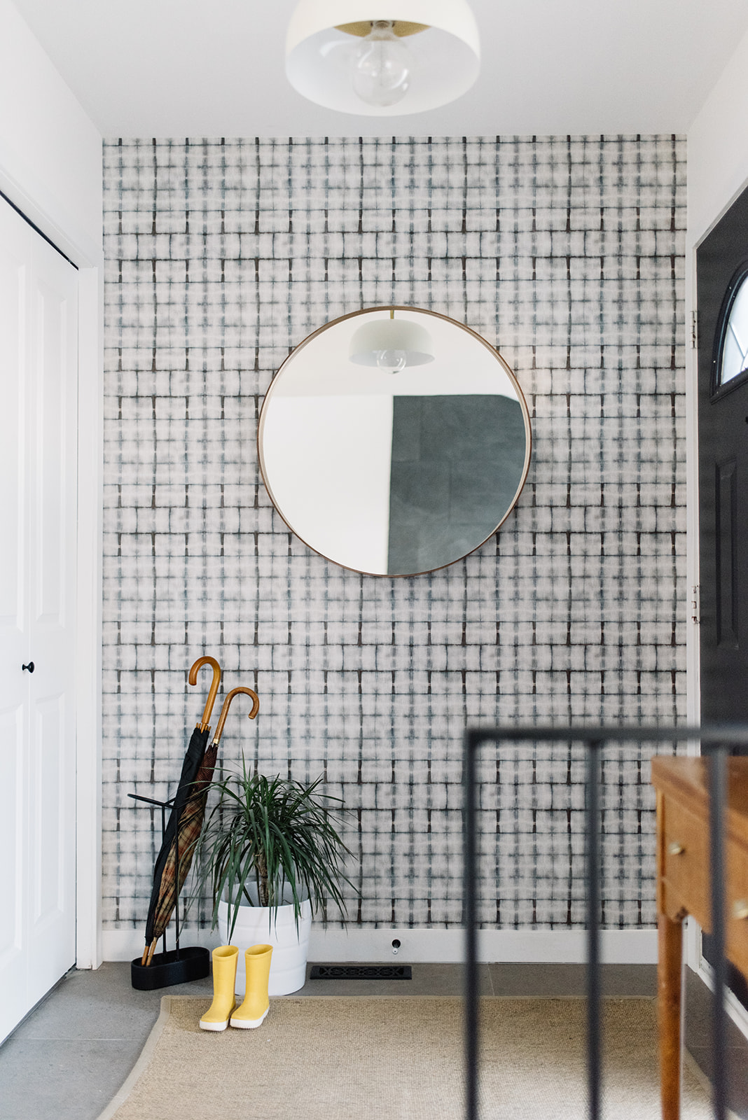
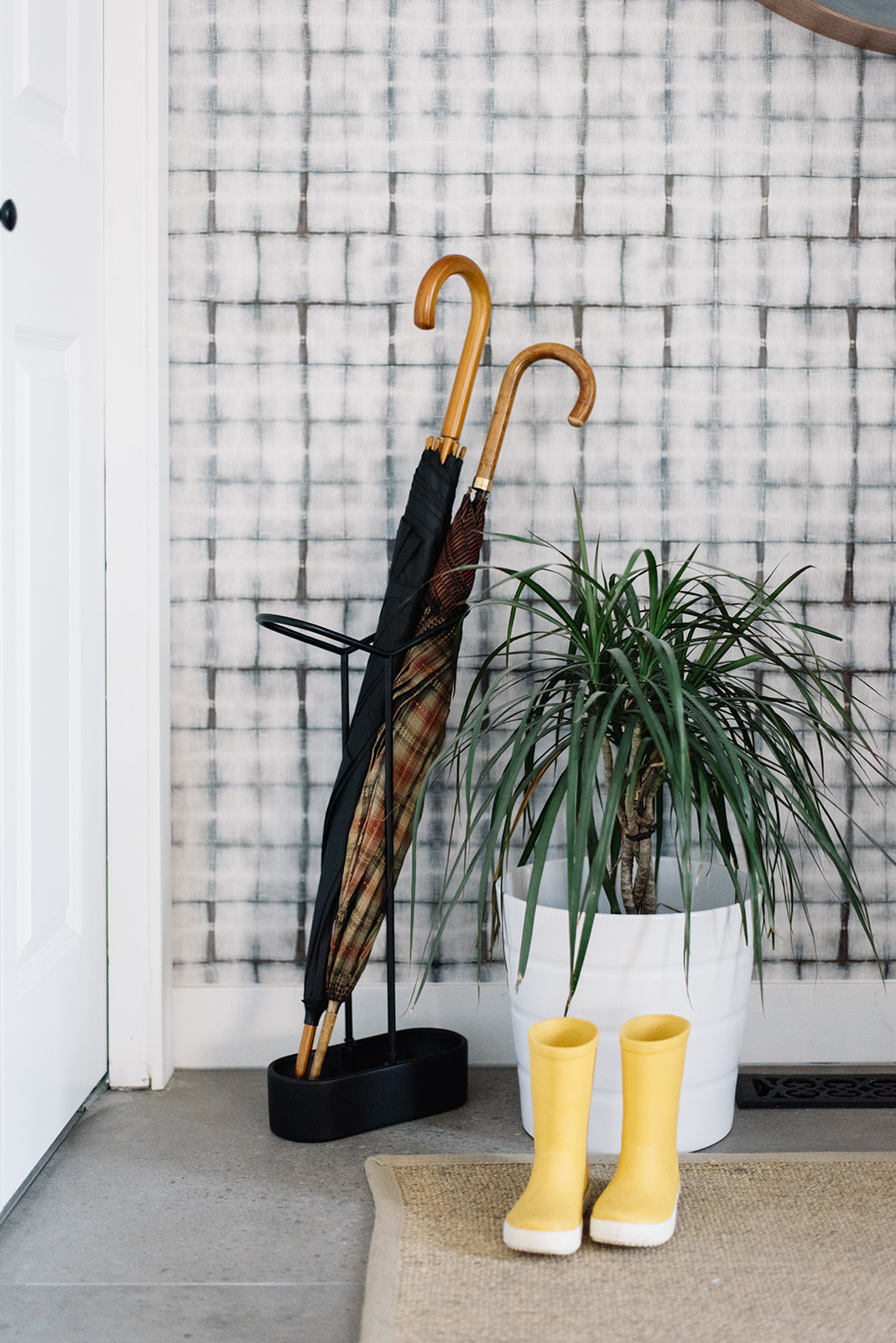
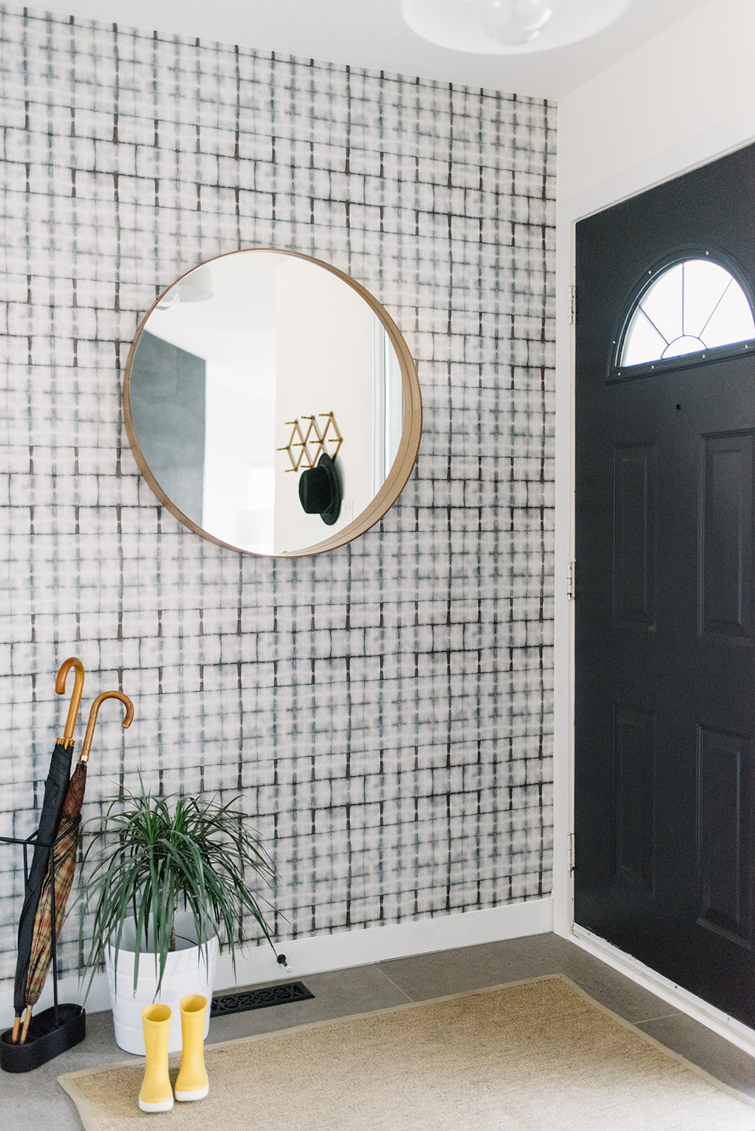
I am so happy with the way the front entry has transformed. It’s now a much more welcoming space and creates a better first impression…a preview of what to expect throughout the rest of the home. And it feels much more me!!
What do you think?! Have any thoughts or questions?! Comment below!
Photos snapped by Tracey Jazmin
