The day is here!! It is reveal day in this fall One Room Challenge and I couldn’t be more excited to show you are finished kitchen space. But first…
If you are visiting for the first time, I’m so glad you found me! I’m Kristina, an interior designer and blogger and this is my little slice of the internet. I’ve been updating my Ravine house in Edmonton Alberta for about 3 years and this kitchen renovation is the last piece of the puzzle, thank goodness! I share this space with my contractor husband Ryan, my little boy Jack and my two rescue pups Shya and Ava. You might remember me from my first One Room Challenge when I redid my half bath and laundry room, but if not here it is again (and I did a follow up DIY here!)
If you missed any of the progress posts and would like a refresh before the big reveal here you go: Week 1 (the design plan), Week 2 (demo, setbacks and more!), Week 3 (walls and electrical – yay, lighting!!), Week 4 (countertops!!) and then finally Week 5 (plumbing and decorative touches).
_____________
Before we get to the beautiful photos of the finished kitchen, let me take you back to the beginning so you can fully appreciate the transformation!
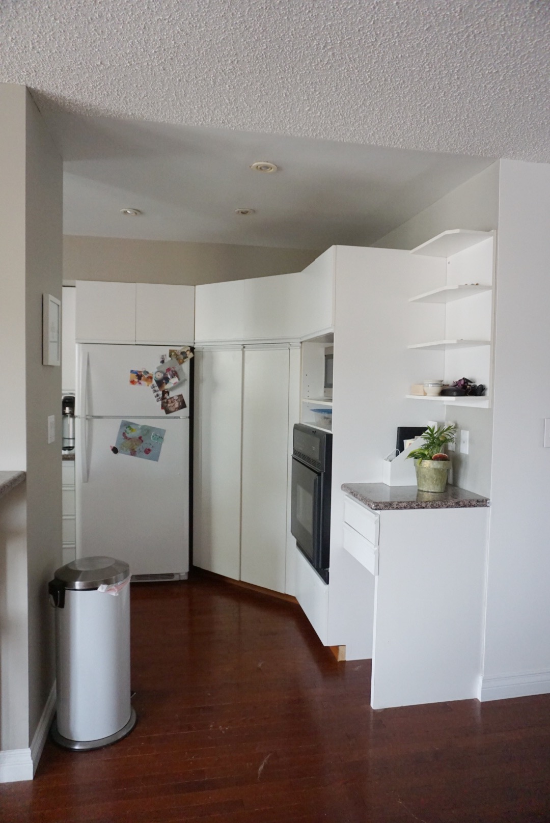
We had a U shaped layout which made moving around really tricky. It was quite closed off and we never felt like we could host gatherings here. In fact, I said to my friend that my dream was to have people come over and gather around the island…that’s what I had always envisioned…having that great gathering space…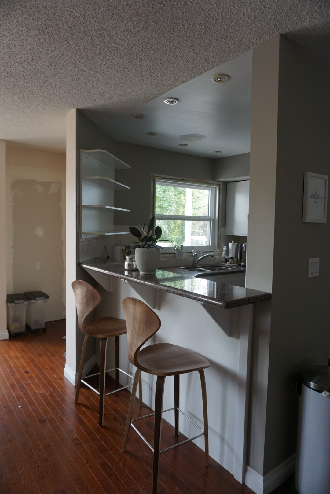
About a year ago, Ryan closed off the existing exterior door, since we put new ones in to the left. You can see where we made holes in the walls, trying to determine if we actually could make this into a pantry space (we lived with holes in multiple walls for a veeerry long time lol).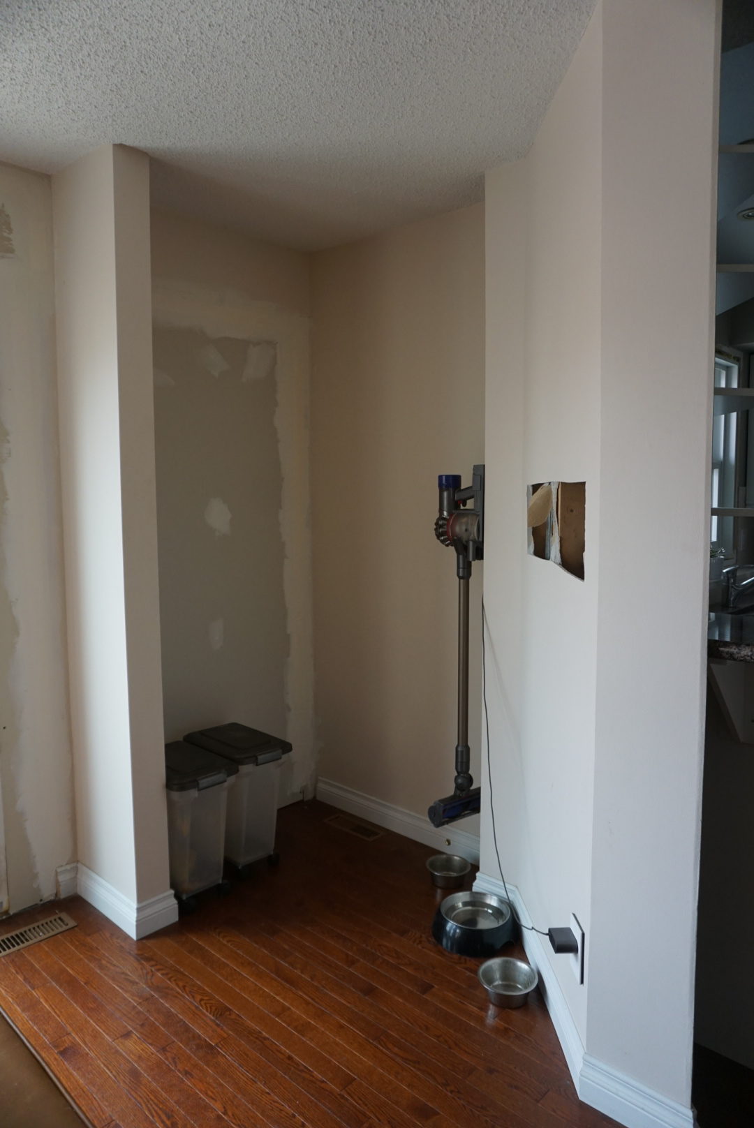
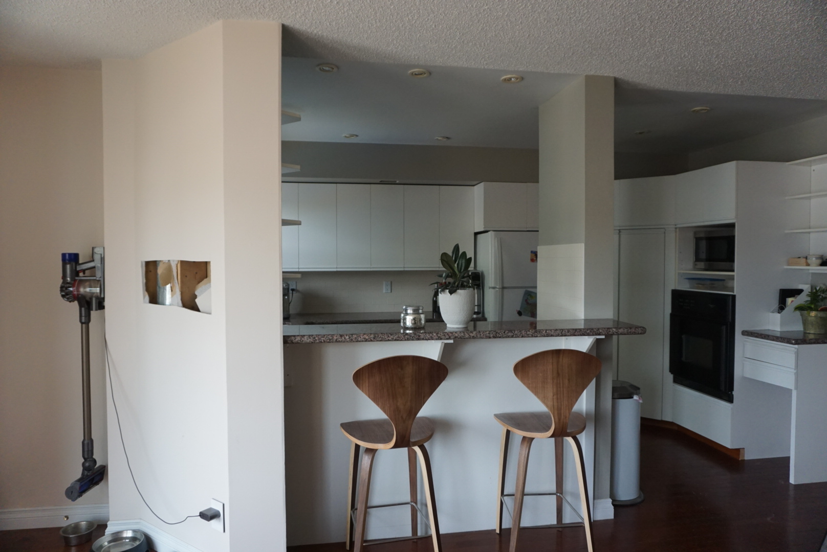
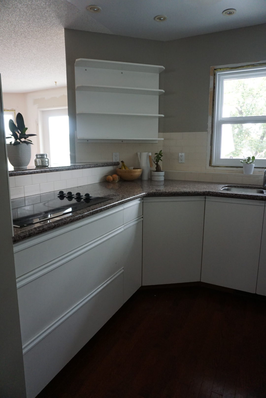
The actual look of the kitchen wasn’t horrible – we lived with it for nearly 3 years after all! But I couldn’t wait to put my stamp on this space. Here’s the design scheme I created oh so many months ago:
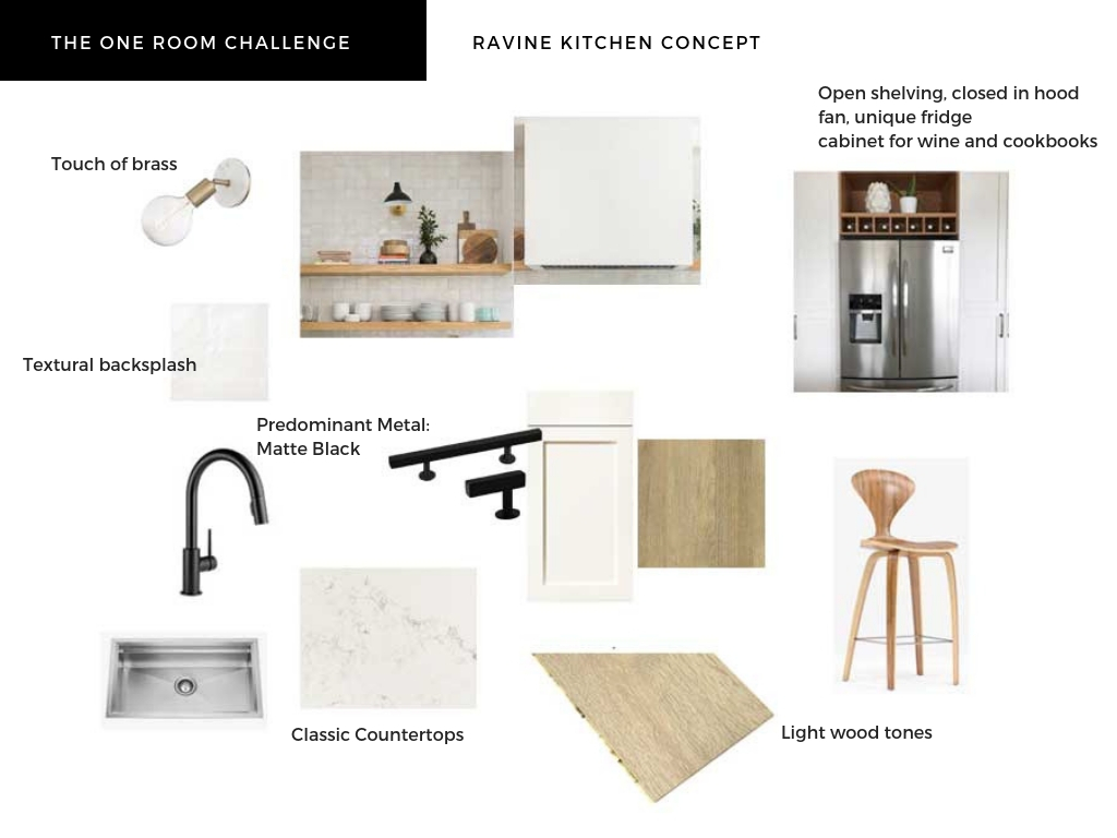
And from that initial concept, THIS is how it all came together!!
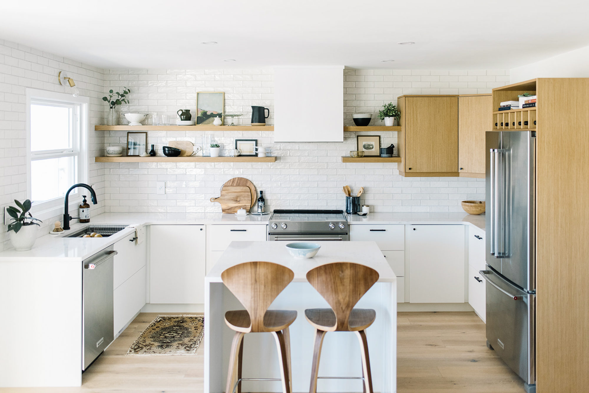
I think you’ll agree – it feels like a completely new house! The layout flows SO much better (Ryan and I have already spent more time in here together than we did in all the previous years combined lol) and the aesthetic feels 100% us. It is exactly how I dreamt it! So let me take you on a little tour…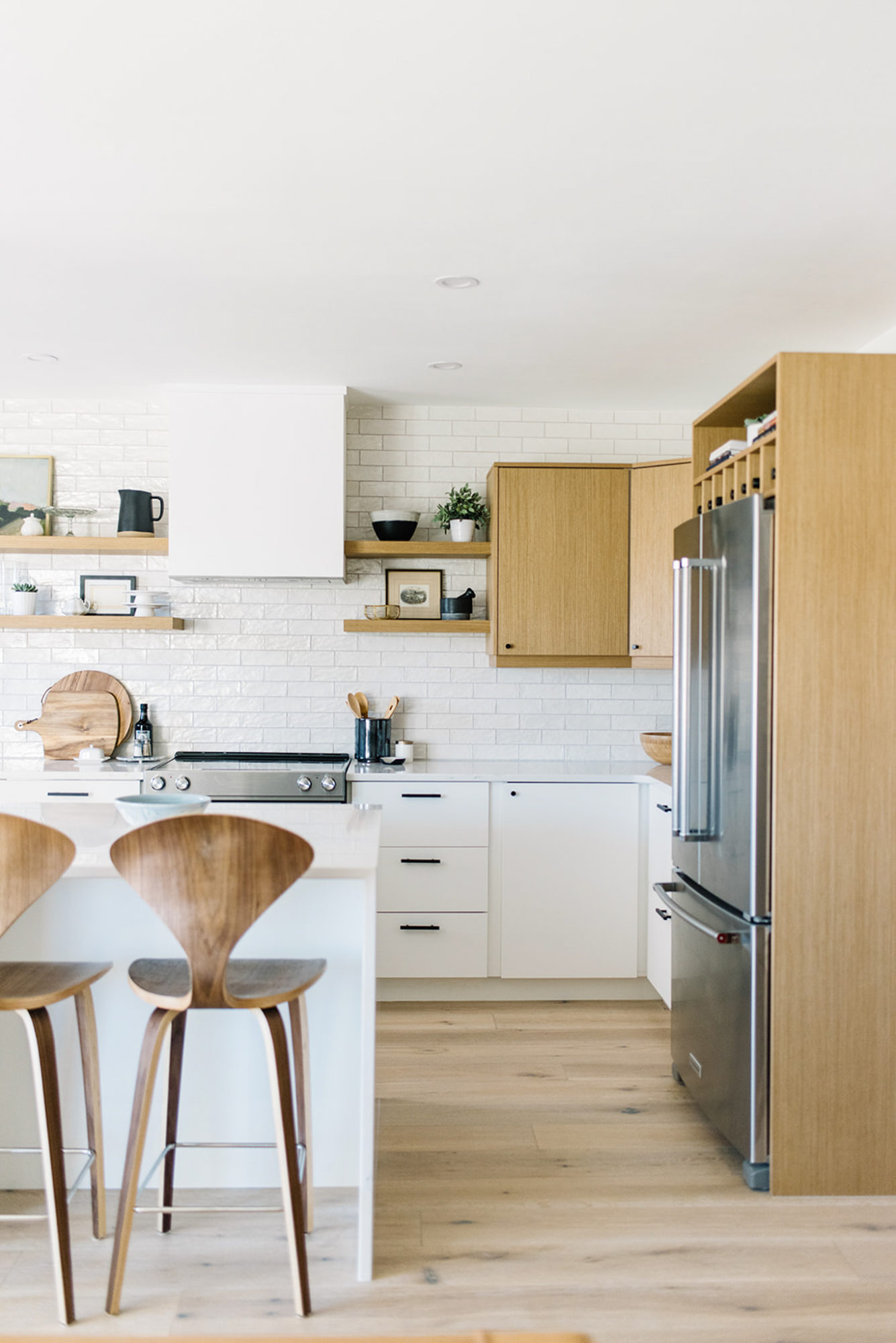
I wanted to keep the palette light and warm – a true nod to my Scandinavian roots. After continuing the same white oak engineered floors from the rest of our home, we knew that a combo of white and wood cabinetry would compliment the flooring perfectly. All the fronts/sides are from Kitch while the insides are all Ikea (yes, I absolutely got their handy dandy drawer organizers too!). We spent that little bit more to get a custom look and it is 100% worth it. I especially love the flat slab panel – modern and clean lines are my jam!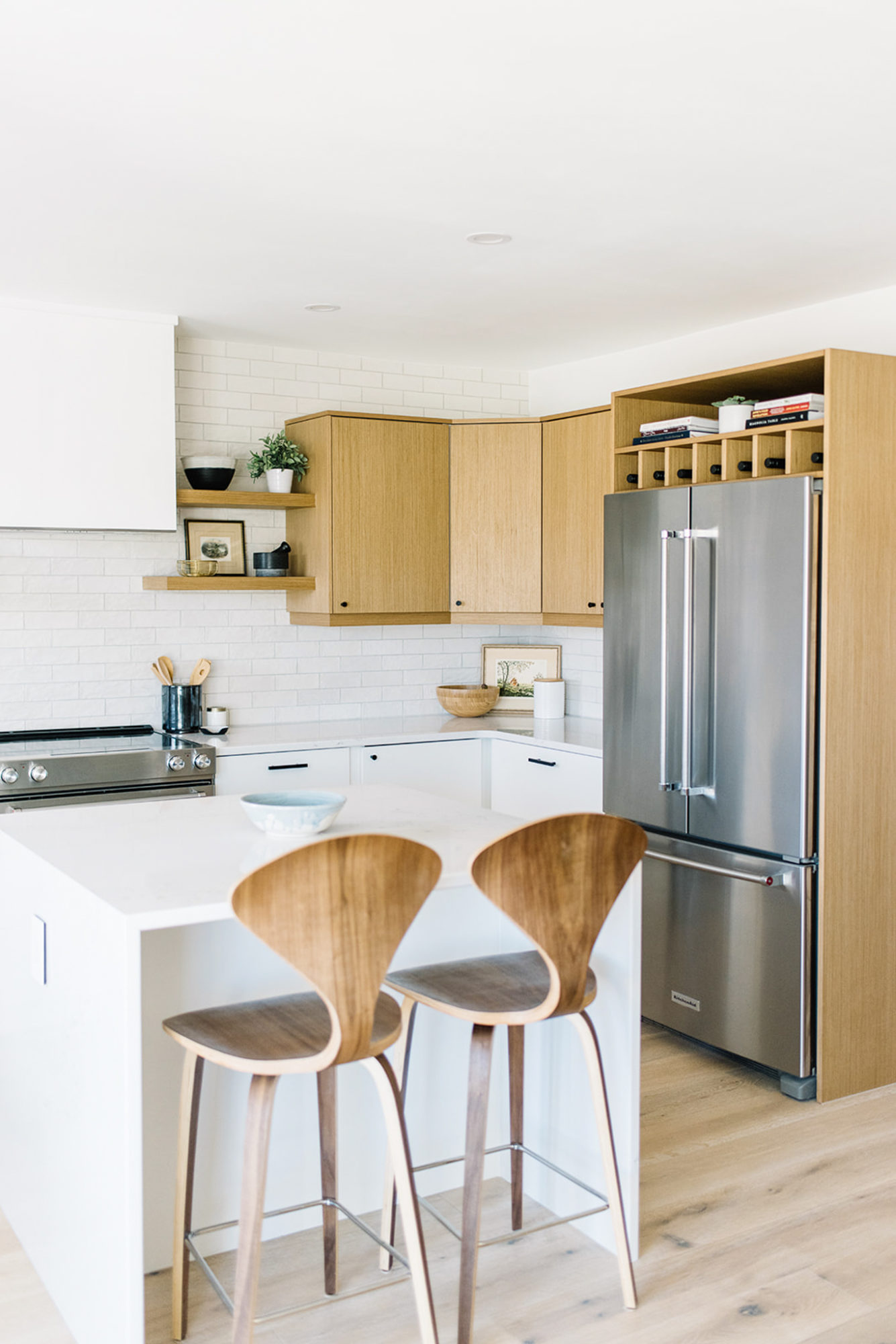
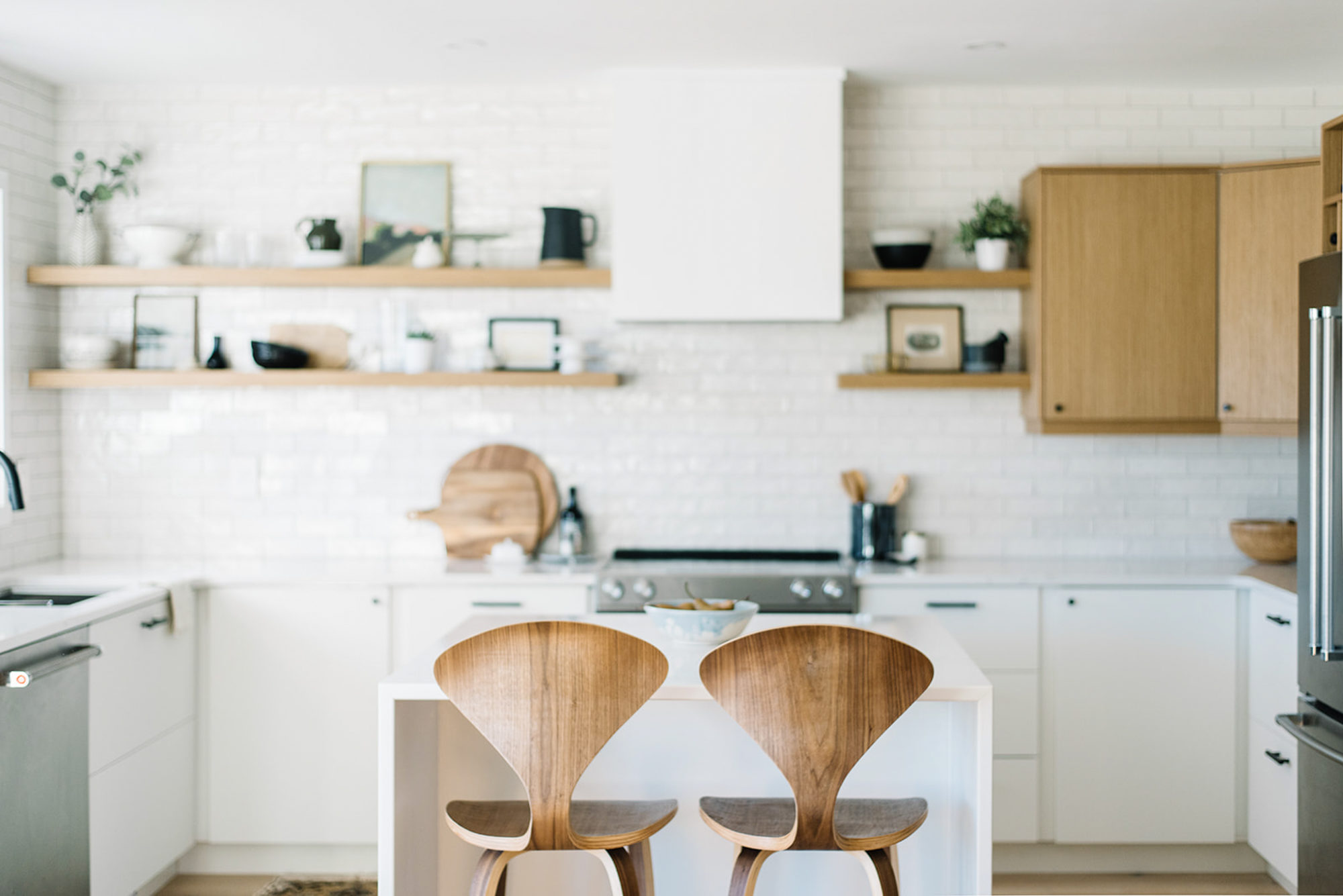
We also got Kitch to create our floating shelves to keep everything cohesive and they might be one of my favourite parts of the kitchen (but who’s kidding who – I have many favourite parts!!).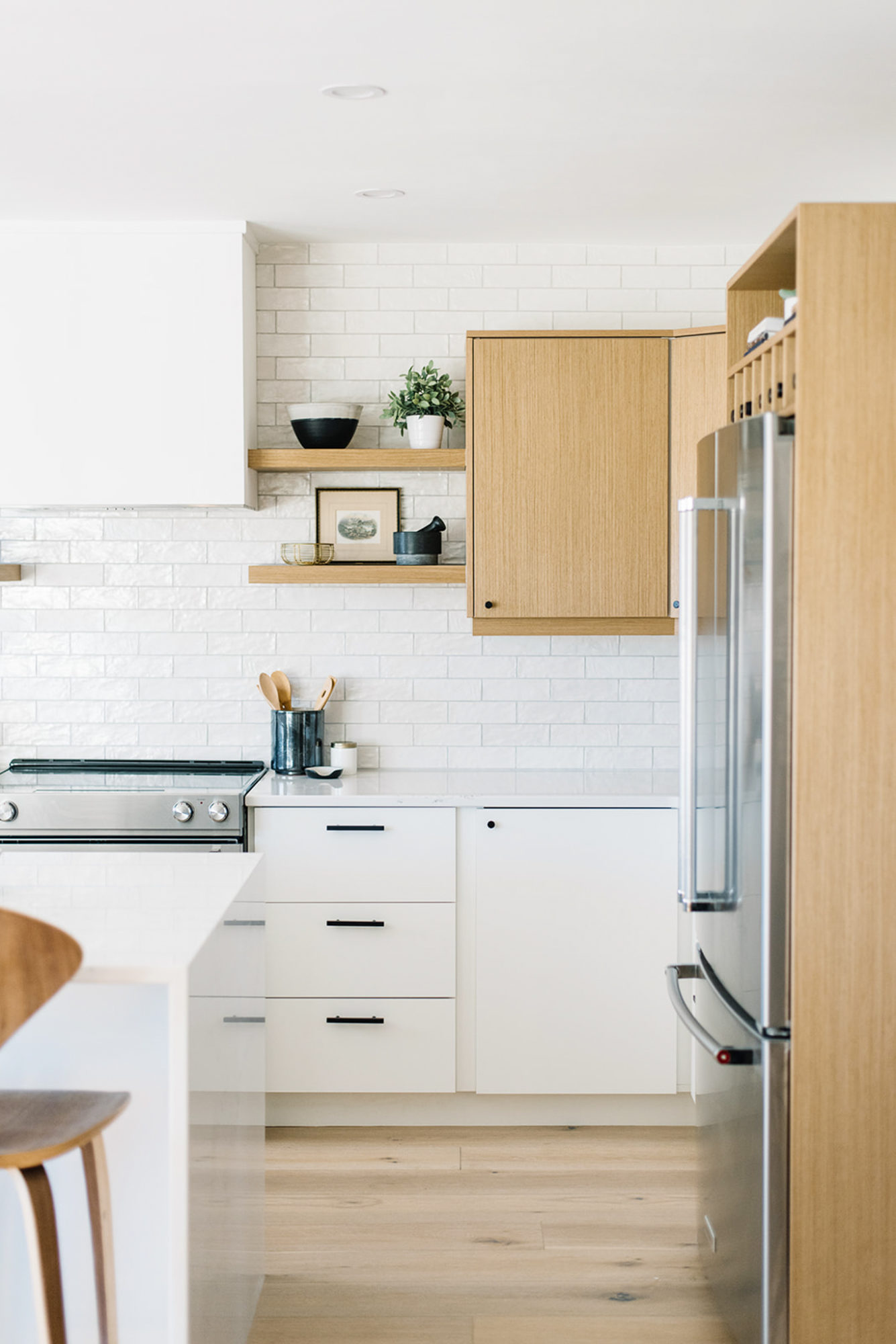
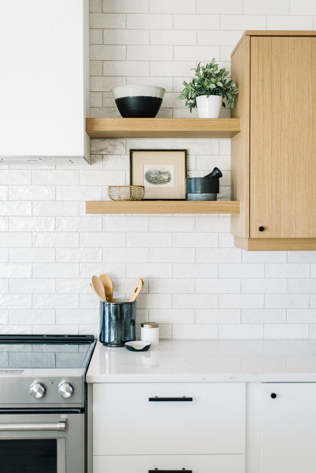
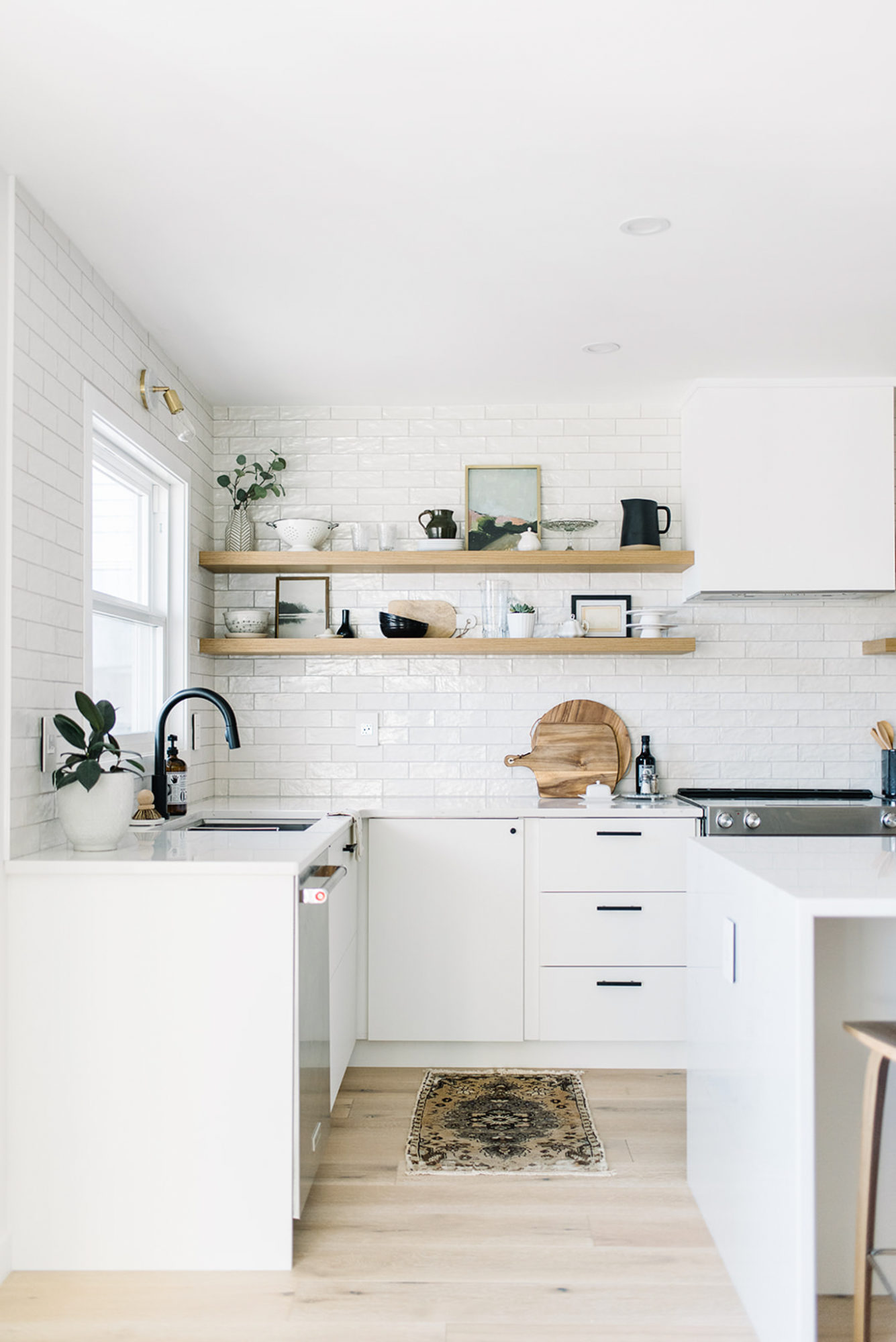
About the backsplash – I spoke about my love of Cle tile in the last post but that it was unfortunately too expensive to ship to Canada. So when I stumbled on this “unicorn” tile from Centura, I knew it was a great compromise. I love the texture and glaze and that each piece is slightly unique. We decided to take the tile right up to the ceiling – a much bigger impact in my opinion!
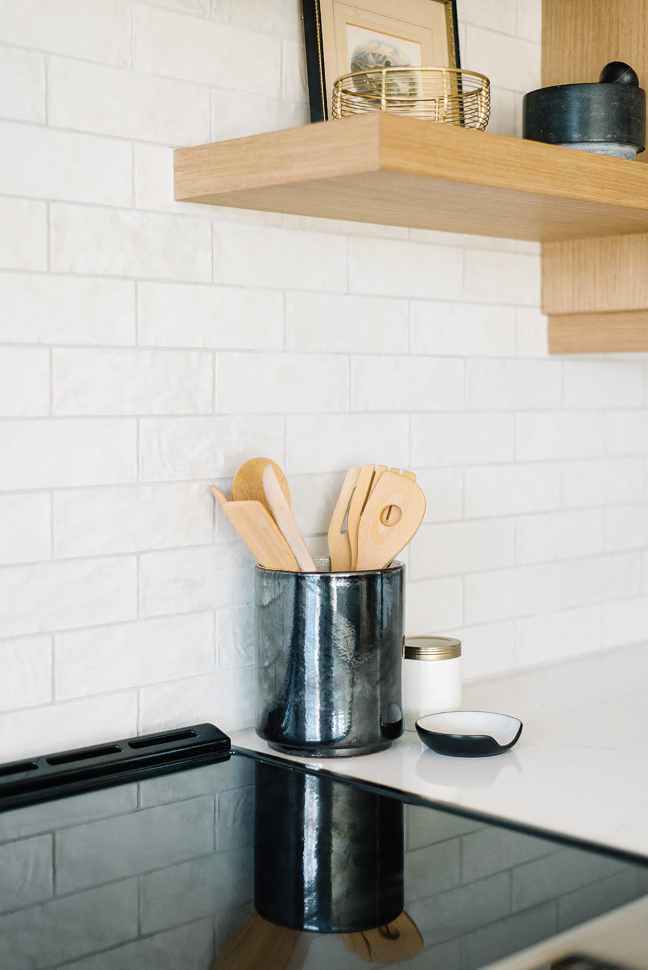
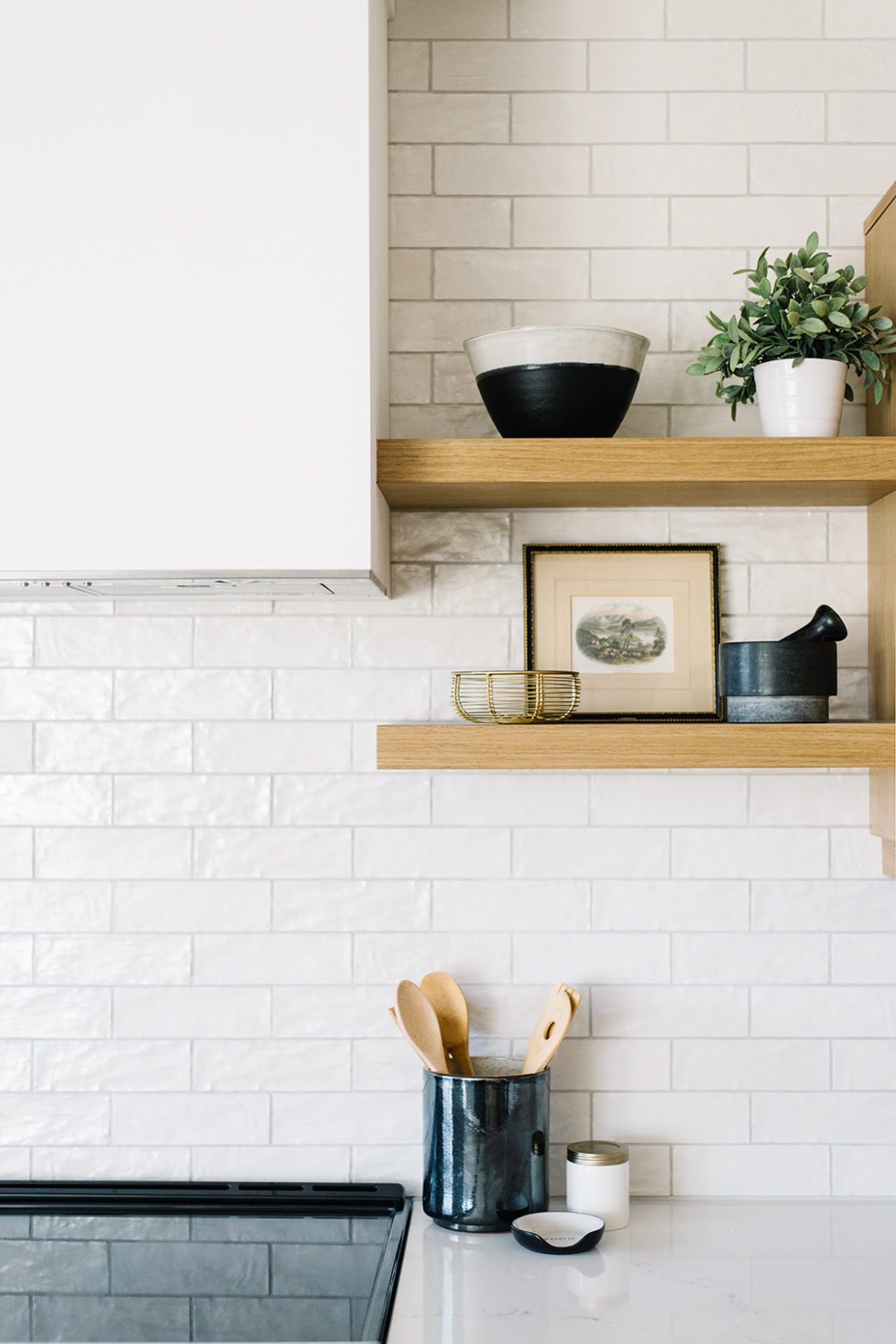
It was a dream of mine to have a built in hood fan and I was so happy that Ryan was also on board. We got a standard insert and then created the box out of MDF. The paint is the same as the walls – Simply White and we finished off the top with a small piece of trim.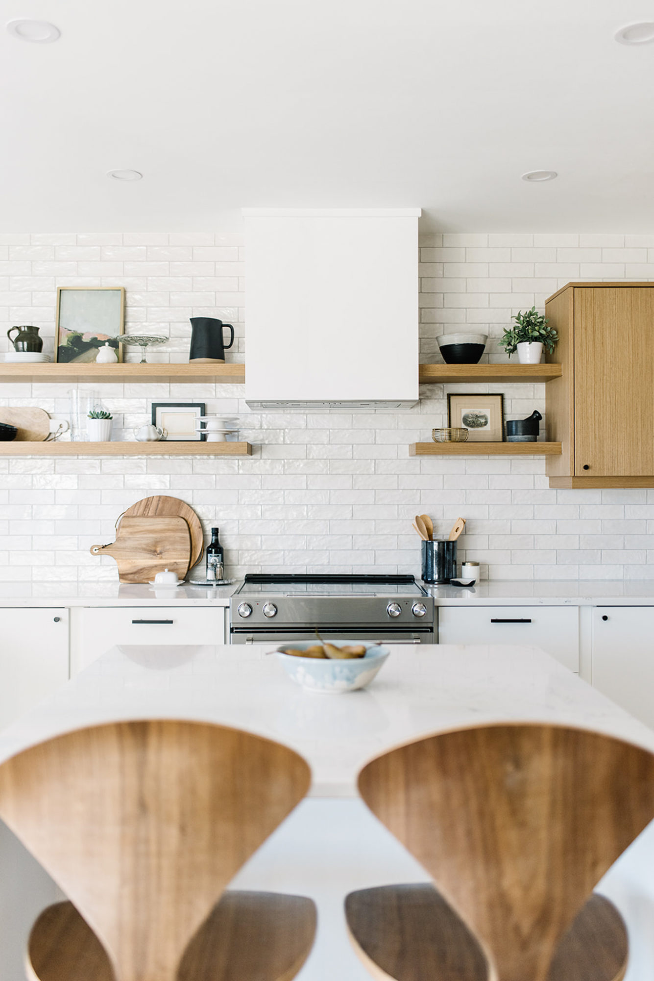
I could have easily added more uppers to the left of the hood fan but there was something about the open shelves that I couldn’t resist. I am a self professed shelfie addict after all! So really, how could I not have a kick ass set of shelves in my own kitchen, right?! I have to admit that while the smaller right side came together almost instantly, I did struggle with styling the longer left side. Luckily I have a design partner who comes over on the reg and helped me get the balance just right. Two design brains are better than one, don’t you think?! Anyways, I also love that I can change them on a whim or with the shifting seasons.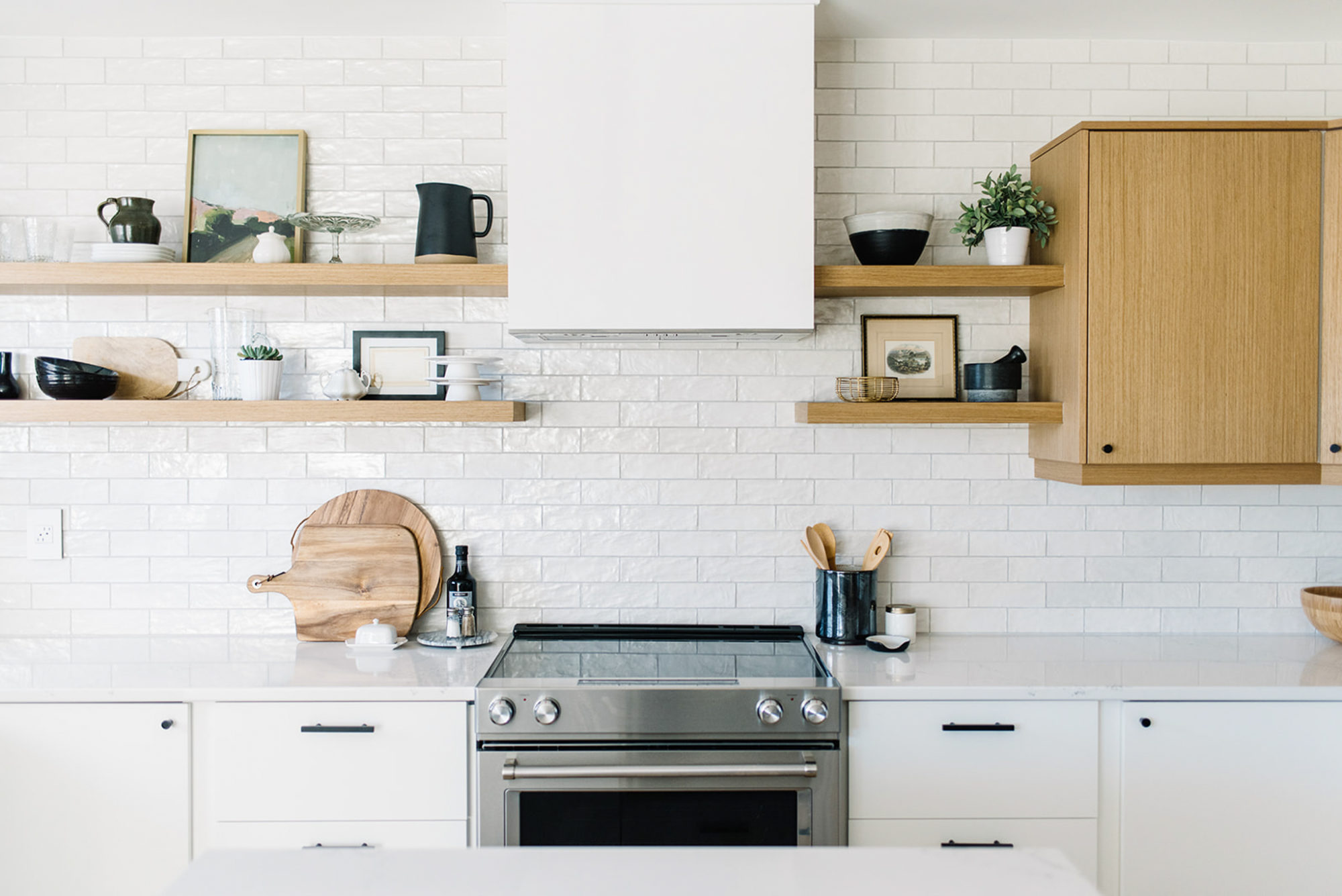
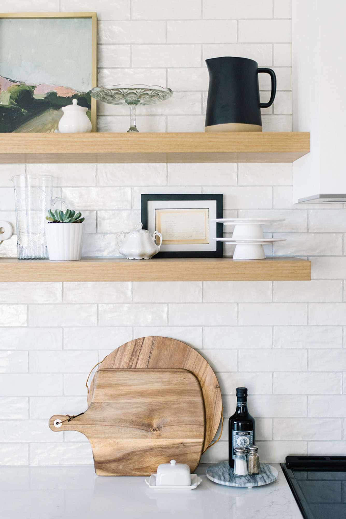
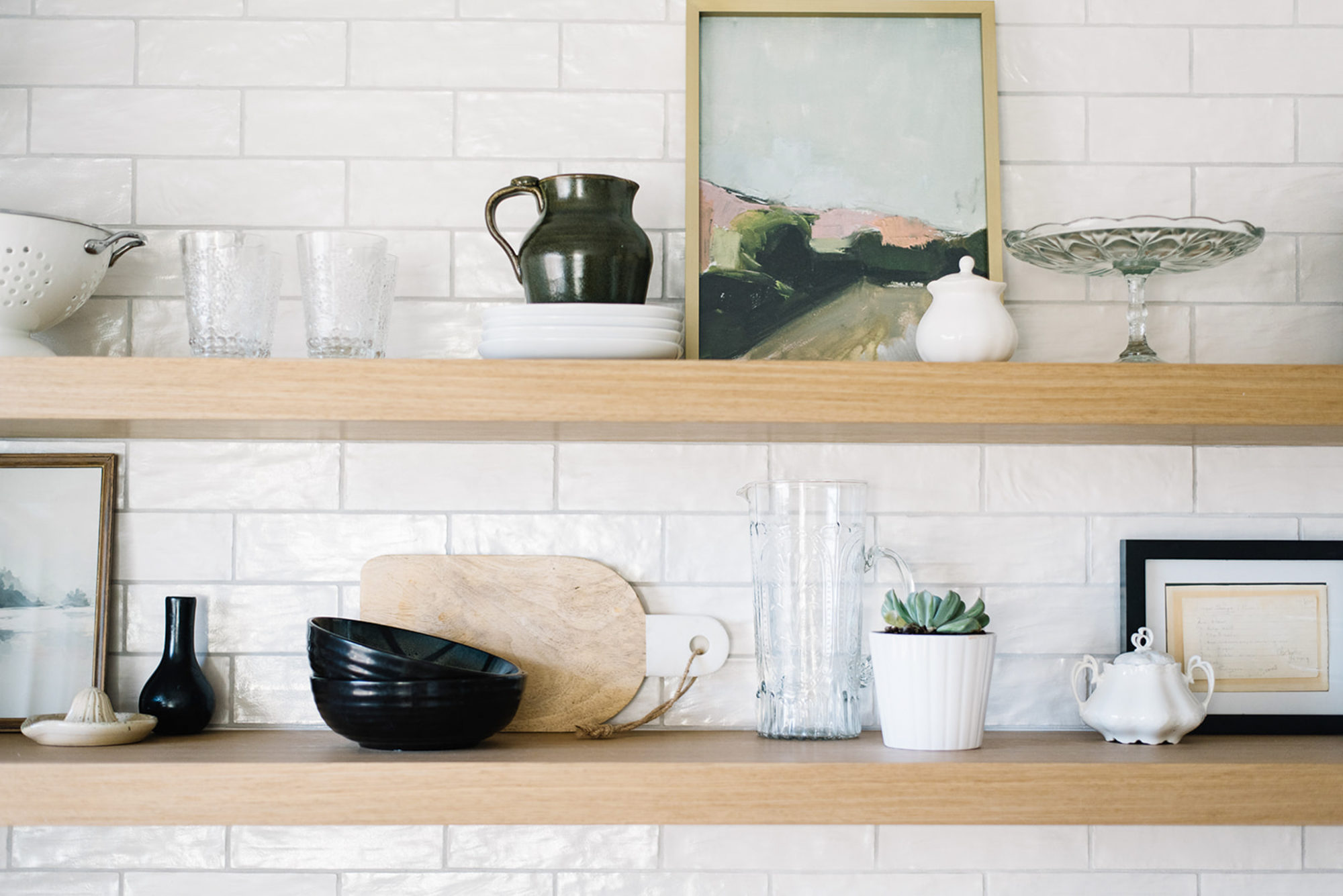
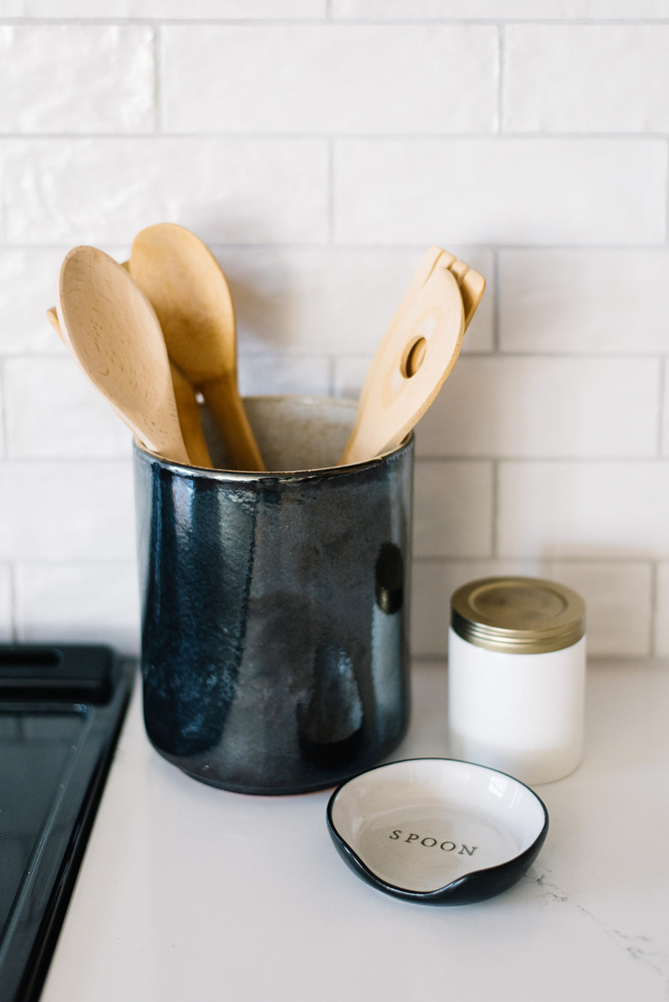
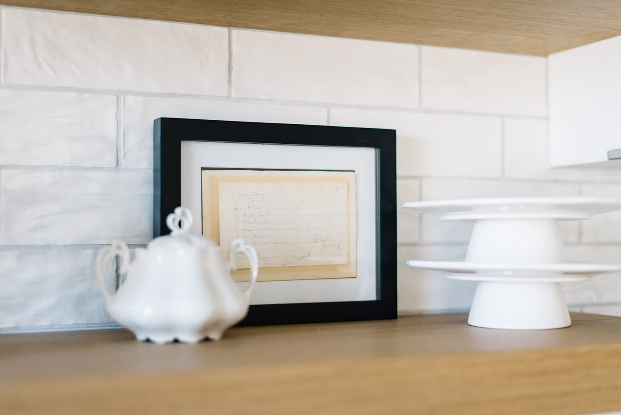
I should also mention that we ended up with plenty of storage for the practical, every day kitchen items in the cabinets, which allowed me to style the shelves with more decorative things and special occasion pieces. Everything you see is really inexpensive – antique mall finds, pottery made by my family (and me!), vintage hand me downs and affordable artwork. I even framed one of my Nana’s recipe cards (of which I have several) in a small Ikea frame. It’s pieces like this that make the space more meaningful and add that personal touch. I’ll link some of the items and similar finds at the end of the post, if you’re curious!
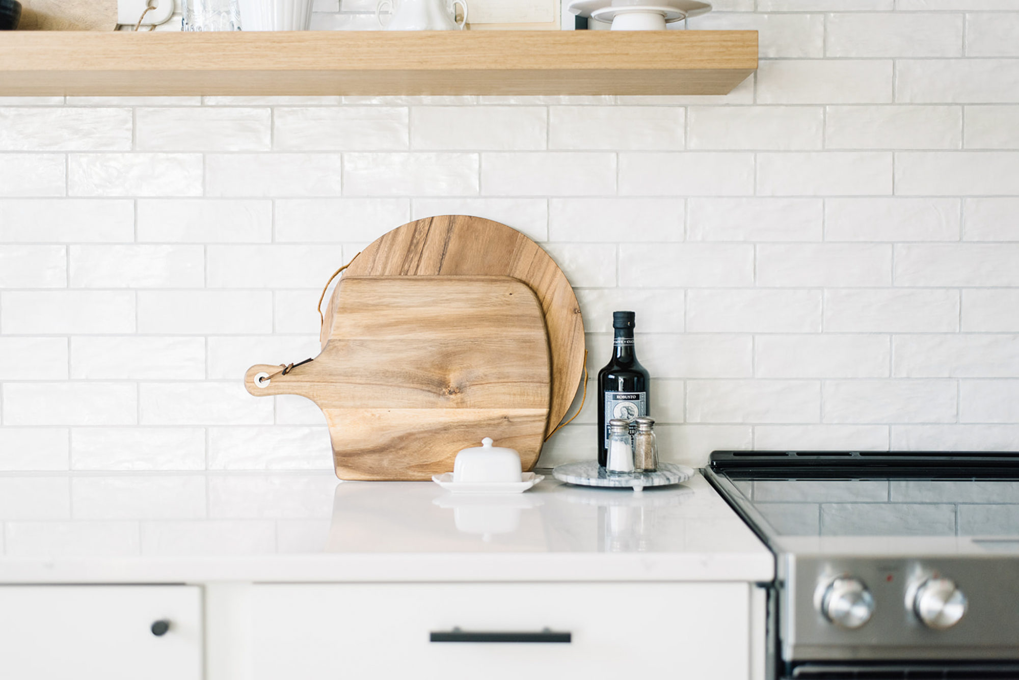
Handy items are nestled on either side of the oven – olive oil, salt & pepper in shakers that I picked up second hand in NYC and some great cutting boards. Whenever you want to make your kitchen look fancier, lean a cutting board or two, am I right?!! 🙂
Another detail I want to call attention to is our cabinetry hardware. I knew I wanted matte black to add that bit of punch the kitchen needed. My current favourite pulls were a bit out of my price range so I turned to Etsy and found these beauties from a shop called Hook & Knob. I absolutely love them and their squared lines and think they compliment the knobs perfectly. 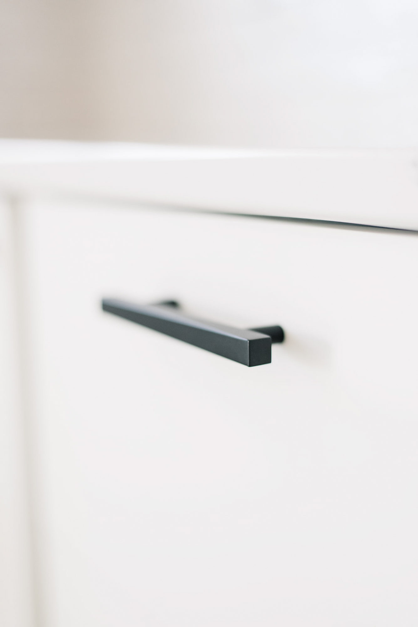
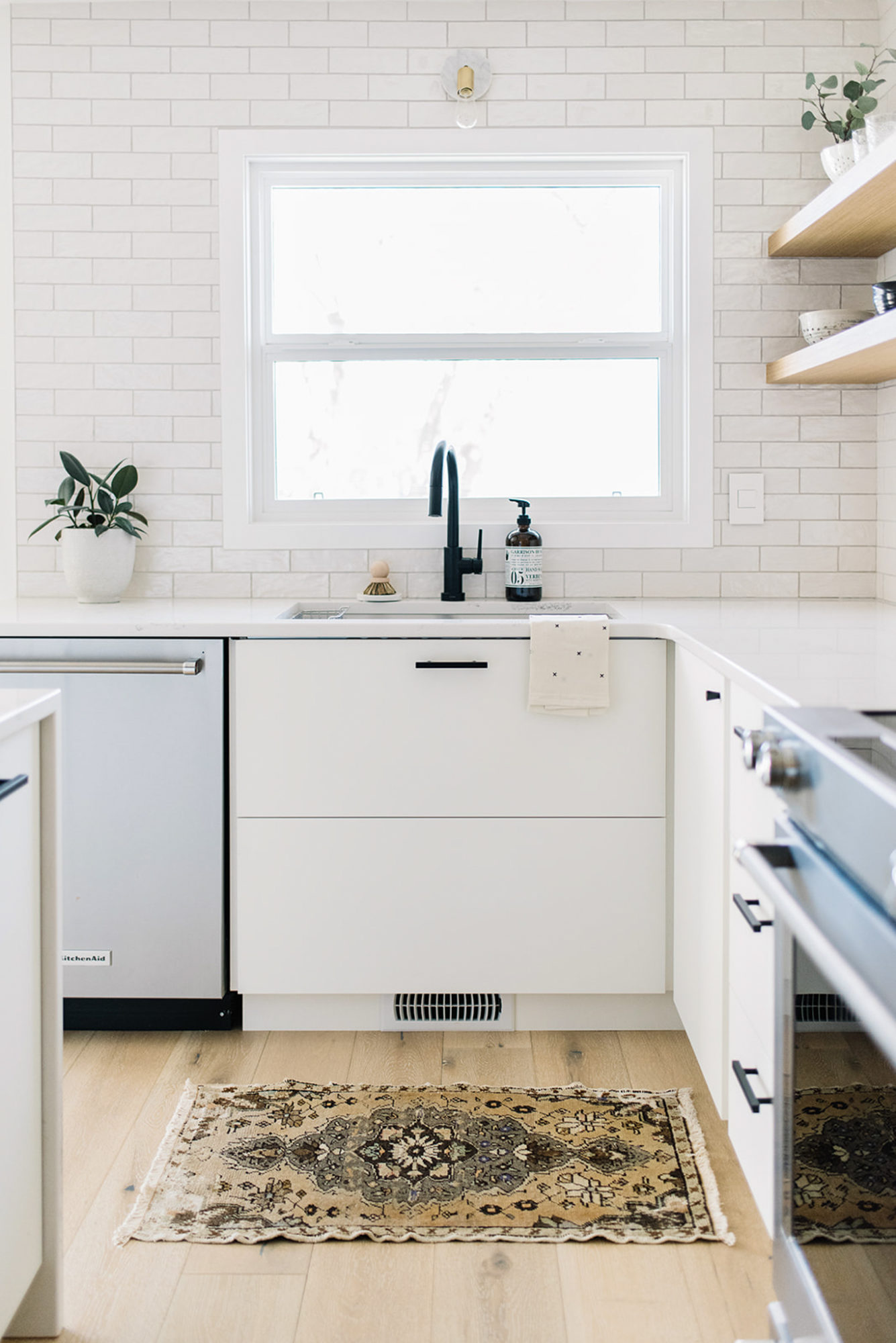
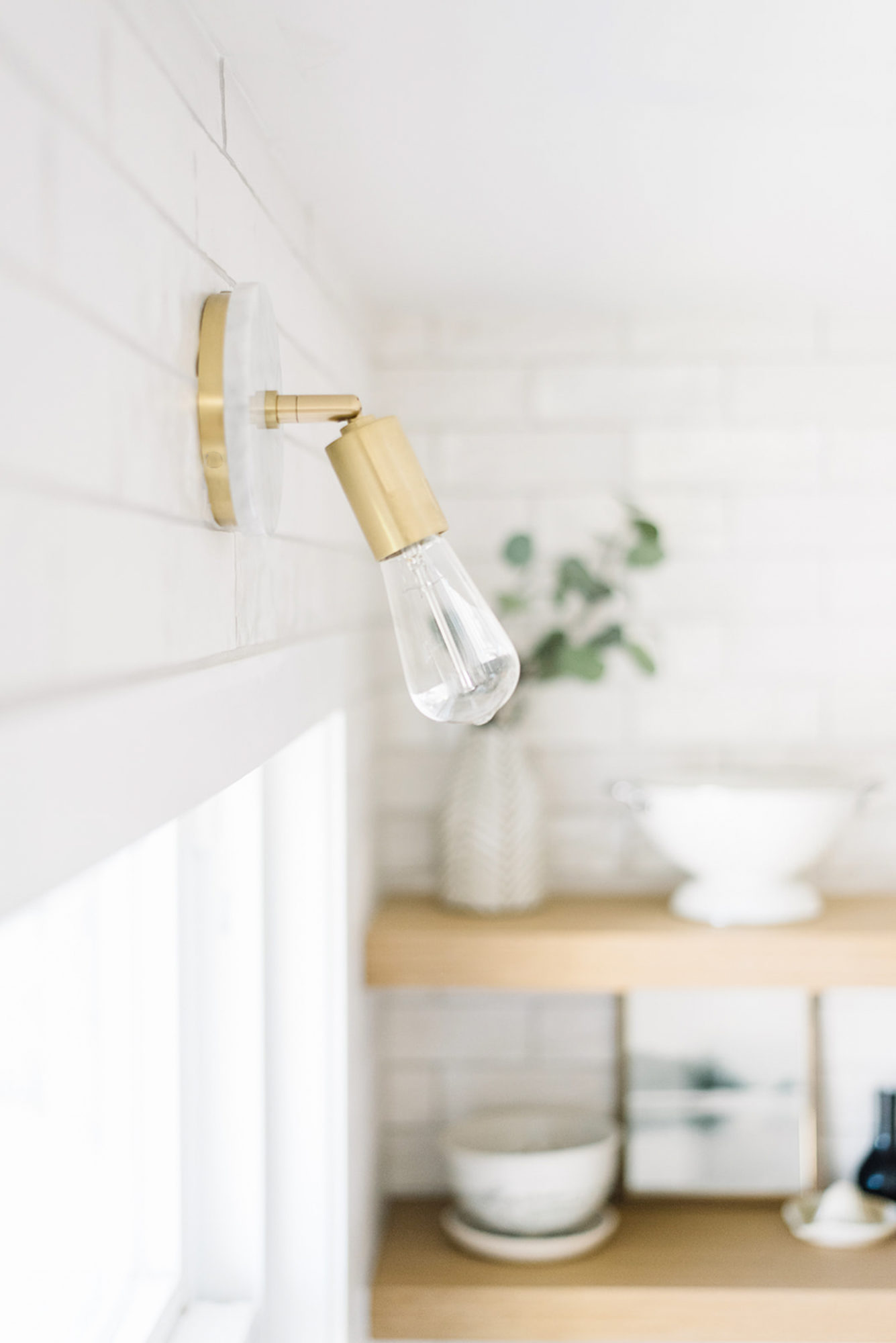
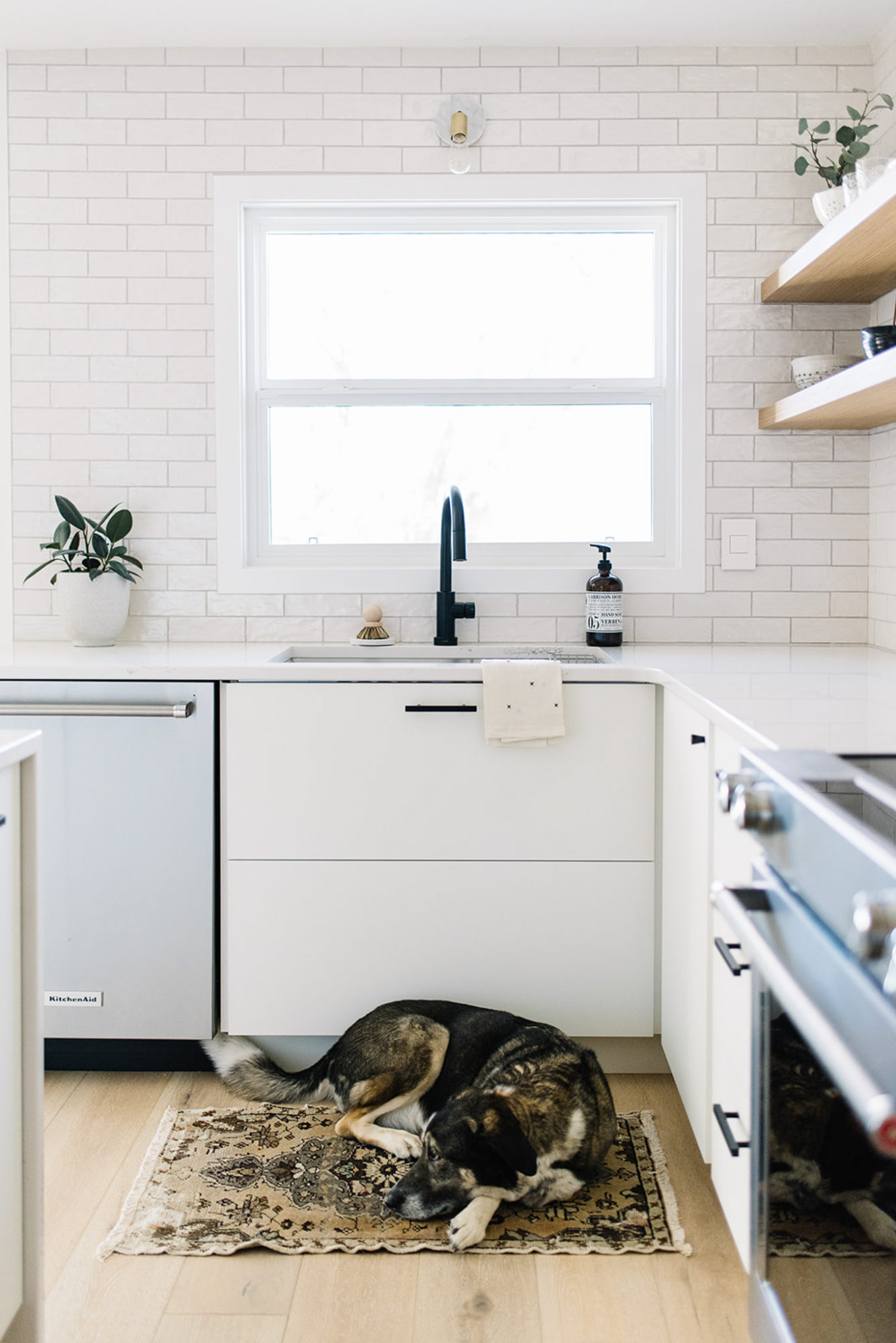
On the other side of the kitchen you can see where we added our new pantry (I also got my Schoolhouse pantry knob installed – yay!). We kept the sink wall pretty minimal so that the tile could take the focus…not to mention that simple wall sconce from Mitzi that I could not be happier with! Just the smallest hints of brass works well with all the matte black. 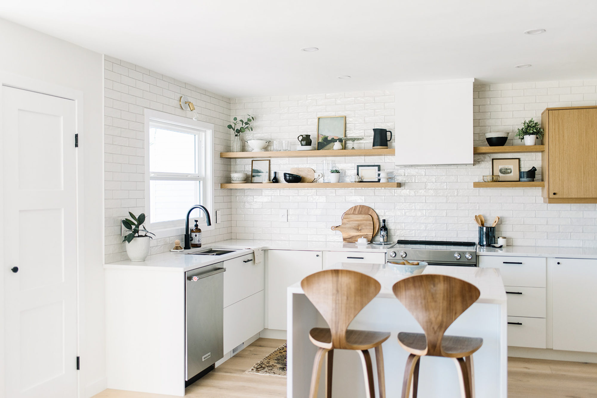
The Delta Trinsic faucet was the piece I knew I needed to have in here – I honestly couldn’t picture anything else. The matte black finish stands out beautifully amongst the white tile and bright window! 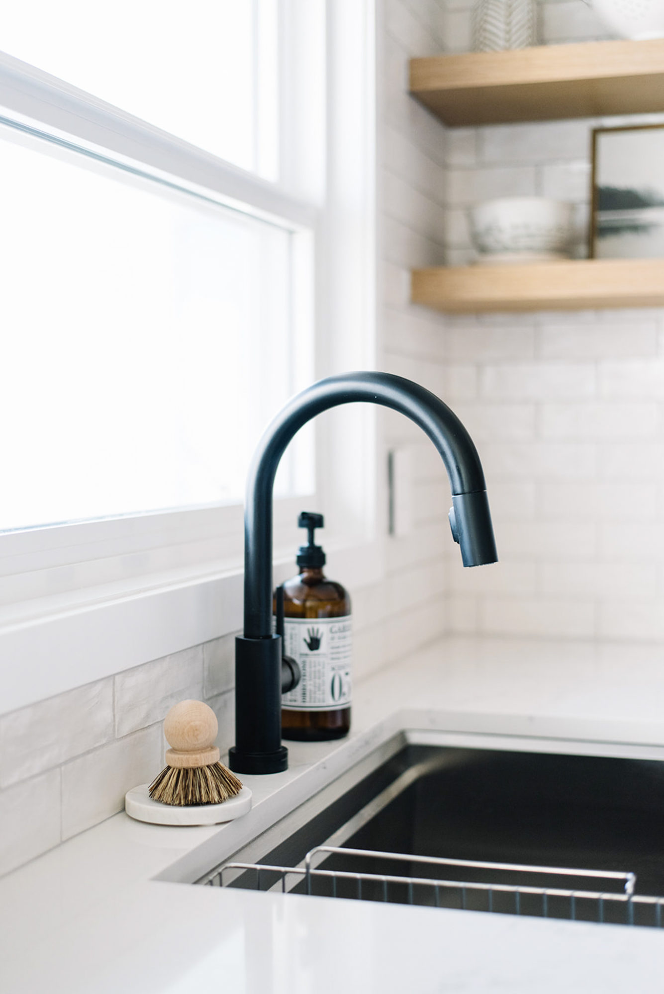
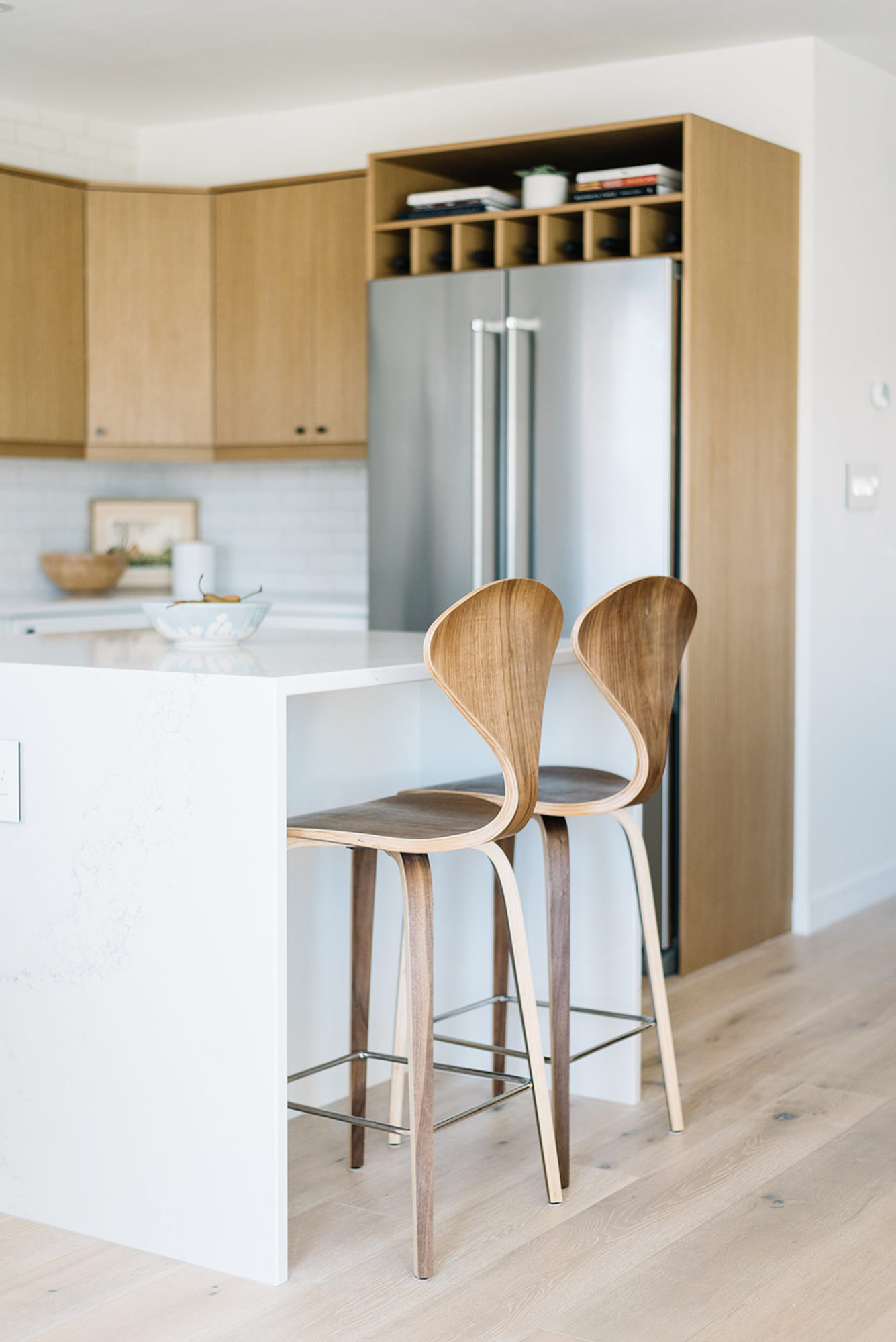
Another addition that I had chosen almost before anything else – my counter stools! I basically planned the whole kitchen island around them! But seriously, how can you not love this classic shape and the beautiful wood finish. Plus, I have to say, they are as comfortable as they are stylish! 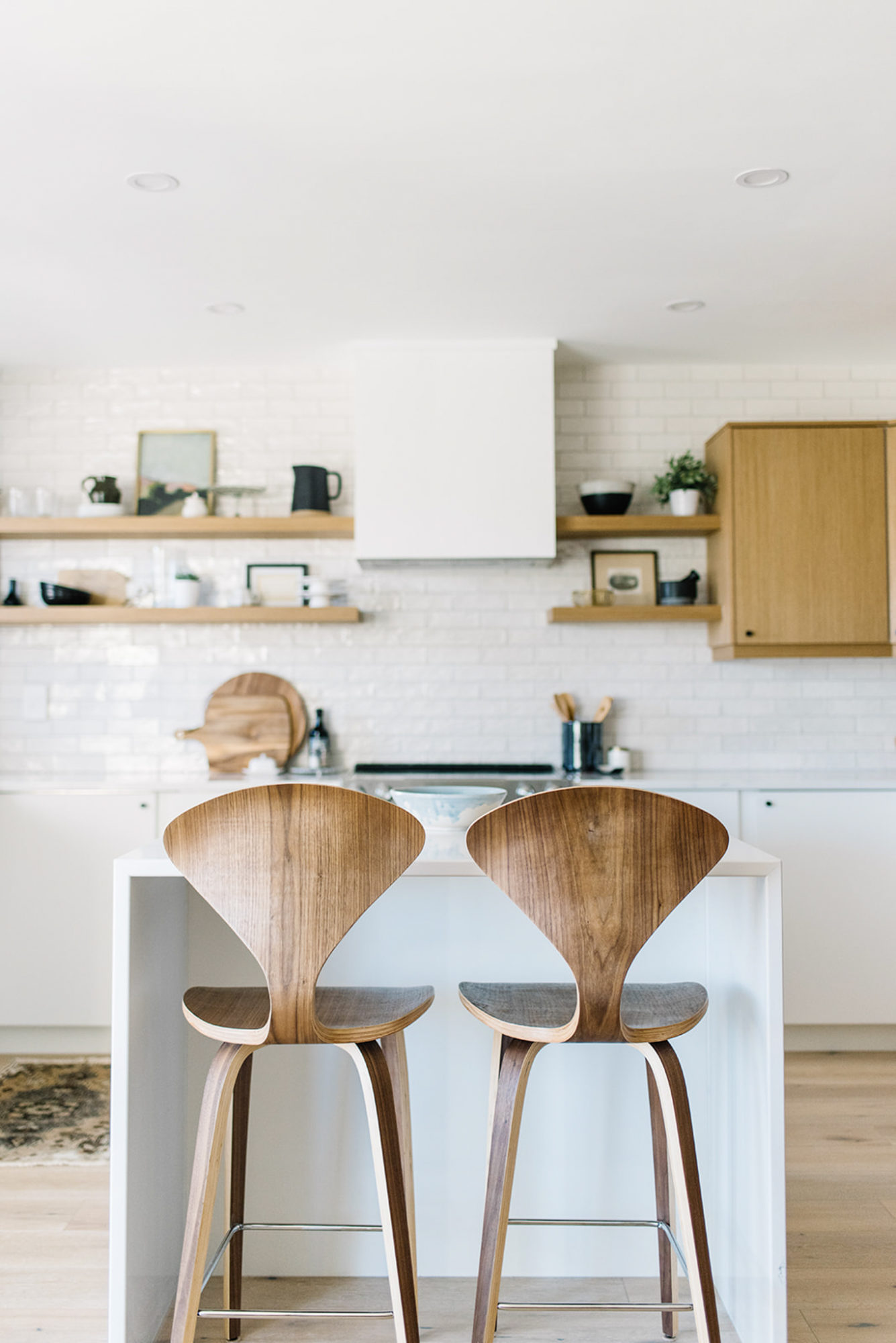
Because we didn’t have a large footprint, we designed the island to be perfectly square, with an overhang that would accommodate my beloved stools. Once we completed the counter top template, the amazing people at World Stone suggested we do a full waterfall feature on either side. And my goodness, am I ever glad we did! The result is absolutely breathtaking and they even matched the veining almost perfectly with the HanStone quartz so it felt like it just naturally cascaded down the side. Magic people…sheer magic! That is actually one of the reasons we chose the Yorkville quartz from the Boutique collection – because of that subtle veining. If you know me, you know that I love to keep things minimal so this was just the right amount of detail and contrast for me. 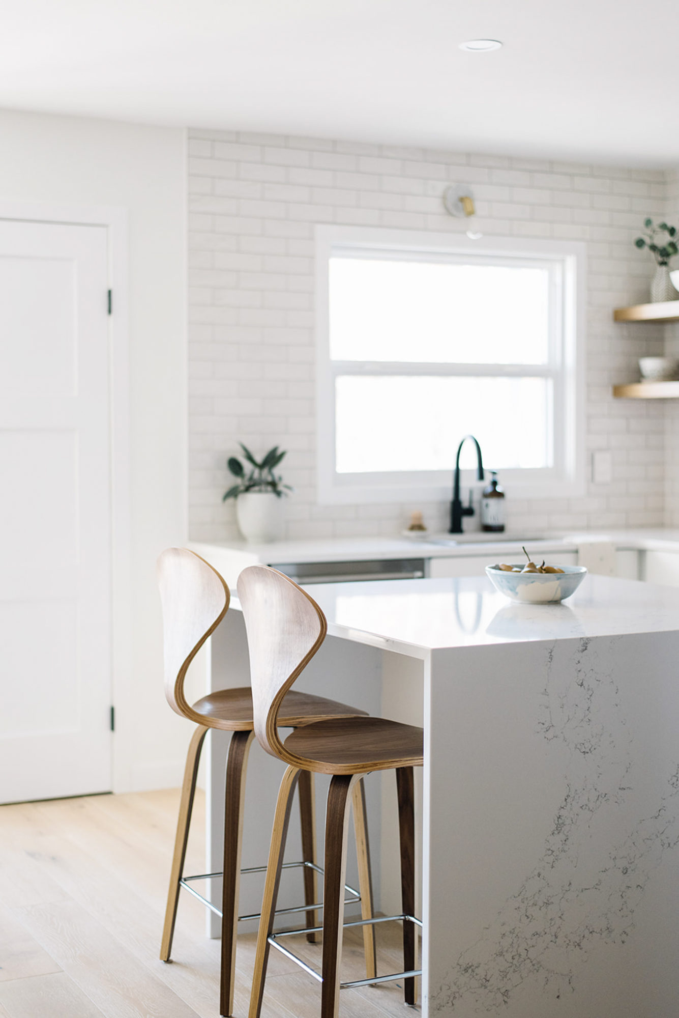
I cannot believe I am saying this…but we have officially finished the One Room Challenge and we now have a total dream kitchen space! Ahh! That felt so good to say! And it feels even better to be using this room as a family and creating some long lasting memories here. Seriously…I might never leave…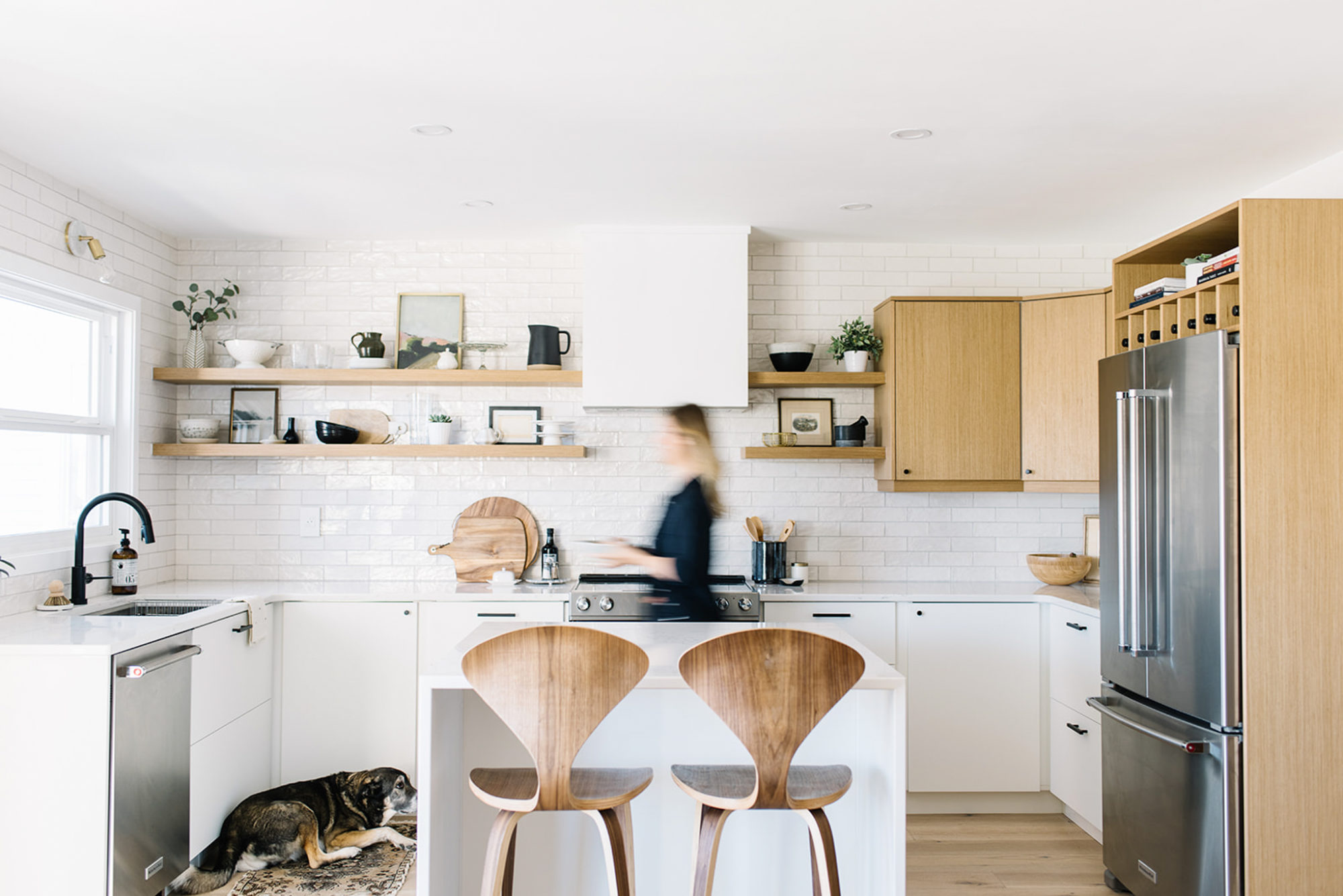
Loved something and want to find it for yourself?!
Here are all the sources to shop my kitchen!
Engineered Hardwood Floors | Simply White by Benjamin Moore on the walls and basic white trim/door paint from Home Depot | Cabinetry and shelving by Kitch | Fridge | Dishwasher | Stove | Hood fan insert | Kitchen Sink | Faucet | Wall Sconce | Counters fabricated and installed by World Stone | HanStone Counters | Backsplash Tile | Grout Colour – Sterling by TEC | Knobs | Pulls | Pantry Doorknob | Counter Stools by Rove Concepts
Rug from VintageDecoRugs | Hand Towel from Magnolia – similar | Dish scrubber | Tray for Dish scrubber | Vase (similar to the pitcher) | Scenic Print 1 | Scenic Print 2 | Cake Stands | Round Cutting board | Utensil Holder was on clearance at Crate and Barrel – here’s a nice matte black canister though | Bowl | Wire basket | Mortar & Pestle | Candle | Spoon Rest
A HUGE thank you to all the brands and vendors who conspired with me to make this renovation come true. Some product was gifted and some discounted and that made a huge difference to this project! Big thanks to World Stone and HanStone, Delta Canada, Mitzi Lighting, Hook and Knob, Pearl Sinks and Rove Concepts. More blog posts to come sharing even more details behind the design!
Photos snapped by Tracey Jazmin
And as always, make sure to check all the other amazing reveals on the main One Room Challenge website! Congrats to everyone who completed their projects big and small!


Comments are closed.