And just like that, we have only one week left until the big reveal in this One Room Challenge! How. Crazy. Is. That. Before we get to the good stuff, a little blurb again…
If you are visiting for the first time, I’m so glad you found me! I’m Kristina, this is my little slice of the internet and I’ve been updating my Ravine house for about 3 years – this kitchen renovation is the last piece of the puzzle, thank goodness! I share this space with my contractor husband Ryan, my little boy Jack and my two rescue pups Shya and Ava. Maybe you remember me from my first One Room Challenge when I redid my half bath and laundry room, but if not here it is again (and I did a follow up DIY here!)
Now if you missed out on the previous posts, check out Week 1 here (the design plan), Week 2 here (demo, setbacks and more!), Week 3 (walls and electrical – yay, lighting!!) and last week’s post here (countertops!!)
_____________
Today, I am happy to say that we are in very good shape to finish on time! It’s true we had some bigger setbacks in the beginning and then a couple minor hiccups with the wrong tile showing up and some miscommunicated finishing details, but otherwise, it’s honestly been running quite smoothly. I won’t show you TOO much because I want to hold your suspense a little longer but here are a couple photos of the progress.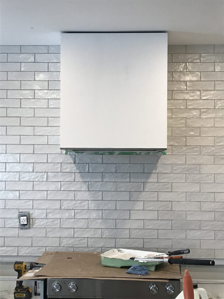
The hood fan is in and we did debate a little bit on its overall length and how far we wanted it to sit above the stove top. The very minimum is 24″ but we also had to take into account our floating shelves and where they would “hit” the box. So we ended up installing it around 2’5″ above the stove. We still have to finish off the top with a piece of trim, but otherwise, it’s looking so good!
You can also see that my beloved unicorn tile is installed and we’ll be grouting it with the Sterling colour so we can still appreciate the rough edges without having too much contrast. The tiles themselves are all a bit different in sheen and texture – that’s the appeal! I had originally wanted this Cle tile but it was too pricey to ship to Canada, so the Centura Mallorca was a what I considered a great second choice (at a WAY more affordable price point!).
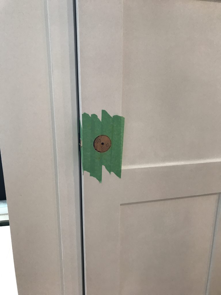 We had a small oopsy happen on the pantry door. I had failed to communicate that I had picked up this knob at Schoolhouse Electric, rather than an actual door handle. So, Ryan lovingly filled it back in and will patch it up so I can get my pretty pantry knob 🙂 True love people, true love!
Now, the last thing I wanted to chat about today is some of the finishing touches I have planned to bring the whole space together. There’s a lot of white (and wood too of course), so get ready to be hit with some punches of black. I am really excited about the hardware I chose from Hook & Knob because they are squared off pulls (hello, modern and sleek!!) and very similar to some of the more expensive options I was originally looking at. Plus, they came crazy fast! Yay! Highly recommend people!
I then have my dream faucet…yes I dream of faucets, don’t we all?!…going in as soon as the counters are finished. Do you remember the Lady Laurier’s unreal Delta Trinsic faucet we installed? Let me remind you…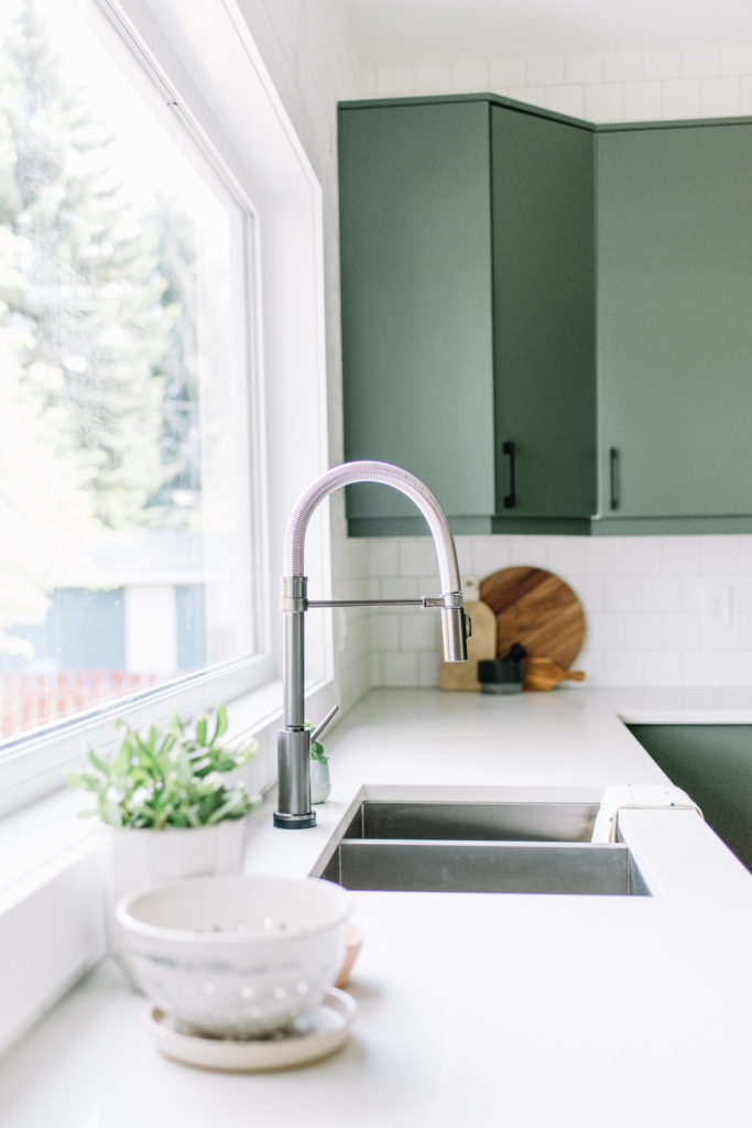
I was jealous when we installed this beauty (it was touch btw) and thought that if I could ever have my pick it would be the matte black Trinsic pull down option…again, with touch, because why not!!! Plus, we have the champagne bronze bathroom Trinsic version in our half bath just around the corner…gotta love when there’s continuity from room to room, right?! So stay tuned for more on this because, yes, my faucet dreams have come true!
Lastly, our floating shelves are in and we should have them installed, along with the cabinet fronts and sides, right away. Of the whole design, the open shelves seem to be the most…hmm let me see, controversial?? choice. A lot of people like to comment about the practicality of them, whether or not the dust would be a big issue and if they can be kept “pretty” all the time.
I do get it – they are definitely not for everyone. But I definitely think we’ve built in enough closed storage that I can keep them looking beautiful…and I don’t mind cleaning…in fact, I sometimes really enjoy it. So, I think they will work for me and my family. Plus, I LOVE styling shelves and a good shelfie 🙂 So, to conclude week 5’s post, I leave you with some amazingly beautiful kitchen shelfies that have inspired my own!
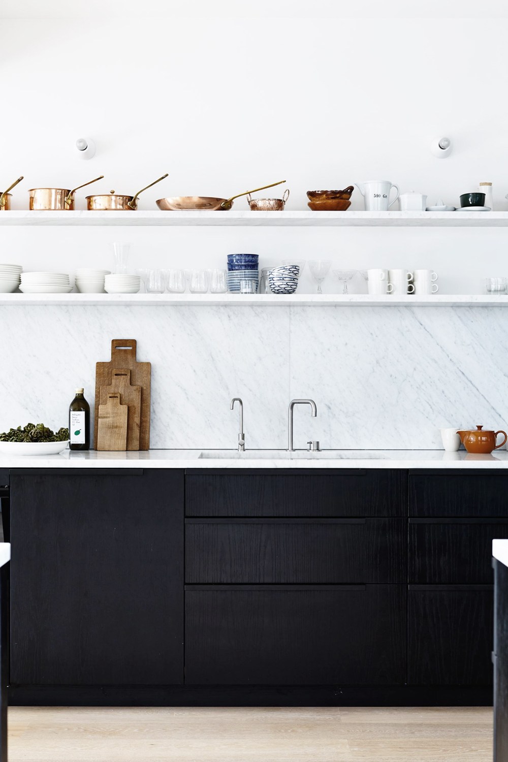
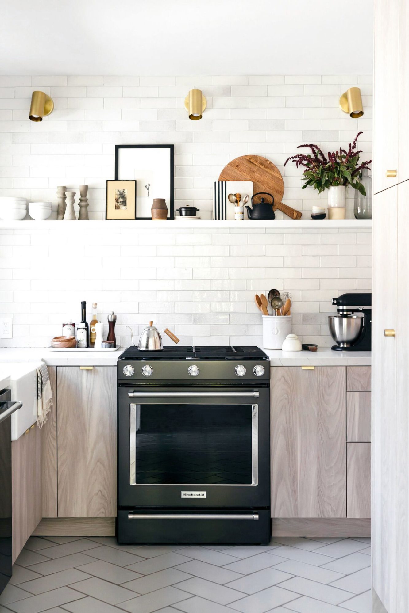
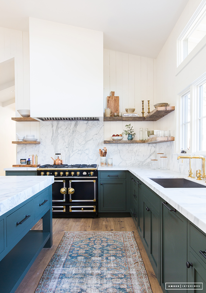
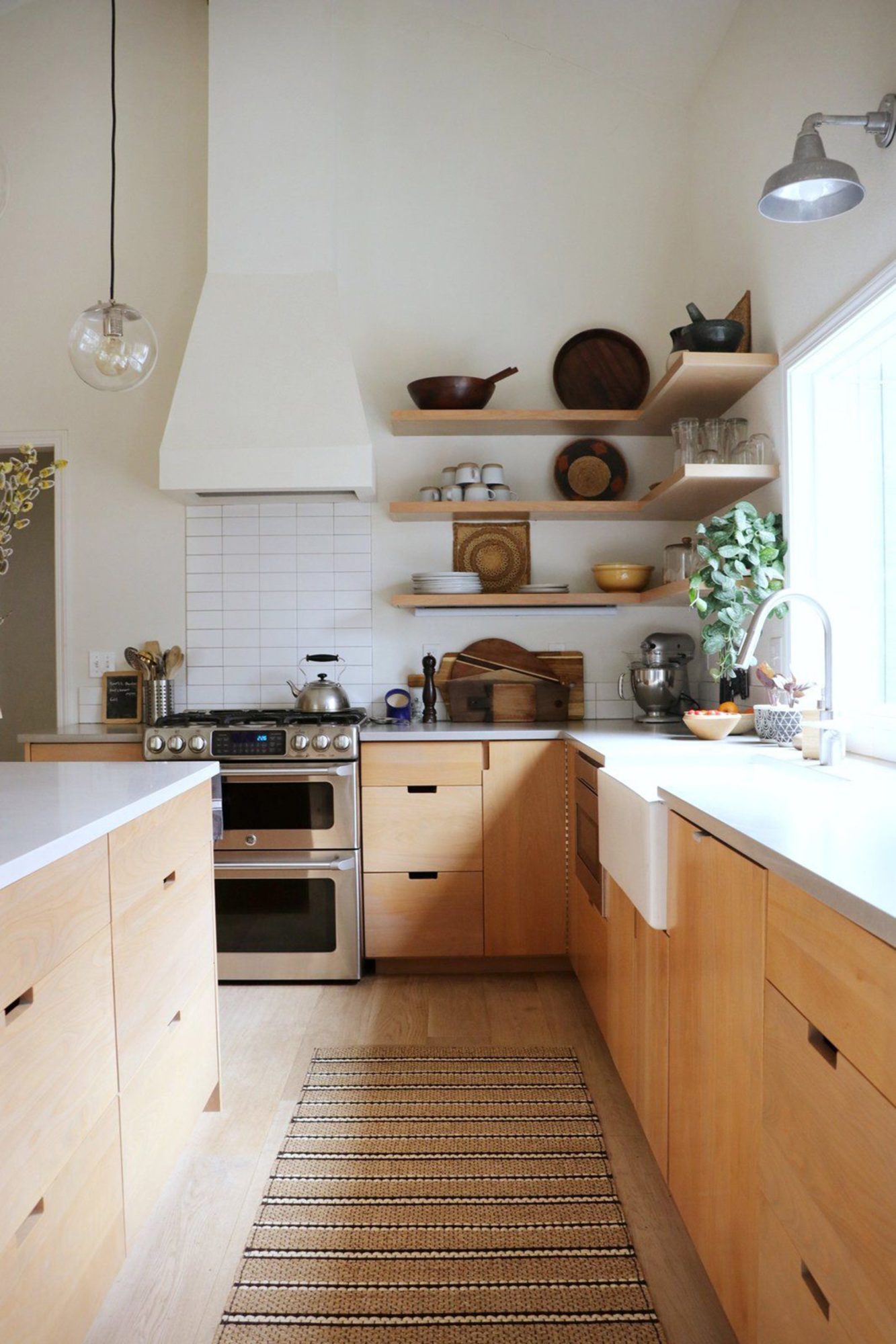
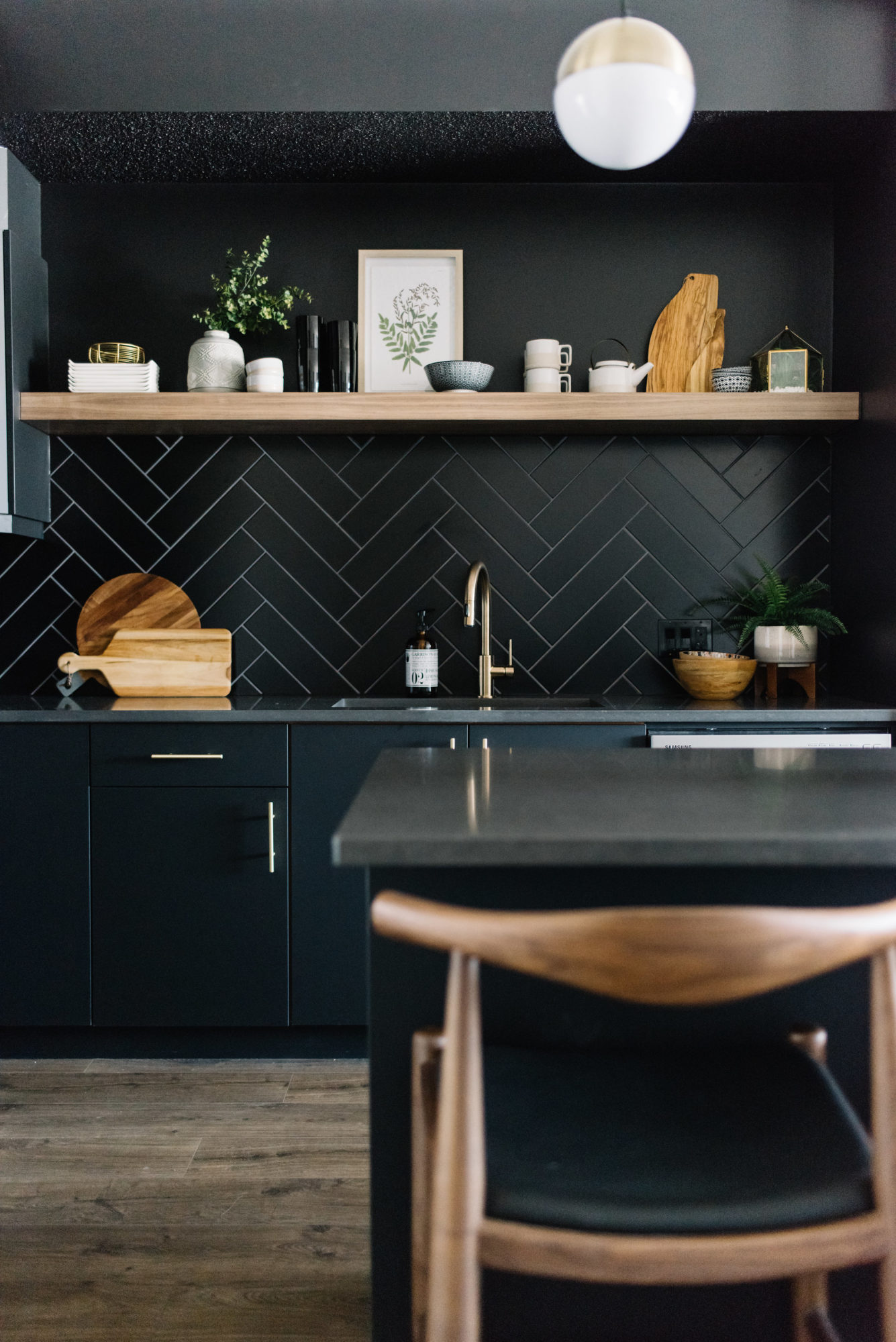
Image 1 Oracle Fox | Image 2 Anne Sage by Studio McGee | Image 3 Amber Interiors | Image 4 Emily Henderson | Image 5 Kresswell Interiors (me and Diana!)
Don’t forget to visit some of the other guest participants posts here!
