It seems crazy to say that TWO years ago we renovated the Ravine House’s master bedroom. And yet, to some it may seem crazy to already be making changes again. But when we originally created the space, we made a lot of compromises to keep it affordable, knowing it would grow with us (plus I’m a constant re-designer lol). And then, when we decided to update our queen bed to a king, the bedroom redesign naturally followed. No time but the present, right?! Let’s take a look…
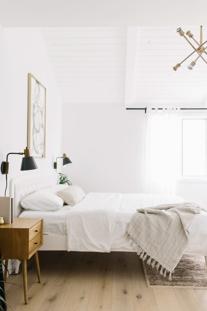 Right off the bat, I should mention what did not change: we didn’t repaint (though I would have done a warmer white if we’d had time), the lighting is all the same (besides the table lamp), I couldn’t not keep our nightstands because I love them dearly and I wasn’t able to find a different area rug that I liked more than my current one. That is what’s the same, now for what’s changed…
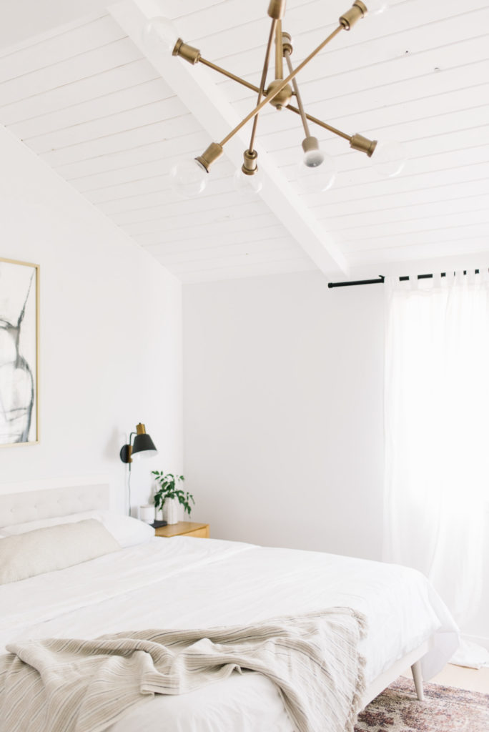
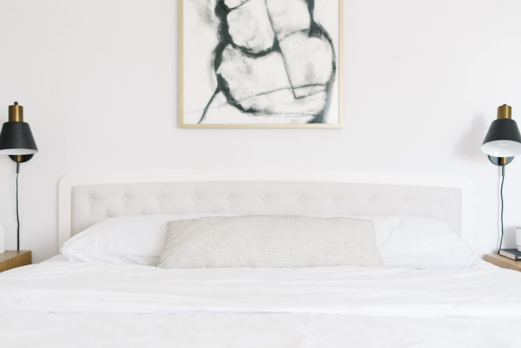
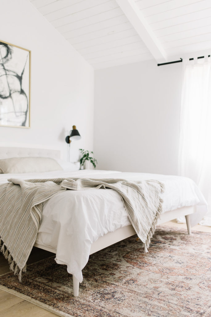
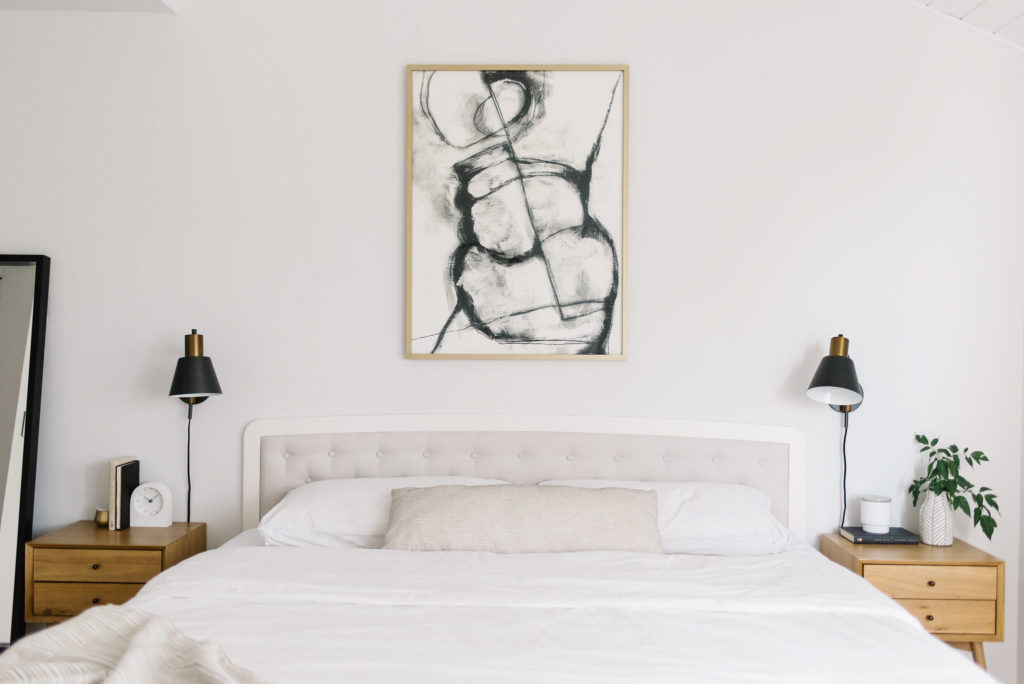 Obviously, the new bed and bed frame was what inspired the whole design. I originally wanted a full linen headboard but when I found this Article frame that combined the solid white wood and linen, I fell in love (read all about my adventures in bed frames here).
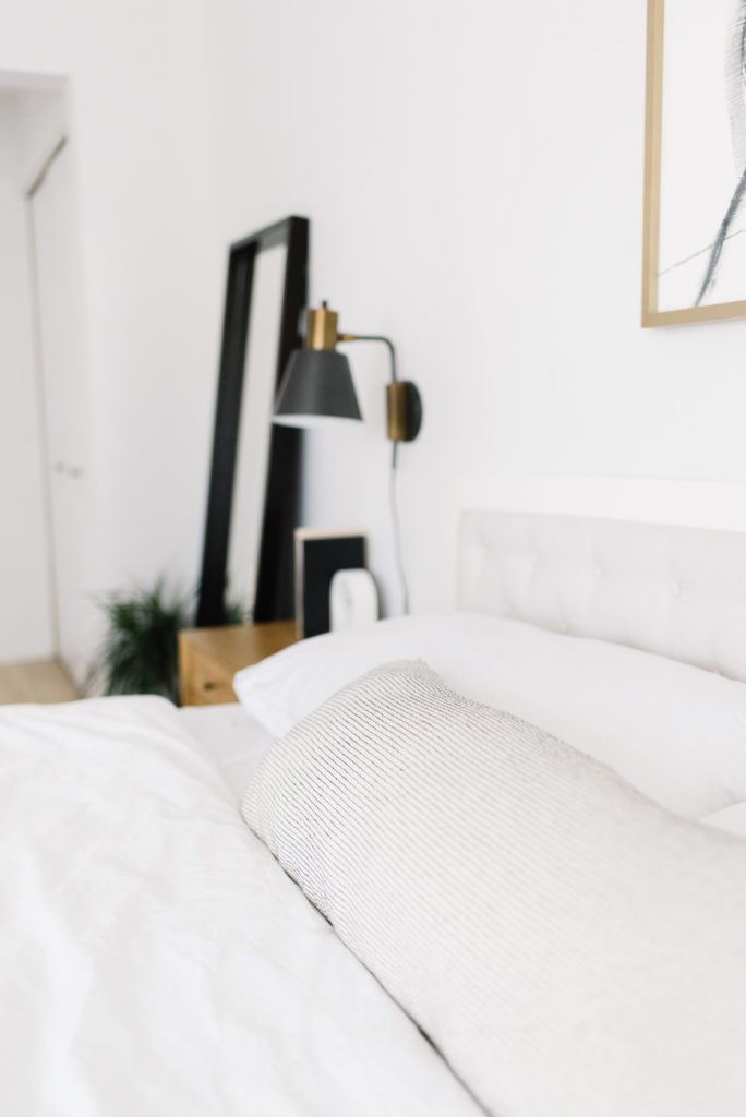
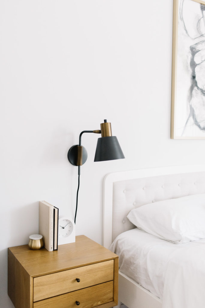
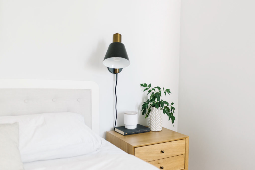
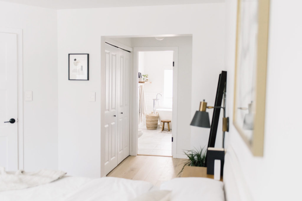
The next piece of the puzzle was to find artwork that would compliment the neutral palette and draw the eye up to our sloped ceiling. I had so many favourites but settled on this black and white abstract piece in the end. I love the curved lines that are almost reminiscent of a woman’s figure.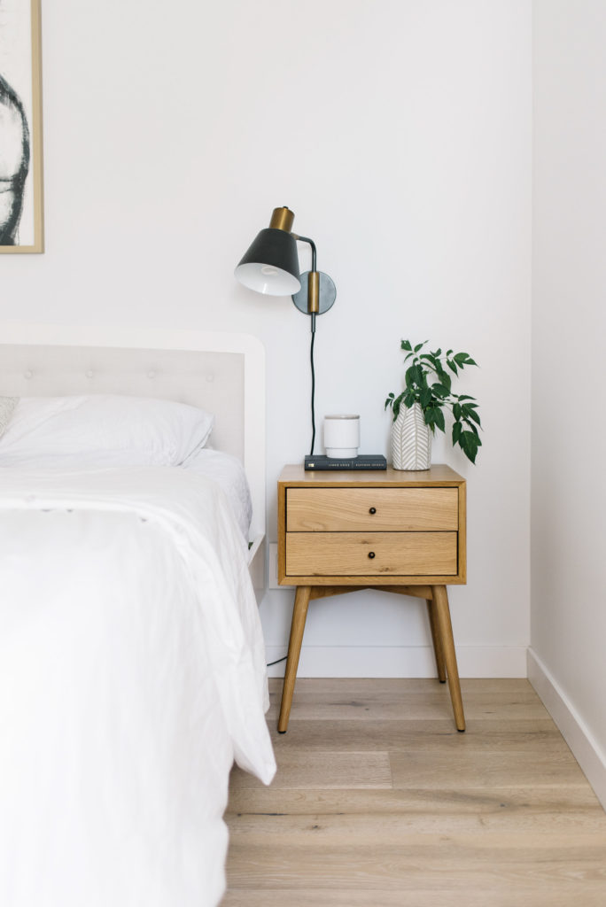 To minimize wall damage and extra work, I decided to only move one wall sconce to accommodate the bigger bed size. Typically sconces are centred to the nightstand but I like that we divided the space between the bed frame and night stand making a triangle essentially. Then on the far side of the room, we added a much needed floor length mirror…after two years I can finally see my whole outfit!! lol
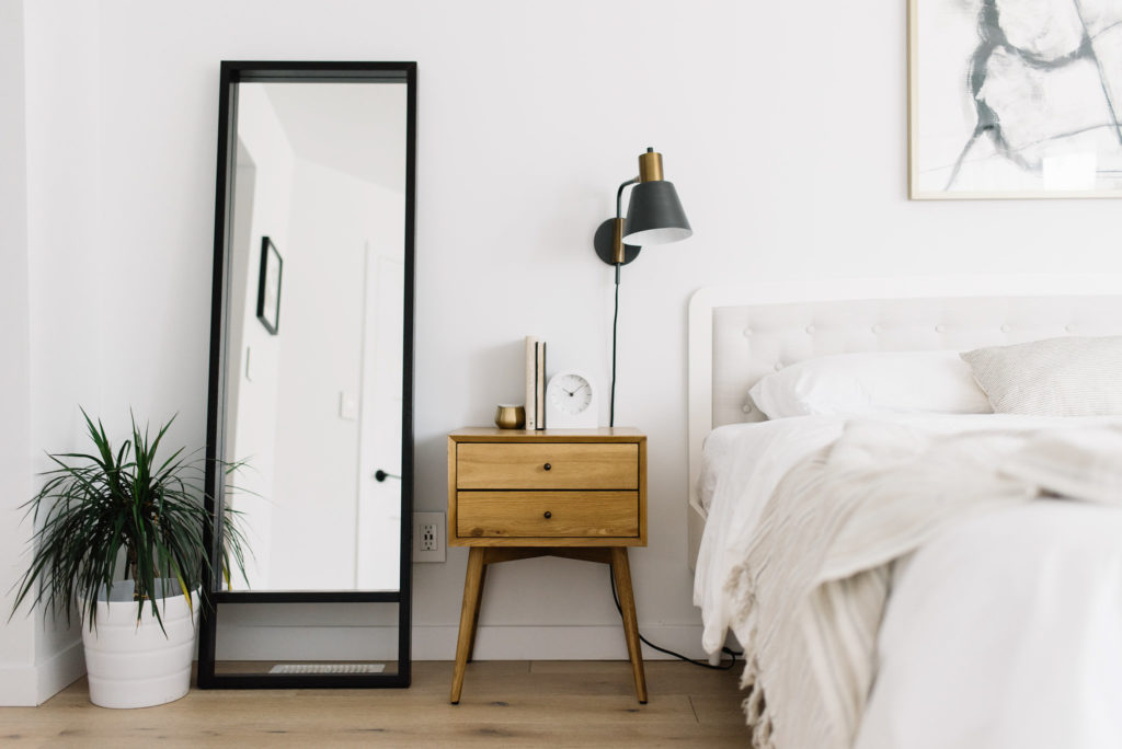
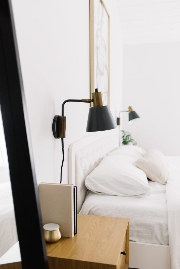
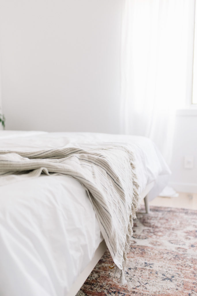
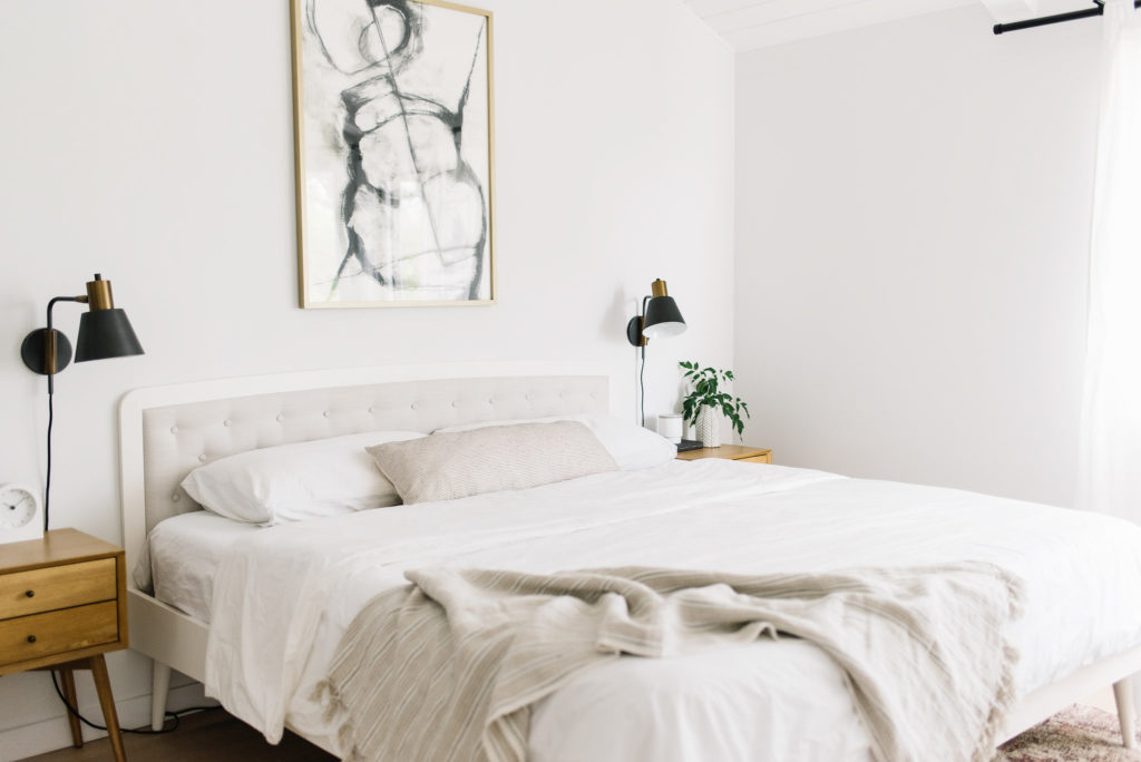 When it came to styling the bed side of the room, I kept it pretty simple and minimalistic. We’ve got soft white sheets, pillow cases and duvet, a very subtle linen throw and my favourite purchase…an extra long lumbar pillow with the prettiest line detail ever.
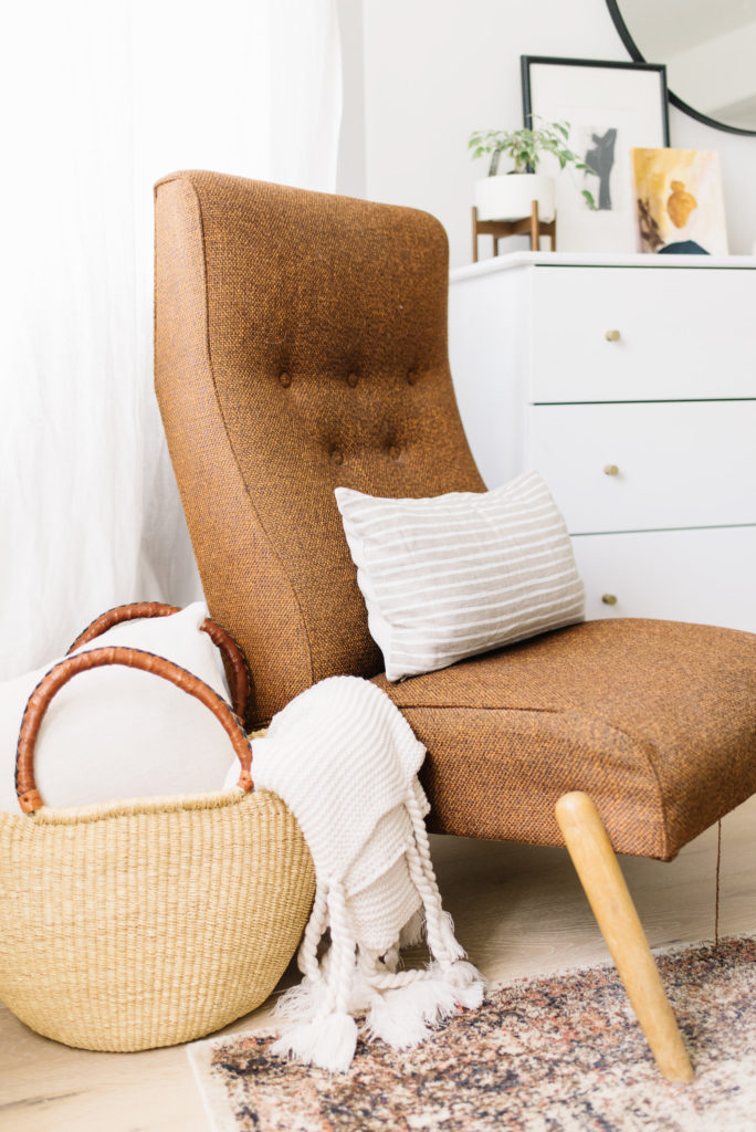
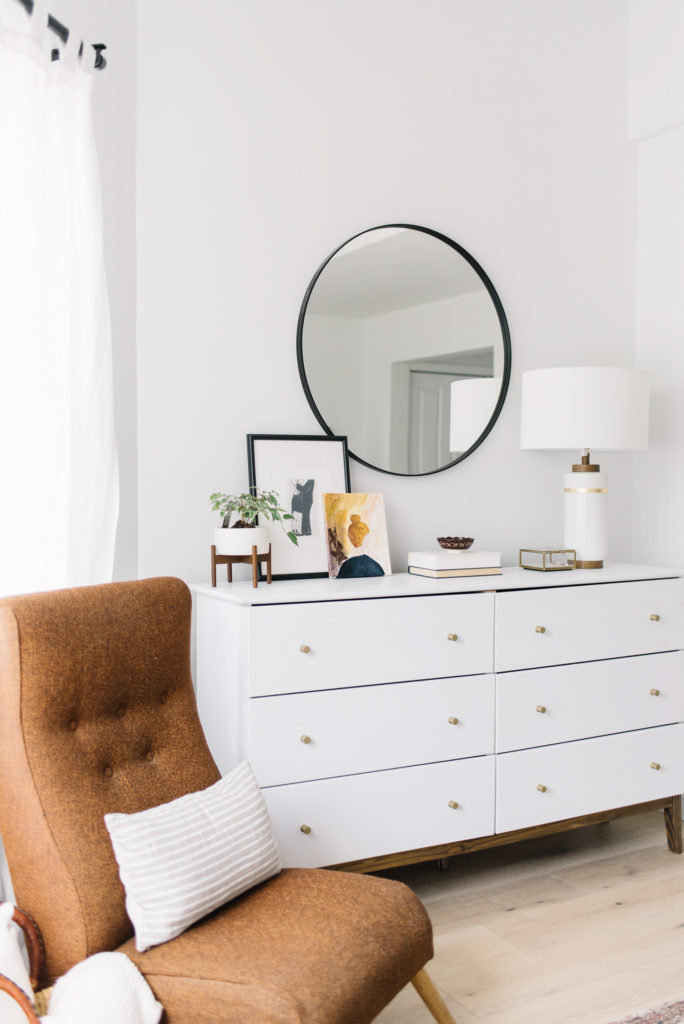
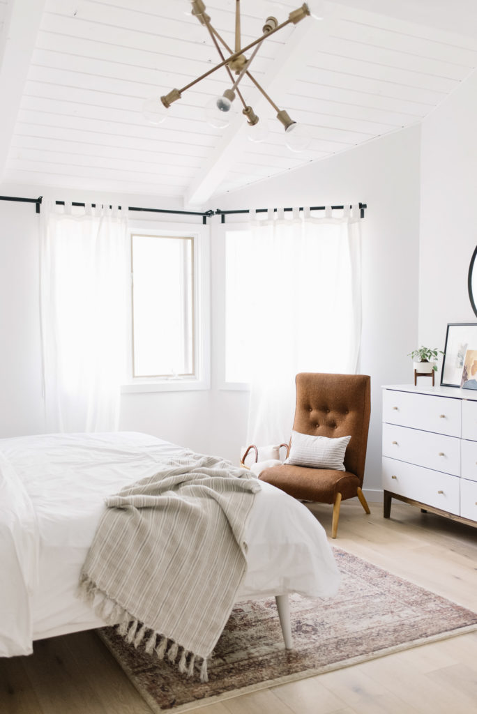
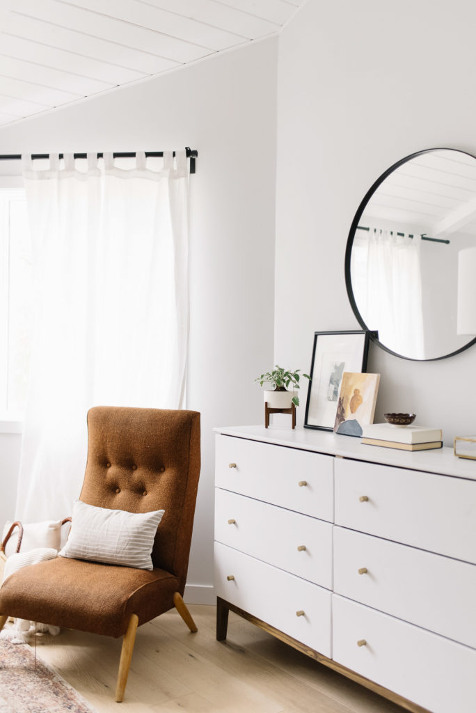 And then for the opposite side. We moved Granny’s chair to this nook to free up some play space down in the living room for Jack. Now, I’ve always thought this chair looks good anywhere but I’m particularly in love with it here, especially nestled with a small pillow and my woven basket. Knowing it has found the perfect place makes me very happy…it has seen so many special moments and it will continue to do so here.
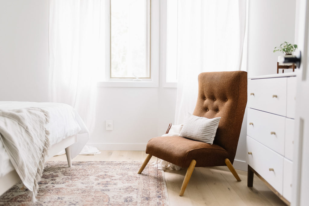
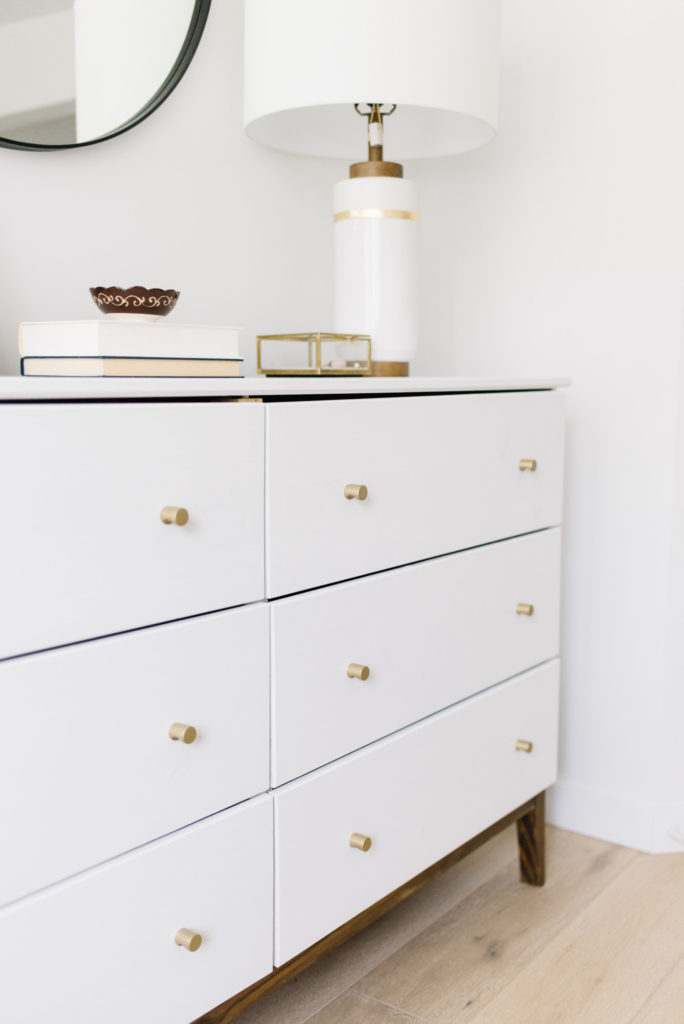
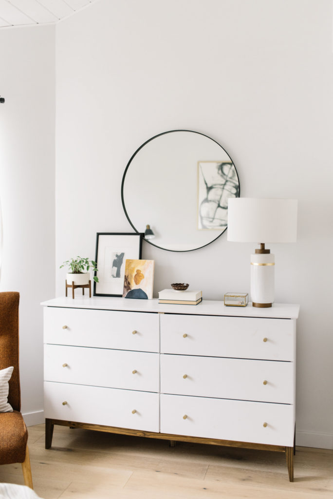 As for our DIY’ed Ikea dresser, it is still going strong despite some minor warping and a few dings here and there. I did decide to give it a fresh coat of white paint though just to cover some of the darker wood spots that seem to slowly creep through as the sun shines in.
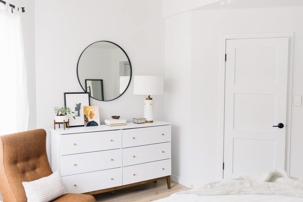
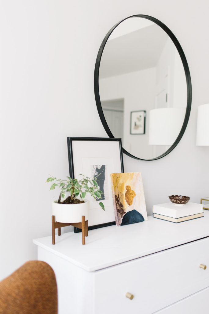
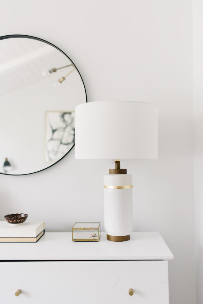
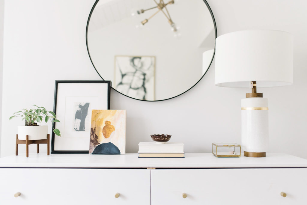 My favourite part of this refresh is the simple dresser styling here. I treated myself to one of my all time favourite lamps from West Elm but then DIY’ed my own artwork to add a bit of colour. Everything else was already here, just in a slightly different configuration. It’s amazing what taking everything off, refining it a bit and then restyling can do…it’s like a breath of fresh air!
 I am so happy with how this bedroom came together, even though it wasn’t a complete redesign. There is absolutely going to be a follow up post about how to accomplish this for yourself and some more helpful tips and tricks for styling a master bedroom – so watch out for that! If you have any questions, please feel free to ask in the comments below!
Bedroom Details: Flooring is a white oak engineered hardwood from Timbre Town | Wall colour is Decorator’s White | Ikea Dresser details can be found here | Article Bed Frame and our Mattress | Duvet Cover from local company Skylark and Owl | Larger candle on Nightstand
Shop the Rest of the Room Here:
Photos taken by Tracey Jazmin
