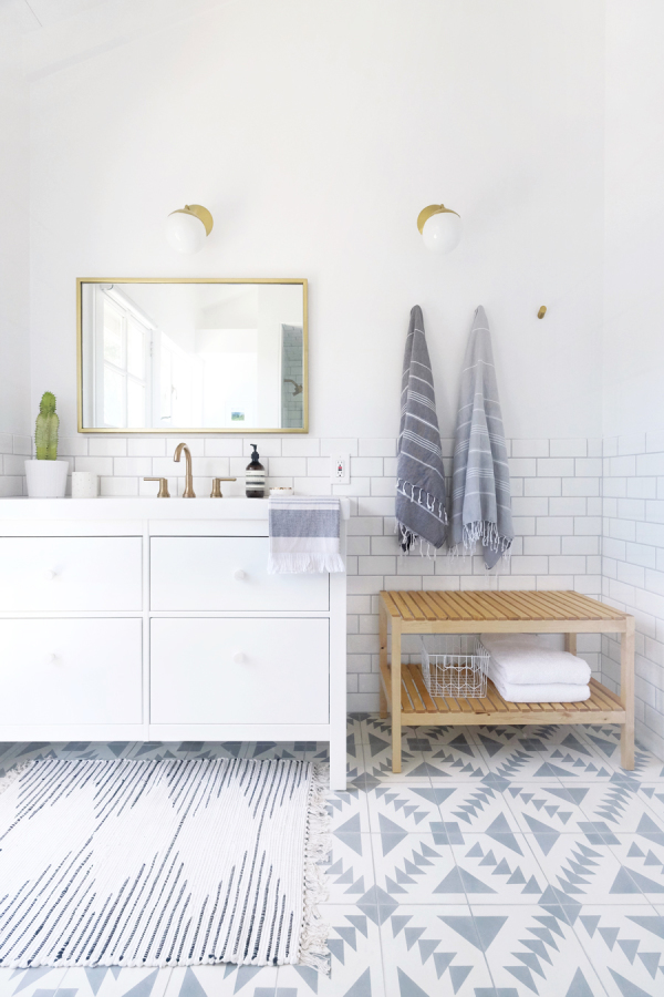
 Lately, there’s been a lot of bathroom design in my life. We completed our own master ensuite renovation, I did a laundry & bathroom design for a client this summer and then, currently, I’m working with another awesome client revamping his main bath!! Woooo, see what I mean?! But you know, I don’t mind one bit. I’m on a roll and I may as well keep going!! So this month’s Steal this Style is…surprise, surprise…a beautiful bathroom! I saw this image on Pinterest a short while ago and I may have gasped a little. It seriously caught my attention for a few reasons:
- the tile! It’s not anything we haven’t seen before, but it just reinforced how much I love the patterned cement tile look. This is pattern done right people!
- the use of brass fixtures, which are gorgeous
- how affordable a bathroom can be – changing the hardware on an Ikea vanity, for instance, can make a big difference. It still looks great in the space and it has a more custom feel without the custom price.
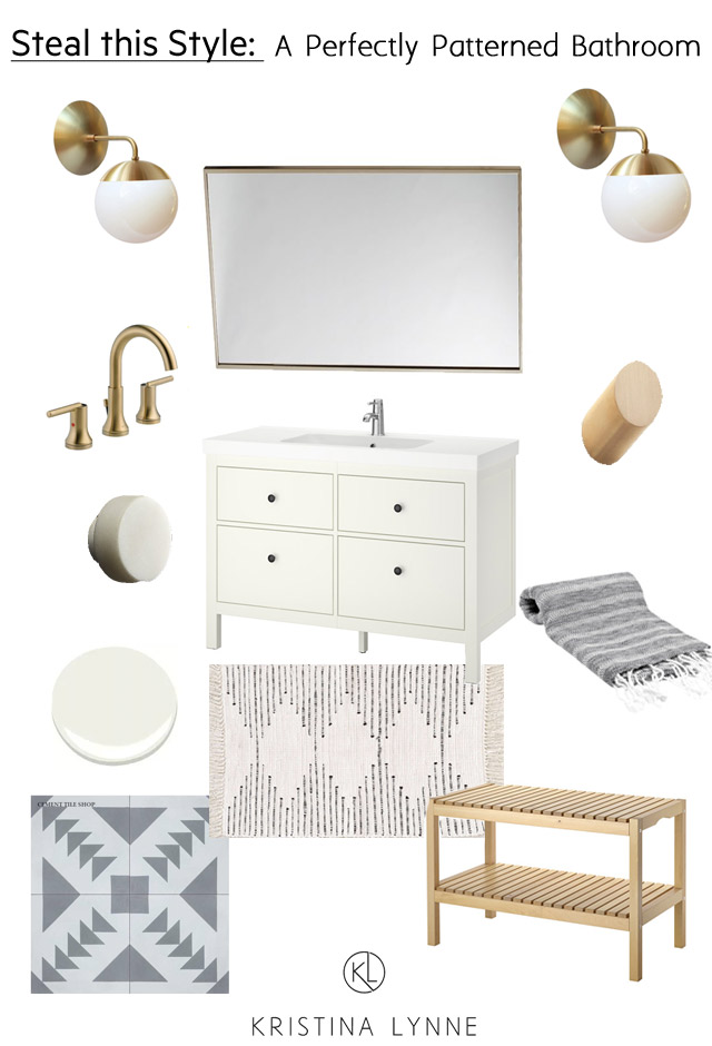
This bathroom has such a relaxing, airy feel. It seems luxurious while still being practical and low maintenance. It is most definitely a space I could see myself spending a lot of time in. So, shall we steal this style everyone?! First off: Choose the right patterned tile. The Tulum pattern in a soft grey is perfect for those that are still a little timid of adding such a bold statement. Remember – this will more than likely be the focal point, so keep the rest of the bathroom clean and simple.
Grab your Ikea vanity and update the hardware with something a little higher end, like these marble knobs. Then think about your faucet, which will tie in to your other accessories. The use of brass in this bathroom design adds the perfect amount of contrast to the mostly white space. Check out this brass faucet, this beautiful metallic mirror and my favourite lights from Cedar and Moss. It’s the perfect brass combo! I also love that they found small round wall hooks in brass as well. A good paint option? Try Simply White or Decorator’s White from Benjamin Moore. Nice and clean!
(PS – notice that the sconces don’t frame the mirror/vanity perfectly? Instead they are placed evenly across the whole wall. This would look strange if they hadn’t balanced the other side with the hooks and bench. But because they thought of the entire wall in their design, the light placement is great and even a little unique!)
Then it’s all about the accessories – a little wood is brought in with the bench (PS – I wholeheartedly believe every bathroom design should incorporate at least a small touch of wood somewhere!), and softness is added with the area rug and the turkish towels. Oh, and they even thought to bring in brass with the toilet paper holder. Smart!
Black love: towel ring, toilet paper holder, towel bar, robe hook, faucet
So, what do you think of this perfectly patterned bathroom? Would you ever make your floor the feature with cement tile? xo
