As the Lady Laurier renos progress, I’ve started to finalize the design plans for each space. Today, I’ve set my sights on the laundry/mudroom. I don’t know about you, but I’ve started to notice how desirable a good mudroom has become…people love having a space that’s functional and keeps the clutter away. Plus, it’s another spot to add in some style. In the Laurier project, we do have our laundry nestled into the mudroom, which works really well for the layout of this home. Before finalizing the design though, I decided to do some searching to find some stellar spaces that combined these two into one. Here are 7 laundry mudroom combos that marry function and style perfectly…
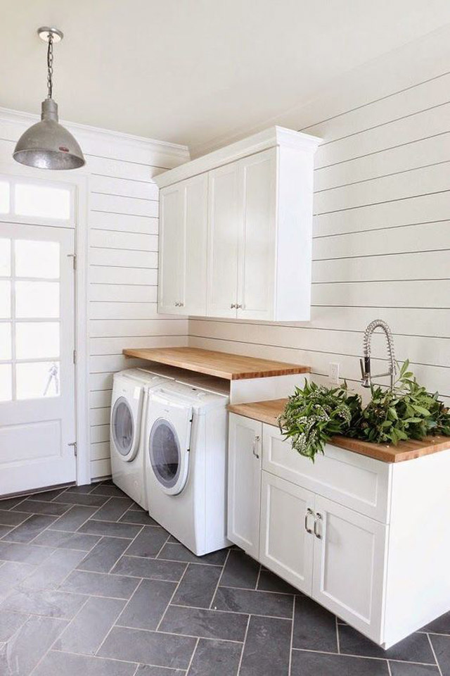 This first option from Studio McGee is the perfect blank slate. I love the classic herringbone tile and the natural wood counters. The ship lap walls give it a farmhouse vibe but the design is simple and timeless.
 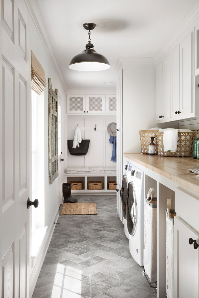 Along the same lines as the first space, Joanna Gaines utilizes every square inch in this rear entry. Plus it’s pretty…no one would put off the laundry if this was where they were doing it!
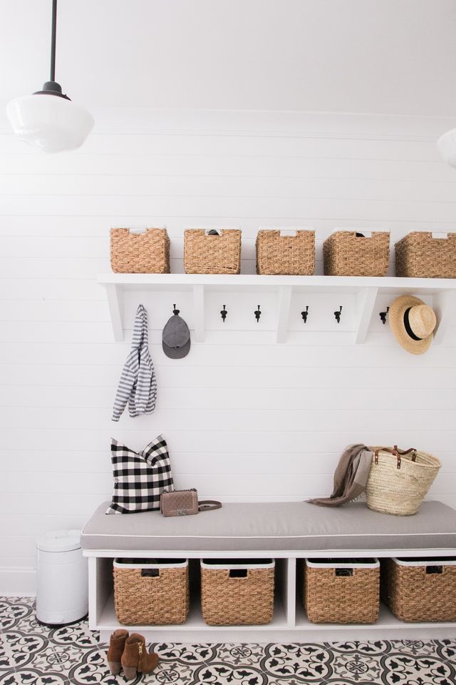
 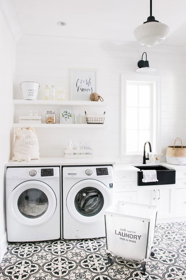 This next space is definitely pulling out all the stops. The flooring is a huge focal point that contrasts beautifully with the bright white walls. It goes to show that adding in a little extra effort when it comes to styling goes a long way. The shelves house everything necessary in a laundry space but look meaningfully put together. On the opposite wall, the baskets offer a ton of storage, and again, add in that perfect amount of texture.
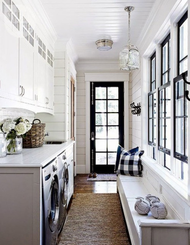 Style at Home featured this laundry in a narrow back entry but made it work with plenty of seating. I’m obsessed with the black door and windows and the jute runner!
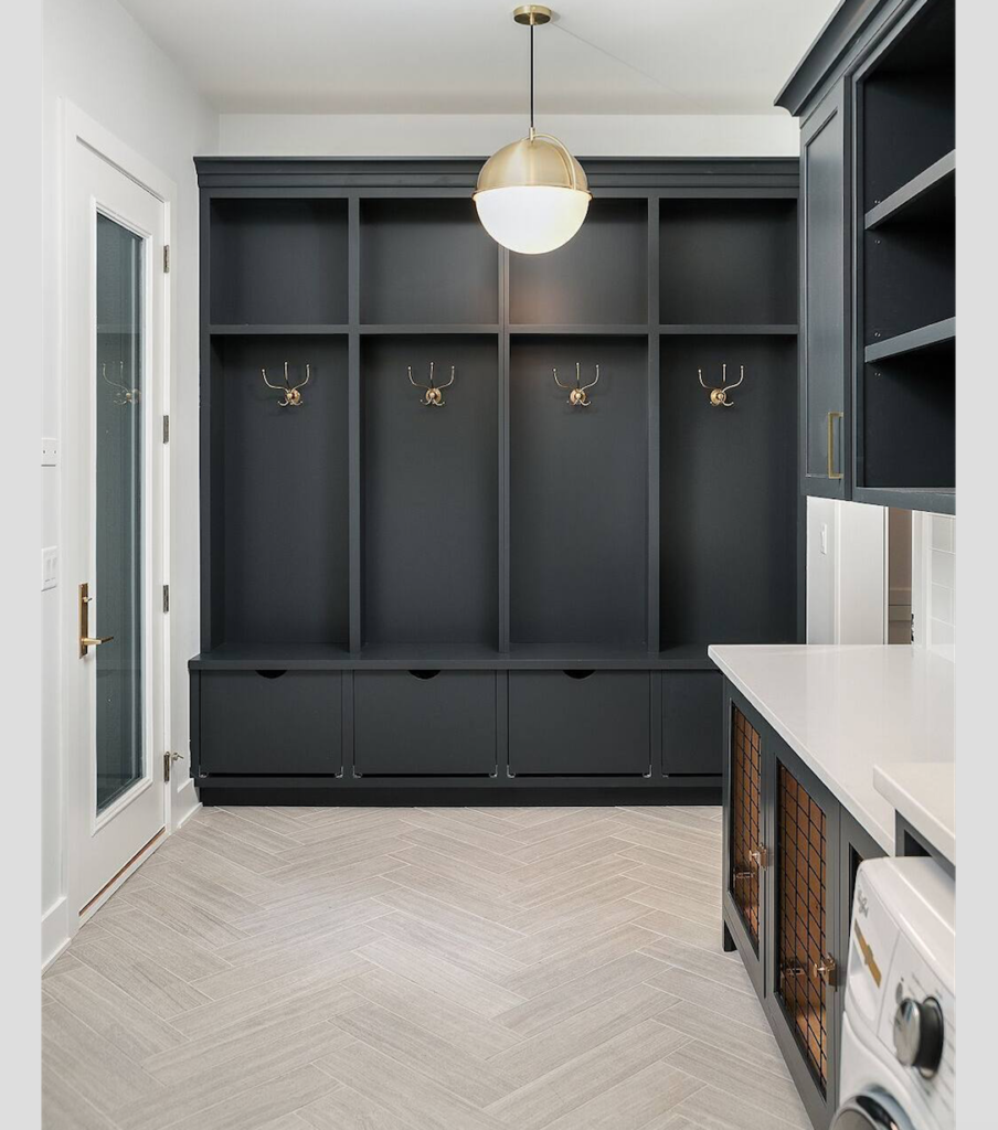
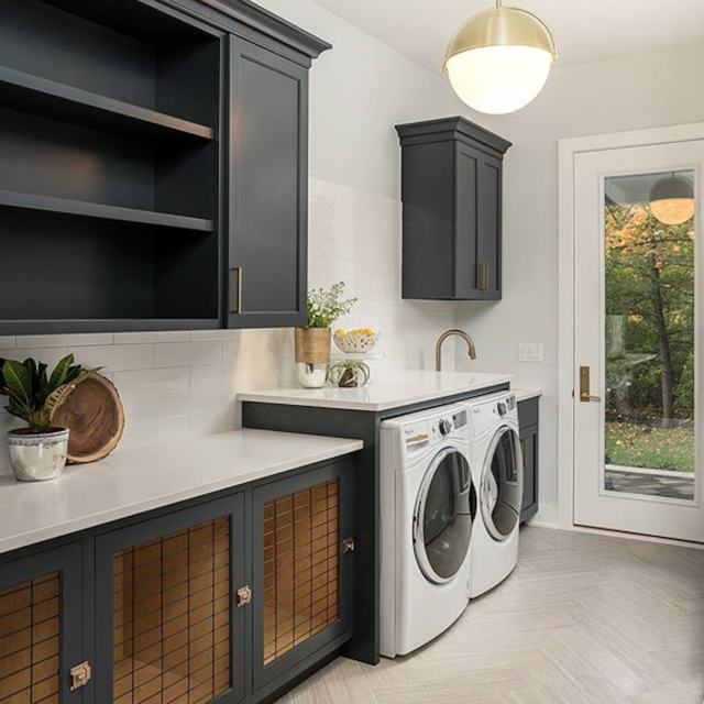 Now into the moodier rooms! I absolutely love the rich charcoal cabinetry with the neutral tiles in this space. The pop of brass is absolutely perfect (hello pendant!!). Then, the wire front base cabinets are fun and unique, though maybe not the most practical. Having the built ins along the far wall is amazing – SO MUCH STORAGE!
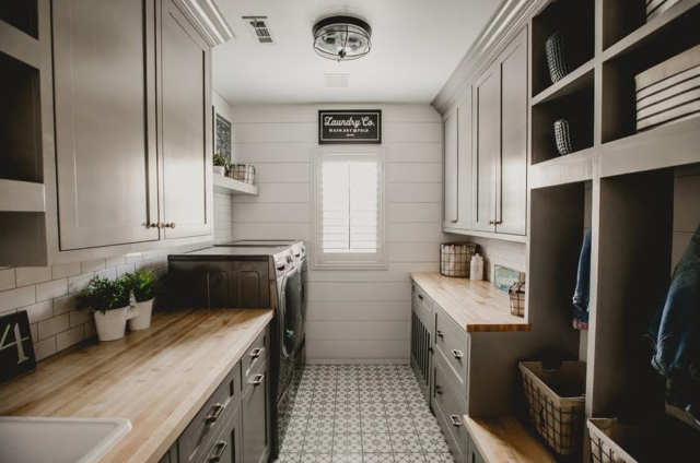 I love this laundry for taking a risk with colour and doing a grey/green shade of cabinetry. They also did a great job of adding sufficient closed storage without it feeling too heavy and full. Lots of counter space and a few open shelves help to guide the eye around easily.
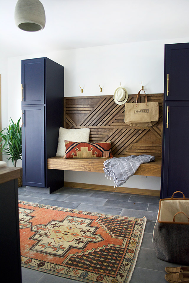
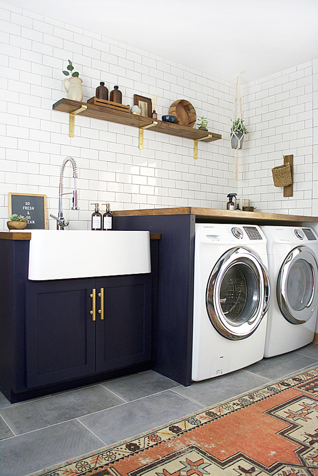 And finally, hands down, my favourite laundry and mudroom space EVER! Bre absolutely killed this design. The navy cabinetry, the mixed metals, the classic tile choices – all gorgeous. But I think we can all agree that the custom bench area is to die for!
All of these spaces take what could be a boring transitional room to the next level. They are happy places that look beautiful, even though they are primarily meant to be messy and constantly covered in rotating things. Adequate storage, some stylish hooks and a few trusty baskets are really all you need to maximize a space like this. But it’s also nice to start with a great foundation…
And so, taking my newfound inspiration to heart, I’ll be sharing the Lady Laurier’s laundry and mudroom designs with all of you tomorrow! Check back then to see the plans!
Comments are closed.