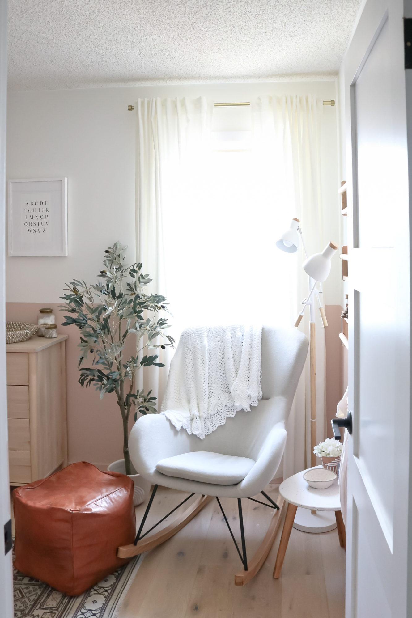
This bedroom has gone through a lot of changes over the years – a glorified dumping ground to a guest bedroom and then an office. But now, it’s seen the biggest transformation into our baby girl’s nursery. And of course, it’s my favourite of all. This space was so much fun to design and pull together and I did it with the help of some really great small shops. Before I take you through the tour, a quick reminder of where we started. I actually announced the gender of baby E with the nursery design, which looked like this…
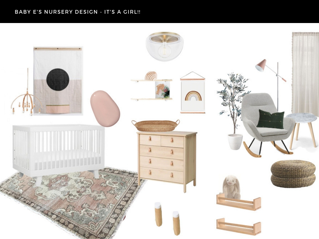
And my plan barely swayed from the original mood board. I missed out on that beautiful rug – such is the Etsy life – but besides that, almost everything is the same. Here’s how it all came together…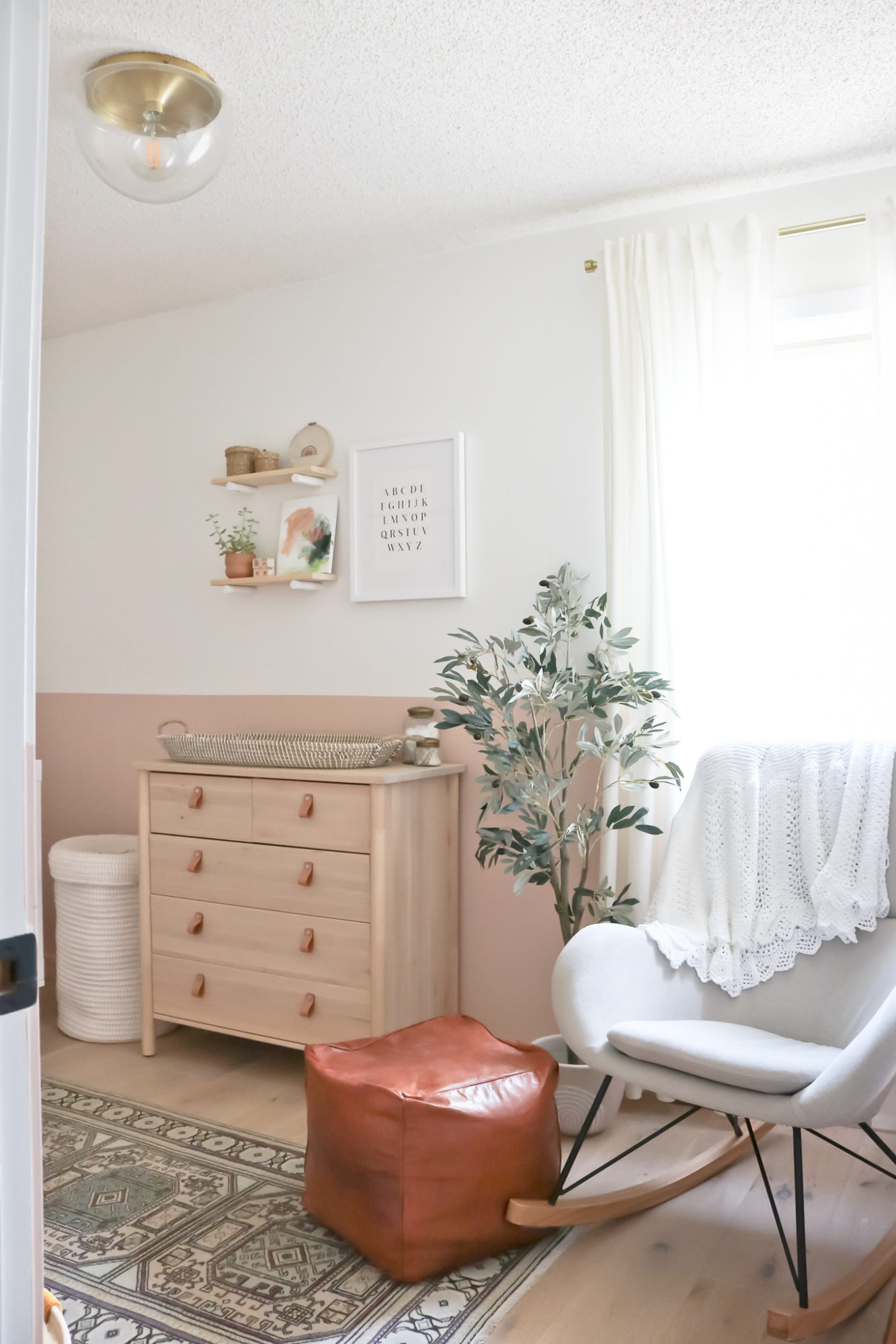
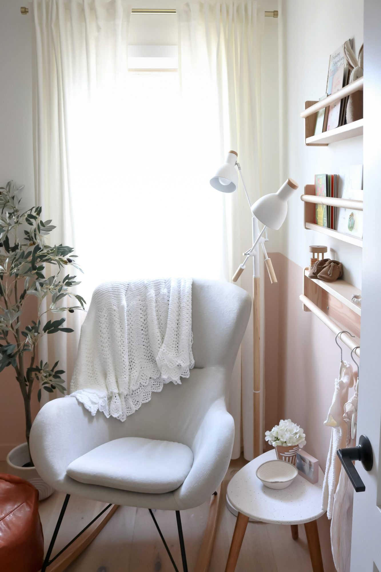
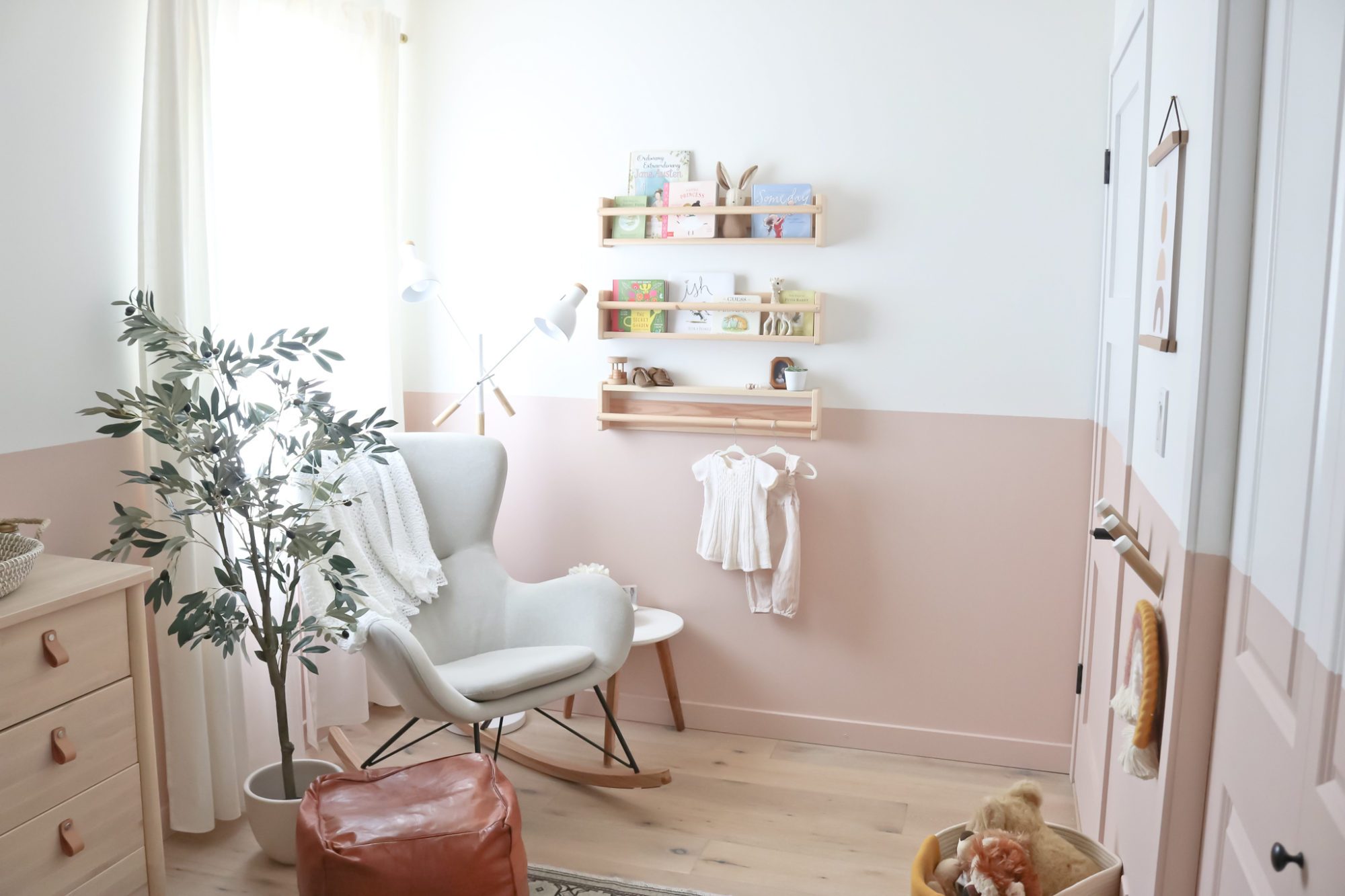
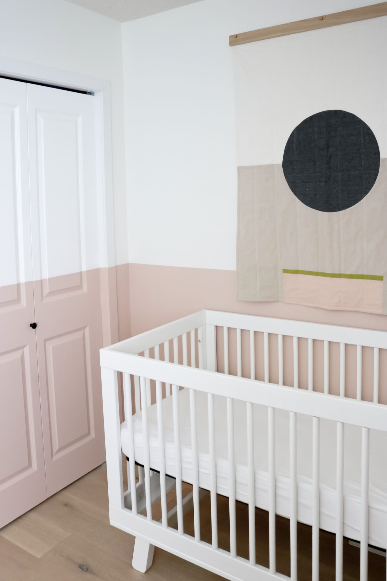
The first thing we tackled was the paint. It was originally a different shade of white but I wanted something a bit softer. Luckily we had some leftover Benjamin Moore Simply White from our main floor renovation, which we used for the top portion of the room (and remember, it’s one of my most used/recommended white paints!). Then after using a laser level and taping off the entire room (I’m talking trim and doors too), we painted the whole bottom section a soft pink colour. I wanted the room to look like it had been dipped into the colour – so not just the walls. I think this choice made a huge difference in this small space – a bold choice that paid off!
After testing out 4 different paints (and getting your input on stories, thanks for the help!) we chose Odessa Pink from Benjamin Moore. I’m completely in love with this colour – it’s muted and more of a modern take on a pink hue in my opinion. Not quite going into the terracotta world, but heading in that direction. It’s exactly what I had envisioned and turned out beautifully! PS – if you are pregnant like me and wanting to do a bit of painting, consider using the Natura line – the greenest paint option. 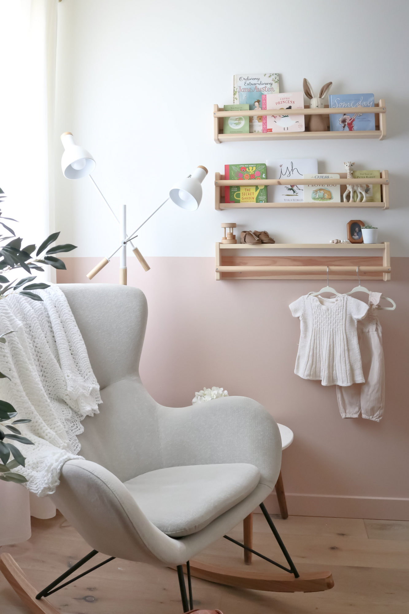
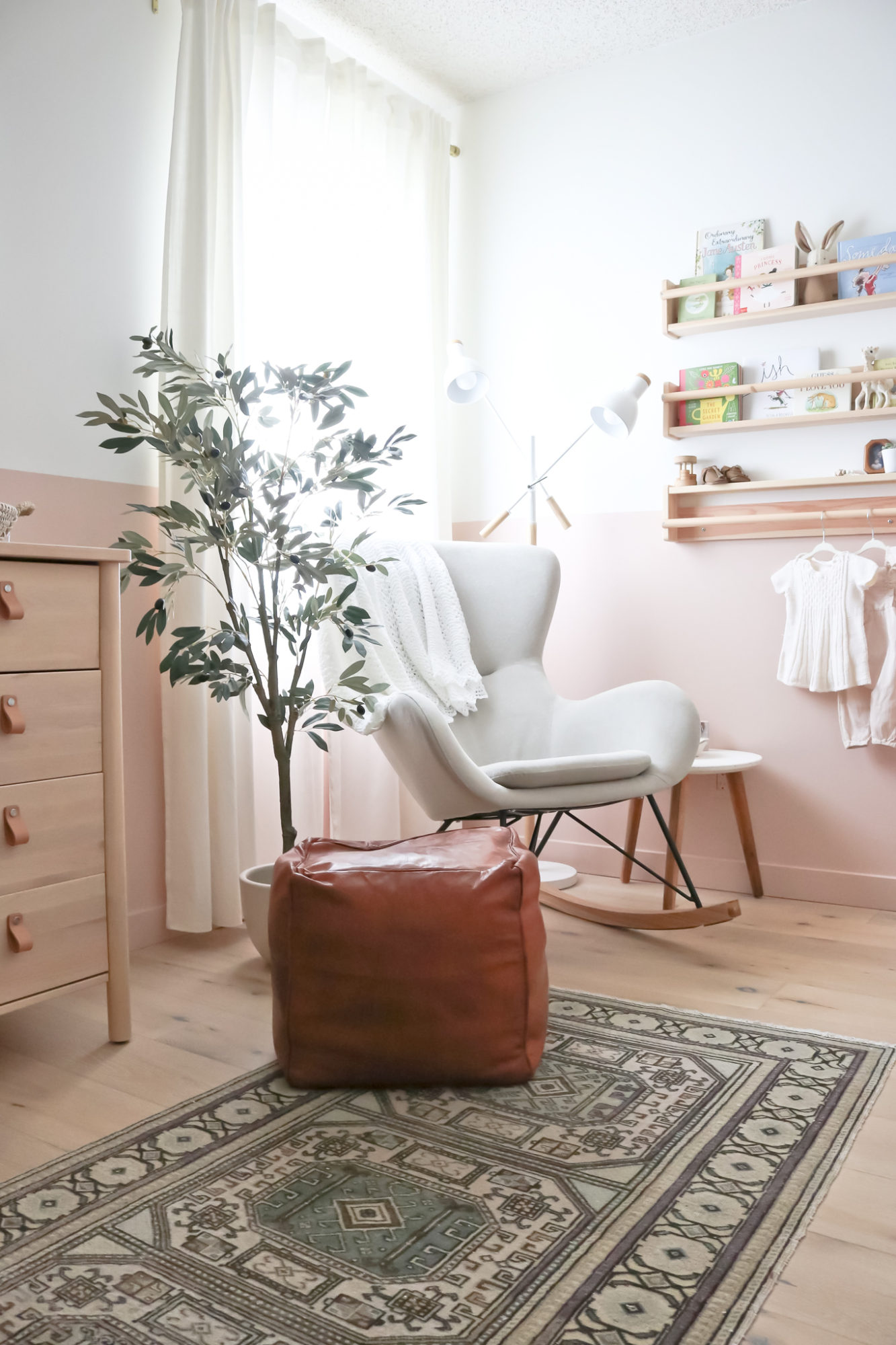
In the window nook, we placed a new rocking chair next to our book display. I would have loved to keep Jack’s rocking chair but the scale was just all wrong for this tiny room – seriously, we have the smallest bedroom sizes in this home! So to keep it feeling more open, I chose a piece that was much lighter with more negative space around the legs and slightly smaller in scale. It’s still cozy though and I envision a lot more time spent in this corner nursing and cuddling with a book.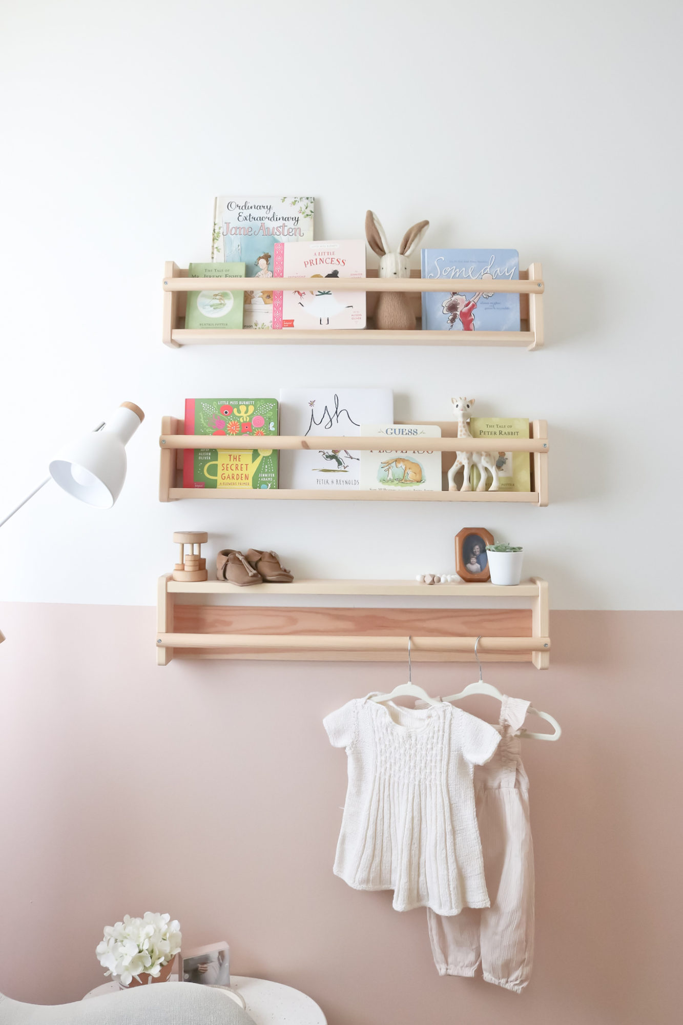
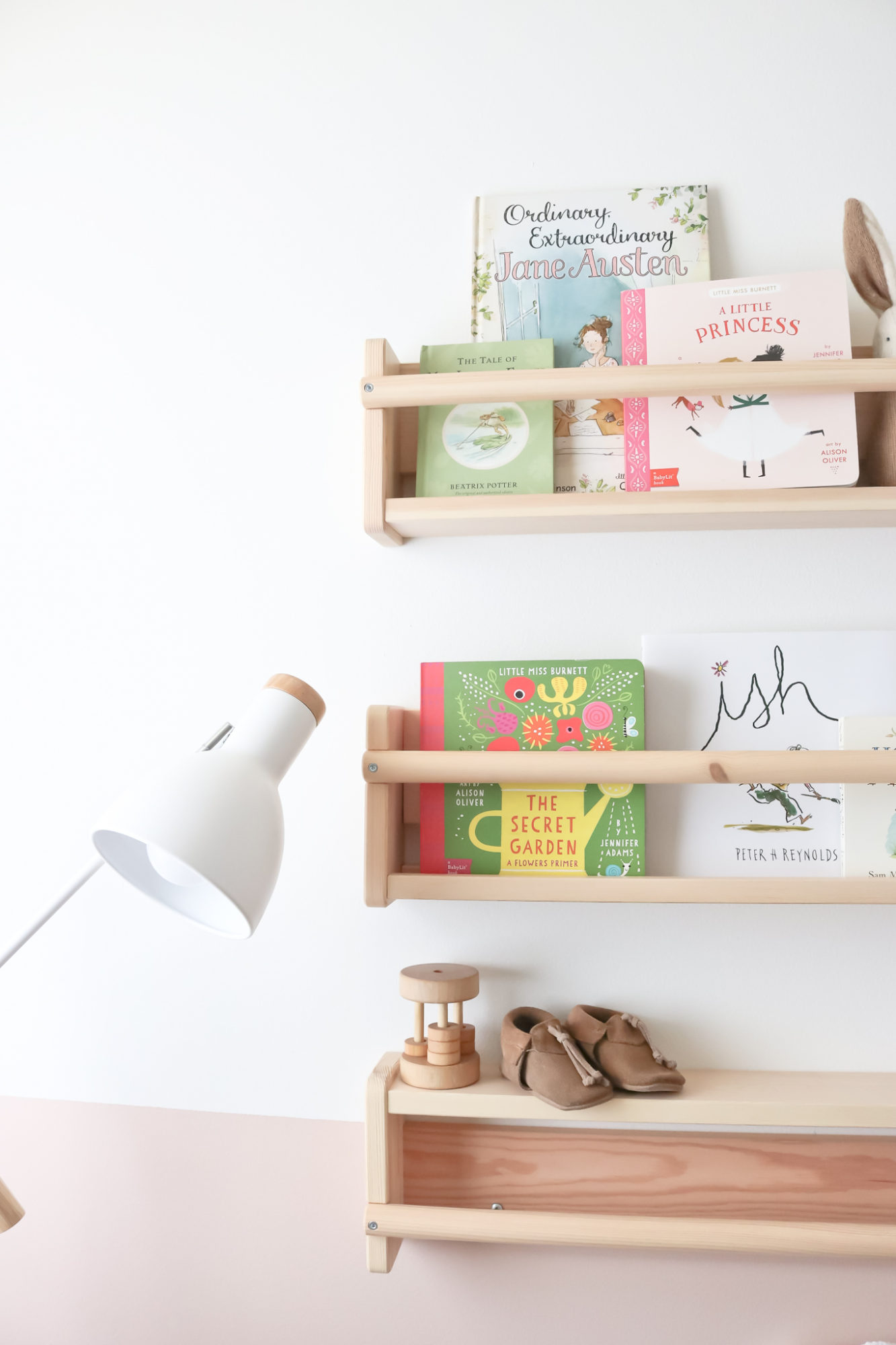
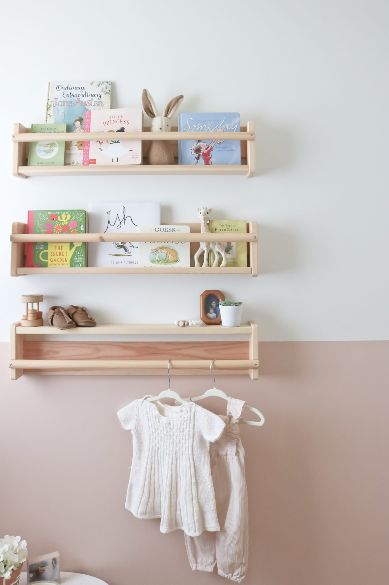
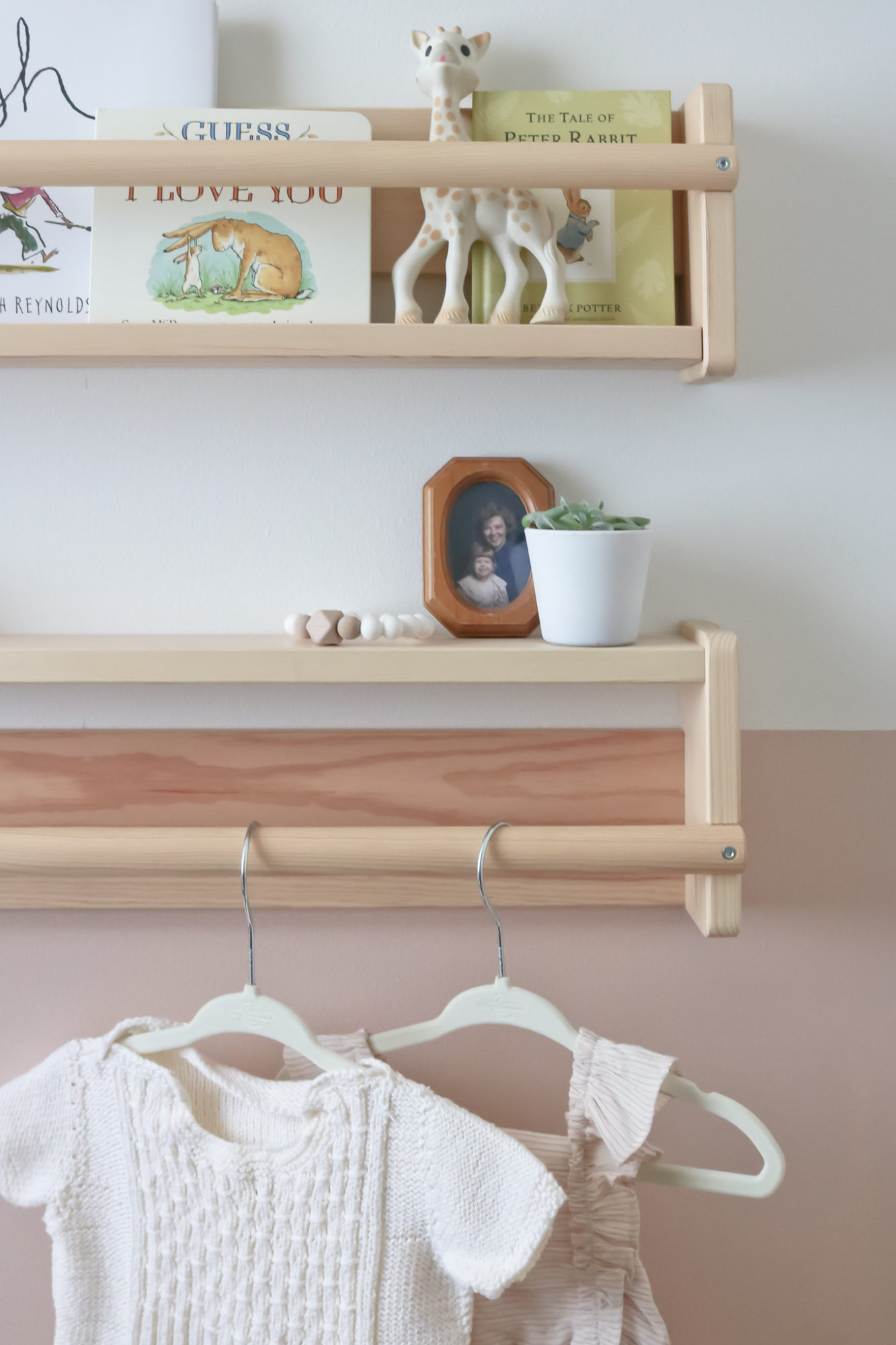
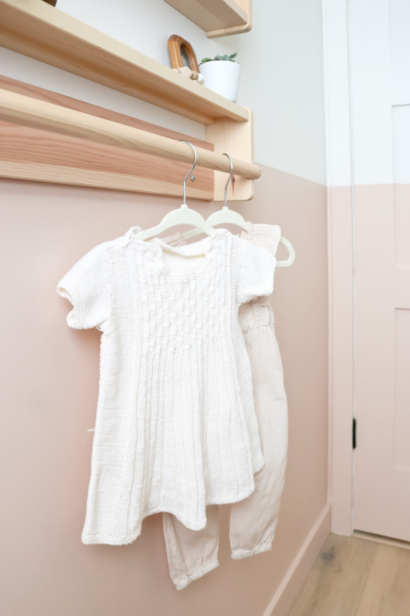
Just like most nurseries, we have the wooden Flisat wall storage units but I flipped the bottom one to act as a shelf and then hanging rod. I love the nod to my Nana, Dorothy Lynne, who is pictured with me as a little one and then the first dress hanging was knit by my great grandmother Ina Kristina. I can’t wait to see baby girl in some of the pieces I wore!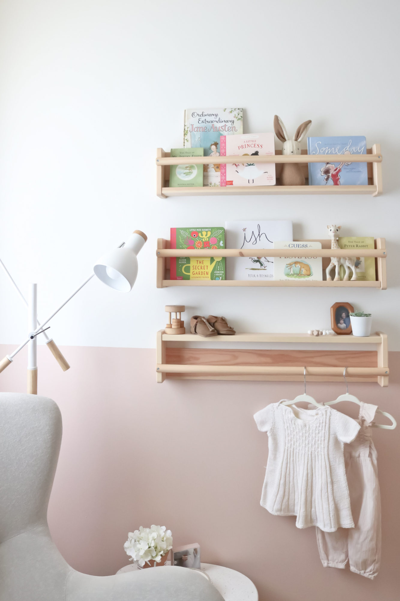
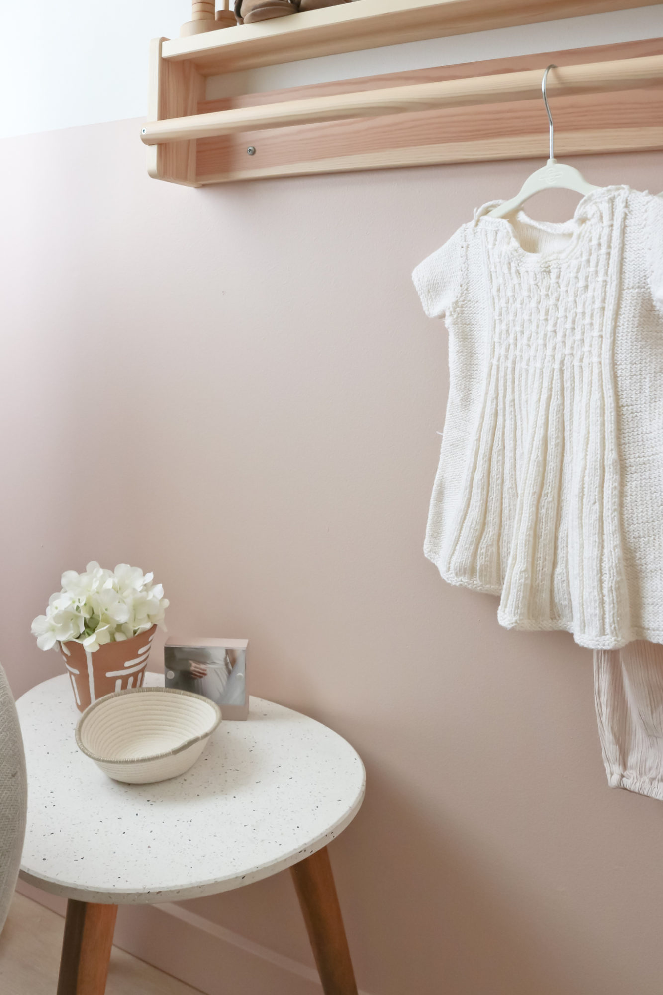
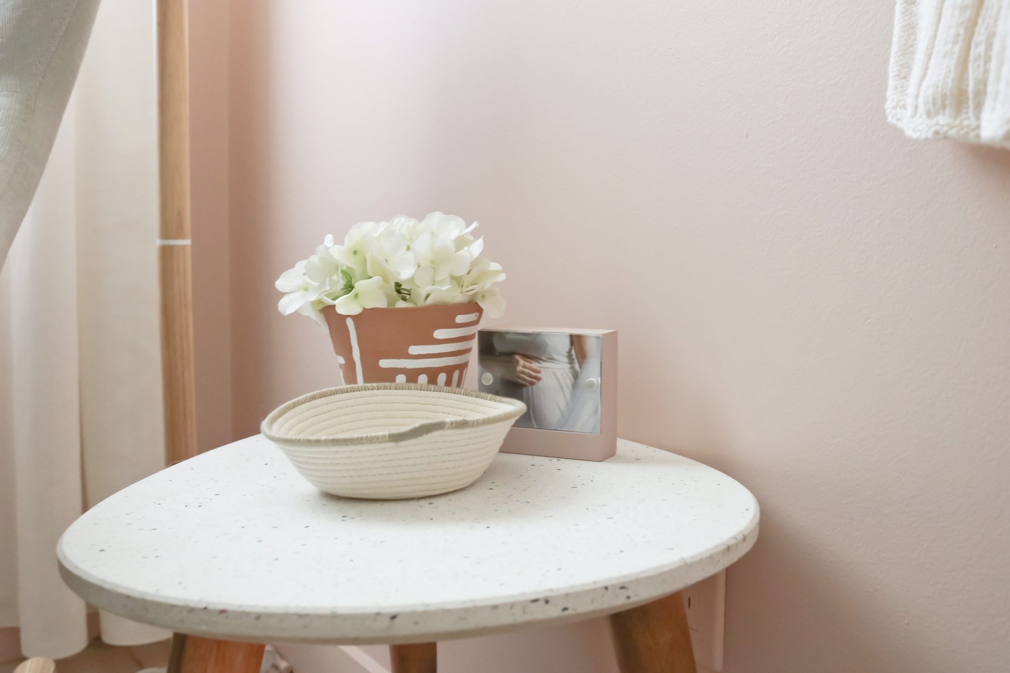
I feel like I lucked out when I found this really tiny table at Home Sense. The terrazzo top complimented the space so well and the shape and size were perfect for this corner. I have just enough space to place necessities while nursing etc. but then, for now, some pretty additions too like the woven bowl I got at an adorable shop in Canmore and a terracotta vase from Auntie Janna’s many travels. 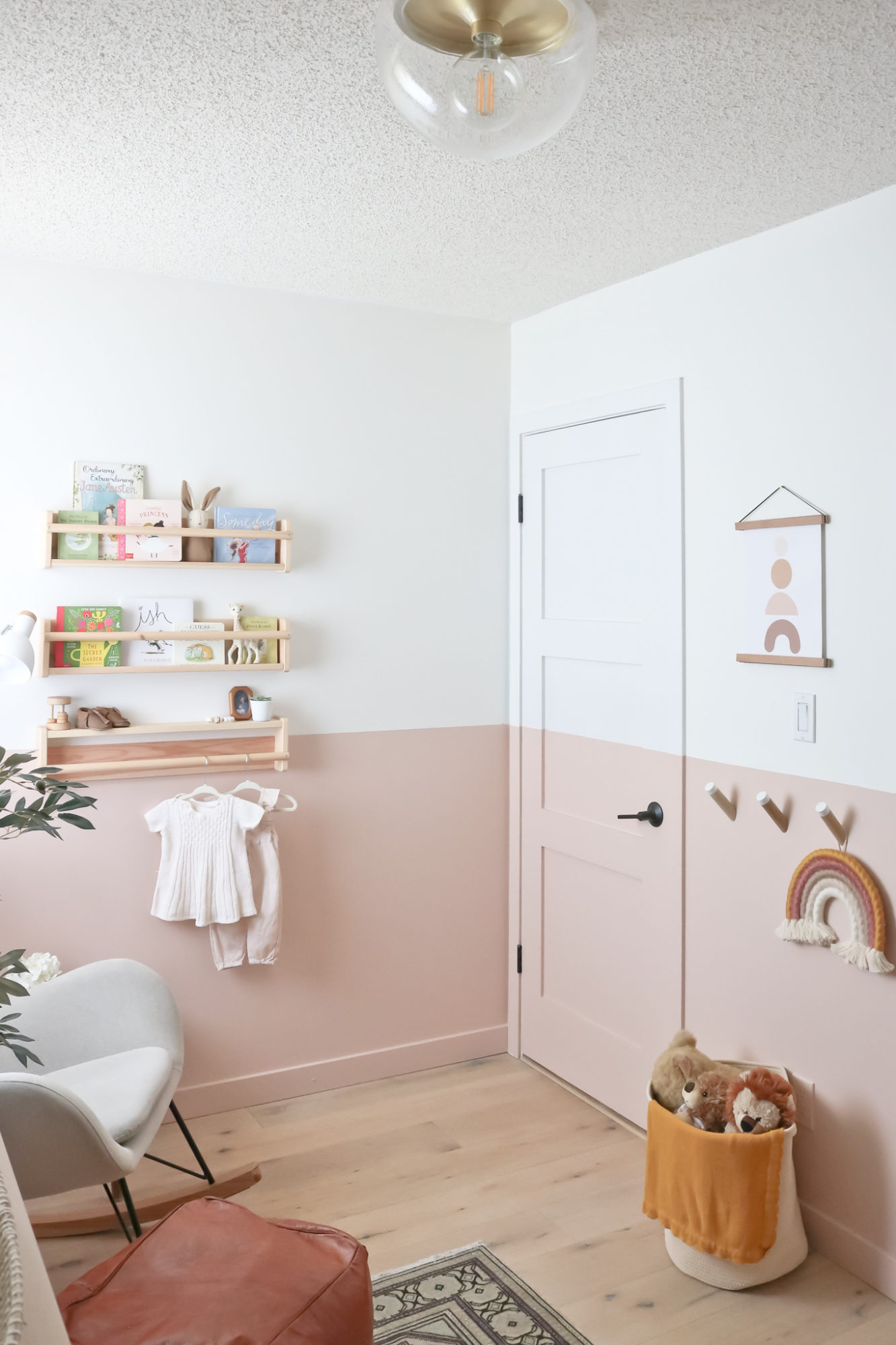
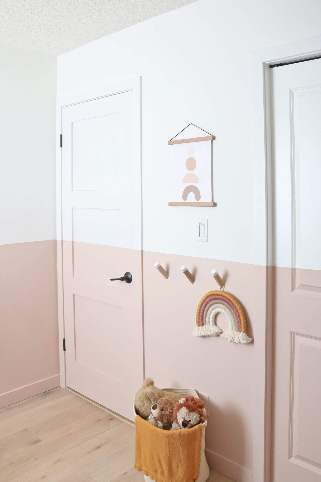
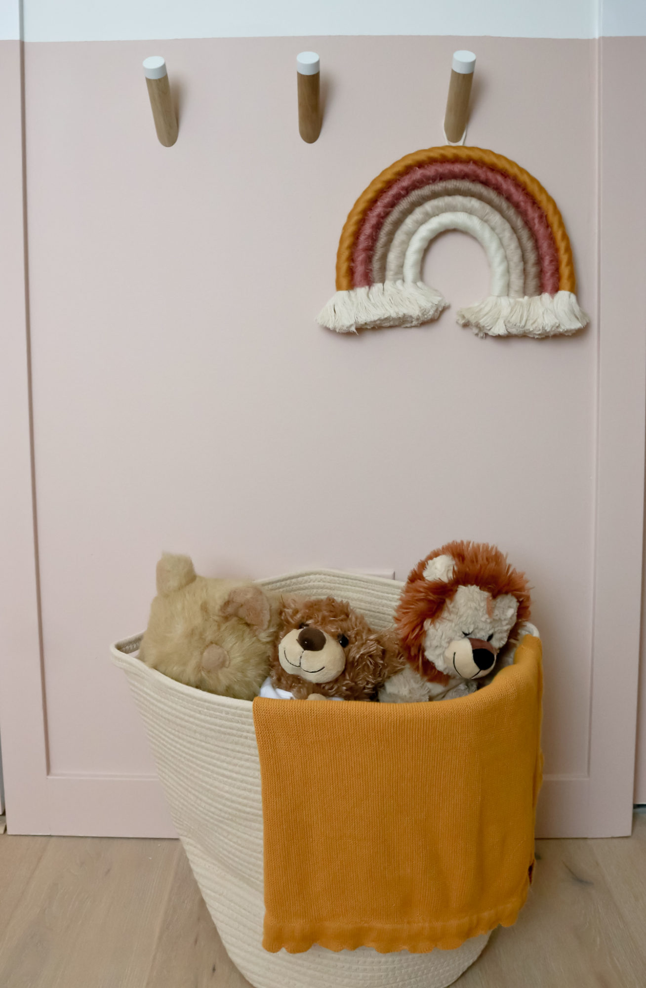
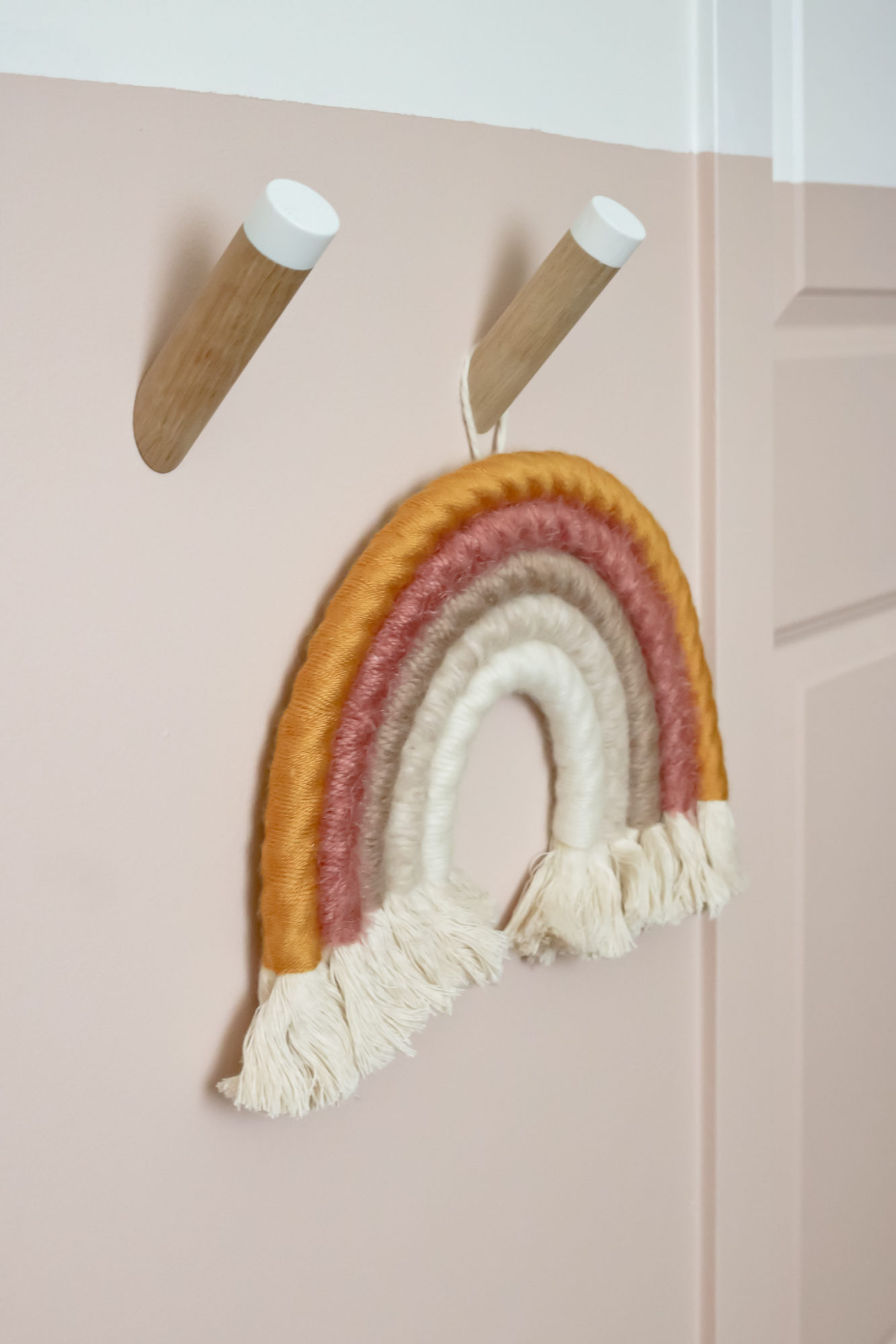
On the other side of the room, I capitalized on the very small wall between the door and the closet. A lovely friend Eli from Loop Living gifted me these gorgeous wall hooks and the magnetic picture frame. I absolutely love them together here with my little fibre rainbow wall hanging from the Wooly Canvas – a small shop that has adorable handmade nursery decor. She can do custom colour combos but even the mixes she has listed are amazing. Love supporting talented ladies making beautiful products.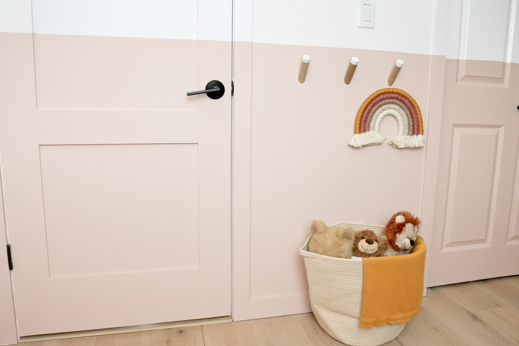
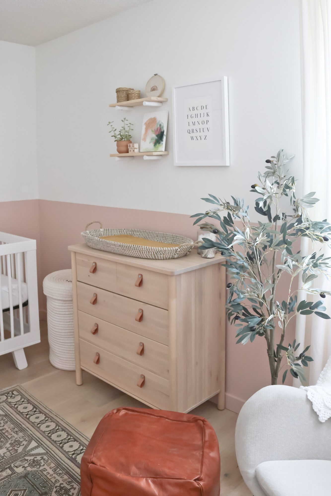
On the other side of the room is the change station/dresser. I always get a lot of questions about this particular dresser and, ladies and gentlemen, it is from Ikea! Yes, leather pulls included. It’s definitely smaller than what I had for Jack but with just enough room to hold my new woven change basket, I’m a happy camper. All the diapers and necessities are in the top two drawers and then clothes below.
A note on this beautiful faux olive tree I nabbed at Wayfair – it is a great piece that looks beautiful in person. I did remove some of the fake olives (which is easy to do) just to have a better balance but I absolutely love it and want to grab another one for our living room.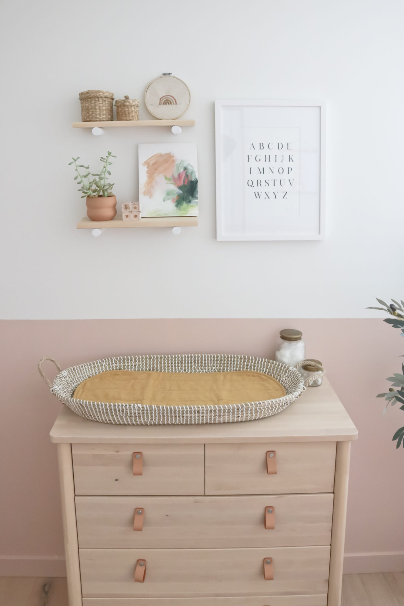
Above, I hung two shelves (again from the talented Eli) that tie into the hooks with the white dowel detail. Just so you know, the dowels come in so many colours – again, perfect for a kids room! It just so happened that the shelves were made in that nice simple Pine wood as well, soft and subtle just like the dresser.
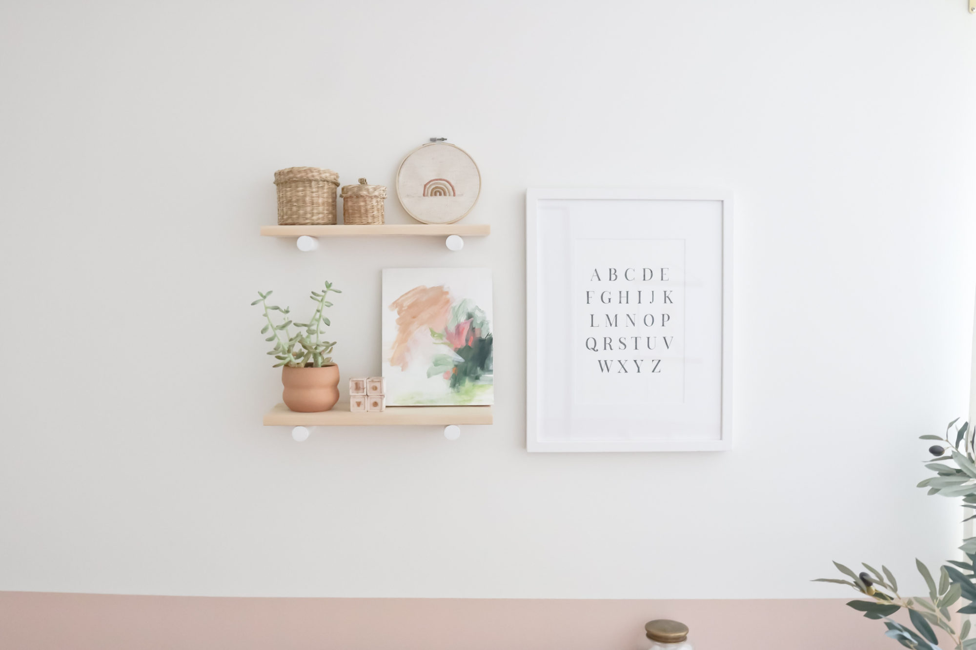
I picked up a few trinkets over the last few months, and while I love restyling shelves every so often, I have a feeling this will stay for awhile. I based a lot of the room off of my custom painting from Rachel Wadlow, which looks perfect leaning here. If you remember from my concept post, I sent Rachel a picture of myself, pregnant, and she created this piece from that image. So special to me!
And then I proudly took on my first embroidery DIY with this little rainbow. It’s far from perfect (don’t look at the back ok?!) but I love it. 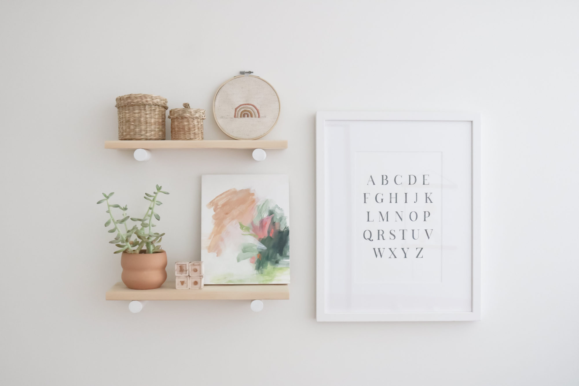
The print to the right was a really simple process. I found a printable online, sent it to Posterjack and they took it from there – matting, framing and mailing it directly to me. Couldn’t be easier!! They make the online printing process a total breeze!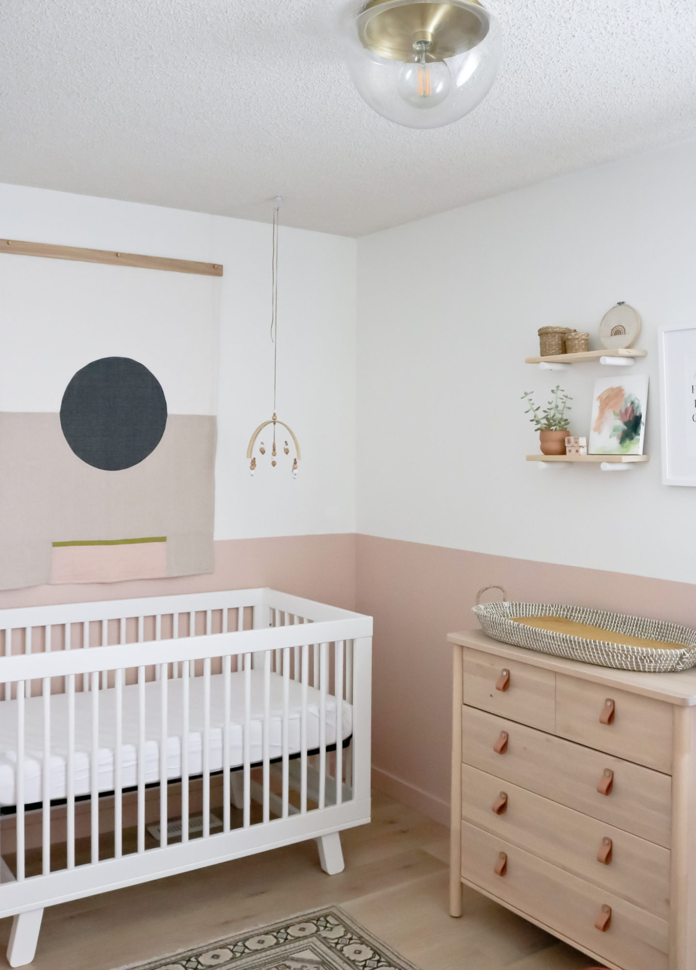
And finally, the crib area. I can’t tell you how in love with this part of the room. Even though the crib itself was used for over 2 years by my sweet boy, it feels totally new in this space. Above, we hung a very special piece – a custom quilt from Louise Gray. I had been following her work on Instagram well before I started thinking about baby #2, and immediately knew I had to incorporate it somehow when the day finally came to decorate a space. The best part, they customized the back, embroidering her name in the bottom corner. Now, I can’t show that to you yet, but once baby girl is here, I absolutely will inundate you with photos of that side because it really is so beautiful and special.
Louise Gray also conveniently has wooden quilt hangers that fit the size perfectly. And you can choose your hardware colour too. I mean, how perfect does this look hanging above our precious girl’s crib.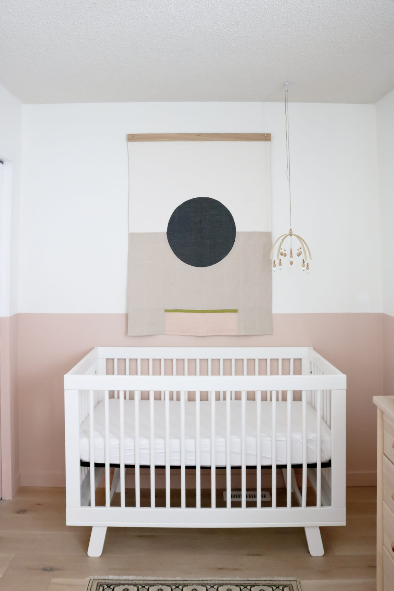
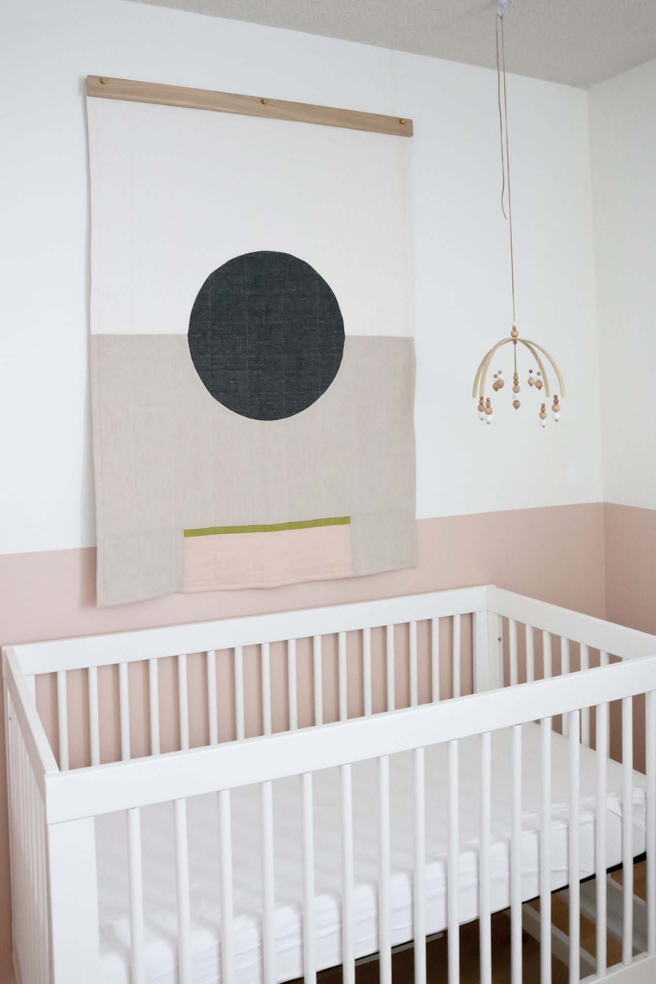
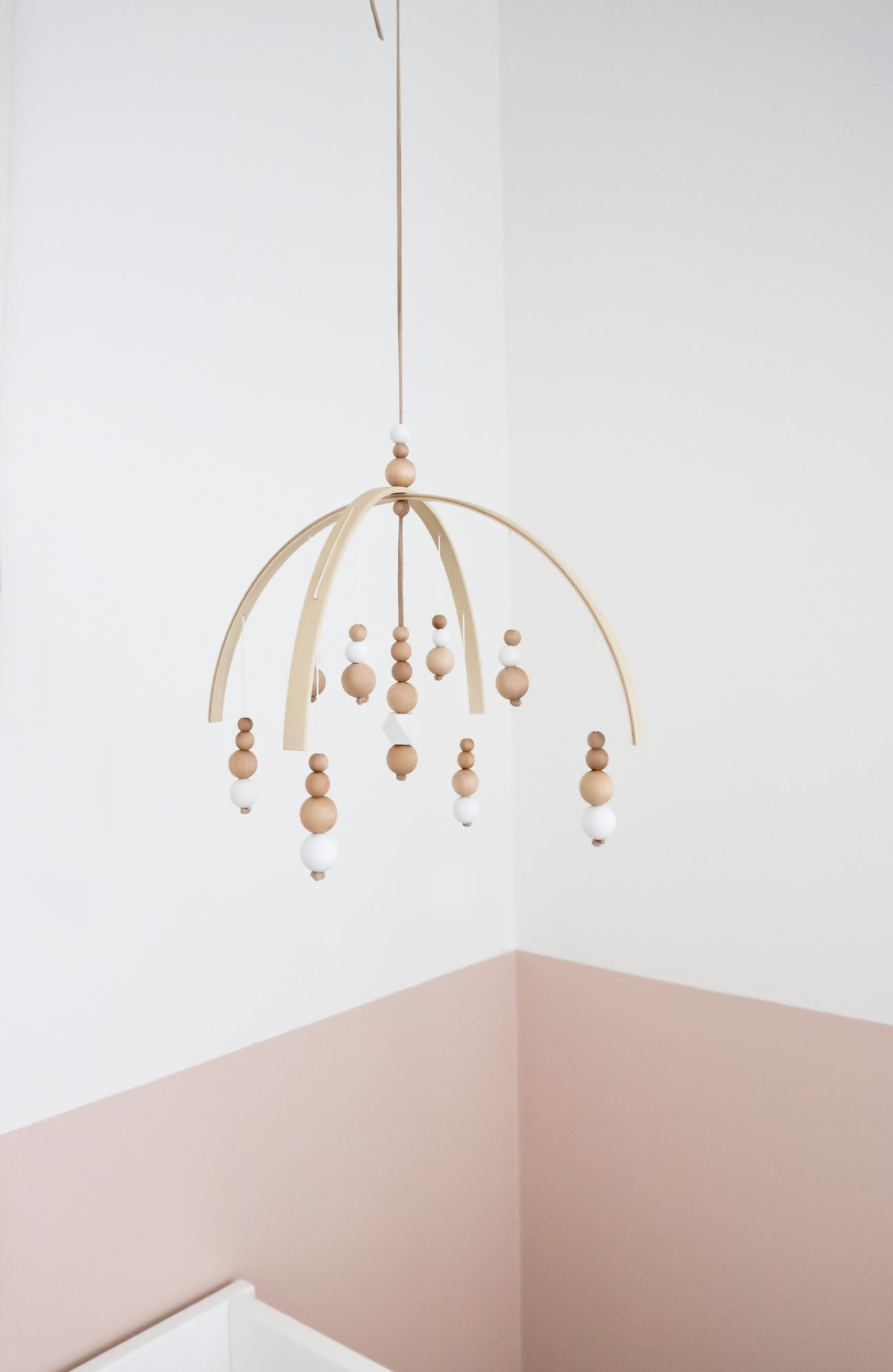
And no crib vignette would be complete without a mobile. Tying in yet again to all the soft woods in the space, I chose the mini nature mobile from Bellabloom kids. I did one colour – white – and the smaller size which works so perfectly here. It’s such a simple design but so impactful. Love! And I should also mention that the team at Bellabloom kids was so kind to me, sending a sweet note, some tea and shipping the item crazy fast. Just made my day!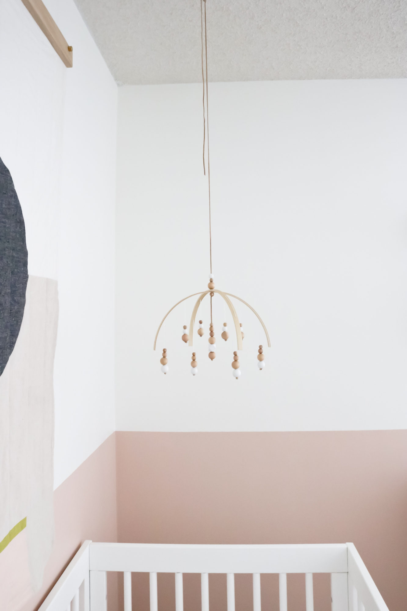
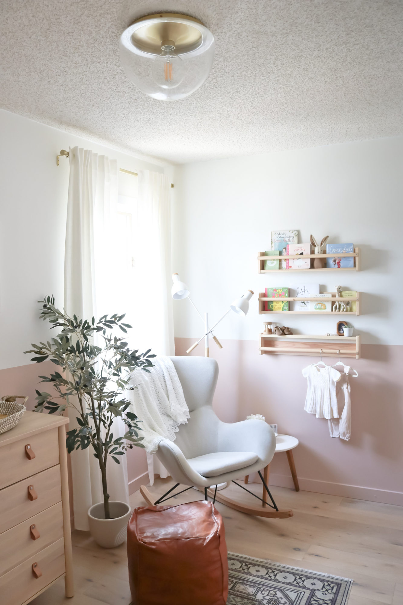
I also can’t forget my favourite new flushmount from Mitzi! Originally, I sourced this for my friend Nicole Ashley’s bedroom, but I fell in love with it too and had to have it in here. The brass plate and dome shape are beautiful. 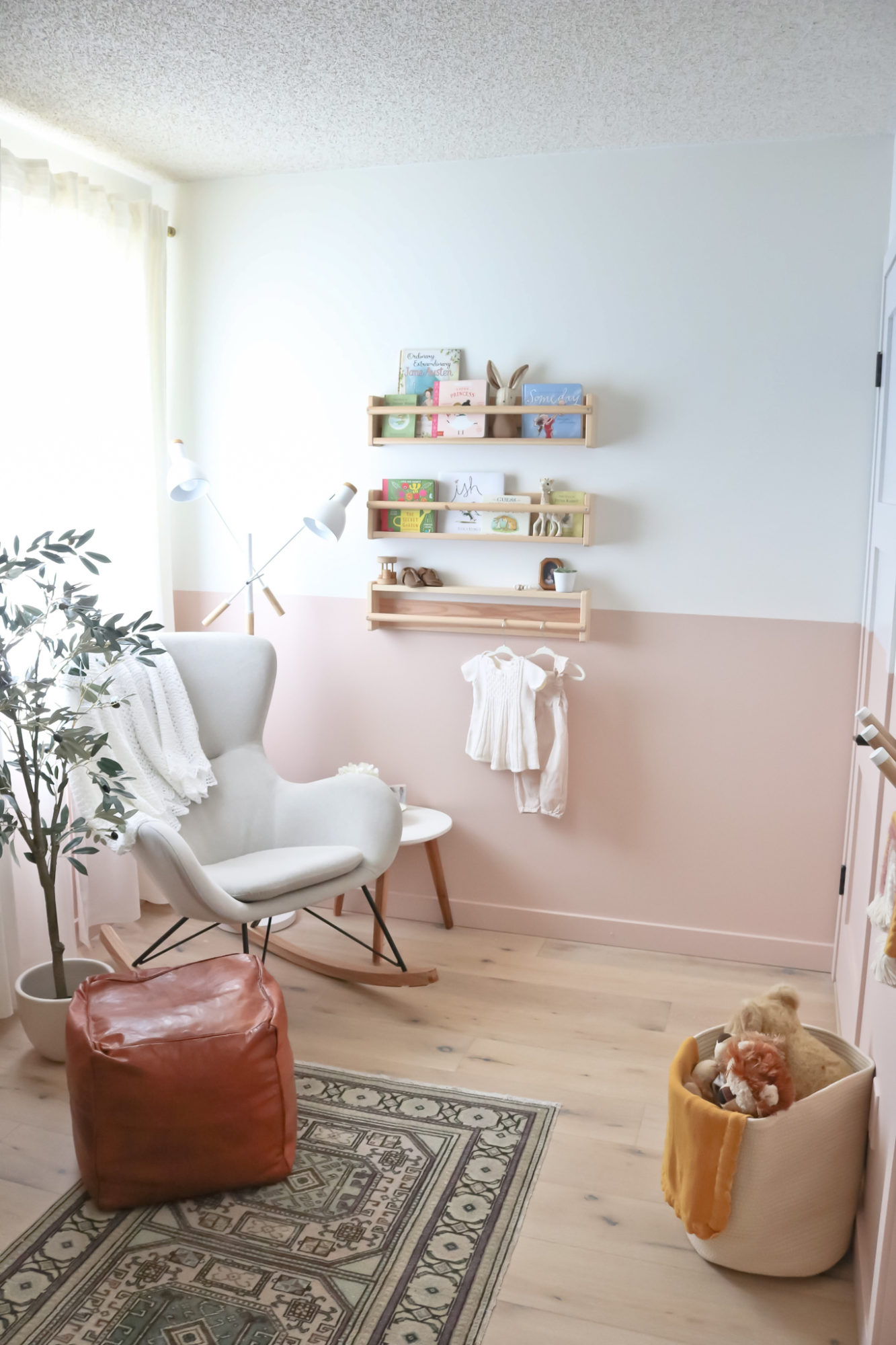
And there you have it! Our sweet baby girl’s nursery reveal from top to bottom! What do you think?! I’m so excited to bring her into this space and create so many memories, just like we did with Jack. Already he calls it his baby sister’s (pronounced baby mister for some reason lol) room and likes to be in here with me. It fills my heart with a lot of joy.
A big thank you to all the shops that hopped on board for this room and took the time to make me and this baby feel so loved!
Show them all some love too and shop the post below!
