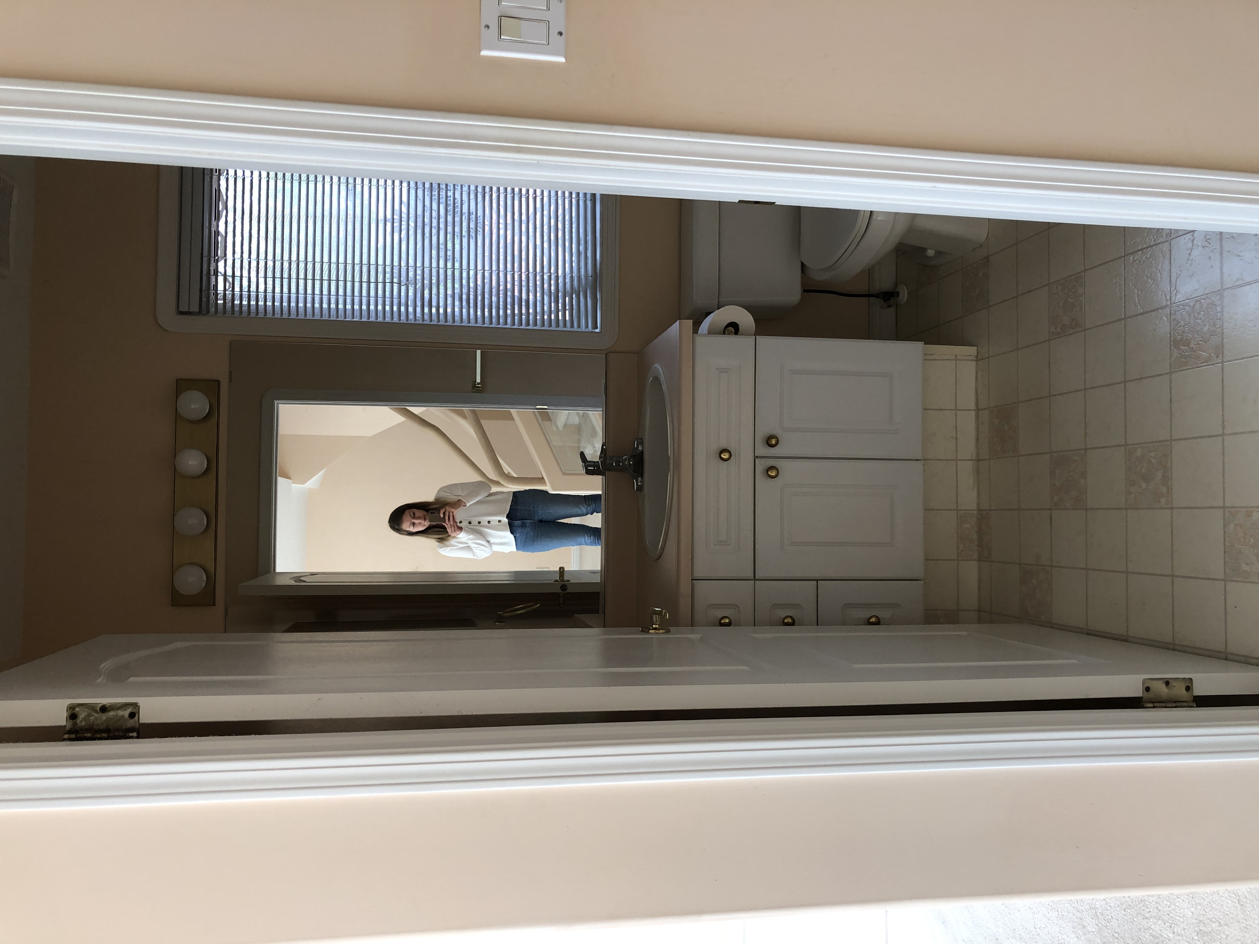
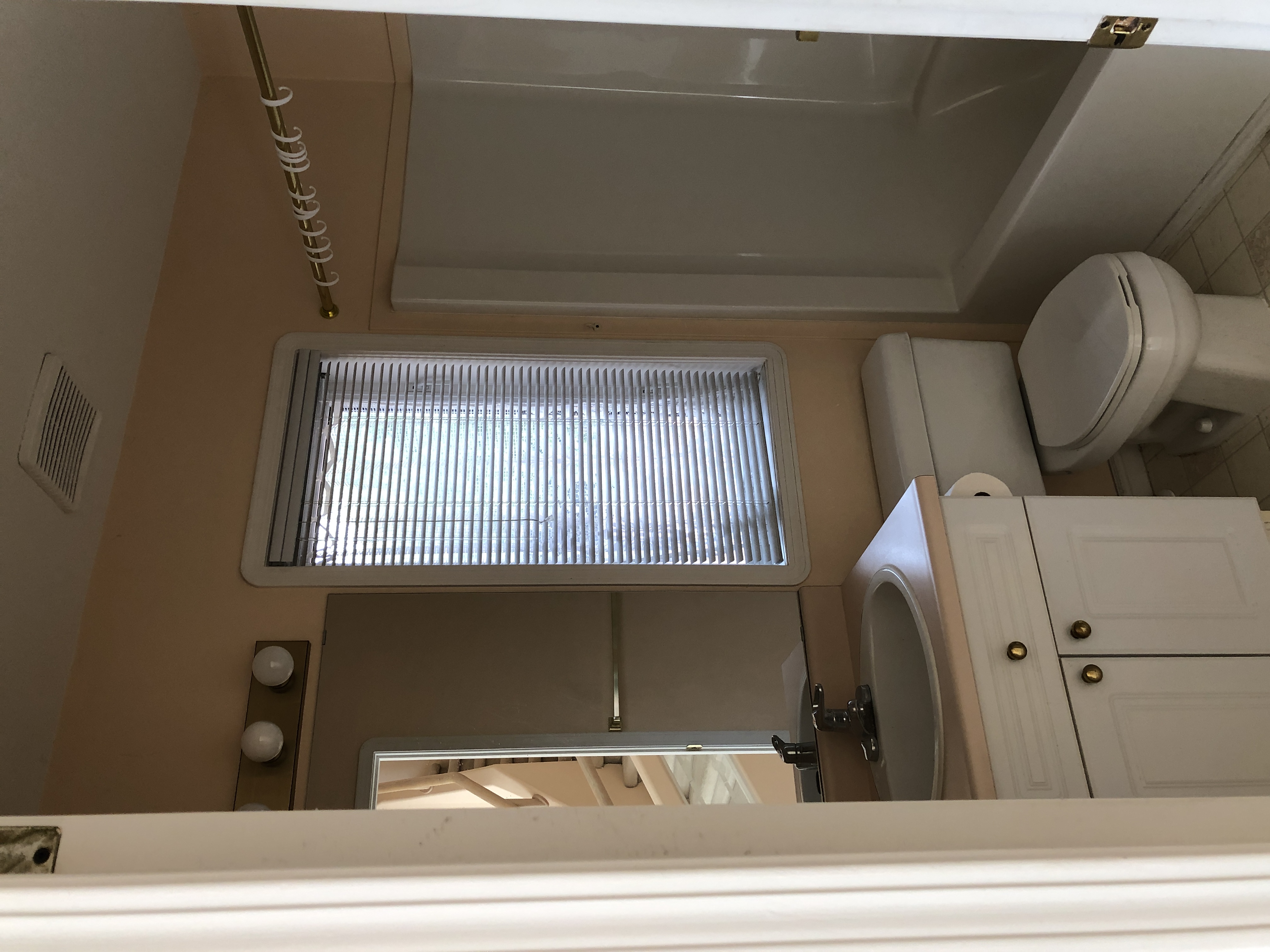
If you’re reading this, I’m going to assume you’re more than likely a mom…or one of my immediate family members or friends, since they consistently read my blog lol…Maybe you’re just curious to see what I have planned for the next room in our Rosie by the River project OR maybe you are actually planning a bathroom reno for your kids too! Regardless, I’m sure that when it comes to kids’ spaces, you’re like me and want to try and balance how much “kid” is a part of the design scheme.
Don’t get me wrong – I’m all for having some fun and making some different choices in what will be a bathroom dedicated solely to the kids but I also want to make sure that the room feels cohesive with the rest of the home, that it will grow with them and that it can still feel, well, beautiful. I’m not big on the overly cutesie, themed or character driven decorating, so you can bet that my permanent fixtures (tile, vanity, etc.) won’t necessarily scream “this is a kid’s bathroom!!!”
So here’s what I have planned for Rosie’s second floor bathroom design, ie the kids bath…and of course, the ‘before’ first!


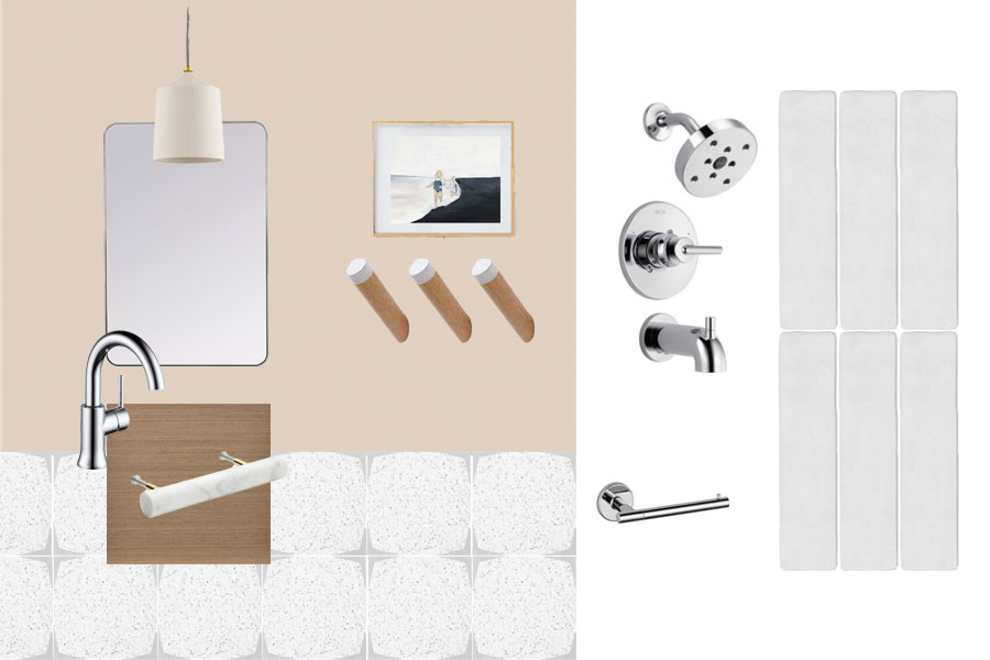
The design plan:

Everything stemmed from this encaustic cement tile from Geon tile and our friends at River City. The actual tile itself is so beautiful with its terrazzo centre and subtle curved line, that creates a really fun star pattern when installed. It’s really perfect for a kids space – a bit of fun without straying too far from the rest of the tile choices in the house. Plus, I’m all about terrazzo right now so I had to have some somewhere!! On the walls, a matte elongated subway tile that has this glorious texture…we will go vertical here (and maybe throw in a line of horizontal if it works out…stay tuned!)
I could have easily done a coloured vanity but I chose to keep it consistent with the ensuite and go with a warm wood. Much easier to take the colour onto the walls – which can easily be painted later on. While the soft pinky beige is up for debate, my original thought would be to pay homage to Rosie here…I mean I should have ONE room still pink right?!? Plus, the tile does have this beautiful soft pink running through it! Love!
Instead of a vanity light, I chose this matte white pendant, which will look so lovely hanging in front of a simple mirror. Don’t worry, we’ll add some pot lights to make sure it’s nice and bright in there! And the pulls on the vanity will also be in a matte finish – I found these knock off cb2 pulls on Etsy and they look great!
And then, I’ll layer in more elements to make it kid friendly! My favourite hooks from Sylvie’s nursery will be nice and low so the kids can hang up their own towels (here’s hoping), and a cute step stool, fun bath mat and shower curtain will be next on the list as well.
When it comes to bath toy storage, I’ve found that this hanging option is the best for allowing things to dry and it doesn’t pull a lot of focus. We tend to have a lot of toys in the bathroom (Jack is constantly bringing different cars, action figures or animals into the tub) so we definitely need to incorporate good storage. Because we have a floating vanity, I may try a woven basket underneath to house the extra bits and bobbles or this metal stacking unit from Crate and Barrel (the mint is cute!). I used to own one of these larger, anti-slip mats but I hated cleaning it, so I am going to opt for these stickers on the bottom of the tub instead and see how it goes.
Adding in more kid friendly decor in small doses suits me much more – all those details can easily transition as they grow up or be eliminated completely when we…say…sell!
What do you think of our kids bathroom design? Can’t wait to share more details soon…last space is the LOFT!
