After taking a weekend off to celebrate Sylvie’s first birthday, we are kicking off the new week with our design vision for Rosie! Yay! A whole week of beautiful content!!
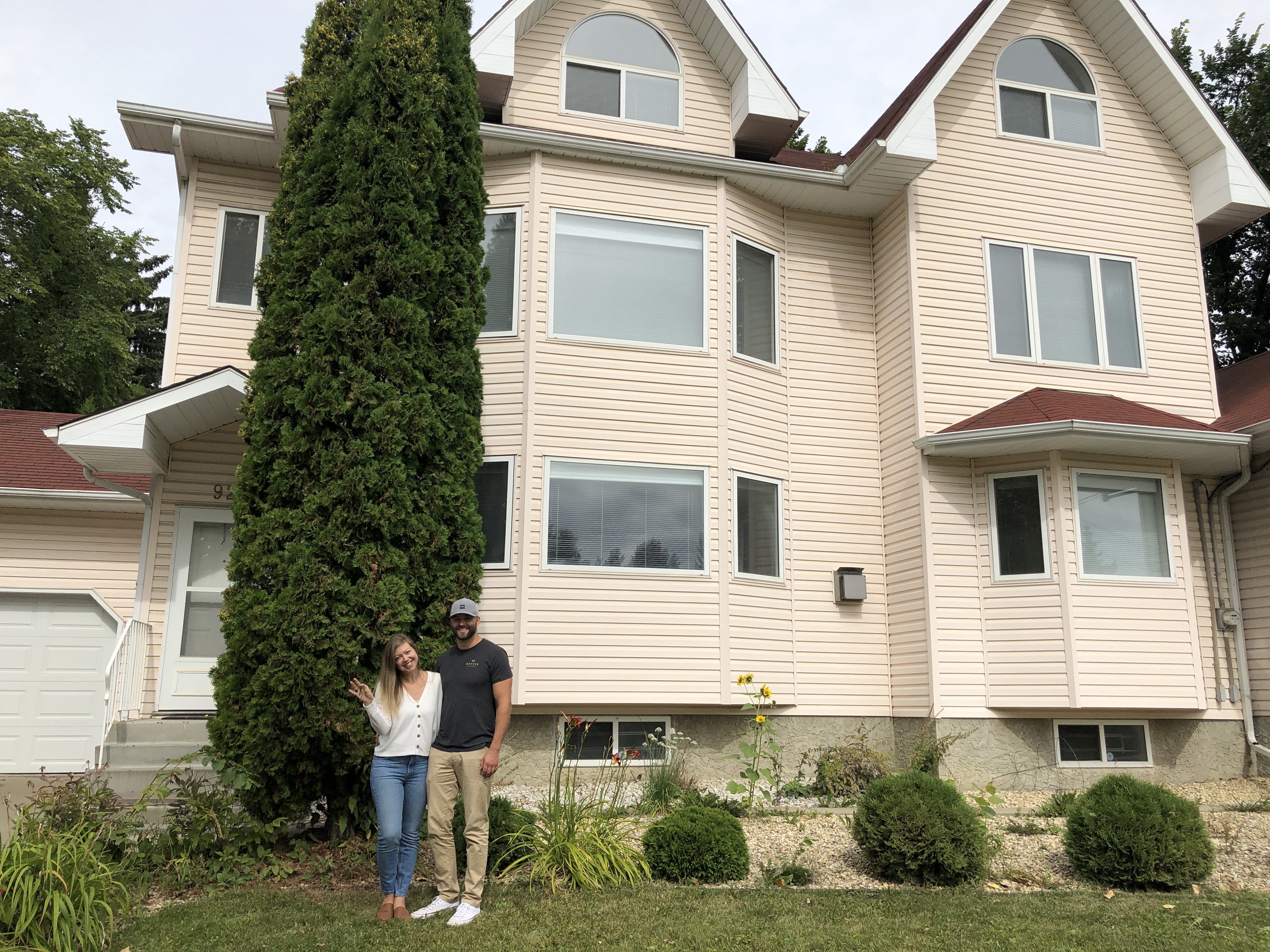
First, if you never got to experience a full tour of Rosie (our new/old home that we are fixing up in phases over several years) you should definitely pop over to my IG for the all the ‘before’ goodness. She’s very pink…think Barbie’s dream house…but has a ton (!!) of potential. Phase one of the renovation, that we are currently in the midst of, is the top two floors. That includes our bedroom and ensuite, a den/dry bar area, the kids bathroom and bedrooms and THE LOFT! So excited to share every detail, but I won’t overwhelm you with every space just yet.
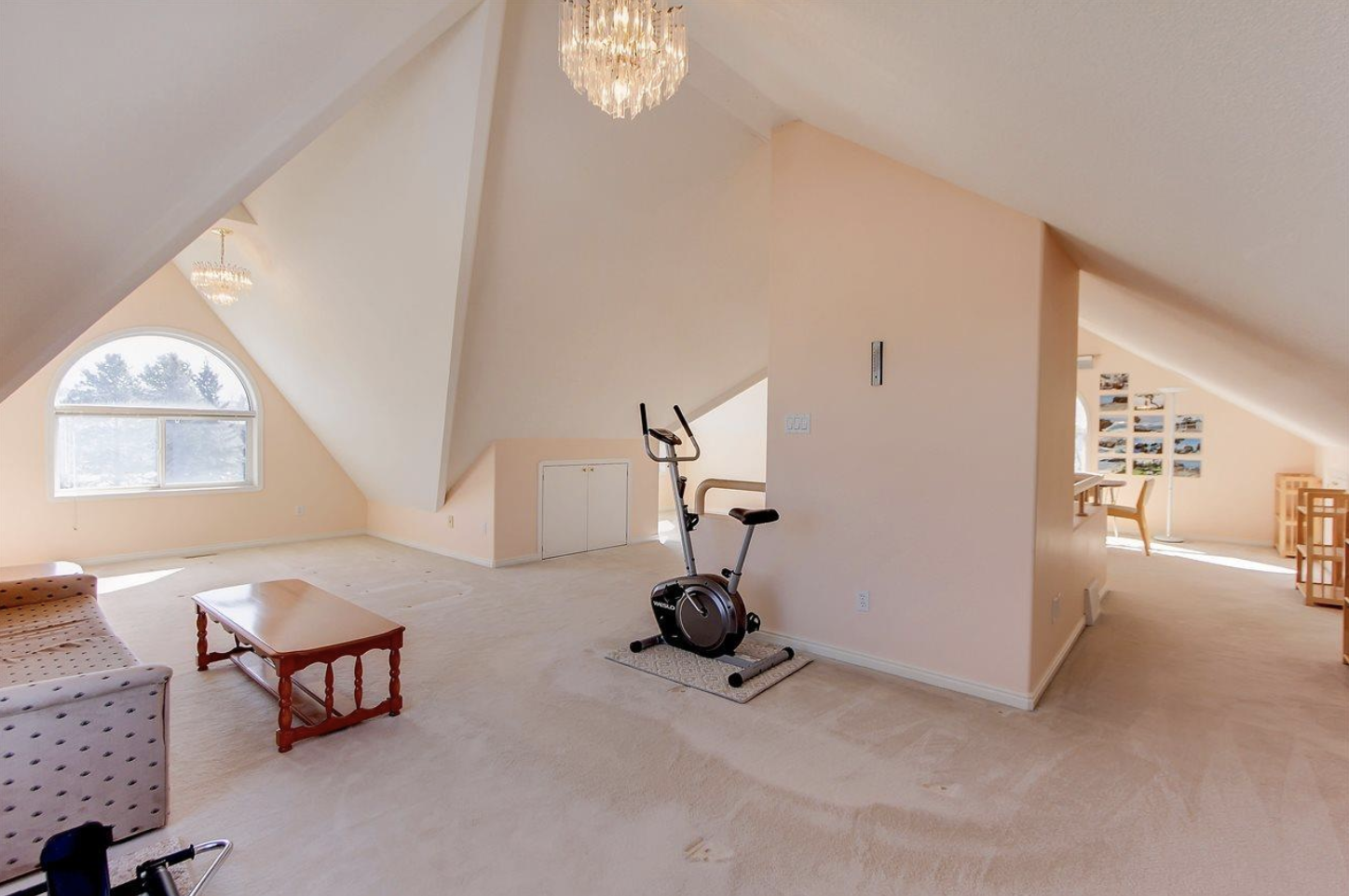
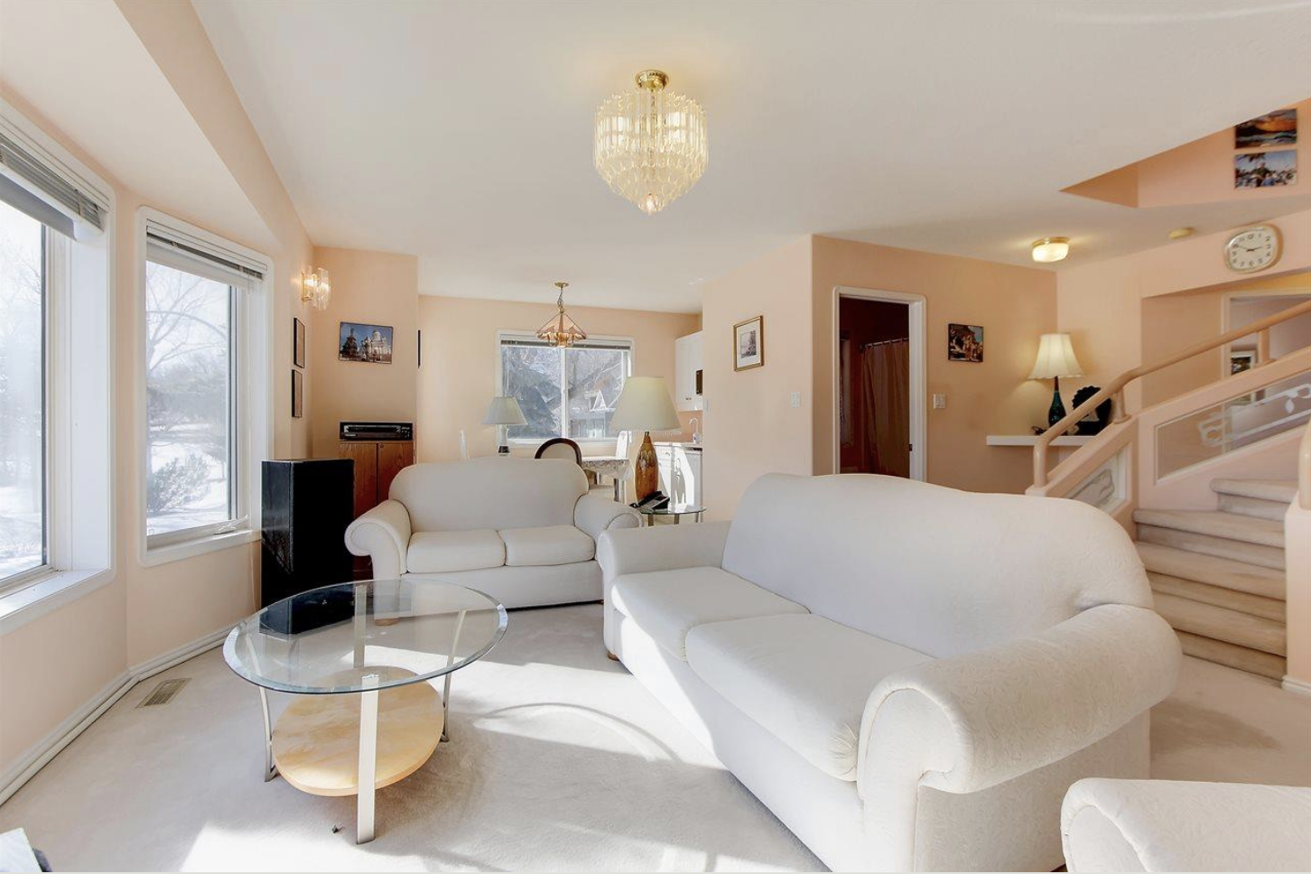
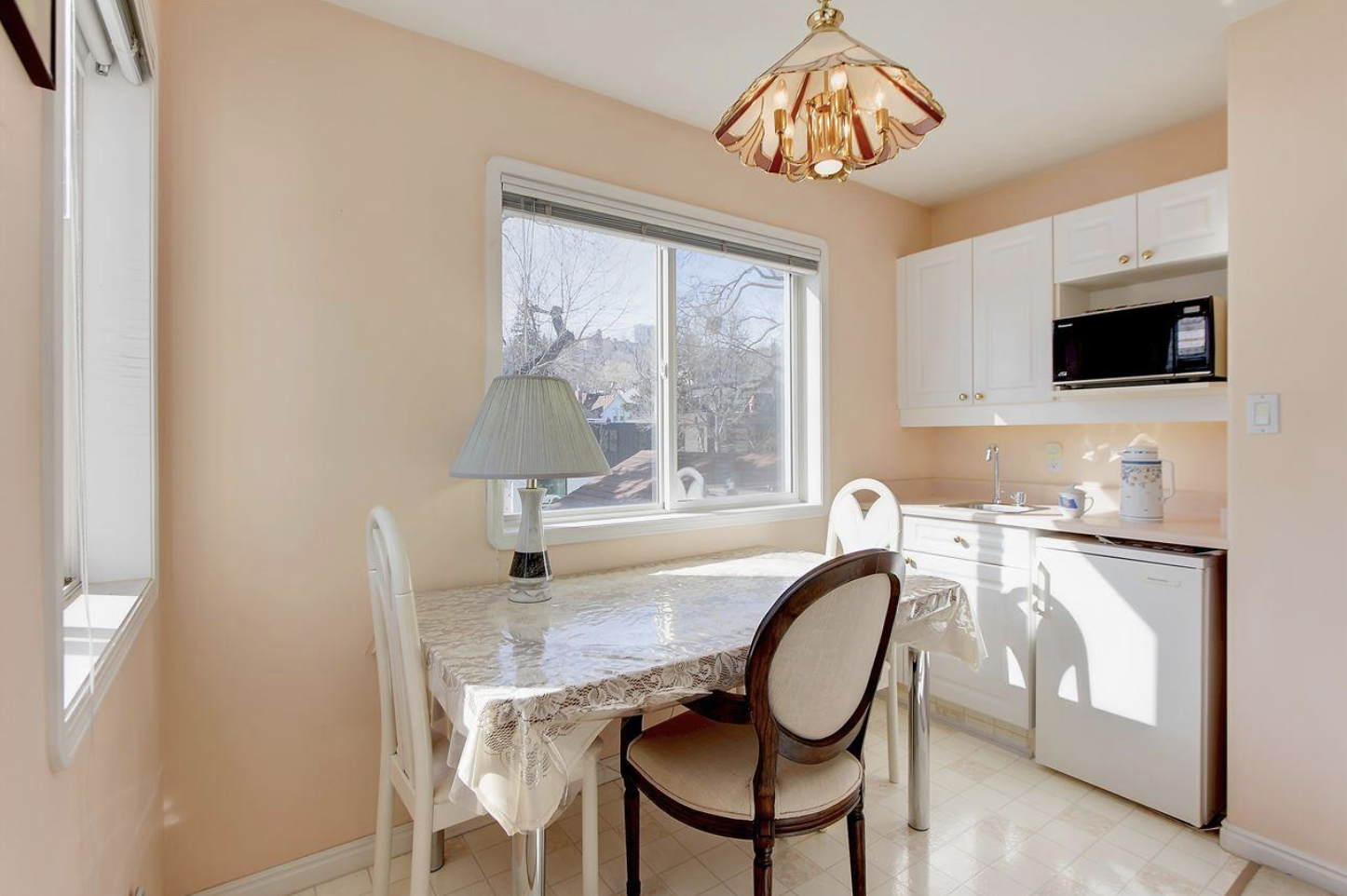
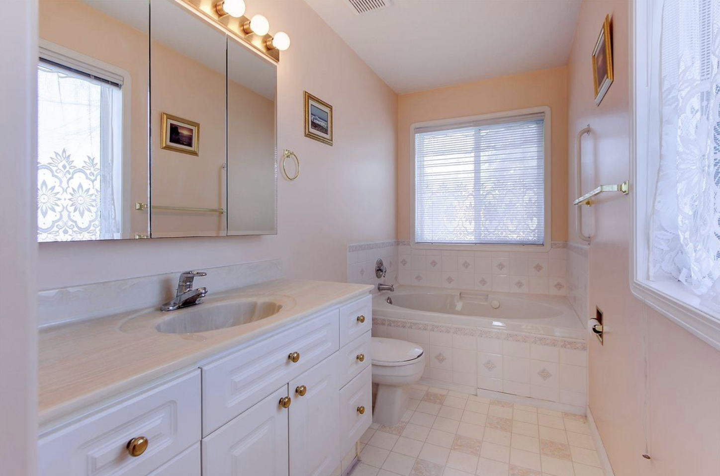
Also, I should mention right off the bat that Rosie is a passion project…I do get asked a lot if this is our forever home and quite simply, I don’t know if Ryan and I will ever have a forever home. We enjoy this process too much to sit still for long. So while I am technically designing this home for our family, every decision I am making I am also trying to think of the future buyer, the family that will hopefully love this home as much as us later on. And I am also trying to make conscious design choices FOR Rosie specifically. It’s important that I keep the integrity of the home – a super modern design just wouldn’t work within her walls. We need to merge the old with the new in a way that works…
It’s also important to me to have an overall vision for the home, even if we aren’t tackling the entirety all at once. In our last house, we just started in one room and worked our way around until it was complete. To me, it never felt completely cohesive…not something anyone else but Ryan and I would notice, but we definitely learned a lot on that project. It’s clear from looking at our ensuite (first project) to the kitchen (last project) that our style, abilities (and financial situation if I’m being totally honest) changed. And so, it’s important that Rosie has a consistency from the get go.
Get to it, right?!
The vision for Rosie: transitional design with nods of classic elements…warm touches throughout…inspired by European roots (think chic chalet almost with those long sloping rooflines)…emphasis on natural, restful, simple palettes
Here are some images that are leading the way for Rosie’s design plan…

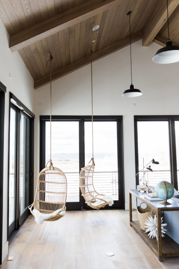
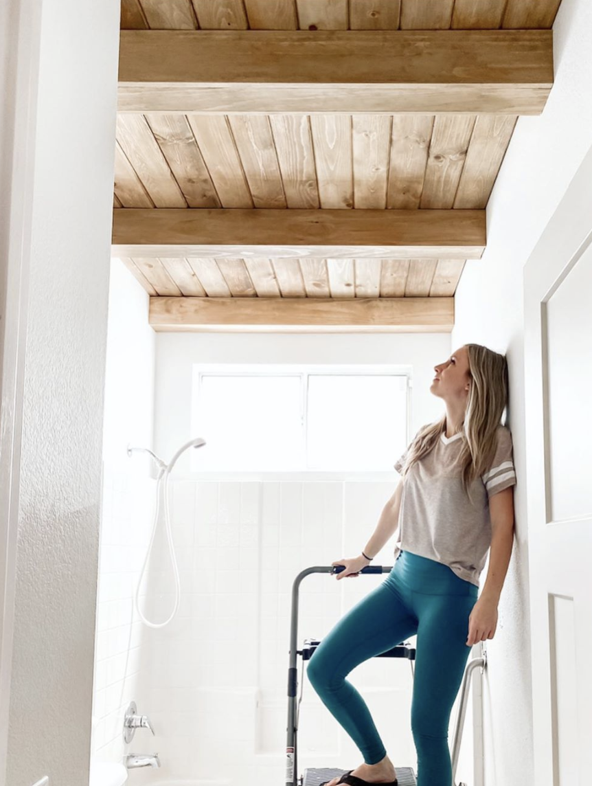
Soft warm wood is going to be a big element in this home. We plan to carry it into as many rooms as we can. And yes, that means on the ceilings too. The hanging chairs…yes…that is happening but I will wait to tell you where.

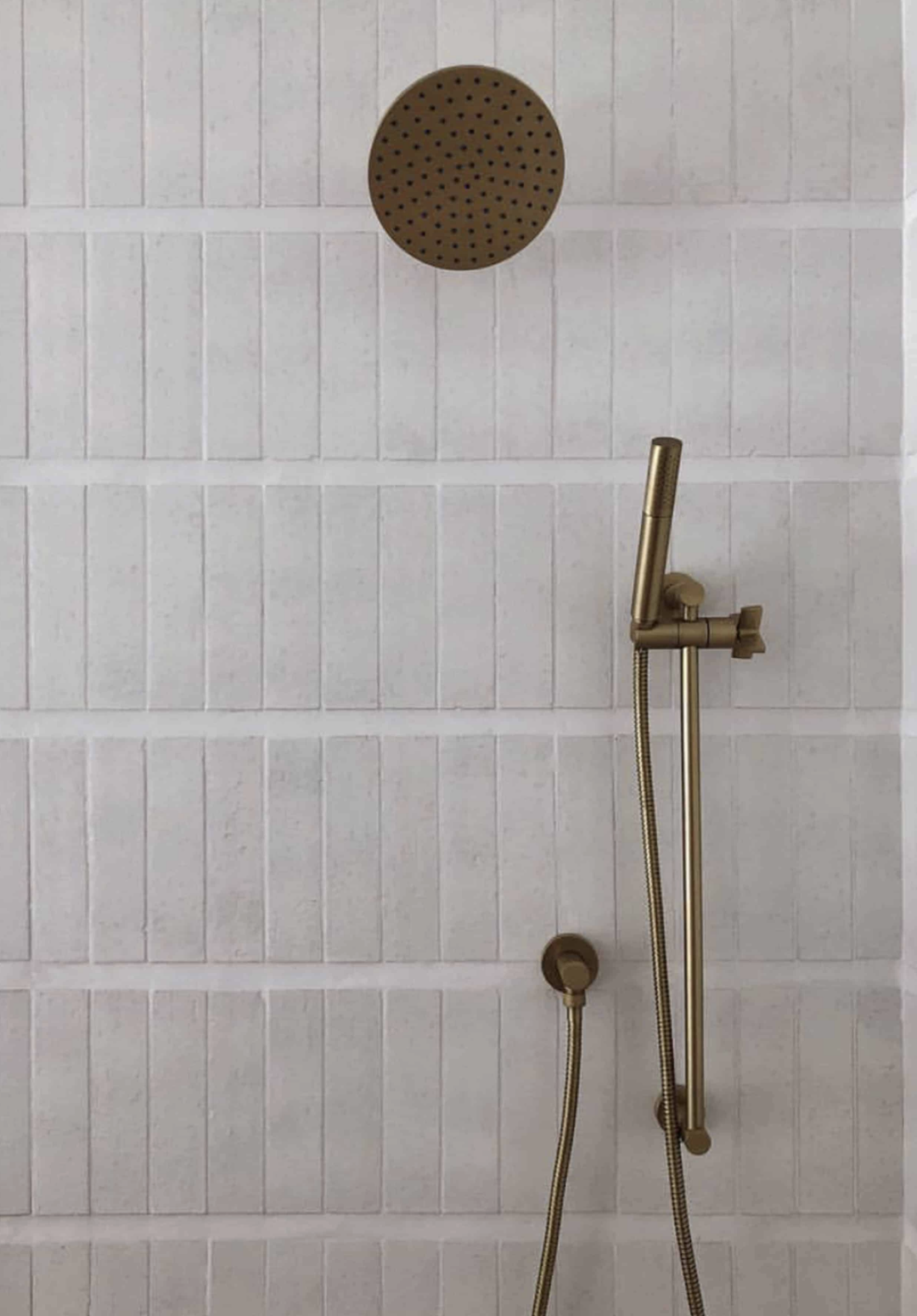
Bathrooms are where I am having FUN with tile. It’s going to be ALL about the tile with River City tile‘s help of course.
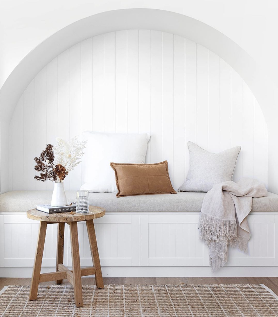
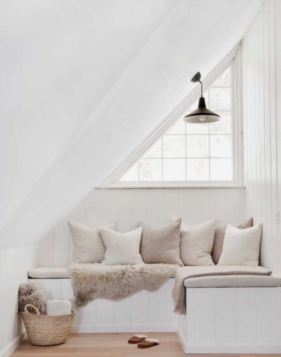
In the loft – statement ceilings continue and you better believe there will be soft spots like this to land. Let alone…the books…
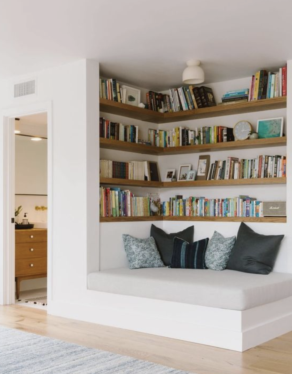
I know this is just a tease, but hopefully from this small selection, you can see a bit of the design vision we have for Rosie. I will have more design goodness coming your way very soon!
Thanks everyone!