Today I am doing something I have NEVER done before…I am sharing a whole project from start to finish in ONE post. That’s right, today you are getting all the goods and seeing the Befores…the design concepts…and the Reveal! Did I just make your day or what?! Maybe you’ll get as excited as me when you get to know this amazing space a bit better…let’s start from the beginning, shall we?!
Rewind to last fall when Kresswell was contacted by what we would deem as a dream client – an easy going, crazy stylish, amazingly cool boss lady! She had purchased this very “builder basic” condo to serve as her escape when she travelled into the city from Jasper (her home base) and yet, it just wasn’t feeling like much of an escape. It was absolutely liveable but lacked any sort of personality! She of course had visions to transform it and thankfully those visions absolutely aligned with our aesthetic and style. Match made in design heaven! It didn’t take us long to start dreaming and scheming, enlisting the very best contracting team around and turning this casual condo into what we dubbed The Oliver Escape. Let’s take a peek at a few before photos…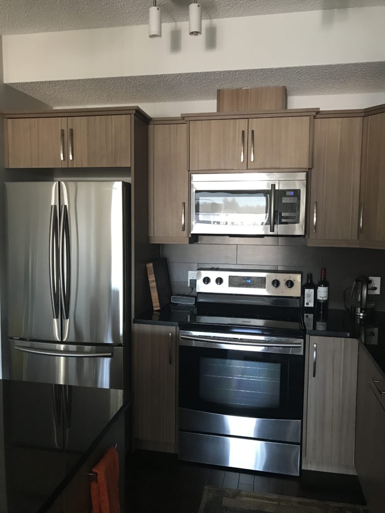
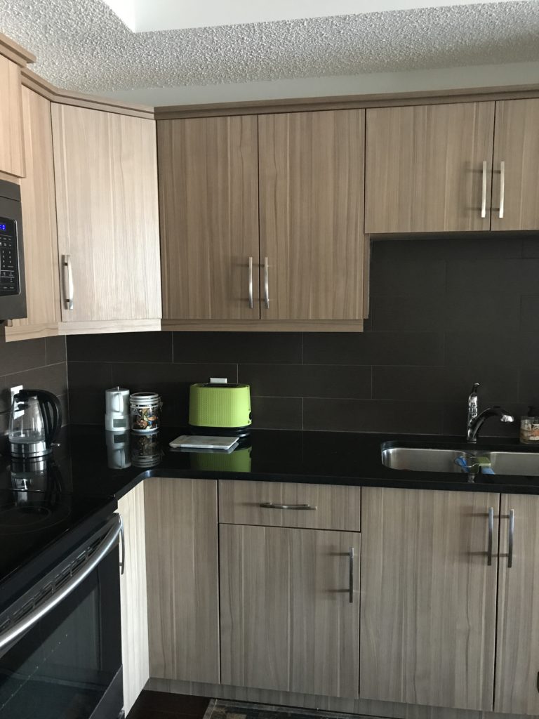
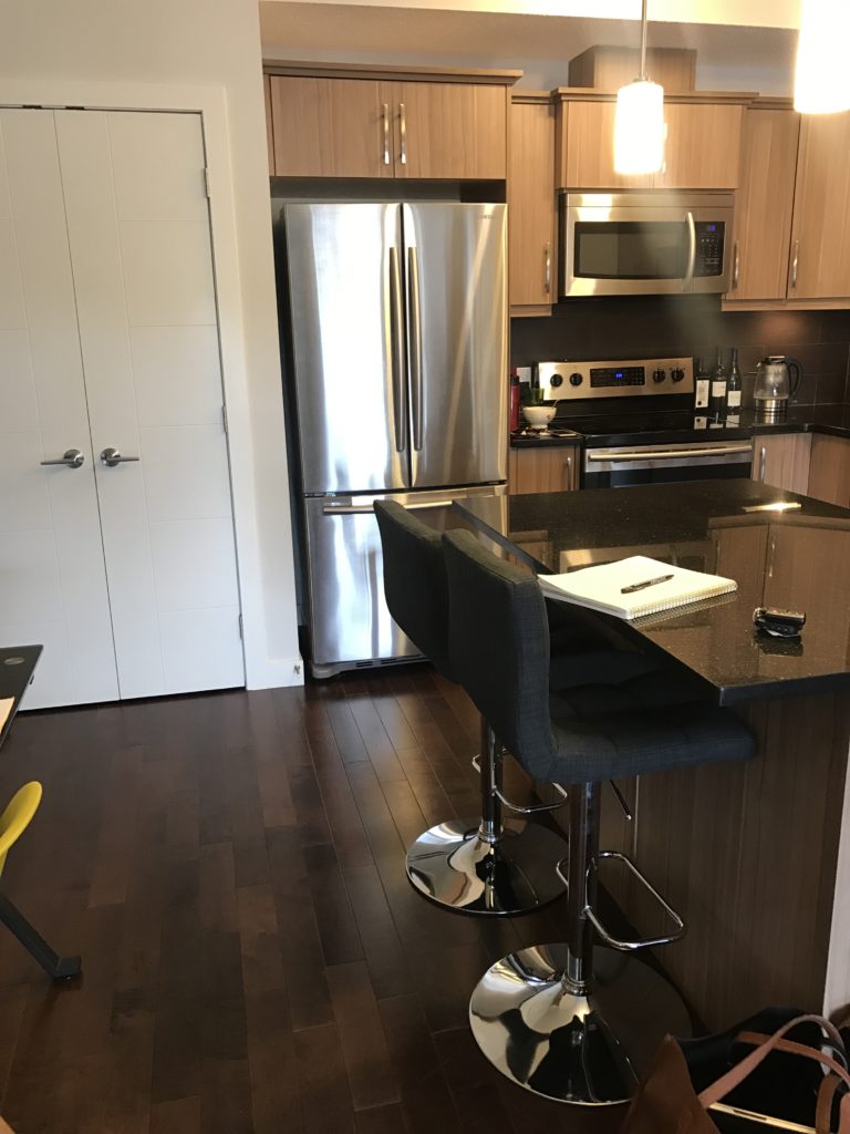
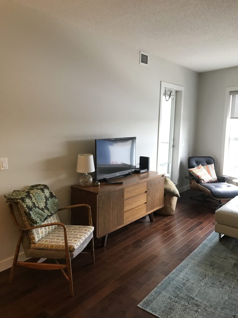
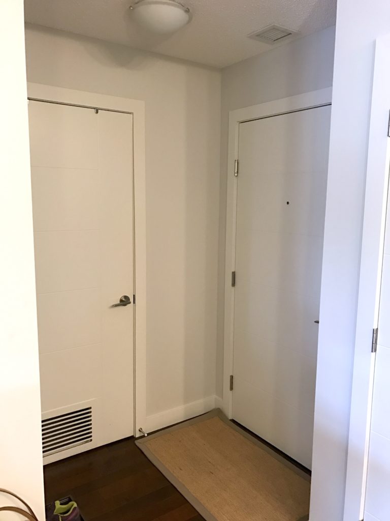
I know what you’re thinking…nothing wrong per say! But here’s the design concepts we started to plan for…
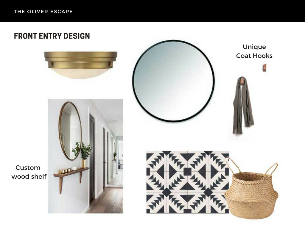
With a small entry space, we wanted to keep it open and airy while making a great first impression. A bold graphic tile with some custom wood pieces would certainly do just that. So we turned to some of our local friends (hello Oliver Apt. and Forge and Fell) to help us, after we ordered some graphic cement tile and a seriously sleek brass fixture.
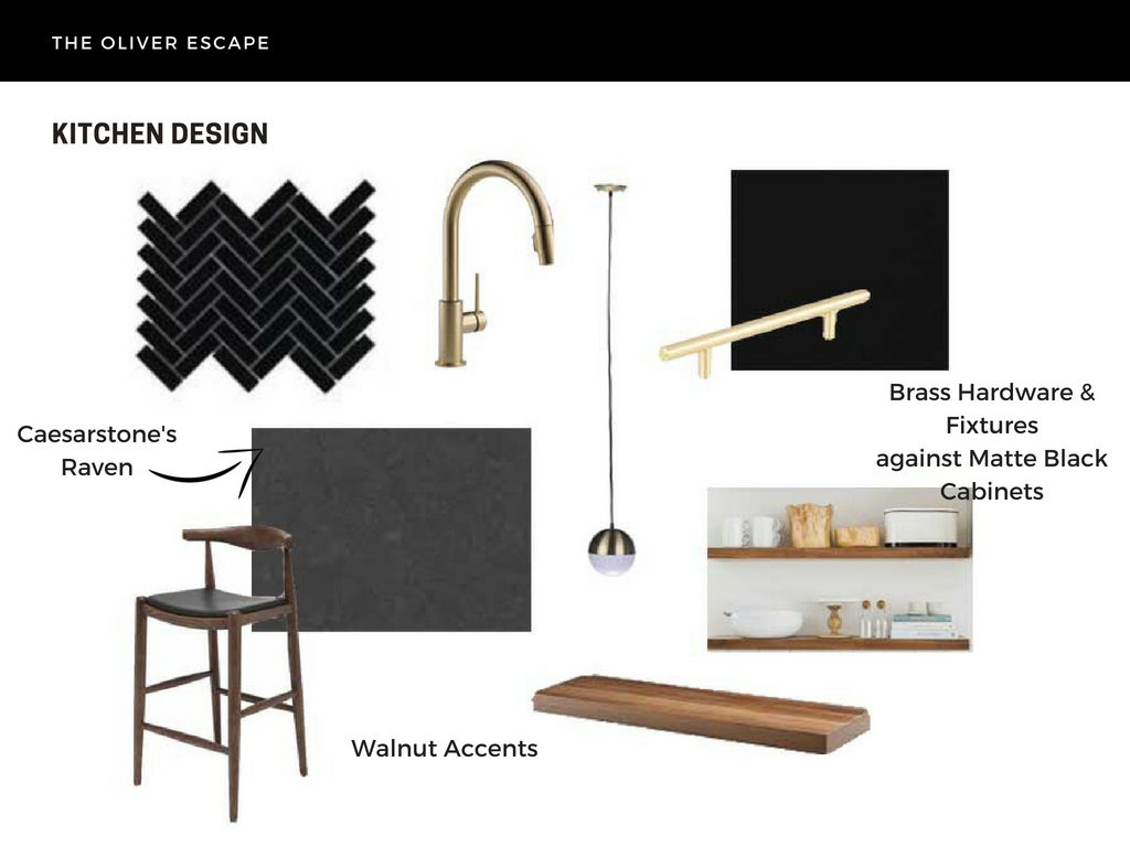 In the kitchen, drama was the theme! Our client wanted to go bold and dark…which was SUCH a refreshing change from what we typically do. To say we were on board is an under statement! We immediately chose Benjamin Moore’s Onyx as our wall colour and main inspiration…which led to refacing the existing cabinets with Kitch’s Fenix line in Nero Ingo, installing a matte black backsplash and a near black kitchen countertop! There were a few questions raised with our reno team, (is it tooooo dark?!?!) but from the beginning, we knew that small additions of wood and brass would be just enough to keep the space feeling balanced.
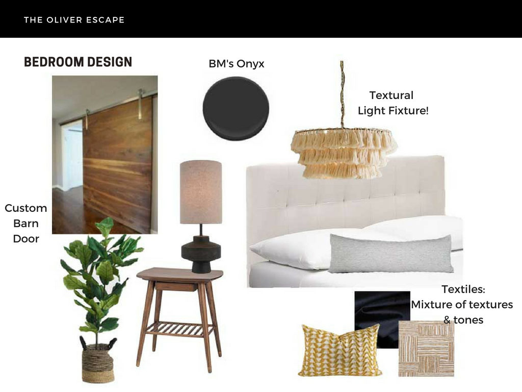
And then, in the living and bedroom space, we played with texture!!! And it was too much fun! Diana and I have always loved this particular pendant and felt we hit the jackpot when our client was as excited as we were to use it. We, of course, continued the same wood tones (hello custom barn door and mega beautiful mid century night stands!!) and brass tones (enter Tonic Living fabric) in this space as well…with just a few pops of green for good measure.