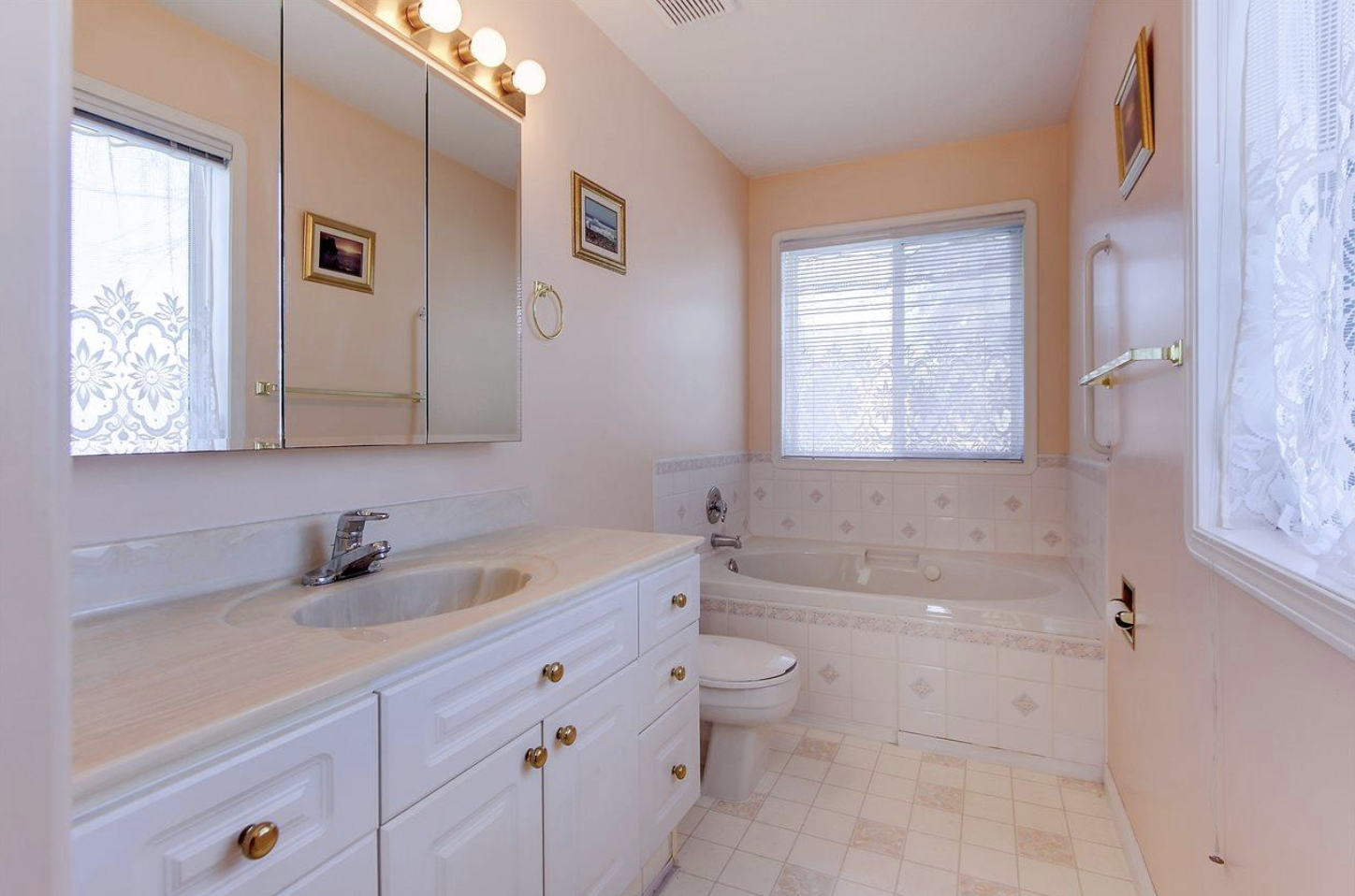
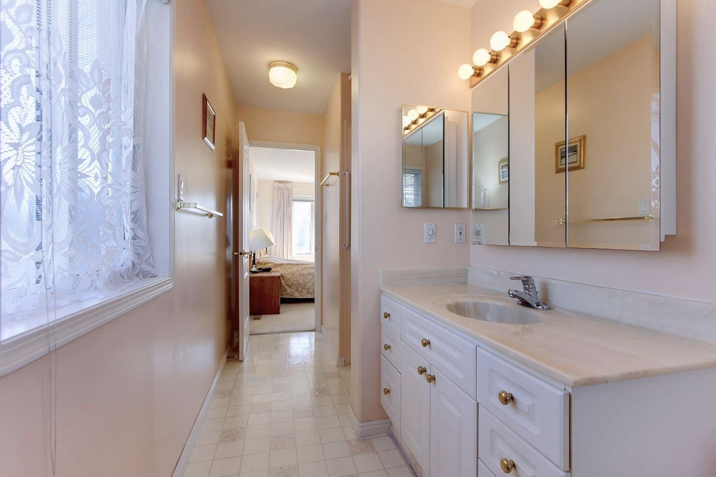
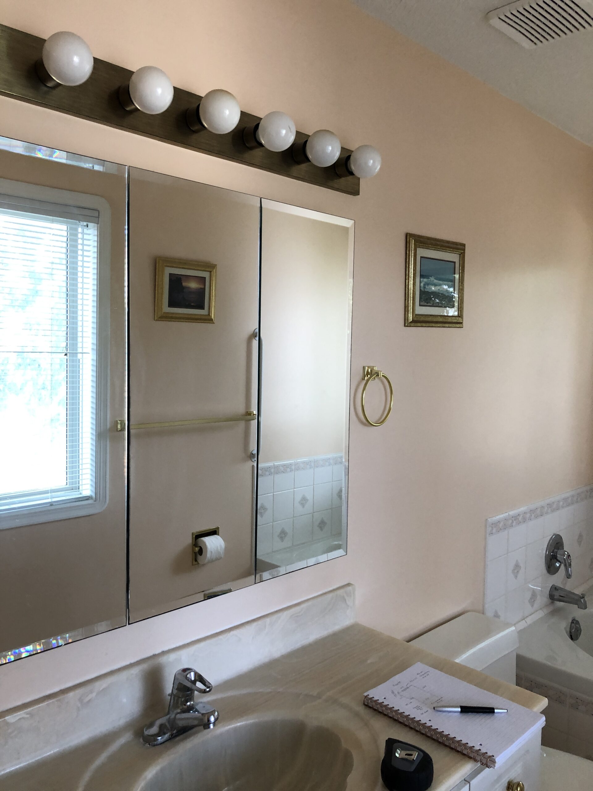
Though we’ve technically had a finished ensuite for a little while now, it’s not surprising that those final details can sometimes take the longest to bring together. And then to clean, style and shoot the space during a very hectic time…well, it takes some commitment! Regardless, I am here now, finally able to share all the details and pretty photos of Rosie’s ensuite design. But first…I would be remiss not to include some before photos (and if you missed the first design post and want to see the whole vision, head here!).
At first glance, the pink isn’t really all THAT bad…unless you live in a house that is head to toe pink, which Rosie is/was. But honestly, even though it looks semi clean and well taken care of, Rosie was actually quite grimy and lacklustre when we moved in. The extremely tiny shower (not pictured but you can see where it’s tucked in there by the towel bar) was so disgusting, I wouldn’t step in at all. Other things that we wanted to improve: the single sink situation (not good for marriages lol), the layout (it’s such a long space!!) and general fixtures etc.
Our vision started to come to life as soon as we took possession in September ’20 and got to demo’ing. If you want to see some highlights, head to my IG stories…some great moments are saved there!
And now for…drumroll please…the new ensuite!
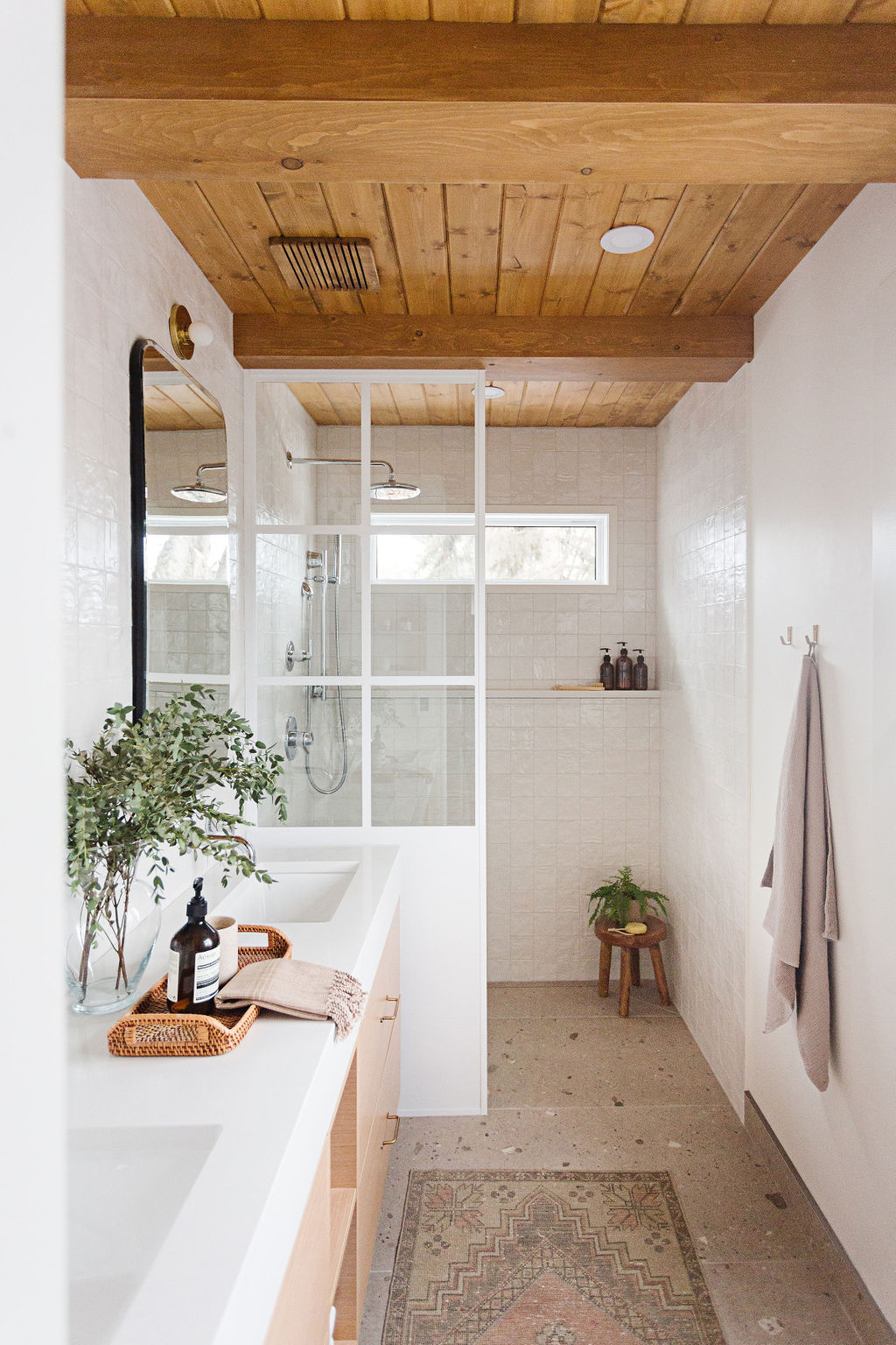
Let’s start at the floor and work our way up shall we? As you can see, we decided to relocate the shower where the built in tub used to be and designed it to be curbless. When you have the most beautiful floor tile from River City Tile, you want to show it off in all its glory! They even sprayed our Aria vent to match the tile…what service! So, we sloped the floor towards a linear, tiled drain and then used the same floor tile as baseboards throughout the entire space.
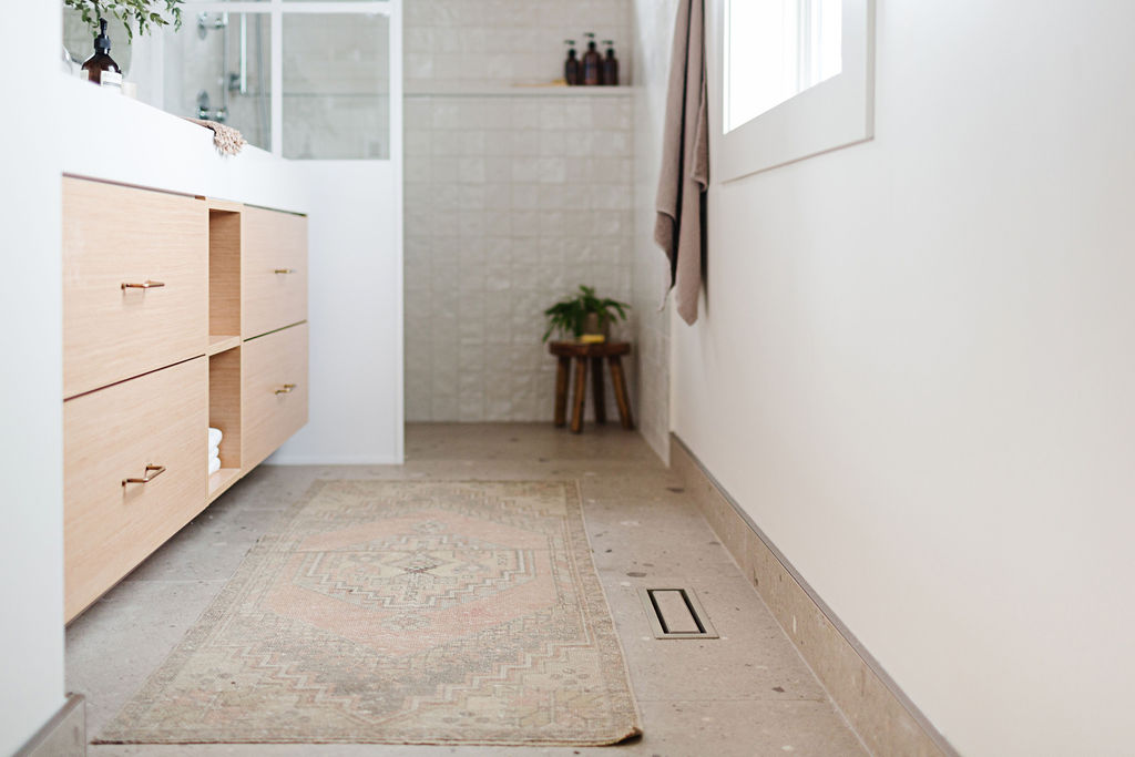
I found this antique rug on Etsy and it looks right at home next to our new vanity. This particular vanity is an IKEA hack in the best way…it is two Godmorgon vanities built with Kitch components to look like one large vanity. We chose the most beautiful wood veneer finish called Quartered White Oak – it’s my favourite door front that Kitch carries.
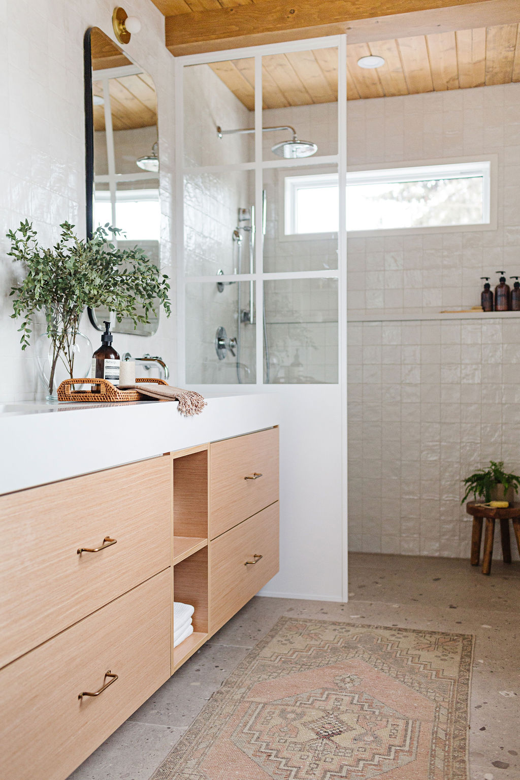
I get asked about this vanity configuration all the time. In order to still have the use of the top drawer and have an undermount sink, you need to get a little creative. There are a couple of ways to do it but we opted for a bigger quartz profile so that the sink can settle in that space, instead of take up the drawer. The open cubbies in the middle are easy to order from Kitch – they come in several sizes and just make it that much easier to get the exact vanity length you want. Plus I love that I can add some towels and glass jars here. PS – they also have added the Godmorgon high cabinet to their offerings. Basically, anything bathroom can be hacked now with Kitch!
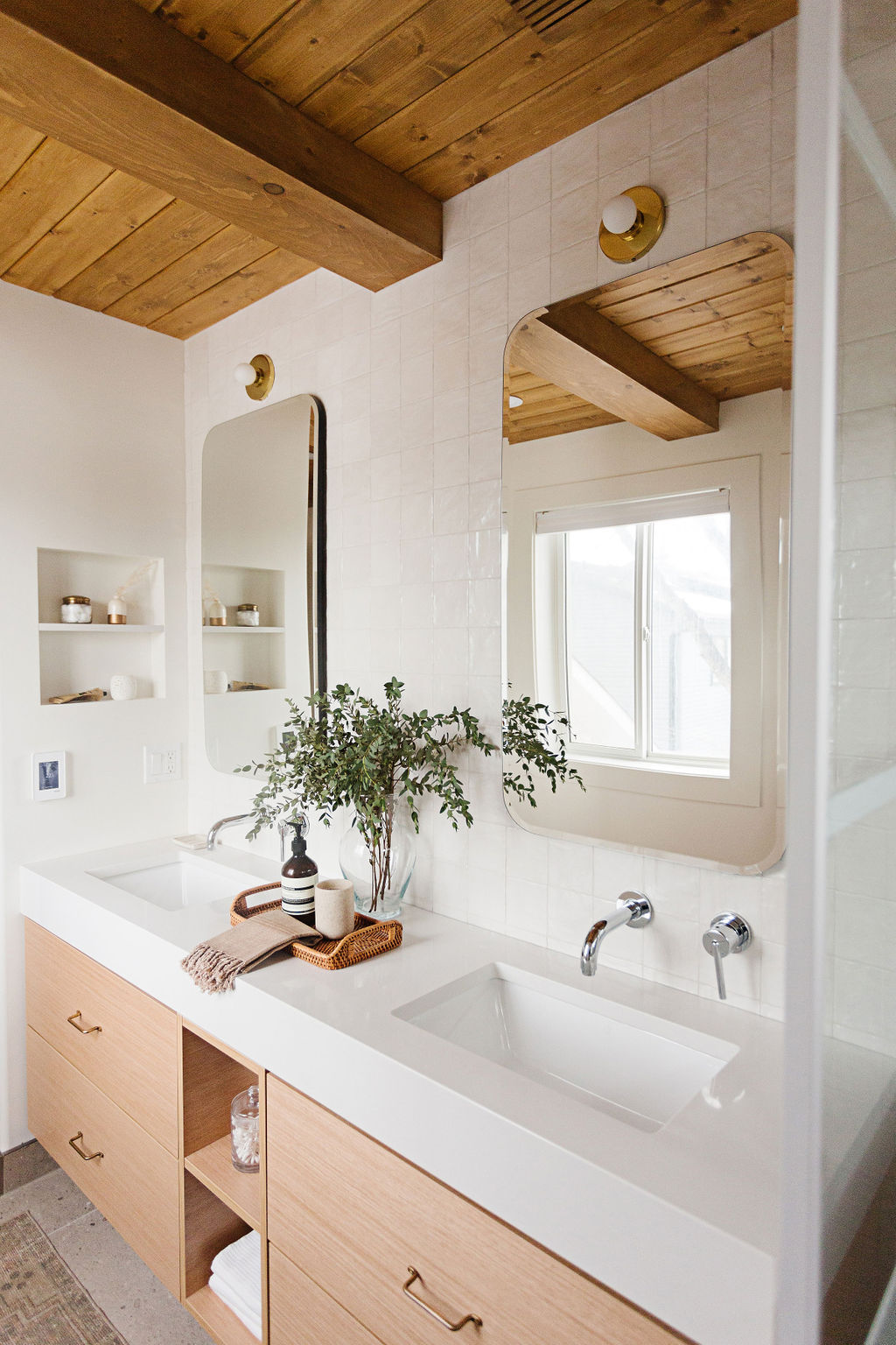
I’m over the top in love with our vanity set up – from the new nook Ryan built in the wall, to the wall mounted faucets and adorable wall sconces from Hudson Valley – it’s exactly how I dreamed it.
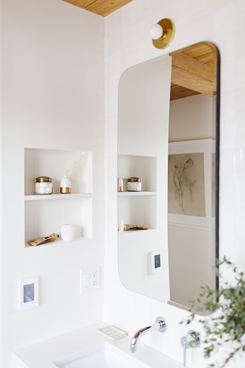
At first we thought we would need some more overhead lighting, so we added in pot lights. But these Taft sconces actually give off quite a beautiful wash of light. I’ve been so impressed with them. They’re small but definitely mighty. I would highly recommend!
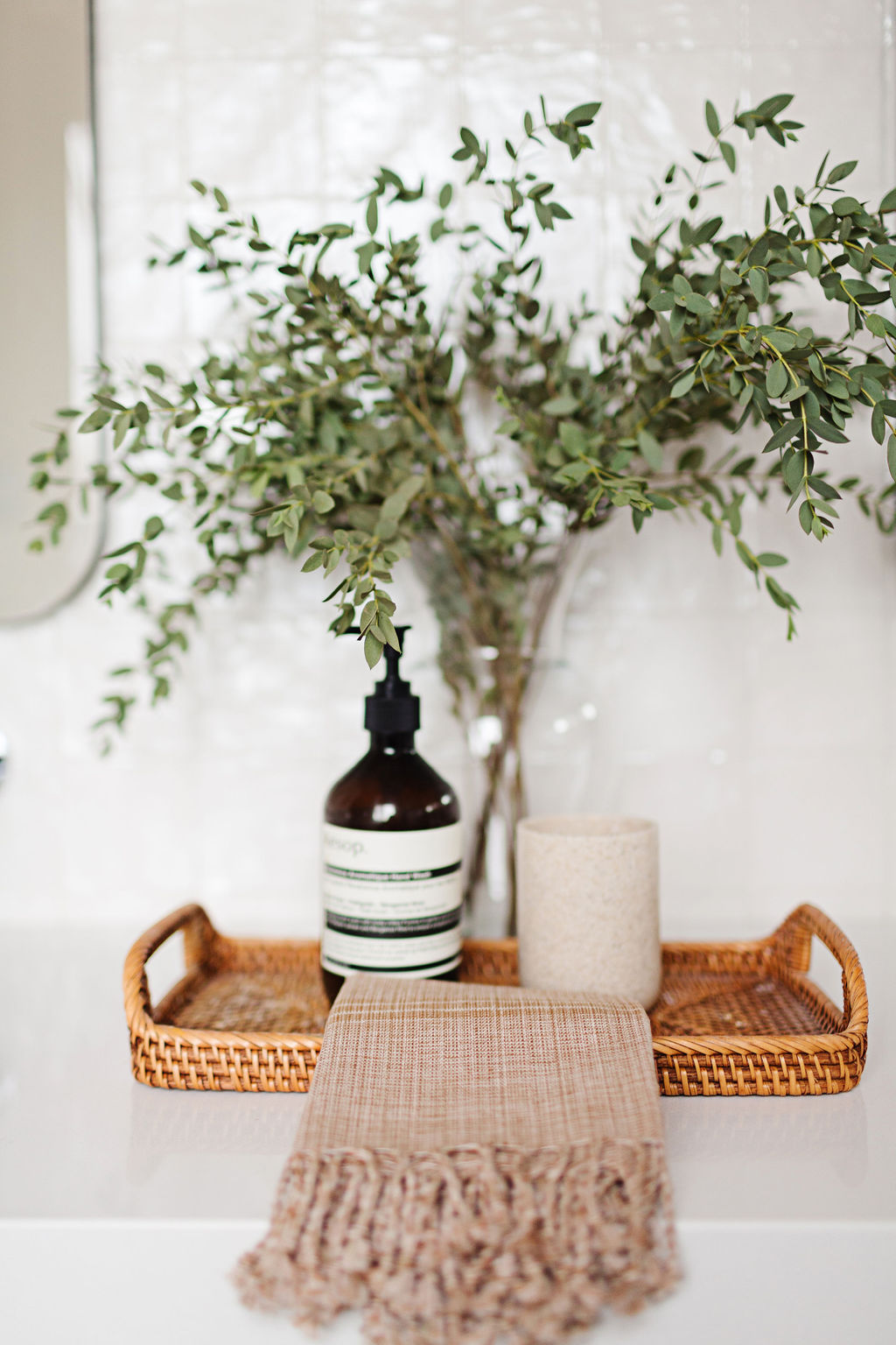
I also love that a wider vanity gives me some space to style in between sinks. Keeping it simple, of course, with a woven tray and a tall arrangement of olive branches (my favourite). This Aesop soap was purchased years and year ago when I was in London and now I just continually fill it with other soap. I love the simple branding, so I doubt I’ll ever get rid of it. Next to an H&M cup and a soft Turkish towel, it’s all we really need here. Everything else is tucked away in the deep vanity drawers!
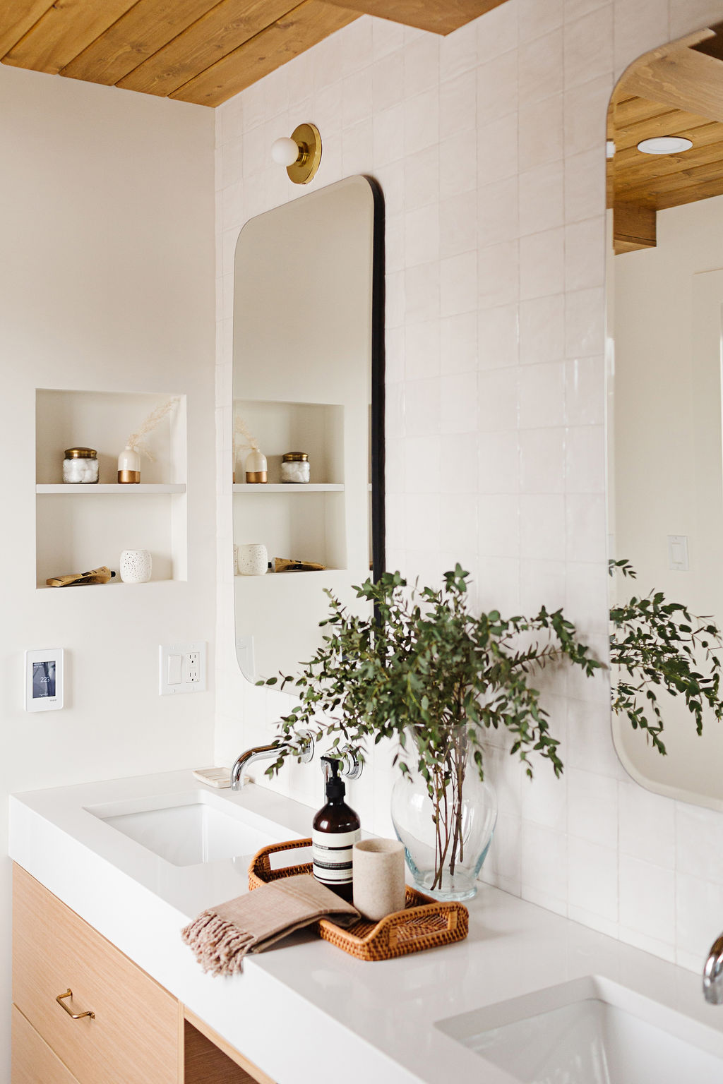
Circling back to the tile choices…this wall tile was a no brainer. Ryan and I chose it in another size for our Ravine House kitchen and loved it. Being in Canada, we don’t have easy access to Cle tile or as many hand made/Zellige type wall tiles…and let’s be clear, there are maaaany if you are willing to spend more $$. But the 4×4 Mallorca is a really get affordable dupe, if you will. It has a pearlescent quality to it and each tile is just a little bit different – giving you that texture and dimension. It’s beautiful. So we carried that from floor to ceiling on the vanity wall, joining into the shower.
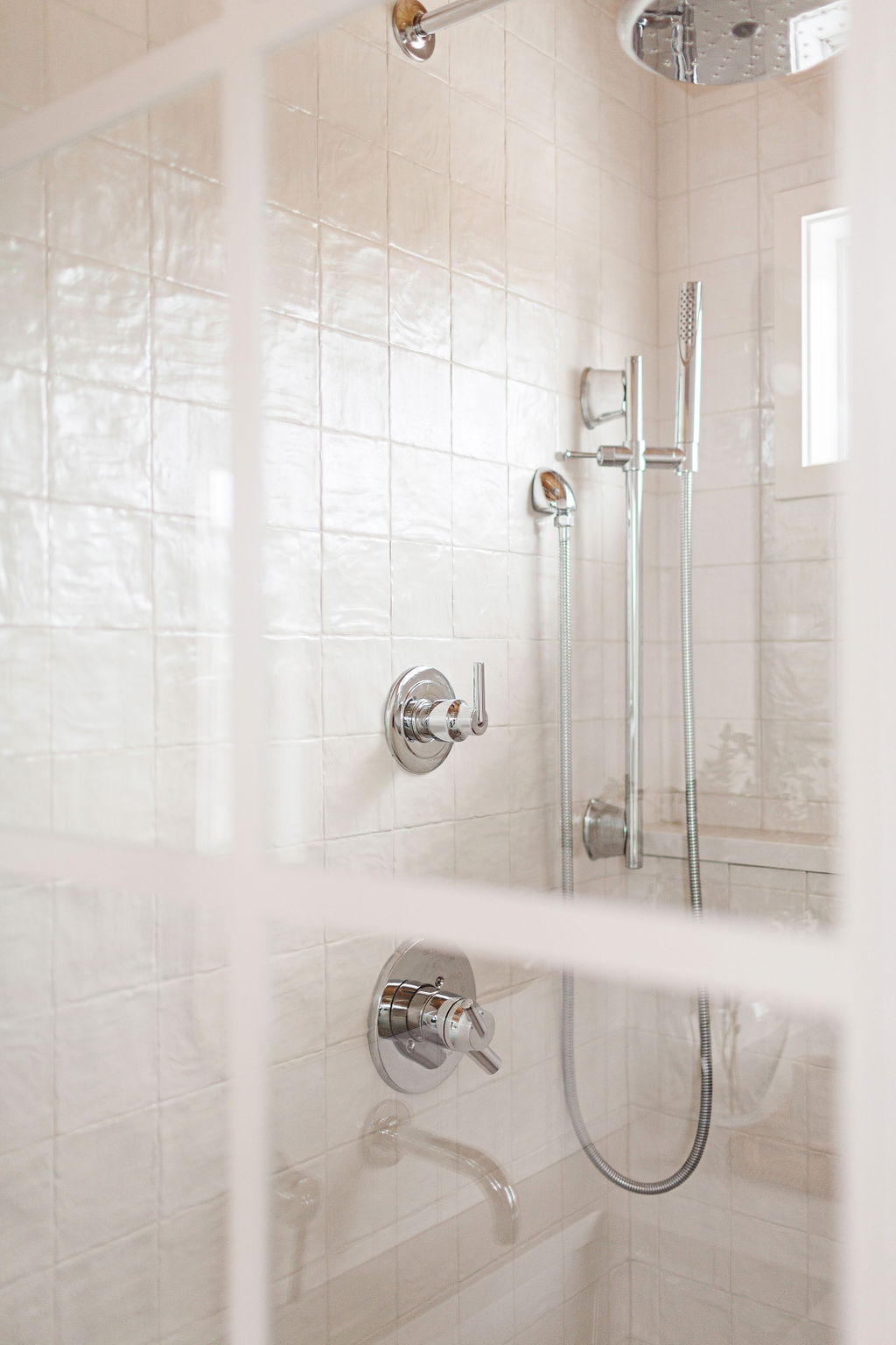
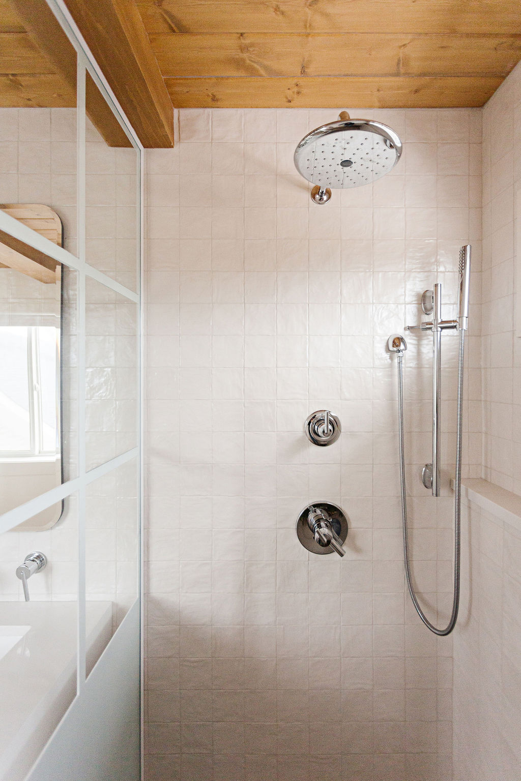
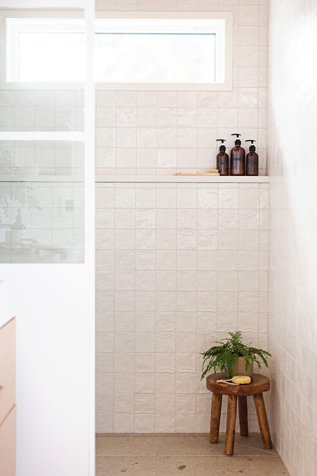
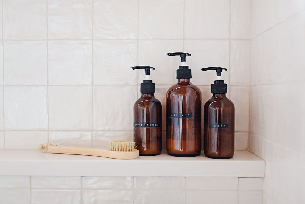
Because the main shower wall was an exterior one, we decided to add a ledge instead of trying to fit a niche on our plumbing wall somewhere. It’s completely sealed behind there and then sloped ever so gently – water doesn’t pool badly at all and the quartz counter makes cleaning super quick and easy. I didn’t want to see a lot of clutter in here, so I dumped all our soaps, shampoos etc. into amber glass bottles instead. Honestly, it makes me sooooo much happier not seeing all those labels.
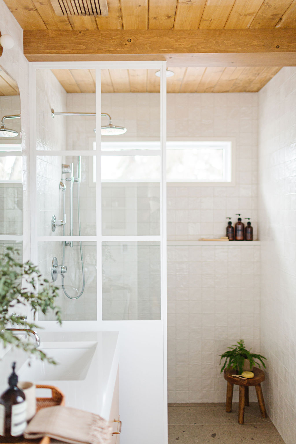
And I know you have been waiting and waiting for me to spill the beans on the two most unique elements in the room: the shower panel and the ceiling. We had Bruce from Iron Elements create this shower panel based off a rough sketch I did…I didn’t want to do something typical and I knew he would be the right person to help me achieve that. Bruce created the metal panel and had it powder coated in a white shade – then Ryan installed a custom glass piece on the inside. It was tricky, but I think we learned a lot in the process. If I was to do it again, I would look at creating more dimension and possibly making the windowpane section skinnier…and I would be really really specific with the shade of white I chose – something a bit more subdued for this space. Details matter!!
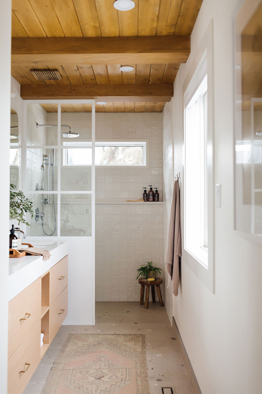
Now the ceiling! We did pine tongue and groove planks, stained to match our hardwood floors. Ryan built the beams out of pine as well and we spaced them out evenly over the ceiling. And yes, that is a pine fan cover that we also stained to match, which I think is a fun detail.
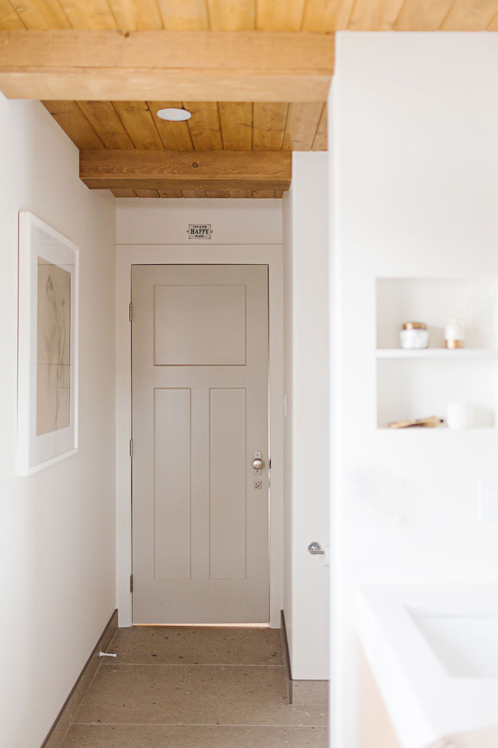
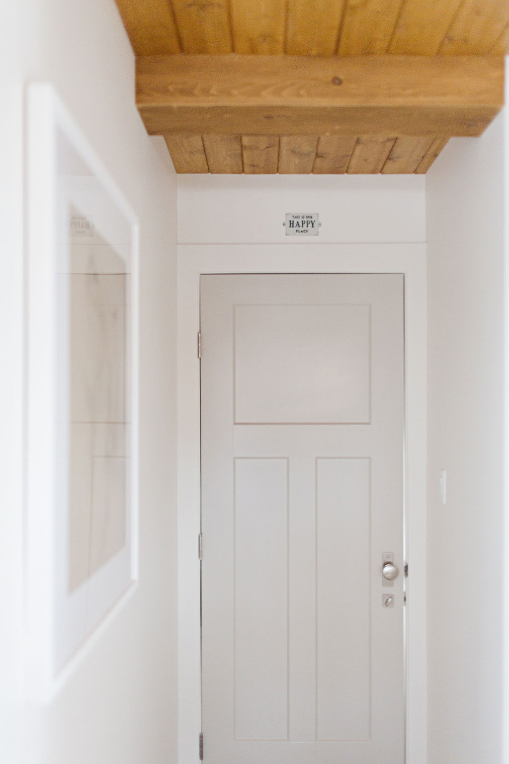
This truly is our happy place, as cheesy as it may sound. But we haven’t had an ensuite bathroom like this before – away from the kids! It feels incredibly luxurious…a retreat at the end of these long pandemic days lol. I feel so fortunate. And as always, none of this would happen without my partner in all things…Ryan.
Please reach out if you have any questions. I will do my best to list as many sources as I can here.
Wall and Trim colour – BM White Dove | Door colour – BM Revere Pewter with tint lessened by 20% | Floor tile – Ego Sabia by Ames and Wall Tile – Mallorca in white by Centura both sourced locally through River City tile | All plumbing fixtures Delta Trinsic | Mirrors – Zara Home | Wall Sconces – Taft by Hudson Valley Lighting | Counters/Ledge/Niche – Hanstone Bianco Canvas | Tray – Crate and Barrel | Stool in shower with fern is a Home sense find | Amber Bottles | Most other accessories are thrifted or antique | Artwork | Sign above door | Winslow door by Masonite and Door handle – Emtek with the longer stretto rosette
All photography by the talented Sharon Litchfield
