After moving into the Ravine house, the master bathroom was the first area we decided to tackle. If you remember from my previous posts, we wanted to get started on the renovations right away…like the day we moved in right away! We wasted no time in gutting the upstairs floor. The biggest part of the job was this master bathroom. It needed a complete overhaul! But it had great bones, a layout that worked really well and no major issues that we could see.
We encountered a few design snags along the way (see the post here) but all in all, this renovation was pretty straightforward. And now!?! I am IN LOVE with our new space!!! And I’m so excited to share this new bathroom design with all of you…our modern black and white bathroom!
First, let’s take a trip down memory lane and see what it used to look like.
| Before |

| After |
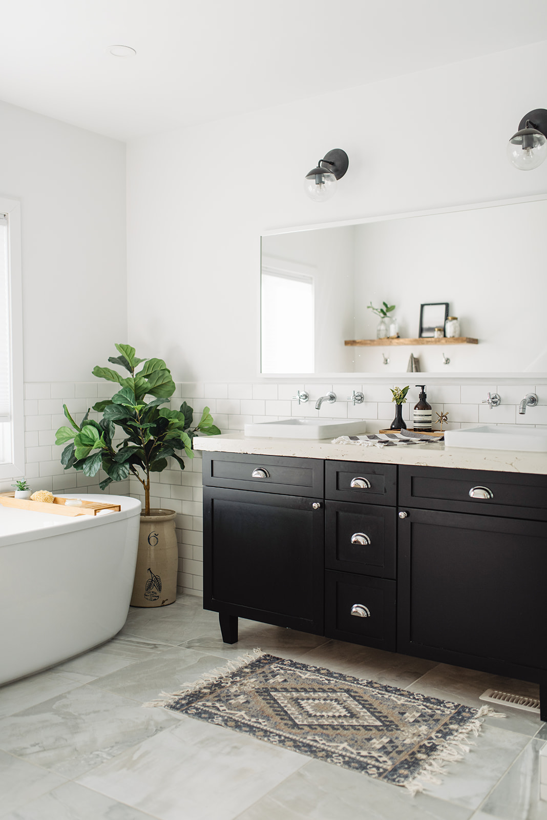
The overall bathroom design included large square tiles in a soft grey, a ton of white subway tile and all new everything! We designed our black vanity with DIY cabinets here in Edmonton, then opted for chrome shells and knobs to tie in the other fixtures in the space.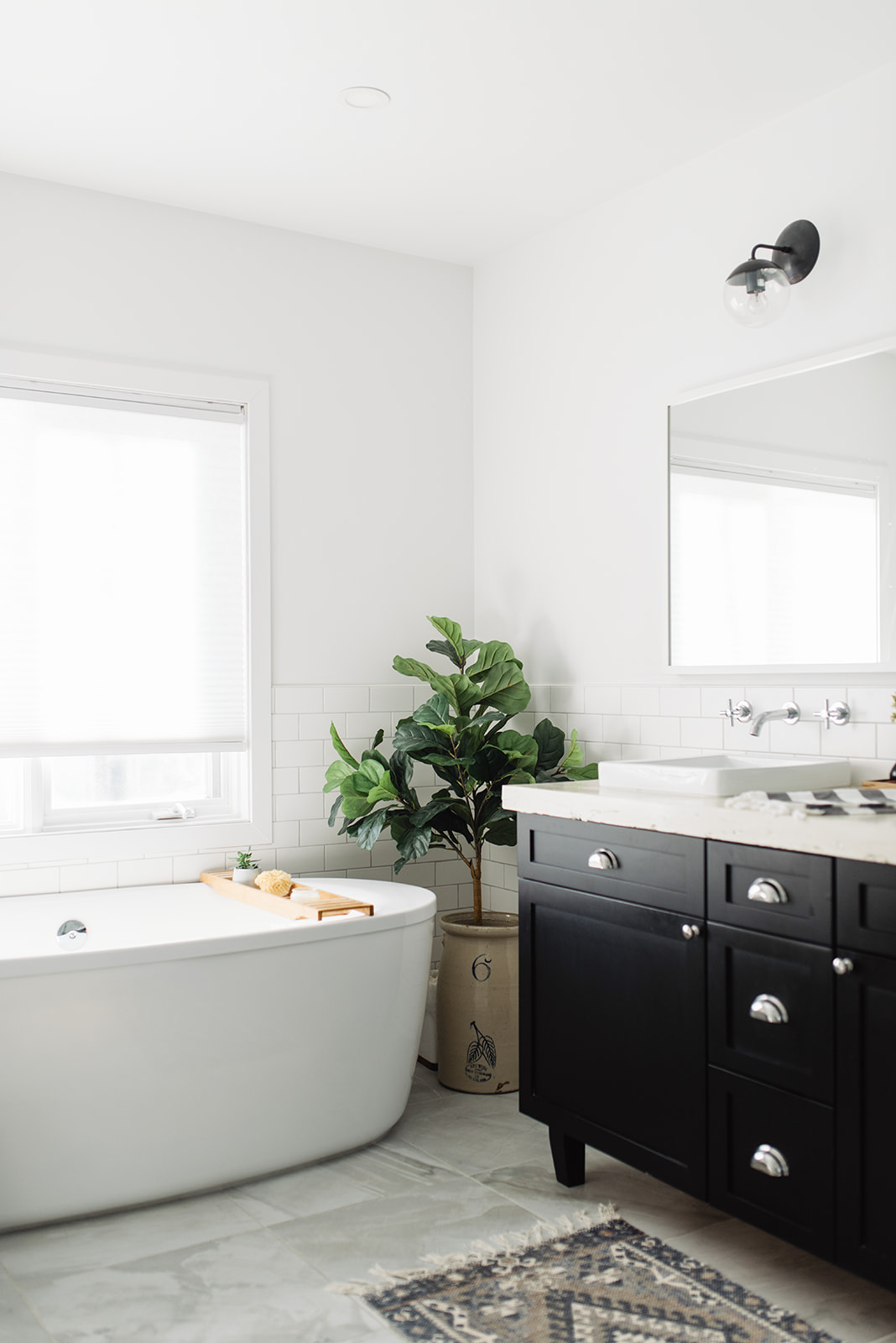
I would have loved to see an antique rug in here but when I saw this affordable option, I knew it would suffice for now. I thought it had the perfect blend of colours and pulled the space together really well.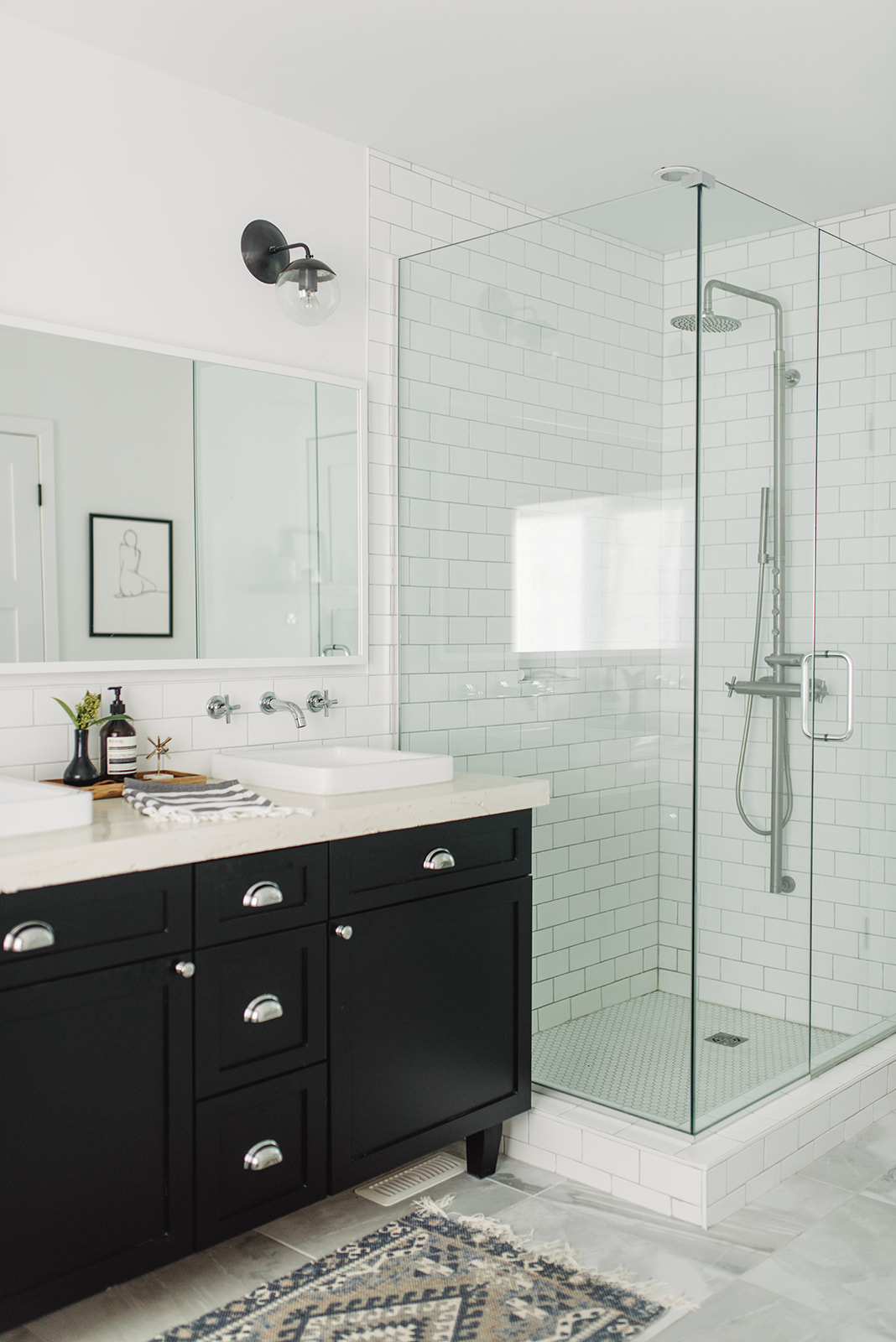
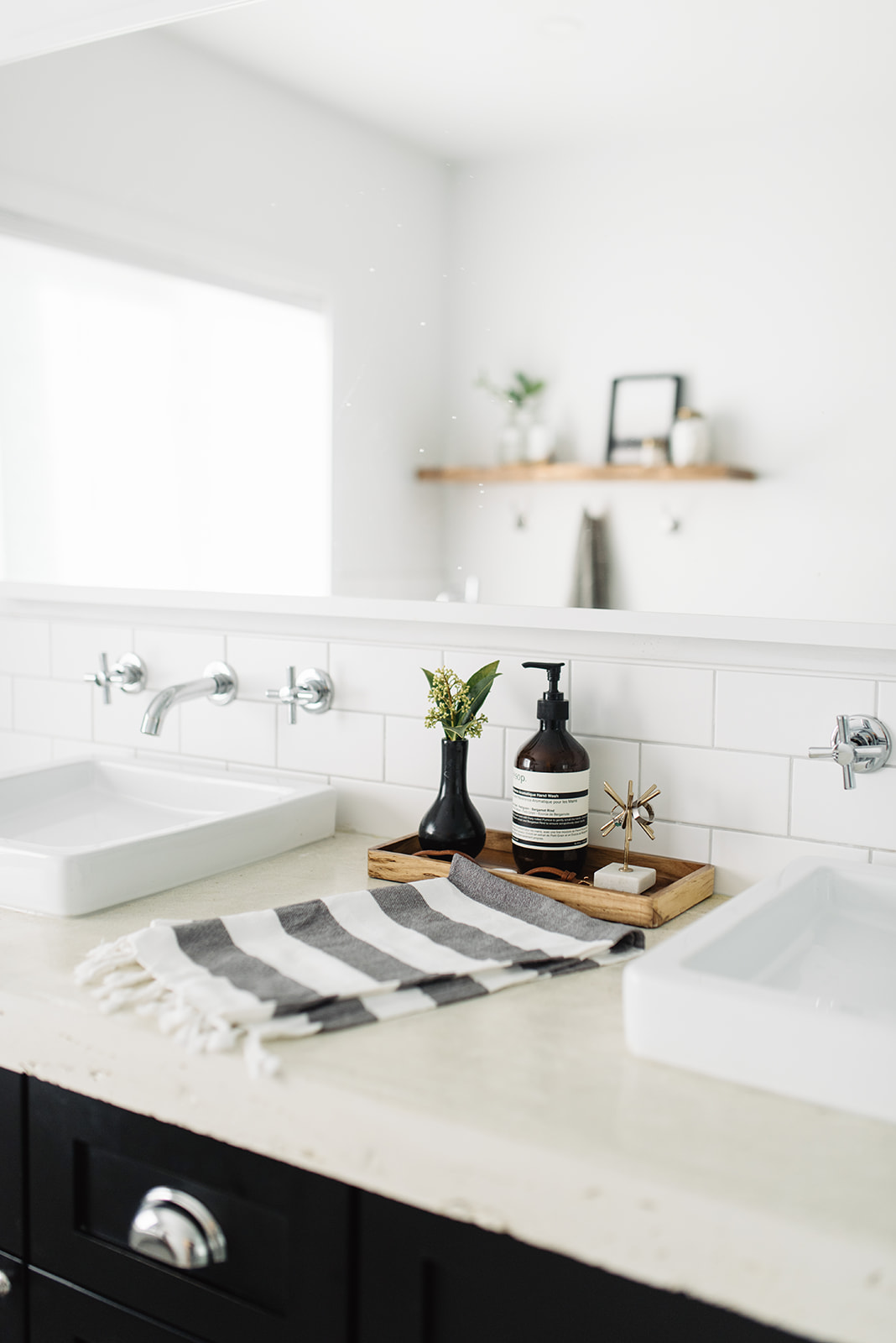
Ryan worked really hard on the concrete countertop and we finally found shallow enough semi-recessed sinks that fit the vanity perfectly. They were hard to find but I’m so glad we took the time to do it right! And double vanities are the best invention of life, let me add! Some people may think that they are hard to clean, but honestly, it doesn’t take much more time to just wipe around the edge. Yes, it’s one more step but for me, not a deal breaker in having vessel styled sinks.
The wall mounted fixtures were a must for me. I love the way they look and I actually do find they get less dirty being wall mounted. I fell in love with Cedar & Moss lighting awhile ago and thought the glass Alto sconces were the way to go. They are one of my favourite things in the room.
The shower is a dream to use…I’ve never had something this nice before. We decided to continue the subway tile into the shower surround and then did small white honeycomb tile on the base.The shower niche Ryan created is so handy!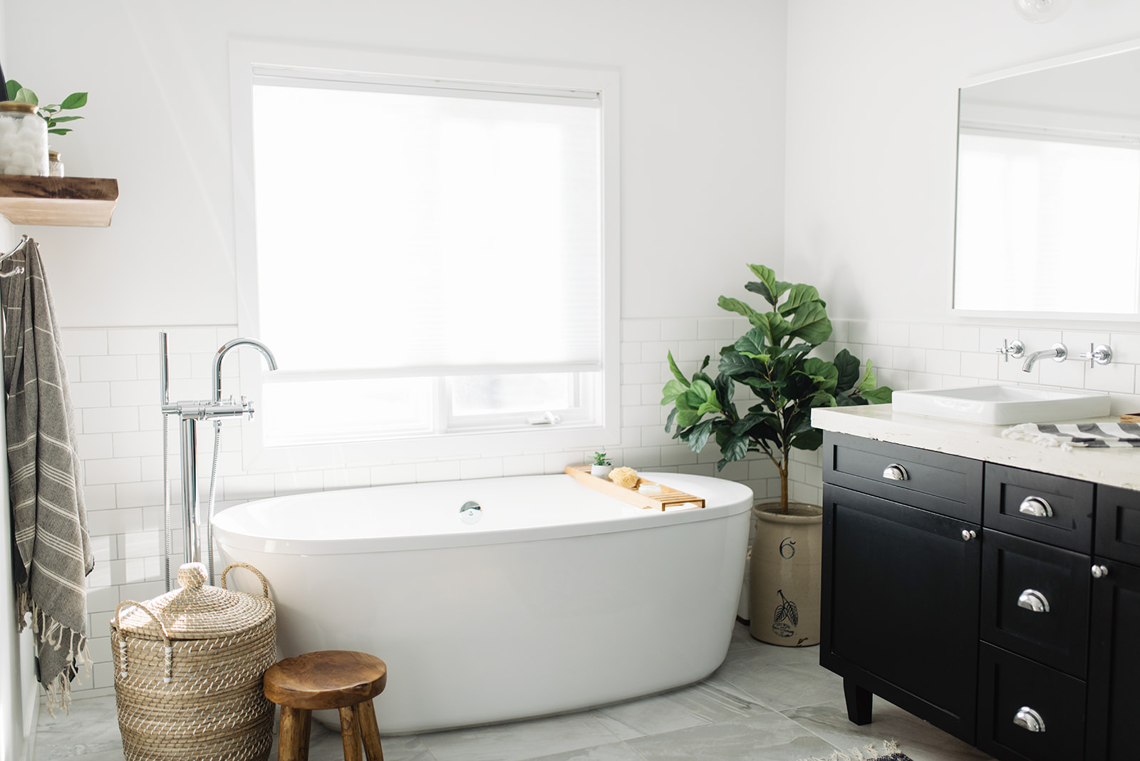
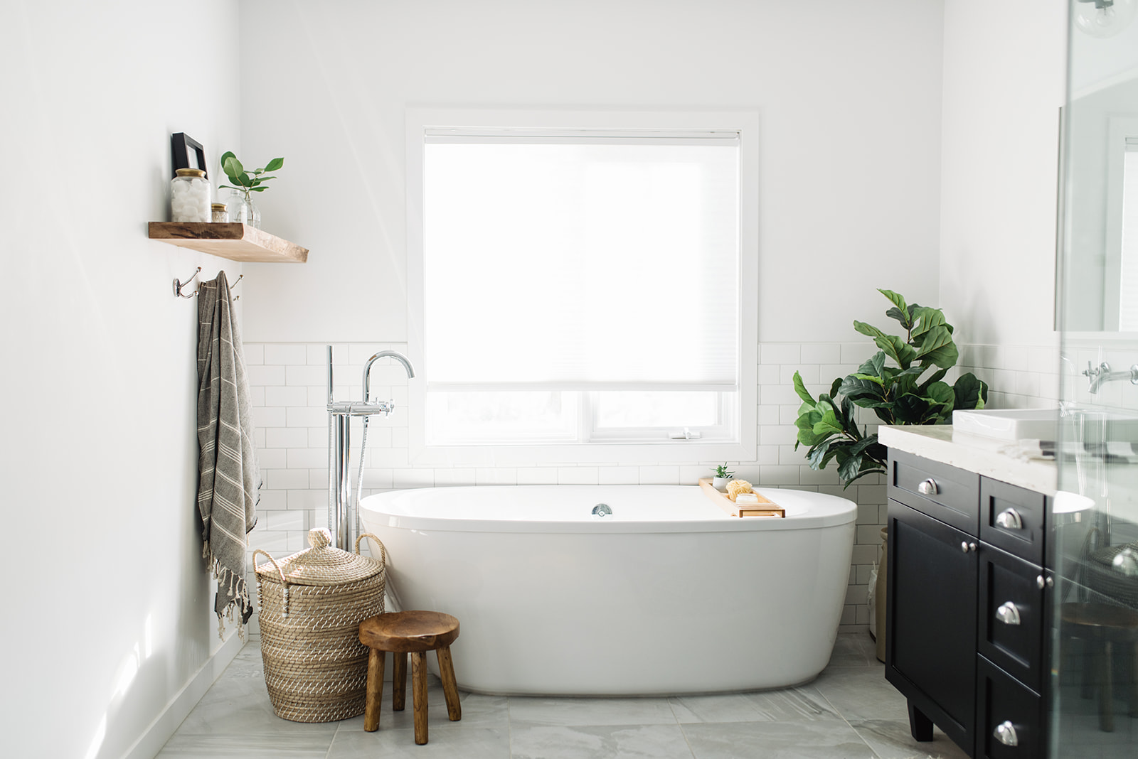
The bathtub area is now a spa like retreat for me, I mean besides when it’s covered in Jack’s toys! We decided that to break up the black and white, we needed a little warmth in this bathroom design. So we added a floating, walnut wood shelf and a small wood stool nestled in beside a pretty basket. I actually use this stool a lot more now that we have Jack – it’s the perfect place to perch while he’s having his bath. And the basket is great because it has a lid…dirty towels are now tucked away until I’m ready to wash!
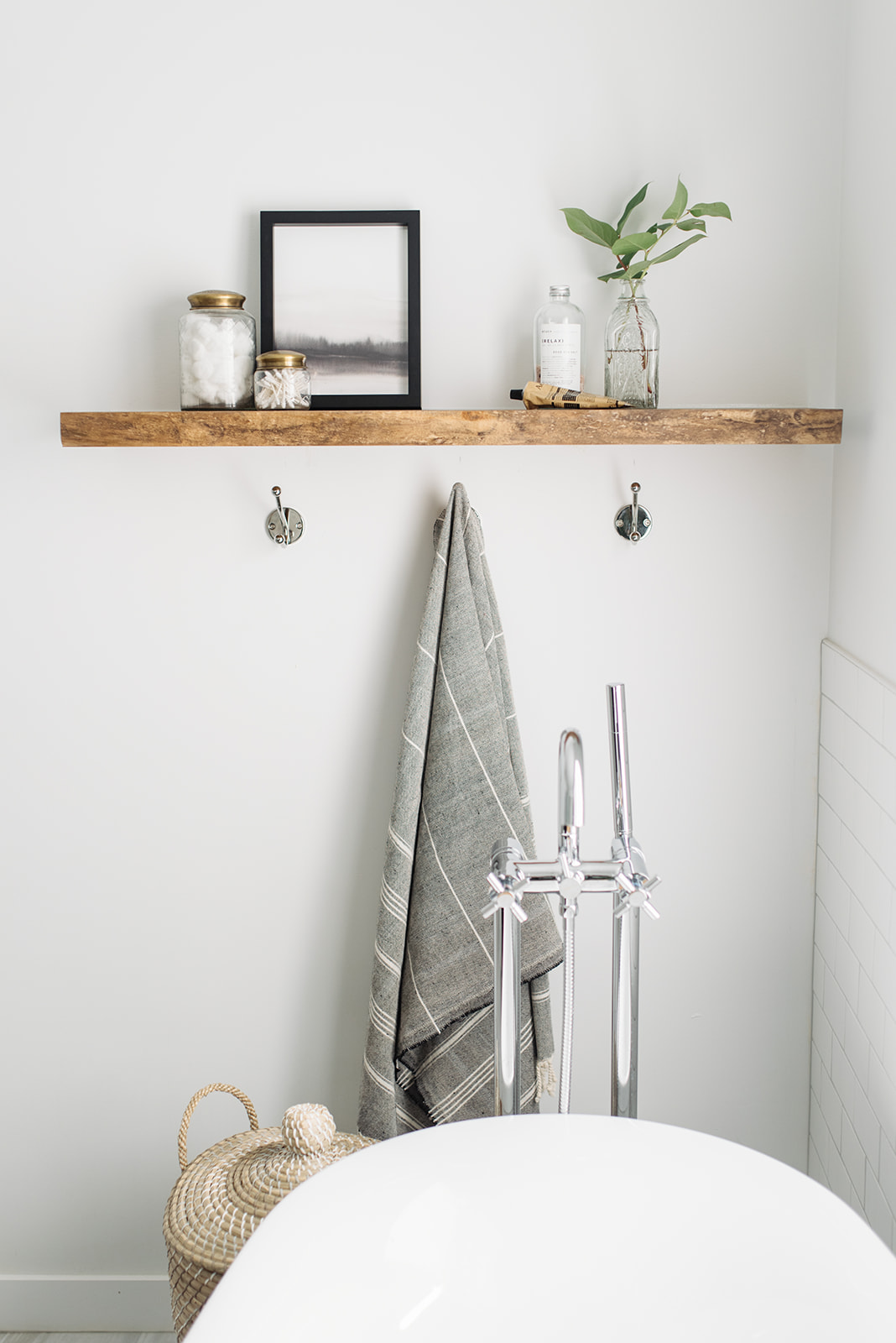
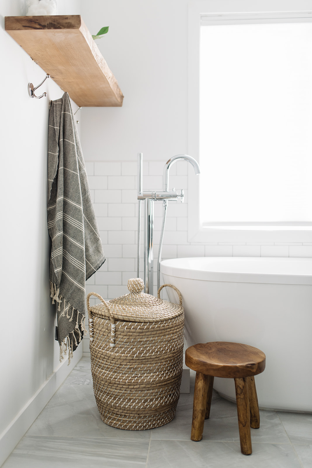 The shelf itself is beautiful but it also provides me with an opportunity for storage above the reach of little hands and some shelfie styling. I just updated this artwork with a printable off of Etsy…such an easy way to get pretty, affordable art.
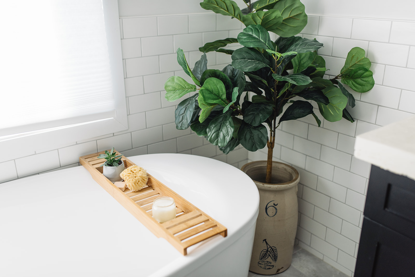
I also love my bath caddy (it’s a bamboo one off of Amazon of all places!) and we use it all the time. Even Jack loves it, storing toys up there. Believe it or not, he’s only hit it off maybe once, so who knows if I’ll have to start putting it away. For now, he barely gives it a notice. 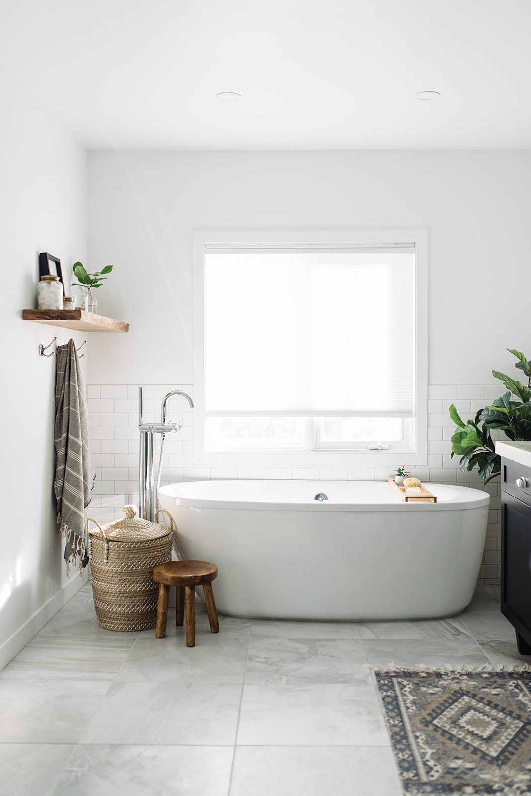
And there’s the full tour! What do you think of our new and improved bathroom design? I would love to hear your thoughts and if you have any questions about the products or finishes we used, please ask away!
Also, you can shop some of the items in the bathroom with direct links here:
(all updated photos taken by the lovely Tracey Jazmin!)

Wow!!! This bathroom is just so beautiful!!! Love the wall faucets and concrete countertop!
Thank you so much Becki! My husband will love that you commented on the concrete 😉
stunning! the vanity is just perfect! we’re hoping to re-do our bathroom and this is such great inspiration!
Oh I’m so glad!! Thank you!
Gorgeous details! the before and after is ahmazing! that concrete counter top is so awesome, I want that in my kitchen! PS your blog is so pretty, off to stalk you!
Aww thank you so much Laurie! Please stalk away! lol
I love the walnut wall shelf! I’m looking for a couple myself to finish off my office…where did you buy yours from?
Thanks Jenny! We actually just went to Windsor Plywood and found a piece of wood. I stained it walnut myself. You can find great pieces like this at any specialty wood place really…but Windsor is great!
Do you mind sharing the dimensions of your bathroom? Your old configuration looks very similar to our current configuration. Thanks for sharing this gorgeous project!
Hi Kierstin!
It’s about 8′ by 12′
The before photo looks so cramped but it’s actually a really big space! Thanks for checking out the reno!
Gorgeous! Do you mind also giving the shower dimensions?! I’m so worried our planned one is too small!
It’s about 36″ by 48″ and it feels pretty spacious. If yours isn’t quite that big, I really wouldn’t panic 🙂
I love the floor tile! Can you tell me the brand and name? Thanks!
Thank you so much! I will have to look into that for you. We got it at Payless Flooring and for the life of me, I can’t remember anything else…baby brain. I will get back to you on that!
This is beautiful. I found this on Apartment Therapy and just had to click through to see more. I completely agree that the rug just makes that room. The colors are just perfect and really do pull it all together. I do have one question about the sinks – I notice there is that tiny gap between the back of the sink and the wall. Have you found that to be a gathering spot for splashed water and potential growth of grossness at all? I know that the area behind the sink to the wall is always the worst part of the bathroom for me personally, so I was just curious how that tight of a space affected this.
Again, amazing reno! I’m definitely going to have to poke around the rest of your blog now. 🙂
Hi Krystal! Thank you so so much! I would love it if you poked around too 🙂
I have found the same problem with almost all sinks/vanities unless they are completely under mount sinks I suppose. It seems the worst for collecting my husband’s hair when he trims/shaves. But so far, we left just enough space for me to swipe it away and it seems to be fine. Also, my husband did a really great job of sealing off the sink to the counter so I’m finding it better to clean. But yeah, that spot is always a grossness collector lol
I definitely agree that the really only sure way to not have this problem is the under mount sinks. And of course if this works well enough for you then that’s what matters! Oh, and you should get your husband one of those amazing beard trimming bibs – they have the suction cups that hook to the mirror so that all the trimmings fall onto the bib instead of the sink. They’re sanity savers, lol.
Haha unreal! That sounds like my cleaning life saver! Thanks!
Your work is beautiful! You need a better camera that will do it justice!
Thank you so much! Yes, you are so right, I do! I need to just make the investment once and for all and get a better camera. I have thought about reshooting this bathroom many times!
Beautiful!! Wall paint color make and name?
It’s Decorator’s white by Benjamin Moore 🙂
Thank you!!