Now that you’ve (hopefully) seen the overall vision for Rosie by the River, it’s time to narrow in on the design plan for each space in the phase one renovation. Today, I’m starting with the ensuite!!
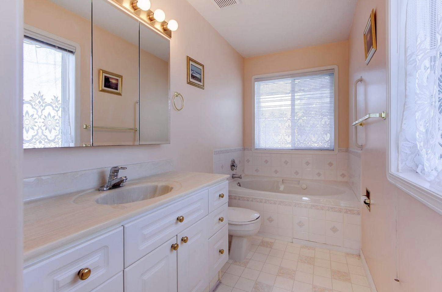
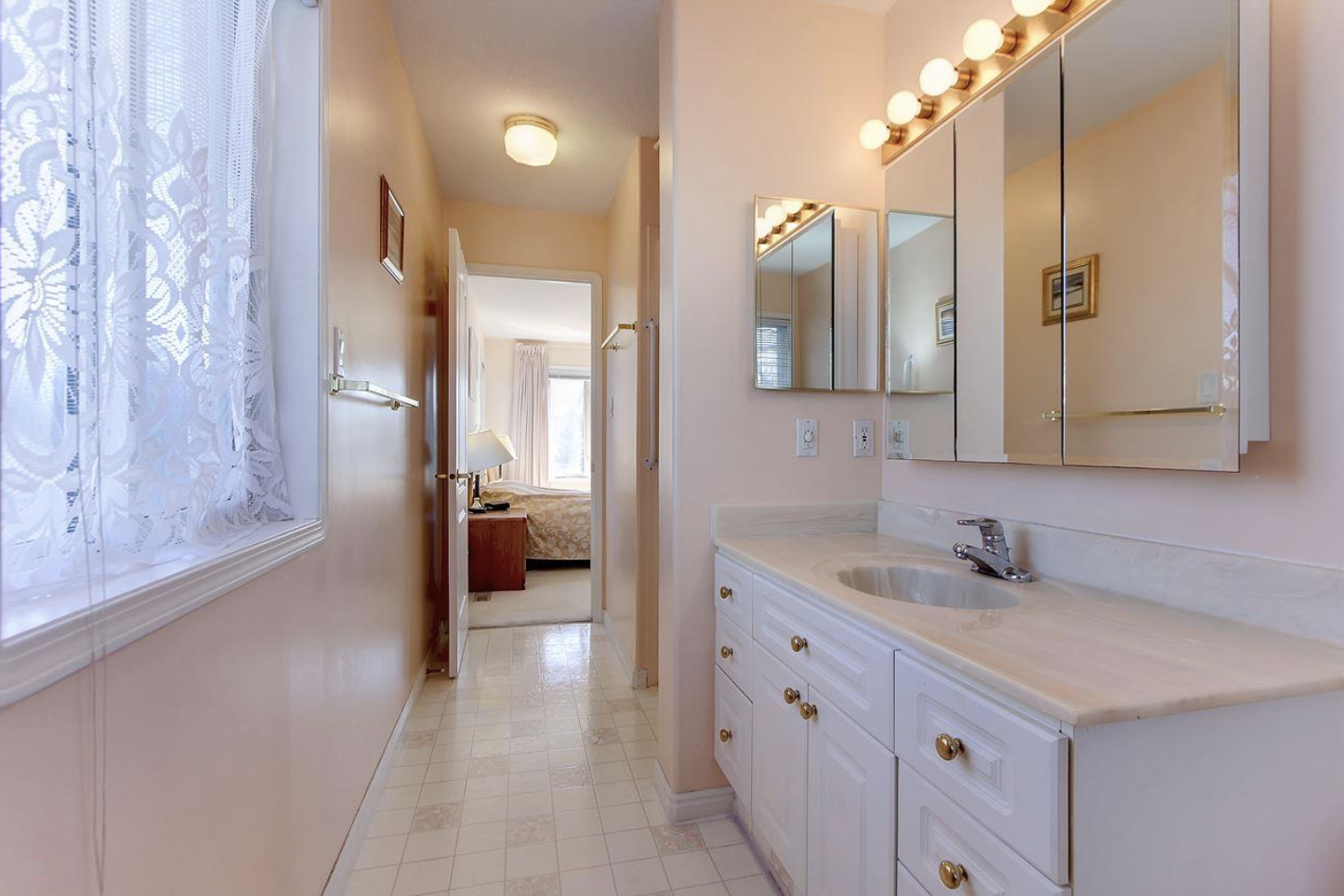
A quick reminder of where we started of course…


The challenges of the space: a very small shower area (that you can barely see from this angle), a narrow footprint with a load bearing wall that restricts the flow and how much we can change the space, a large window in the tub area (that is not appropriate for a shower space), oh and the fact that it needs a full gut job! lol
So here’s where the good news comes in…the wall that divides the shower from the vanity is load bearing buuut we were able to pull it back by a few inches and that really helped with opening up the space. Yay, Ryan! And we naturally discovered a spot where I could add a little recessed niche – hey, if the wall is completely open and needs drywalling anyway, might as well capitalize on every inch, right?
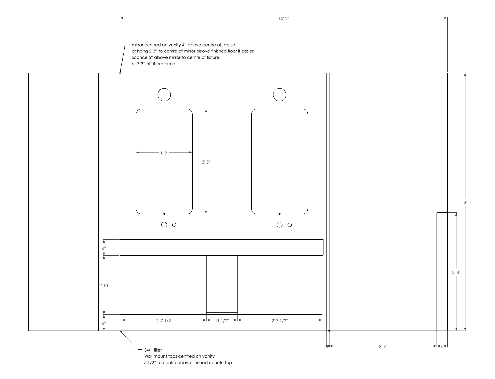
Then, we could take away a little bit of the closet space on the other side to enlarge the old shower area which now becomes the toilet space…so we can move that darn toilet and elongate the vanity, which will basically butt into the new shower. Here’s an elevation to show that…and you guys, I planned this down to the literal inch to make sure it would all come together…

Looks good right?! I’m excited to have a lot of useable space with this vanity, undermount sinks and a thick profile on the counters. It feels so luxurious! Then, in the shower, we plan to replace the window with a transom style (much shorter which means no neighbours spying!! lol) and then build out a wall/ledge as opposed to creating a niche.
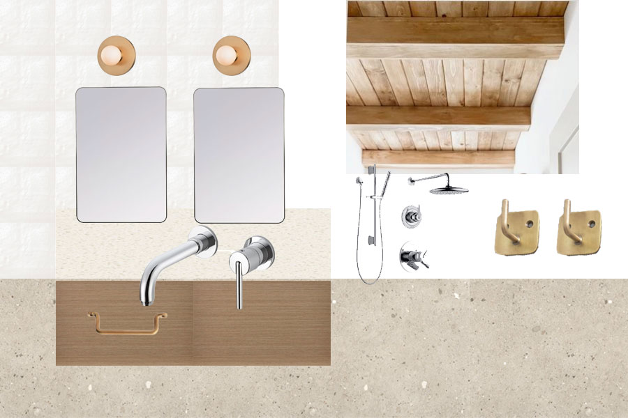
Ready to see the mood board? Here she is!!

I knew from the beginning that I wanted a statement wood ceiling similar to what Angela Rose did in her bathroom. Hello beautiful!! From there, we picked a warm wood for the vanities from Kitch (which is actually a brand new finish coming soon to their website!) to compliment the wood tone of the ceiling. Then..the tile!!! Over at River City tile, I immediately swooned when I saw this large format tile that has lovely chunks and details throughout. It’s basically concrete meets terrazzo in an understated way…and it has a nice warmth to it. It jives so well with my tried and true Mallorca tile that I plan on using in the shower AND on the vanity wall. And because we are going curbless on this shower, we are also planning on running the tile up the wall as a baseboard…very excited about this detail!
When it comes to plumbing fixtures, I can’t stray away from my favourite line from Delta. Honestly, it’s just too good. I source it for clients all the time and I had Trinsic tap sets in our Ravine house. Why mess with a good thing? For this vanity, I am opting for wall mounted taps – love the look and how much easier it makes cleaning the counters! In the shower, the Delta Trinsic shower kit is an easy sell for me. I like having the separate hand shower fixture for cleaning and that you can set your temperature. Handy 🙂
Lastly, I have to mention the lighting. While we do plan to add pot lights for some good general lighting, I needed to create some impact above the vanity. I stumbled on the Taft wall sconce and knew it was a good fit. The simple circle shape and aged brass finish were exactly what I was envisioning. The right amount of detail to compliment this ensuite design, if I do say so myself. And it almost pays homage to what was here originally, which I love!
You might have noticed that I have mixed two metals in this room…brass and chrome…and that is strategic. In fact, there won’t be much black at all throughout the home. While I love a punch of black in every space, I wanted the majority of the design to stay really soft and classic…black just felt like too much of a dramatic contrast. I won’t be opposed to some black accents here and there, but when it comes to the actual fixtures…it’ll be a brass and chrome combo only! What do you think of that decision?
So excited to keep you in the loop with this ensuite design (and a fun element that Bruce at Iron Elements has in store!). I will have plenty more progress posts to come! AND more design goodness too! Who wants to see the kids bathroom plan?!? Check back in a couple days!