One of my favourite rooms to design for my clients is the kitchen. I normally struggle a lot when it comes to designing for myself (I love too many things!!), but our kitchen renovation actually came to me really easily! There was a clear vision from the beginning and I honestly enjoyed the whole process a lot!! The only challenge was working within our footprint…our smaller square footage meant we had to get a bit creative.
Sometimes it can be hard to figure out how to make smaller spaces function for our needs, especially when we’ve been drooling over these massive kitchens on Pinterest (don’t tell me I’m the only one!!). But, with my fair share of kitchen designs and my own successful renovation now complete, I’ve learned a few tips and tricks to getting the most out of your space. PS – You don’t have to sacrifice style for function, promise! Here’s how: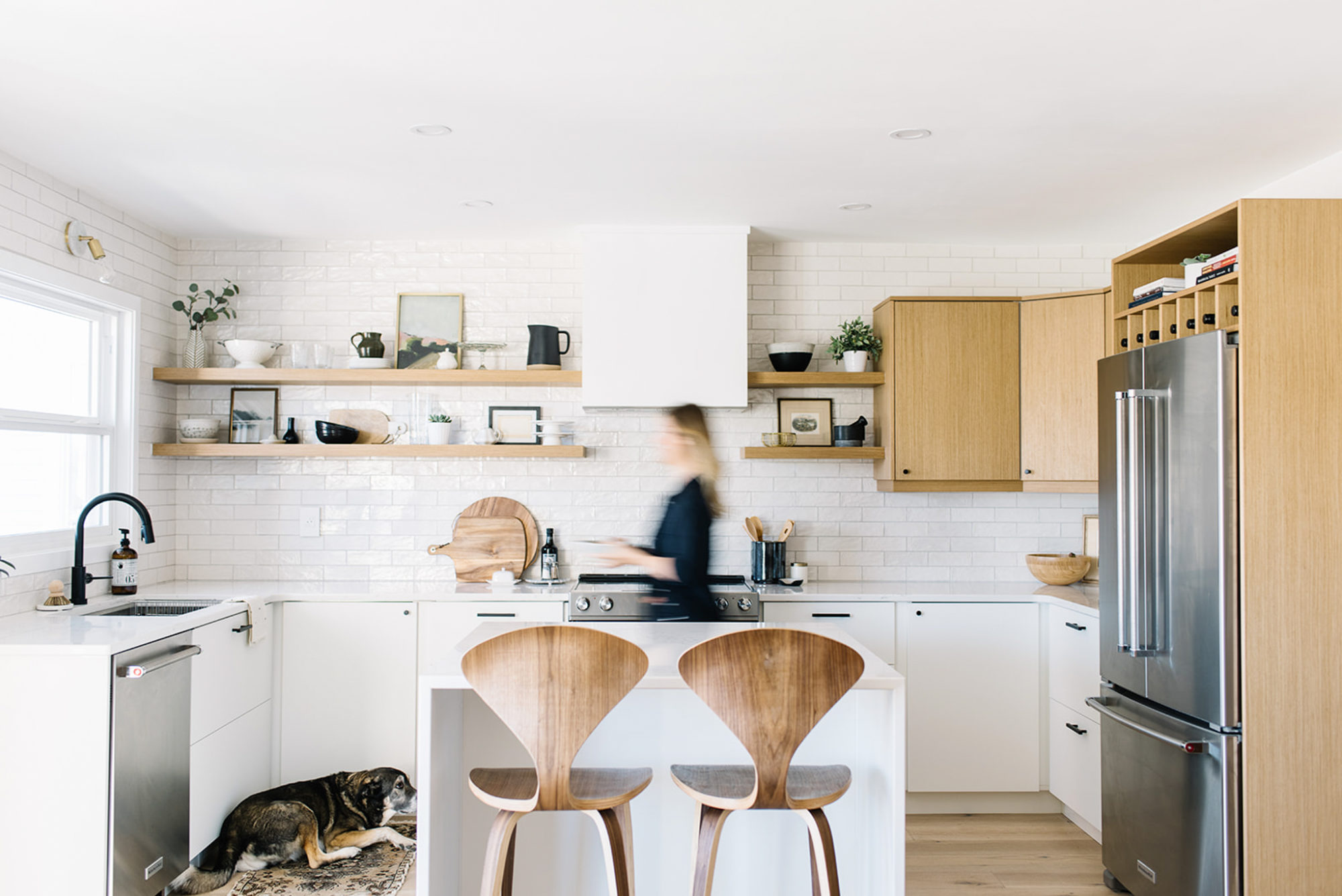
Plan the Space – With Function in Mind
Obviously, every kitchen renovation is going to come with a new space plan. But when it comes to smaller kitchen designs, it’s even more important to spend a lot of energy in this initial phase. First, consider where your major items will be – the sink, the stove and the fridge – and whether or not they are accessible and make sense for traffic flow. Then think of the counter space (prep areas) that surround them. You want to think of your kitchen in zones (this is where I will most likely chop food / this is where I will want to put dishes / this is where I can put out appies!) and allow for the counter space in the right locations. And from that planning, you’ll also be able to add in the appropriate cabinetry…do you need uppers on one side and then some open shelving opposite? Does it make sense to have a bank of large drawers by the stove for pots and pans…a corner lazy susan for the appliances you want to tuck away…and so on…
When you’ve done your planning, physically walk through the space, tape down the new dimensions and then go through the motions of your day to day. I can’t tell you how many times Ryan and I busted out the painter’s tape and triple checked our measurements. We had our island boxed out on the floor so we could practice opening the fridge door, walking through the space, etc. before we committed to anything! Think “from paper to practical.”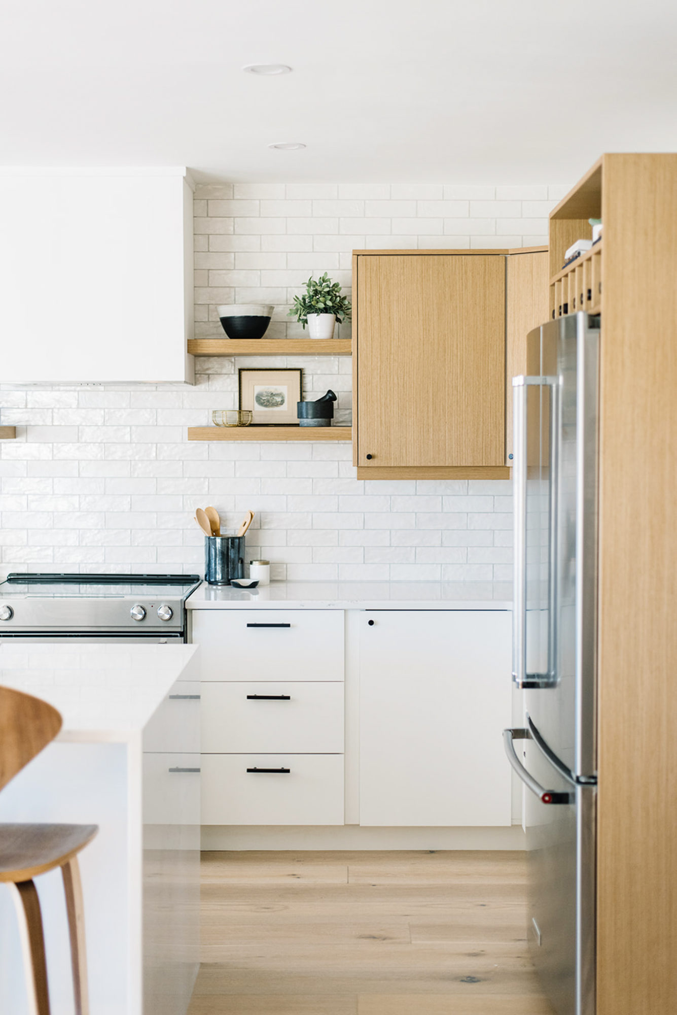
Then Think About the Cabinetry
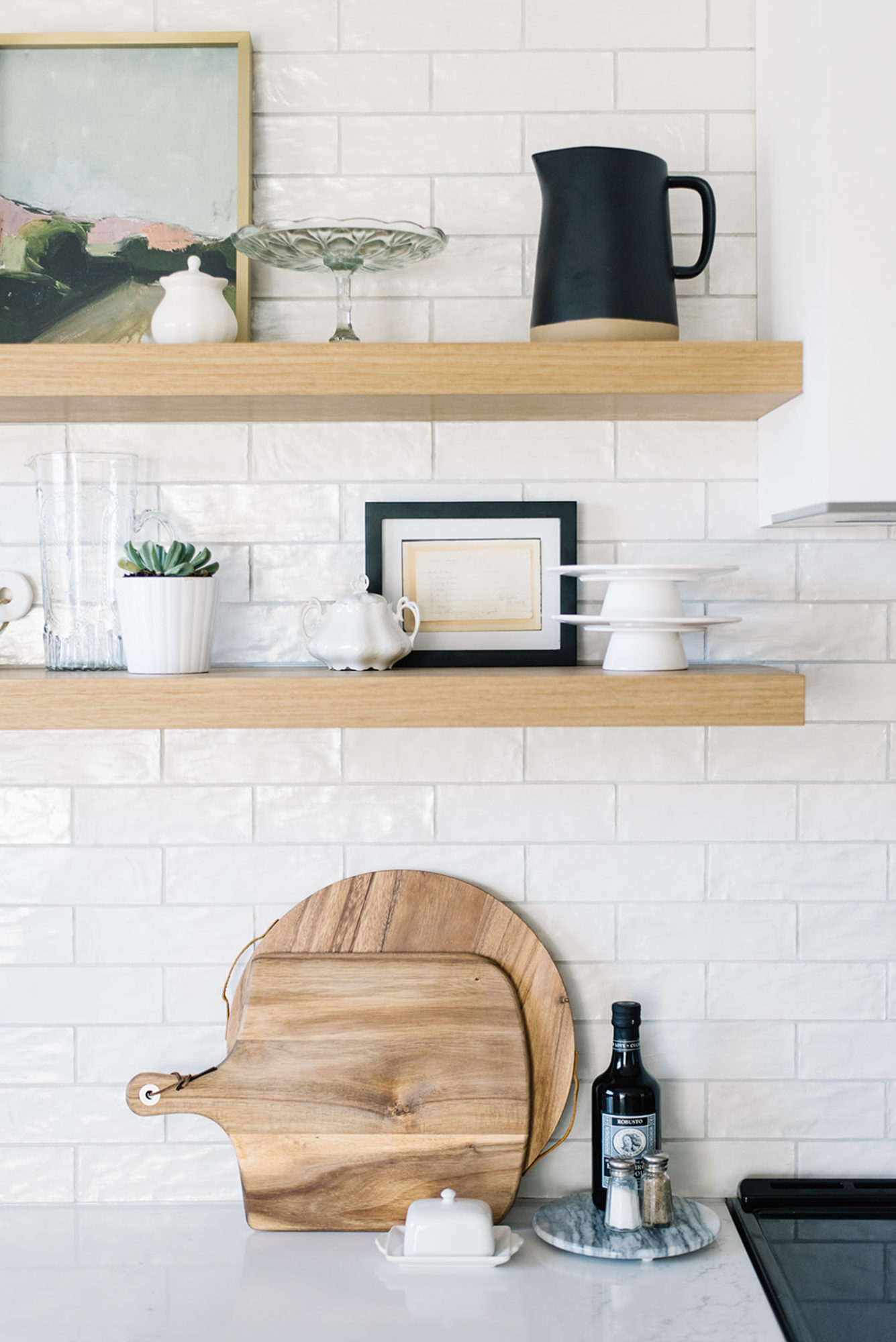
I realize that when space is a premium, you need all the storage you can get! But in my opinion, having too much cabinetry will make the space feel more closed in and almost heavy – if that makes sense. Balance the kitchen space with some open shelving or if that is something that fills you with dusting dread, then at least have some glass fronted doors as an accent. Our own open shelves were a huge talking point for a lot of people who visited the space…I get it, they aren’t for everyone. But for me, I want to actually see my beautiful kitchen objects, I want our personality to be highlighted in the room and I want it to feel impactful and purposeful…that is worth every second of dusting! Bonus: the open shelves truly do make our kitchen feel more open and airy!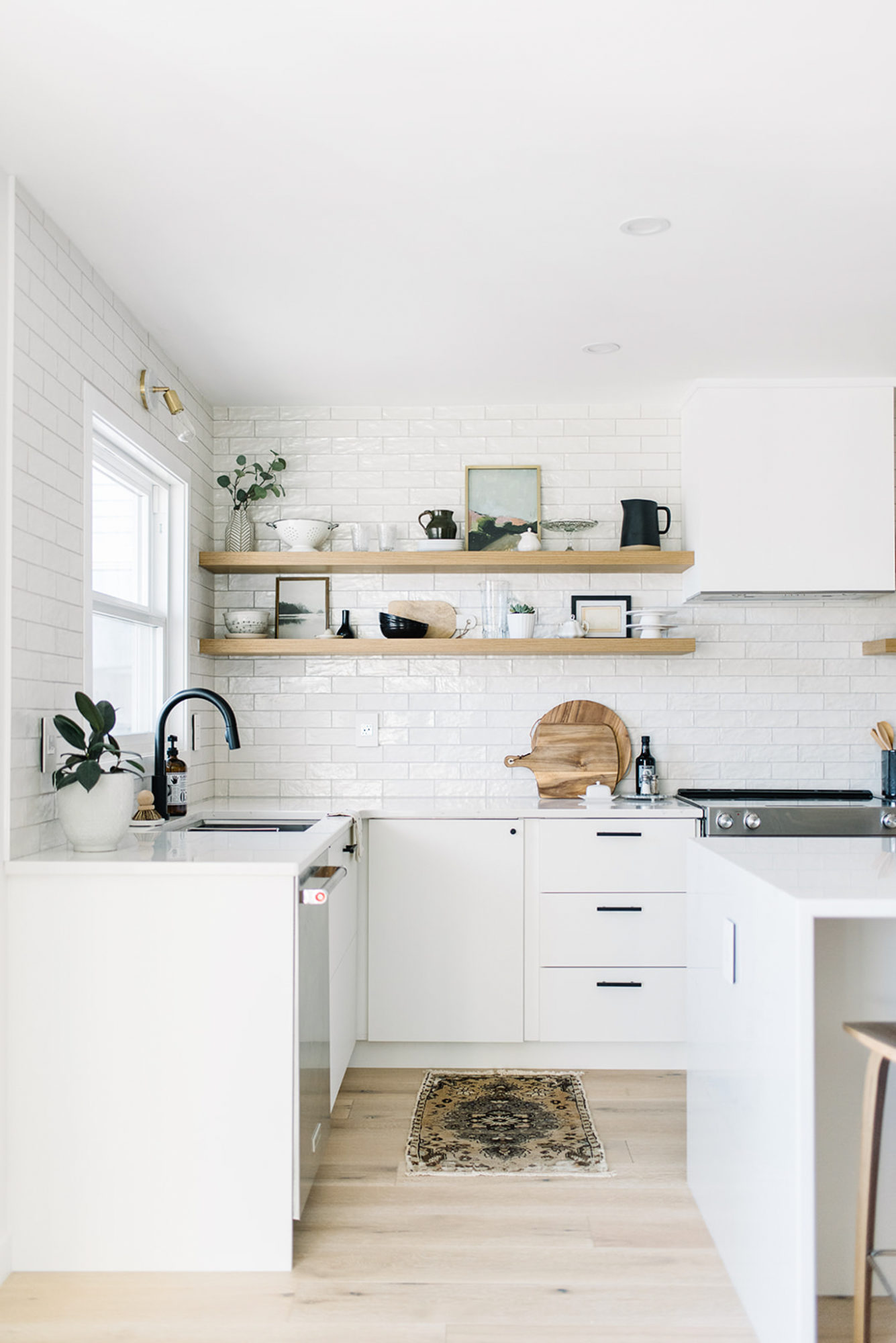
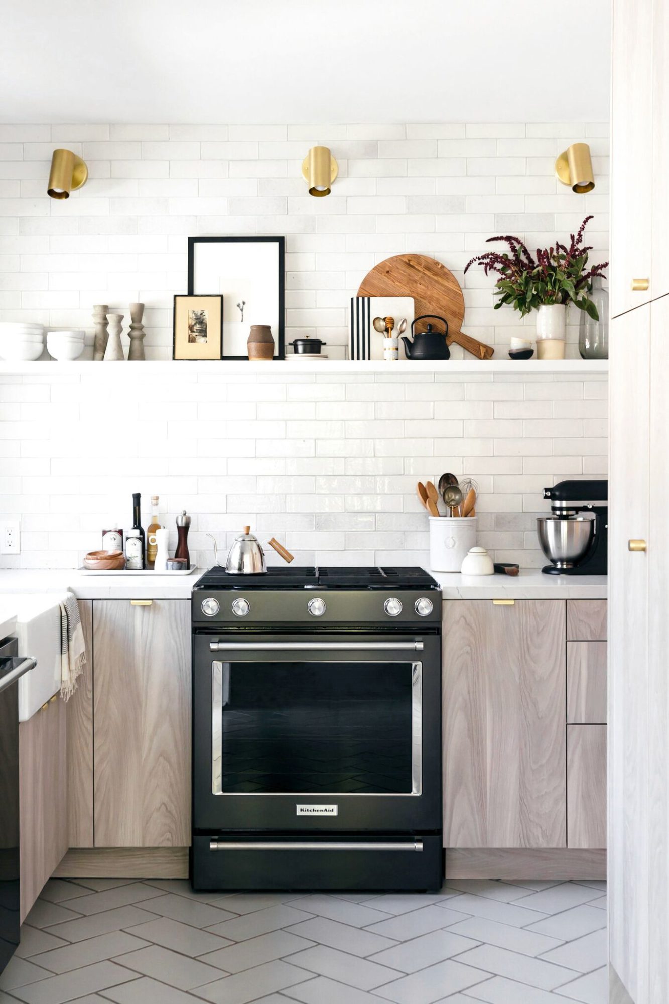
This image from Studio McGee was a huge inspiration for my open shelving…I instantly fell in love with it! This kitchen is definitely on the small side but it doesn’t feel that way for a second!
Keep Your Palette Simple and Cohesive
There’s nothing worse than overwhelming a small space with too many competing elements. So choose your colour palette and then stick with it. There’s a common design myth that going dark makes spaces feel smaller but that isn’t necessarily true. Plus, having dark cabinets could make the kitchen feel even more warm and inviting…exactly what you want for the most used room in your home! The overall goal is simply to keep it cohesive without adding in too many colours and finishes. In our kitchen, we did a combo of light wood and white, and then varied our textures (flat panelled cabinets with glossy, bumpy tile for instance). Our finishes were mostly matte black, with stainless appliances and a small touch of brass in the sconce and accessories. Staying within this design makes the space feel a lot more open because there’s a continuity.
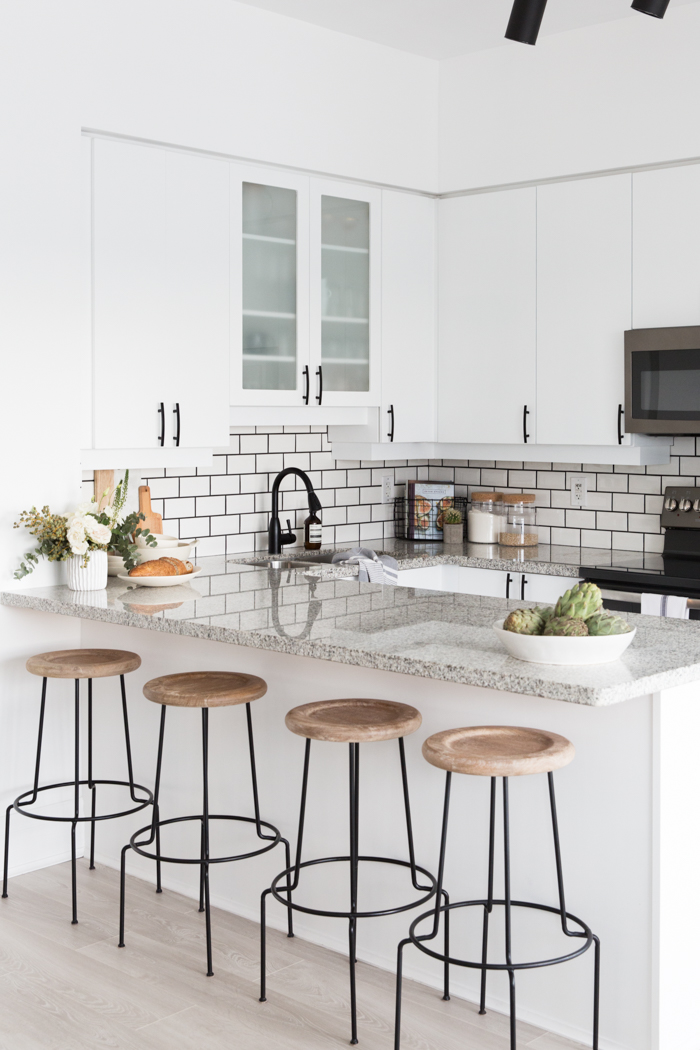
Take a cue from Stephanie Sterjovski’s kitchen – because her design is simple, it automatically feels more open.
Choose the Right Lights
Bad lighting is the absolute worst! It can change how a space feels almost more so than any other element. So make sure the lighting plan is a consideration right from the start. Layer in your lighting – start with pot lights and good overhead light, then think about task lighting like pendants over your island to help shine more on the location you use the most. Finally, add in some accent lighting like a wall sconce above your sink or open shelves, and/or under cabinet lighting. If you end up getting this combination right, it can really help a kitchen feel bigger. When it comes to the fixtures themselves, never feel like they need to be too matchy matchy! (Some lighting design tips for you here!)
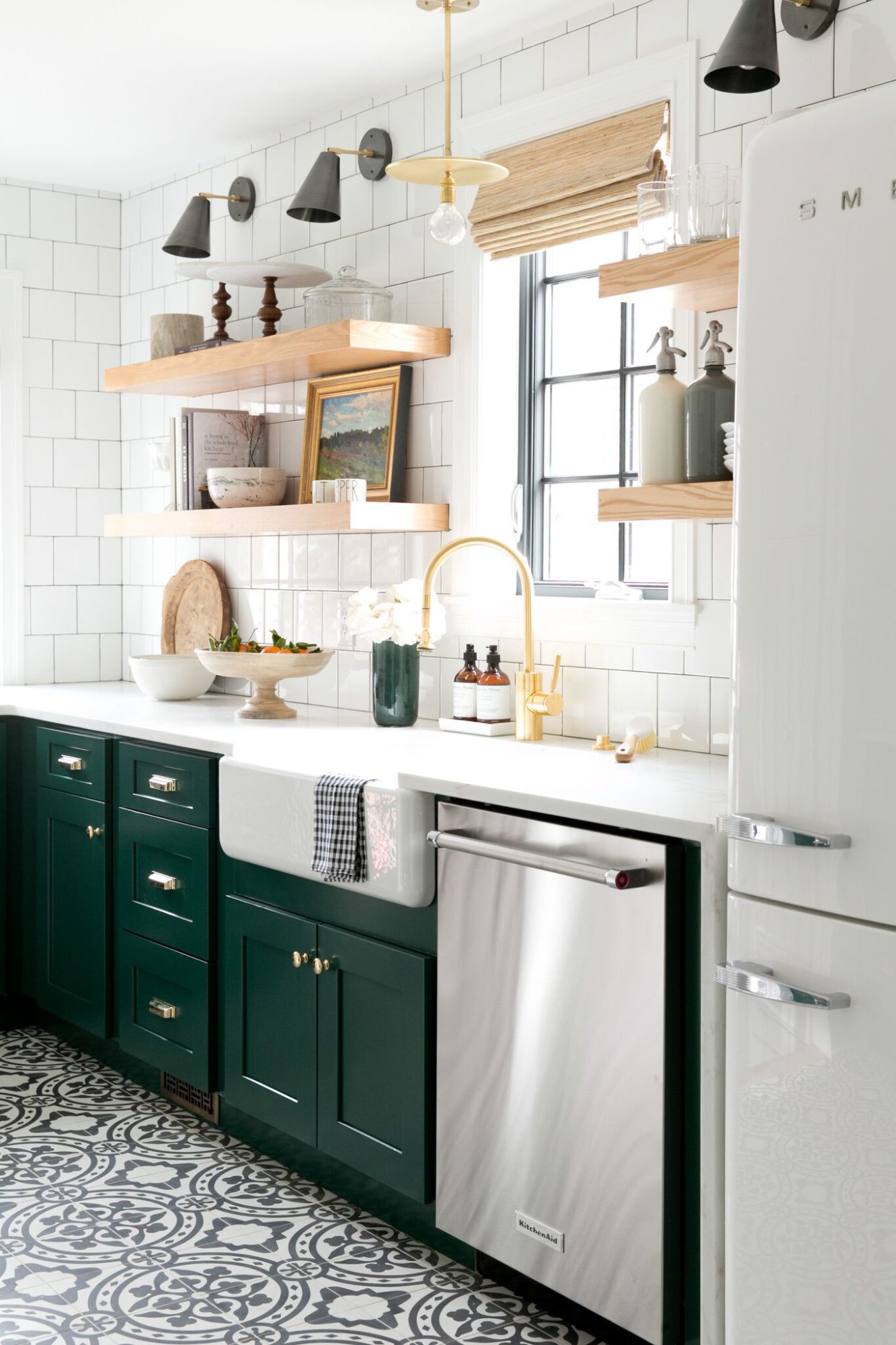
I love the lighting selections in Studio McGee’s Denver Tudor project – even with a small footprint they capitalized on their fixtures. A beautiful pendant amidst wall sconces works perfectly and adds a great punch to the space (just like the cabinetry!).
Resist the Urge to Fill It Up!
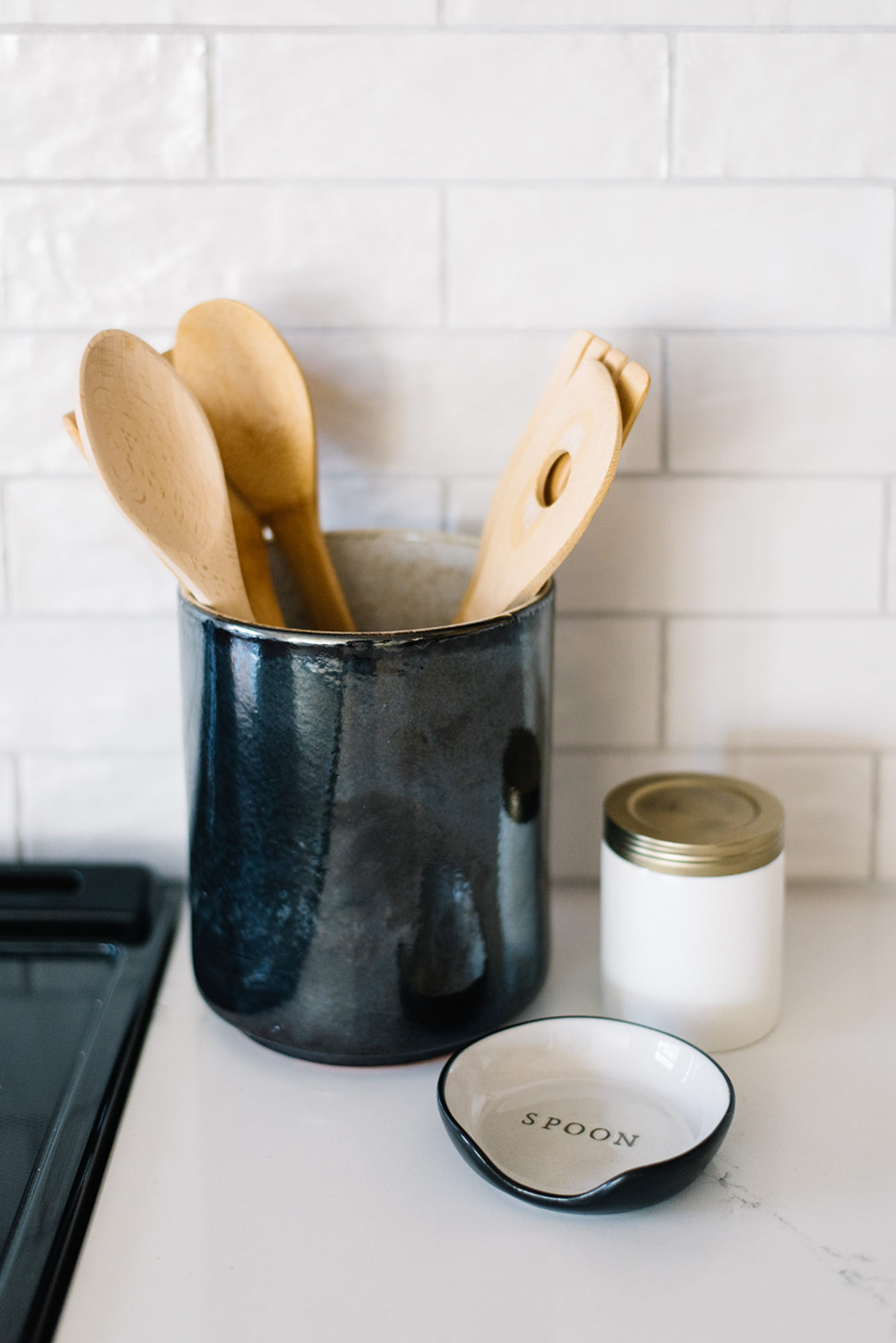
My last tip will probably be a pretty obvious one, especially if you’ve followed me for awhile. I am a big proponent of the less is more philosophy. When you have a small kitchen, the last thing you want to do is clutter it up with a lot of things. Too many appliances on the counter tops or even decorative pieces will make it feel claustrophobic. Instead, keep only the most functional items out and whenever possible, style the space so it looks purposeful. Like a coffee maker…group it together with a cute coffee canister and a candle to make it look beautiful. Put utensils in a beautiful crock, lean some wood cutting boards and utilize trays whenever possible. Take the left side of my stovetop…a small marble tray corrals these necessary items together, making it a lot more pretty!
