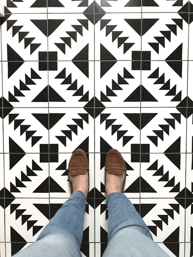
We are already at week 4 in this one room challenge!?! This is really flying by! I must admit, it’s coming together really well – no surprises or major headaches! The demo was simple, the rebuild has been easy going and timing is working out. Plus, we have our TILE, the piece de resistance! So today, I wanted to give you a sneak peek, and talk a bit more about cement tile!
Here is the Tulum pattern, and yes, it’s installed! I can definitely say that it’s stealing the show so far. I know a bold pattern like this isn’t for everyone, especially in large doses. But when the space is small, like our bathroom is, something like this can work really well, making a big impact! I find that small half baths or laundry rooms are the perfect spaces to have fun with design, making somewhat “riskier” choices.
Some of my tips when working with a graphic pattern include:
- think about the grout colour – that can either enhance the pattern or make it appear more subtle
- keep the rest of the design simple – the pattern becomes the focal point, so let it! I wouldn’t start to go crazy with bright coloured walls, for instance.
- introduce some texture for balance – warm wood looks beautiful with the high contrasting black and white
Another factor to consider with cement tile is the maintenance. We made sure to get the perfect sealer from our tile shop (River City tile – they are freaking amazing!) so that we were setting ourselves up right. This particular sealer – TK6 Nanocoat – is so good, we won’t have to cover it again for a long time.
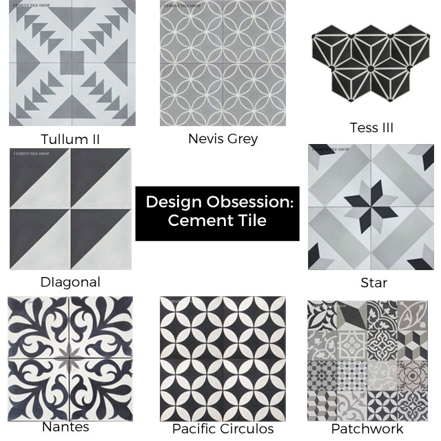
Here are some of my other favourite concrete tile patterns all from the cement tile shop. Which one is your favourite?!
Check out more of the amazing One Room Challenge updates here! Week 5 will be here before you (and me) know it!