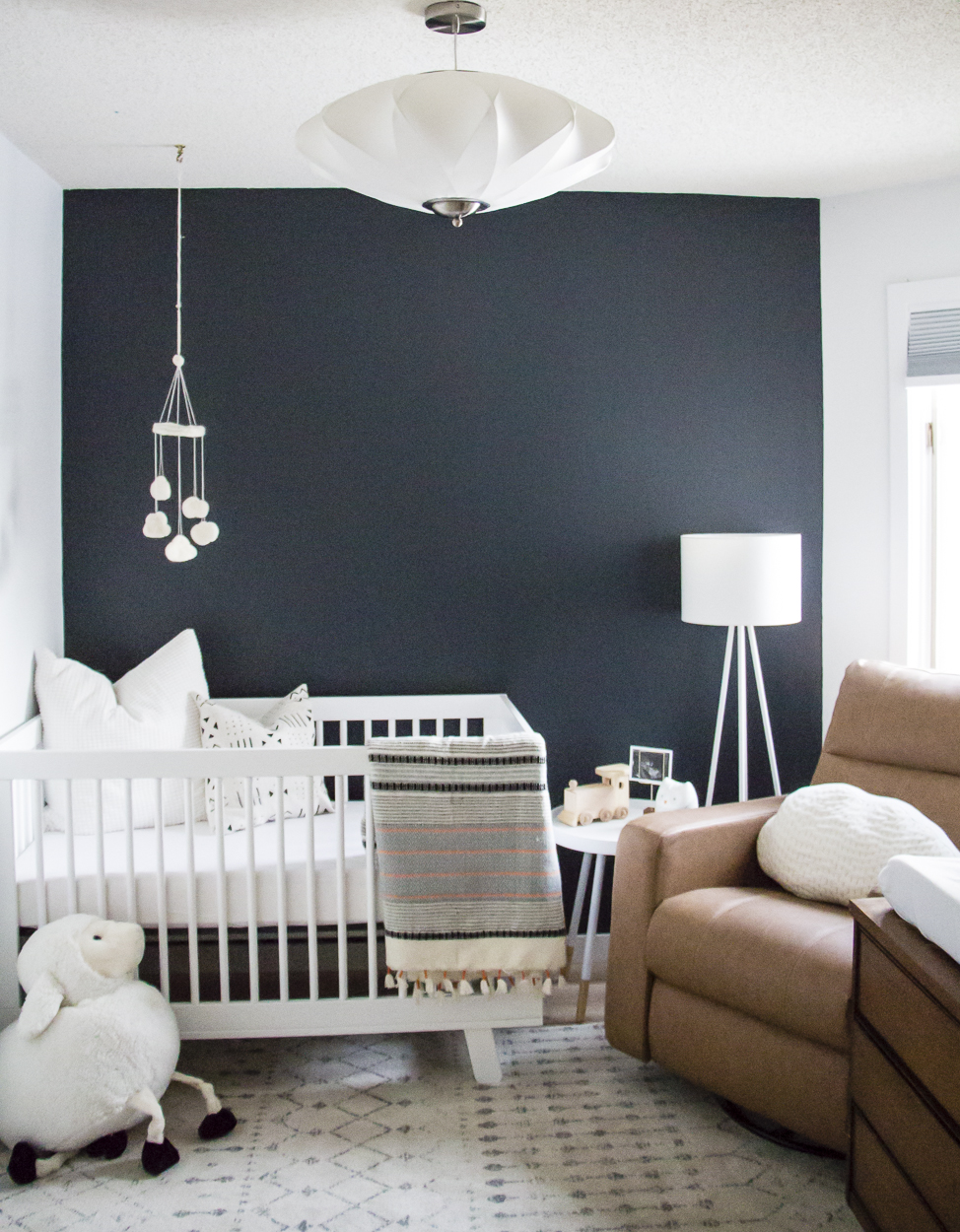
( Jack’s nursery from 2 years ago…see the full reveal here!)
Well we are two weeks away from finding out whether this baby to be is a boy or a girl! That sure snuck up on me! After the first ultrasound, it felt a lot more “real” that we were expecting…but it will be even more so after we find out the gender. Not that it matters to me – I am happy with either – but knowing whether Jack will have a baby brother or sister will be an exciting next step. Plus, it means I’m either saving a lot of money by not buying more clothes…or I’ll be that crazy lady who can’t stop herself with all the adorable baby girl things!! lol
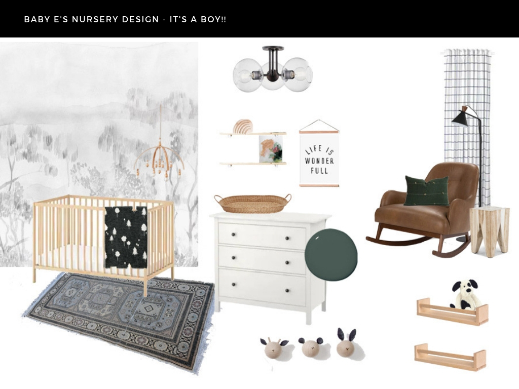
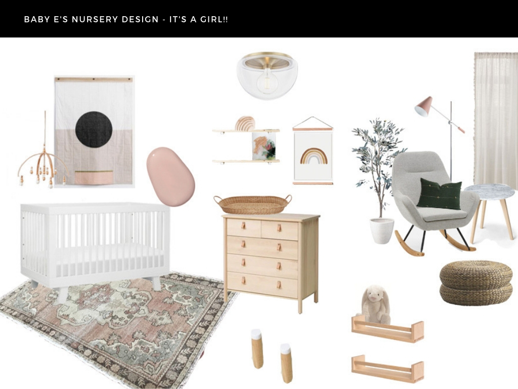
The other exciting development will be in the nursery!!! Obviously you can imagine how thrilled that makes me! I CAN’T WAIT to pull this room together because nurseries are honestly one of my favourite spaces to design. Give me all the nurseries please! And so, because I love to do it anyway, I thought it would be fun to design two options – one if baby E is a girl and one if he is a boy! Things might still shift a bit from here, but essentially, this is what I am envisioning for our tiny nursery once that ultrasound happens (crossing fingers baby cooperates!). Check them out…

Baby boy’s nursery was based around this gorgeous wallpaper I found from Milton and King. Even Ryan loved it right away. What struck me about it was the landscape scene and how it almost looks like a mural…the “woods” theme is popular when it comes to nurseries but I thought this approached it in a more unique way. It is definitely more sophisticated I realize but after pairing it with some other elements, I think it will look beautiful in a nursery space.
The beech wood crib (such a steal btw!) contrasts so nicely on top of the wallpaper and I absolutely love this nature mobile I found that ties into the crib perfectly. I would love to see a vintage rug to anchor this side of the room – something with some soft greens and blues would be lovely!
For the dresser/change table area, I plan to do a little DIY (somewhat similar to my own dresser hack) and paint this one a moody green, while also possibly trimming down the legs for a more modern feel. Though I’m sure I’ll be testing some green paints, I recently stumbled on this company called Clare and was intrigued by some of their hues. This one pictured above is called Current Mood – so will look at giving that one a test! Some new hardware will go a long way too – perhaps some leather pulls or brass knobs. We shall see!
I have become a touch obsessed with changing baskets even though adding more laundry isn’t the most efficient, they’re too pretty not to include in the space. Above Jack’s dresser I did a gallery wall, but with this babe, I’d like to do two shelves offset by a framed piece. Both of these shelves (with the coloured pegs) and the magnetic poster frame are from a company called Loop Living and I am in love! Same with those adorable animal wall hooks which I would put on the opposite wall.
In the corner, I would love to have a cozy nook to nurse and read books – a good bedtime routine has been a really important part of raising Jack, so I want to make sure we stick to that in this space too. This gorgeous leather rocker from Article would be perfect. I already have two accent chairs from them so I know it will be cozy. Plus, I love the tone of brown and the richness it adds to the room. Like the wallpaper, it’s a little more sophisticated and elegant, which I love. Article’s Tana stool adds a bit of woodsiness and is the right scale for our small nook – definitely need a spot to put books/bottles/anything down without the piece taking up too much room.
In regards to the lighting, I would love to see this Mitzi fixture above since it will give off plenty of light when needed. And then for more ambiance, we can turn on the floor lamp and settle in to read a book. The black finish ties them both together, though I do really love the small wood detail on the floor lamp.
And now for version 2…

I’m not going to lie…while I love my boy’s nursery, there would be something very special about getting to go a little more girlie, which is a major departure for me! I am neutral loving girl, so even adding this amount of colour is huge! And I love it! Who am I?!?!
Ok first thing’s first, I based the whole room off of the hanging quilt above the crib (we already own this particular crib, so in this scenario we would look at something new for Jack and move this one in for baby). I stumbled on Louise Gray well before I was on the baby #2 train and absolutely fell in love with everything she did! And I haven’t been able to get this particular quilt out of my head since. It’s beautiful. So I would hang this up on newly painted walls…but no, I am not about to paint a whole room pink. I would look at doing the bottom portion only in this pretty Rosé colour. I want the pink to be soft, subtle and really warm…not quite terracotta but heading in that direction. So a more mature “pink” if that makes sense.
The white crib will pop on the pink wall and then I’d look at continuing some soft pinks and creams into the rug – another vintage option like this one is my goal, which also adds in a touch of green.
The dresser/change table is basically the same vignette as the boy’s room, however, I would look at this Ikea dresser instead and most likely leave it au naturel. Love those little leather pulls too…done and done! If you followed my Insta stories the other day, you’ll remember I shared a custom art piece I received from Rachel Wadlow. I sent her a picture of myself – pregnant with Jack in the desert of Palm Springs. She created the little print you see above on the shelf…and it will 100% be gracing the walls or shelves of BOTH nurseries, regardless of gender. I am in love with it!
A similar set up will take over the window nook – a cozy chair, table and floor lamp. In this version, I’ve gone a little lighter and more airy with a soft grey rocking chair, subtle sheer curtain panels (with black out roller shades behind of course) and a marble topped side table. I HAD to include this pink hued floor lamp – it was just too perfect for a nursery! And one of my favourite elements is this faux olive tree that adds in a lovely hint of greenery without going too big and bold. Yay for olive trees right?!
A note on this pillow you’ve seen in both designs. It is from an adorable little Etsy shop by a lady who is rocking it in my own city! Check her out! I love this particular pillow with the green fabric and the small tassel details…it’s adorable!
Oh and I can’t forget to mention my new favourite flushmount from Mitzi – a brass detailed, glass domed beauty!

Comments are closed.